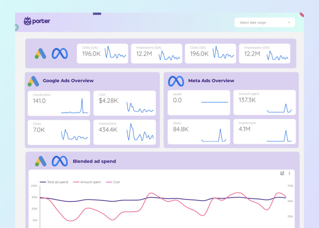
In the previous lesson, we mentioned the importance of Business Intelligence, data visualization, and Google Data Studio.
In this lesson, we’ll see how other companies use Looker Studio and, in general, some Looker Studio dashboards examples. You can find good examples in our Google Data Studio templates gallery.
Most companies have simple dashboards that take two minutes to build to reduce the hype around analytics and data.
When we have helped big and small companies or recognized influencers, they care about many metrics, and that’s it.
Why Do You Need Dashboards?
While some analytics companies show stylish and advanced dashboards as their standards, what we see in reality looks something like this:
I have seen it in meetings with users and customers. All they do is show a table with top-performing ads. Period.
Some businesses want to keep basic dashboards, and that’s ok. Analytics is not about complexity; it’s about visualizing the data that matters to you.
When I talked with Anil from Optizent, an experienced expert with over 20 years of experience in digital analytics (so yeah, that was before Google Analytics existed).
He told me that he usually suggests dashboards with at most three visualizations, and his time with customers is persuading them to keep things simple.
But, come on, we like shiny things. So let’s look at other Looker Studio real examples.
Social Media Dashboards
If measuring the effectiveness of your social media organic efforts is easy, make it simple with rigid reports.
People ask me why I would visualize Instagram data on Looker Studio if the social network offers a dashboard like this.
That’s a functional dashboard. But you’re not sharing your Instagram Business account with every individual in your organization if you want to give access to this data.
Facebook Page Insights Dashboards
In a single view, you should see your top-performing posts ranked according to any metric: likes, shares, engagements, reactions, and even comments.
If your content is controversial or tends to generate controversies like Politics, your brand will likely have a bad customer experience.
You may have a proxy of audience sentiment by monitoring different reactions on your Facebook page over time.
In this report, you may track how a Facebook page performs regarding visibility and engagement. It helps you know if you’re growing your audience over time.
The metrics it displays are:
- Total page likes
- New likes and unlikes
- Total page reach
- Reach breakdown by paid, organic, and viral. For the record, viral reach refers to the people your post reaches when someone else shares it.
- Positive and negative actions. Positive actions serve as signals for Facebook to increase your reach, such as comments, shares, and engagements; negative actions, on the other hand, refer to those that Facebook considers red flags, such as content hides, spam reports, and unlikes.
We encourage you to try our Facebook Insights connector for Google Data Studio to access these report templates.
Our Facebook Insights connector for Looker Studio also brings the first comments on all your posts.
Instagram Insights
Something great about Looker Studio is that you don’t only visualize metrics (numerical values) but also images and text.
In this case, you can analyze your Instagram post’s performance by displaying images, their post text, and even the first three comments of users on those posts.
These Instagram templates also bring critical metrics such as reach, engagement, comments number, and post saves.
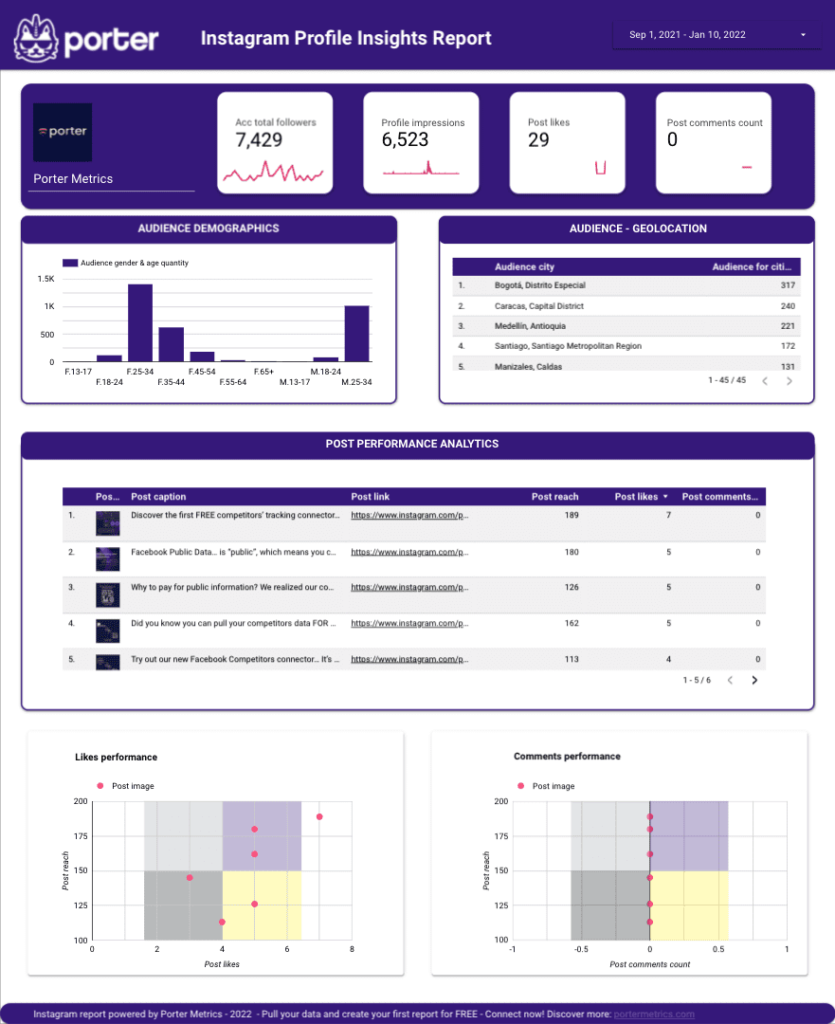
Our Instagram connector for Looker Studio lets you visualize your audience data by demographics (gender and age), geography (country), and the hours your followers are connected on Instagram, which is consistent on all accounts, to be honest.
It is an excellent time to encourage you to try our Instagram connector for Google Data Studio.
Youtube Channel
The quality of your channel, including the audience subscription trend, may be measured using the Youtube Channel Report template.
Furthermore, you may use it to better your unique video content by analyzing your subscribers’ behavior and devising a plan.
Ads Dashboards
Why would you need to build a custom Ads dashboard on Data Studio if there’s already an Ads Manager where you can visualize performance?
If you’re the only one reviewing your Ads performance metrics and only worry about overall performance and quick data, you don’t need to worry about connecting to Looker Studio.
But if you’re showing your performance with your team or clients (if you’re an agency or consultant), chances are you’re taking screenshots and pasting them on Google Slides.
It’s not likely that you’re giving open access to everyone to the Ads Manager—mainly non-technical users who may be lost.
That’s where a dashboard that anyone can access easily to visualize only the data they care about takes relevance. Good data visualization is not about robust dashboards but specific use cases.
H3: Facebook Ads
Ever wondered which Facebook Ads meant to drive post engagements perform the best?
With this report, you can visualize your paid posts engagement over time by the platform—to compare Facebook, Instagram, and Messenger—and even visualize the ad images with the highest conversions and engagements.
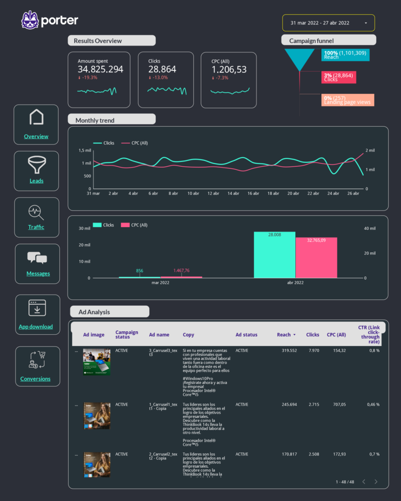
However, if you only want to show a Facebook Ads lead generation performance. This dashboard will visualize the number of leads you’re getting from Facebook Ads over a specific period;
- Lead generation over time (by day)
- Cost per acquisition (and by day)
- Conversion rate from landing page view to lead
- Top ads by leads and CPA
- Top-performing ads position and platform
- Top-performing audiences by demographics
- Best regions
You can access our Facebook Ads connector for Looker Studio here.
Google Ads
With Google Ads, three main drivers help you define your advertising effectiveness:
- Visibility: are you reaching enough people?
- Clicks: do people want to interact with your advertising?
- Conversions: do people end up buying?
This funnel report lets you quickly address where to optimize your Google Ads efforts.
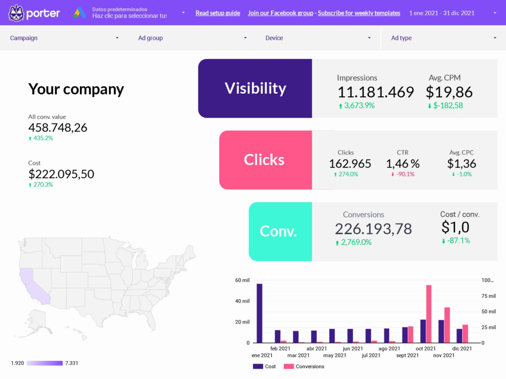
Just as a rule of thumb, to increase visibility, besides increasing ad spending, is to reach audiences according to your target CPM; with clicks.
It’s about increasing CTR by making your ads better targeted and more appealing; to increase conversions—besides taking a look at the buying process as a whole—you should make sure your landing page is effective.
SEO dashboards
Measuring SEO is about knowing how your website improves visibility towards an audience that matters on search engines.
Not all SEO traffic is good traffic, as it doesn’t have any direct or direct impact on businesses. We have an article on our blog in Spanish that drives over 10,000 visitors each month!
Yet, we must pay more attention to it as our target audience will likely convert. As such, on our reports, we filter this kind of traffic.
We also used to filter website traffic outside South America in the past, as we’re also in the retail hardware industry, and we should limit our coverage.
As you can see, more than setting up Google Search Console or Google Analytics is needed to get insights for tracking performance.
You also need to clean your data with filters and breakdowns. That’s where Looker Studio becomes handy—and it takes a few clicks.
SEO report
With this report, you can use the filters to break down your search performance by device, pages, or keywords users use to find you.
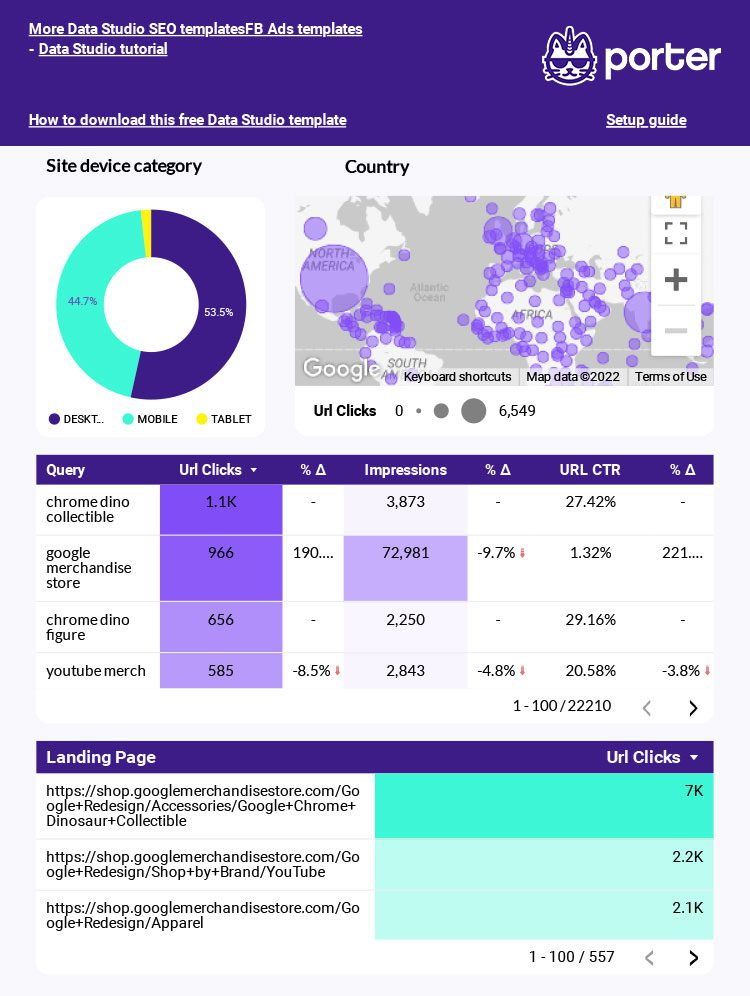
You can do this with Google Search Console. Yeah, I love Search Console, too!
But they have different use cases. Nobody but SEOs is familiar with or willing to constantly visit Google Search Console to do these queries.
Keyword ranking tracker with Looker Studio
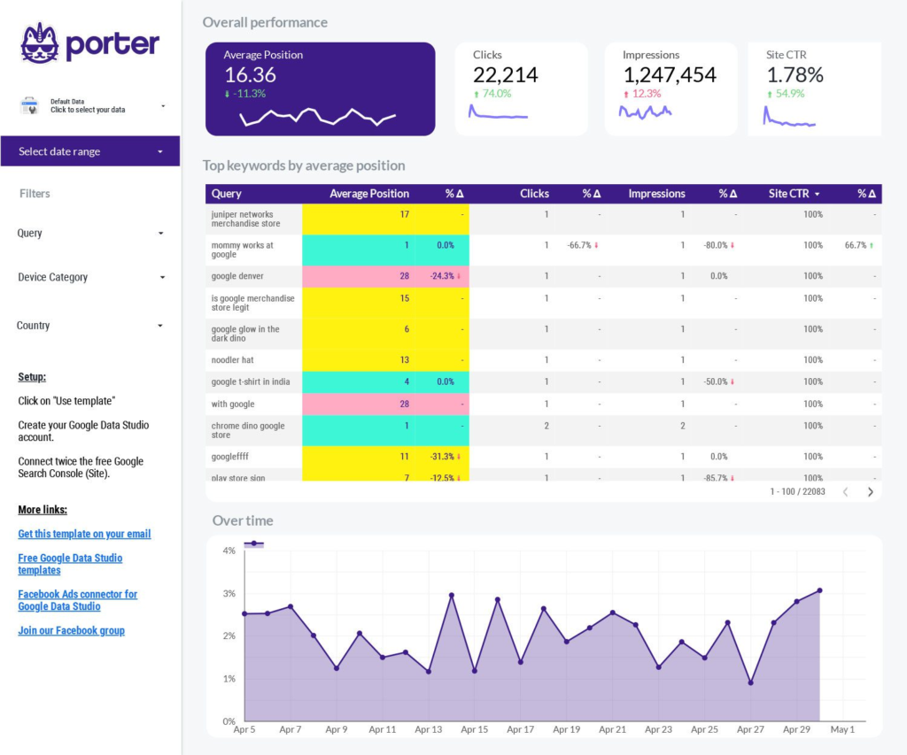
SEO is about more than getting traffic but the right traffic. To do so, you should rank for keywords that drive high-quality audiences to your website.
SEO traffic may turn into a vanity metric when your traffic goes up with keywords that have nothing to do with your business.
CRM Dashboard
To finish, we wanted to share a Looker Studio report template example with Google Sheets: a CRM dashboard.
The best thing about Google Sheets is that it lets you report on any data instead of relying on an exclusive connector.
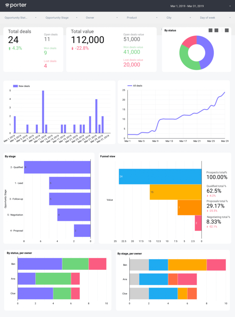
With this report template, you can track your sales pipeline by stage, owner, product type, and state of your deals. We even include a funnel view. We encourage you to read the setup guide to build yours.
Conclusion
Many other use cases exist, but we will explore them throughout the course. Just keep in mind that visualization tools like Data Studio enhance your current marketing apps capabilities in many instances, like:
- Having dashboards for specific use cases and audiences
- Customizing charts and visuals to answer specific questions
- Offering interactive user interfaces to break down your data
- Quickly transforming your data to visualize it to your needs.
- Keep decision-making and communication simple.
Now that you’ve seen what you can use Looker Studio for, I’d expect you’re wondering if you can use it with other business apps like Google Ads, your CRM, marketing automation software, your email marketing tool, or any spreadsheet you want.
The answer is yes, and that’s what the next lesson is about—Google Data Studio connectors.

