In this tutorial, you’ll learn how to design Looker Studio reports, starting from the theme and layout, editing charts, and adding filters and buttons to make them interactive.
No good design will save you if you don’t have the fundamentals right, such as the most important metrics and KPIs, and a good narrative to support your analysis. We made a complete article on how to create a good marketing report so you nail the strategic part first.
Remember that Looker Studio (formerly Google Data Studio) is a tool; to understand what’s the best way to share an idea visually, you should learn data visualization. That’s out of our scope in this tutorial, but’s a good thing to have in mind.
We made a step-by-step video, if you prefer to learn visually:
Create a new Looker Studio report
To design and customize a Looker studio report, first, you need to create a report or edit an existing report.
Open Looker Studio
In the right-left panel click the ‘create+’ button and select ‘Report’
This will open a blank report that you can customize. 3. Now, you have to add a data source to your report; we will use Google Analytics 4, which is one of the most used integrations.
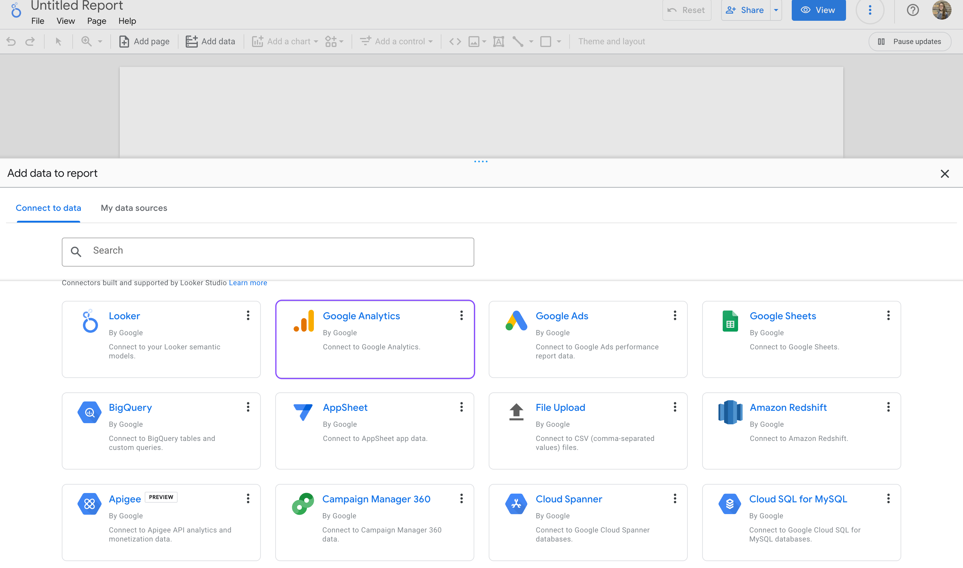
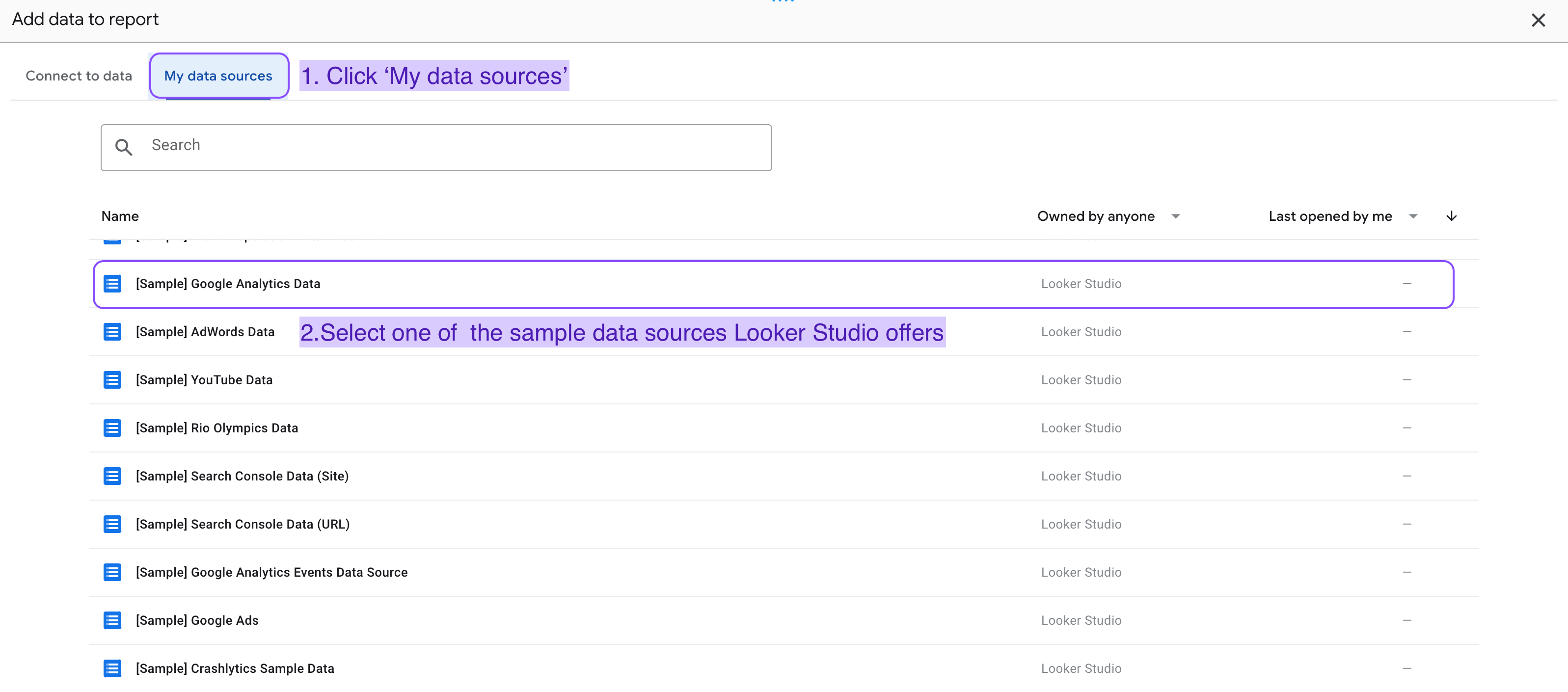
Tip: Remember that you can use demo sources by clicking on ‘My data sources’ and searching for the [sample] datasets Google Looker Studio offers.
Now authorize and select the account you want to use in the report.
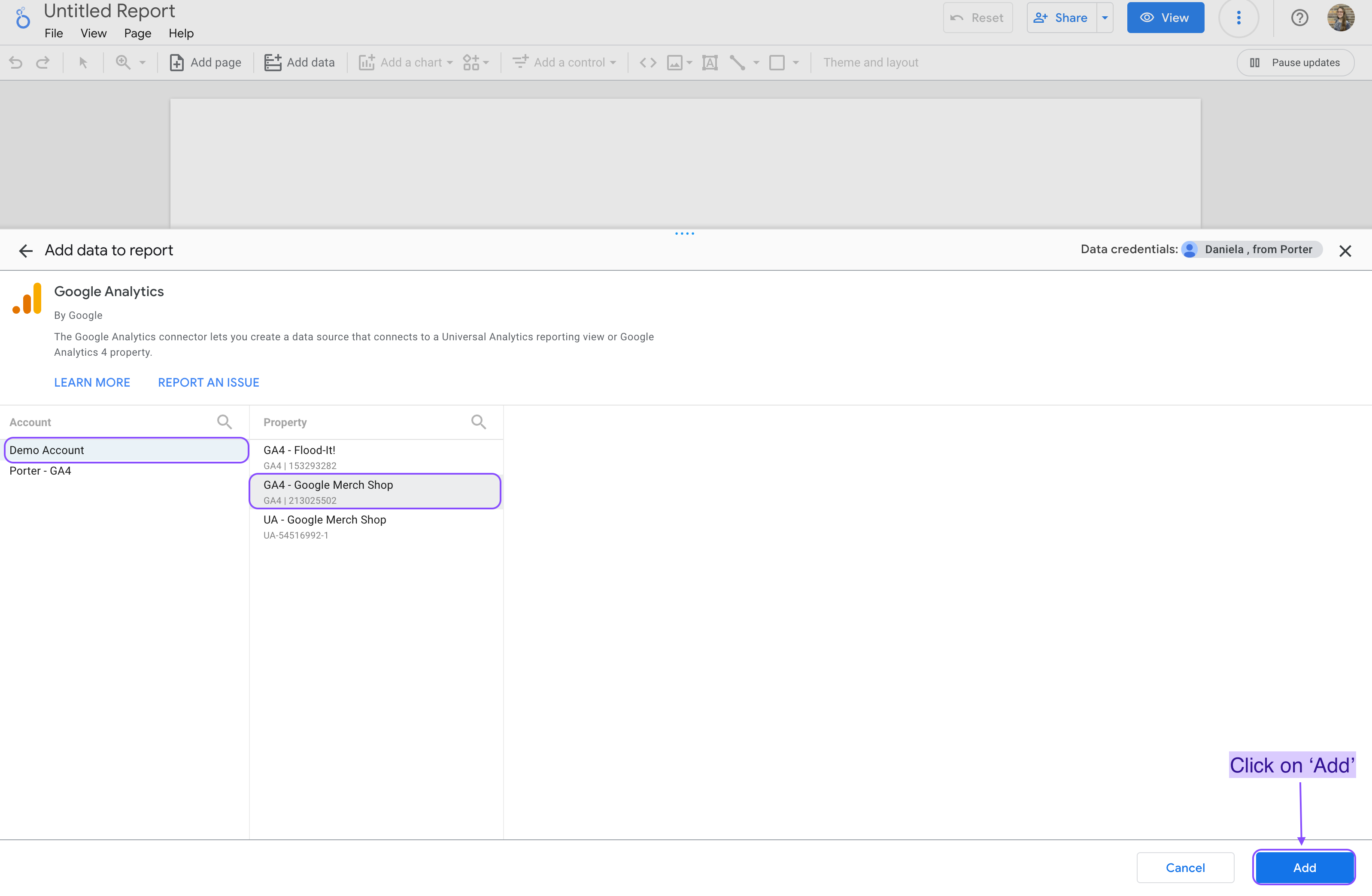
Click on ‘Add’ and start using your new data source to create charts and graphs.
Remember, Looker Studio has hundreds of integrations that pull data directly from the platform so your reports are automatically updated,
You can connect multiple data sources to the same report, such as Google Ads, Google Analytics 4, Facebook Ads, Instagram Insights, LinkedIn Pages, LinkedIn Ads, Hubspot, and more.
We made a complete article about how to add data sources to your Looker Studio reports.
Add and customize chart style
If you want to go deeper, we have a complete tutorial on how to create charts on Looker Studio with step-by-step examples. But let’s see how you can add charts -such as time series and scorecards- and focus on how to customize them:
To add a chart to a Looker Studio report:
We will learn how you can add charts, such as time series and scorecards.
Remember that you always need to add a data source to your report, to add and edit chart components. With that being said, let’s add a chart to your Google Looker studio dashboard:
Click “Add a chart on your dashboard.”
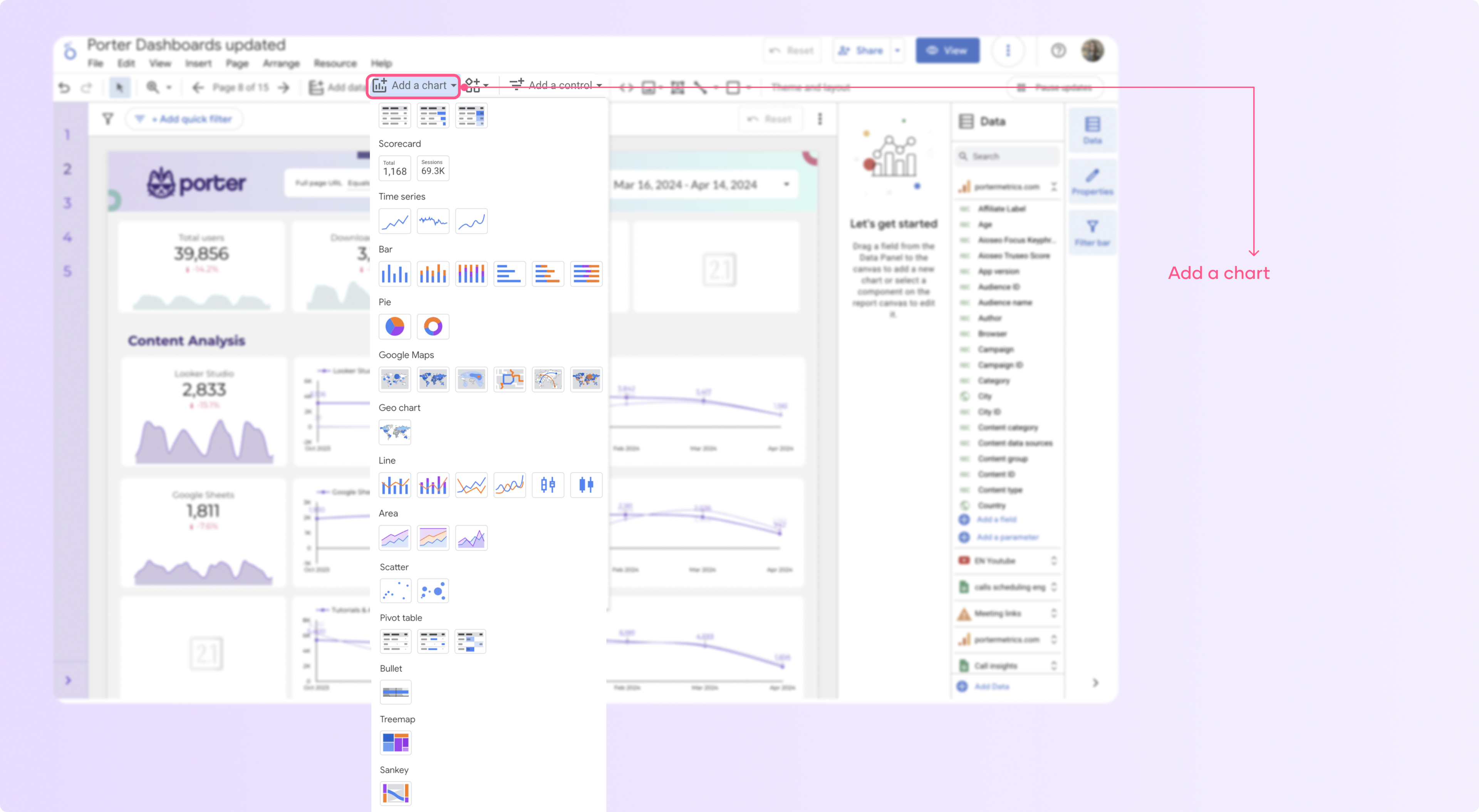
Select the chart you want to add to your page, such as time series, tables, and scorecards.
Click anywhere on the canvas area to add the chart to your page.
Edit the metrics and dimensions you want to include in your chart.
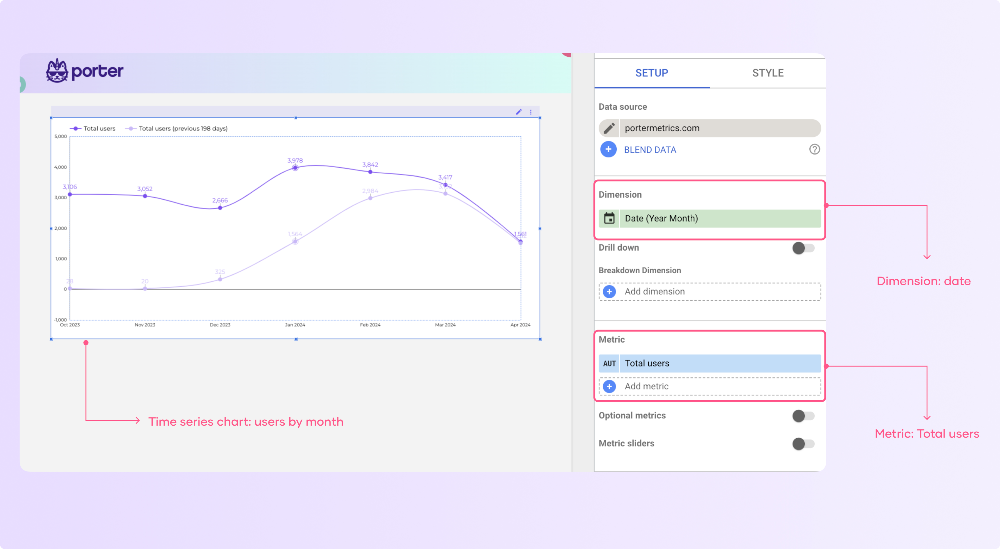
Depending on the type of graph you will have a limit of metrics and dimensions you can add. For instance, in scorecards, you can only add one metric and customize the comparison options.
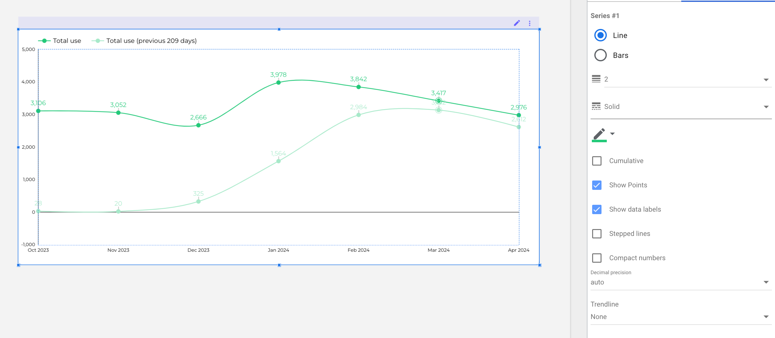
To customize a chart:
Select a chart and go to the “Style” tab in the side panel.
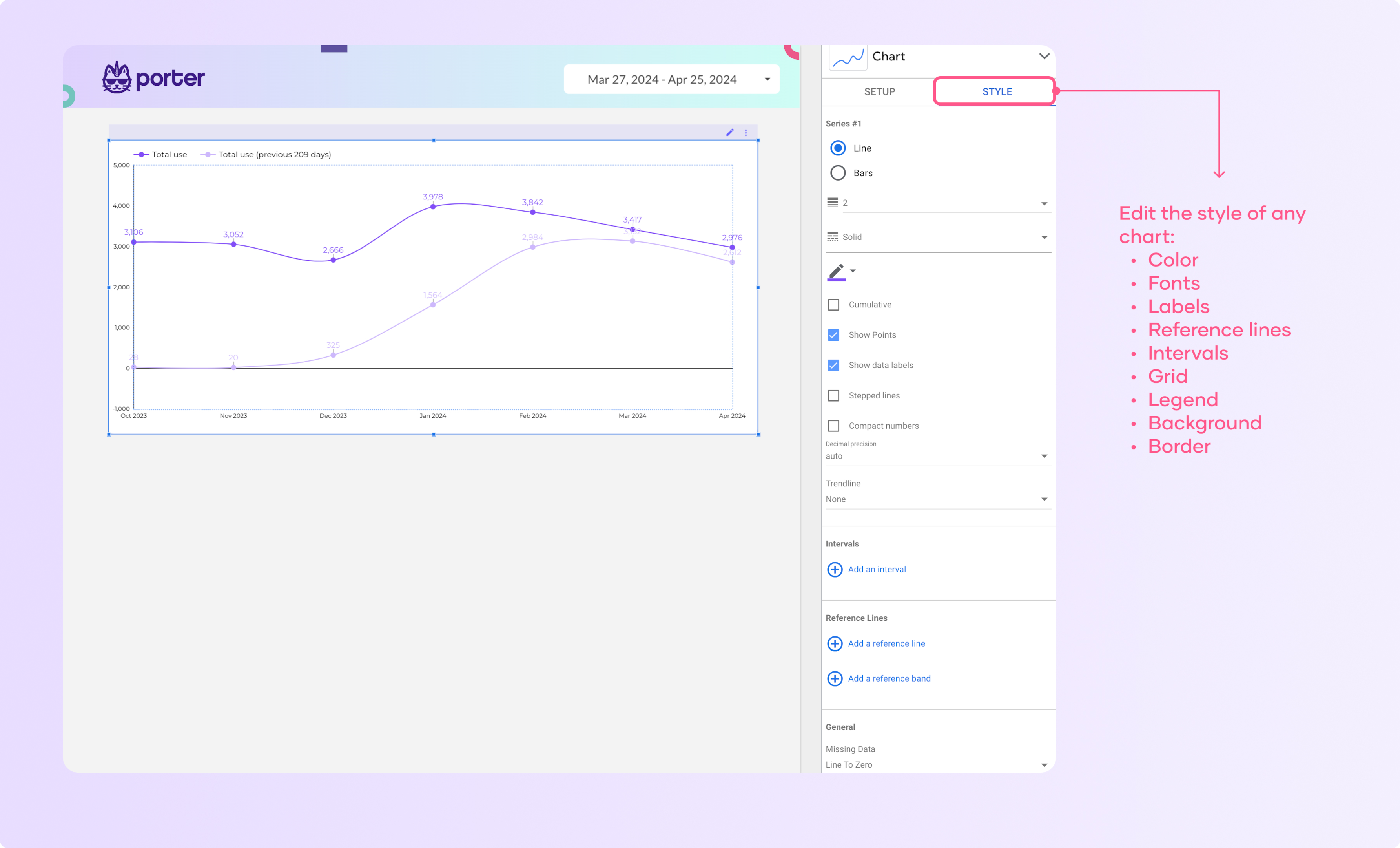
2. Here you can change the colors, fonts, labels, and other visual aspects of the chart.
3. Now you can play with the different settings and see how your chart changes.
I recommend that you think of what you want to do and then search for the settings that allow you to modify that.
4. For instance, if I wanted to modify the color of the line series go to the series line you want to modify and click the pencil. Then, select a new color from the palette or create a custom color.
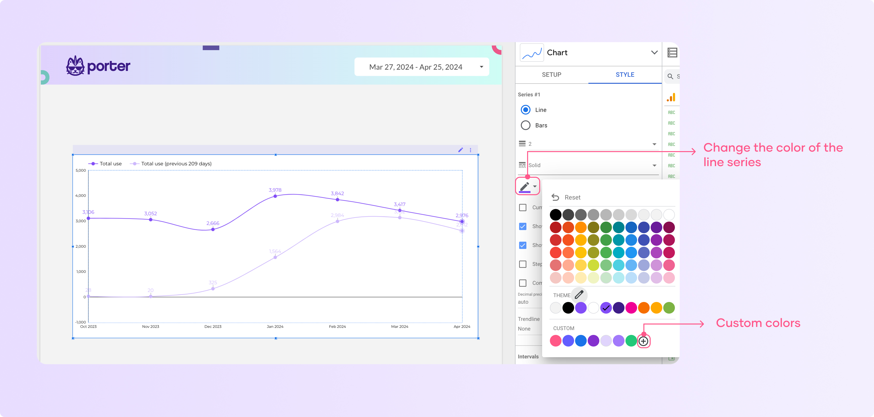
Here you can see how to line changed from purple to green
Now let’s see other examples. Remember, these customization options can be applied to the entire report to ensure a consistent and cohesive look that matches your brand’s aesthetic.
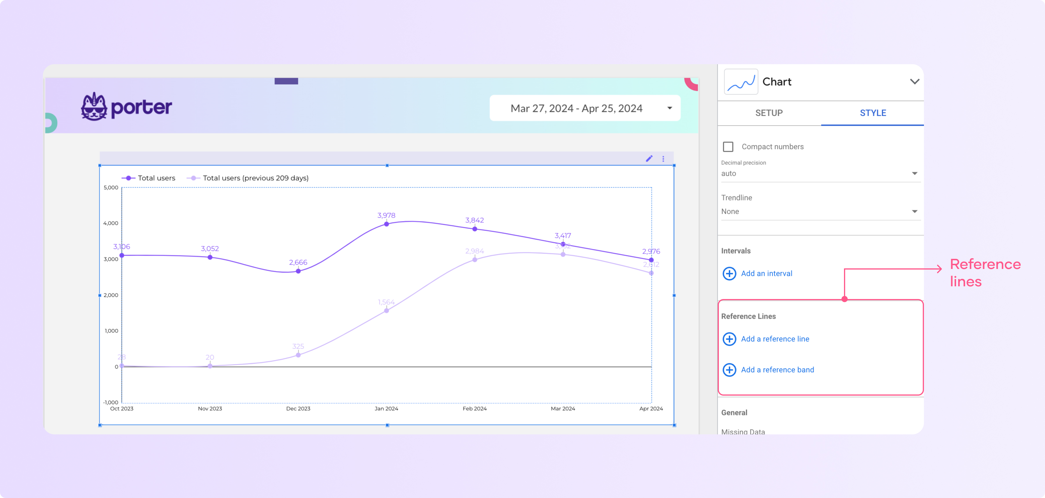
How to add reference lines to a chart
You can add reference lines to bar charts, line charts, and time series charts. To do it follow these steps:
Click the time series chart and go to ‘Style’
Scroll down, go to ‘Reference lines’, and click ‘Add a reference line’ or ‘Add a reference band’.
The main difference between the two is that the first is one line and the second is a range between two values.
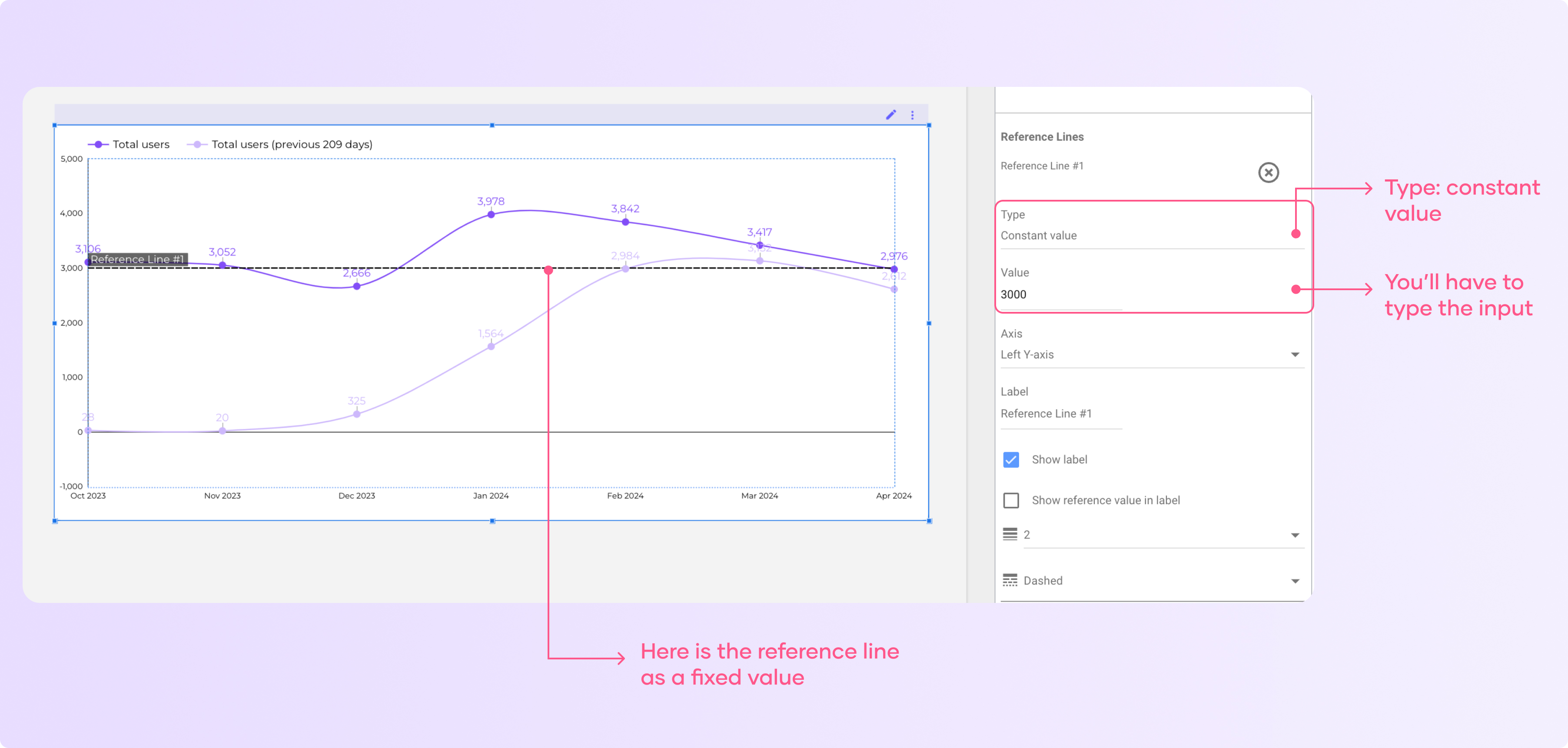
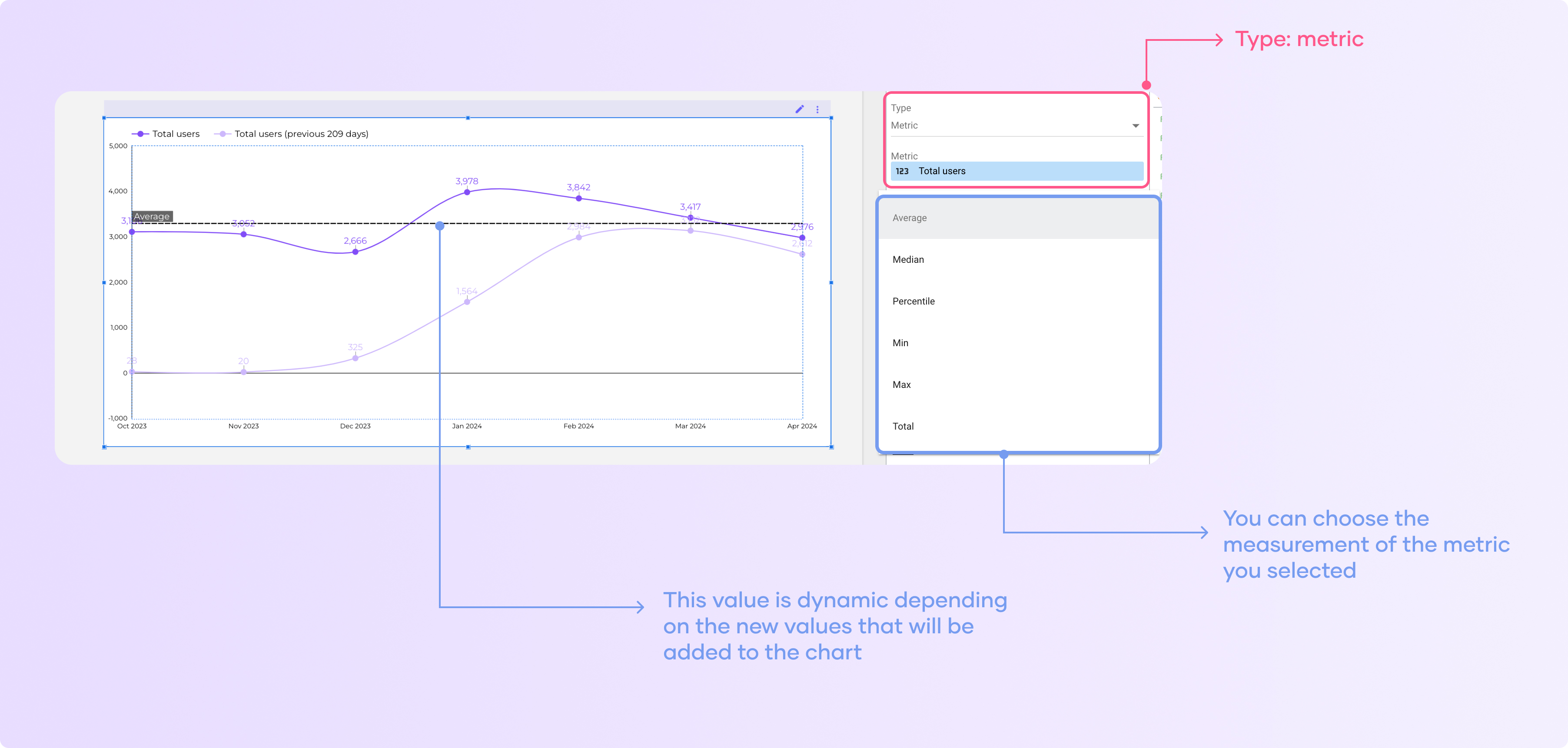
Select the dropdown on ‘Type’ and select if you want to use a constant value, metrics, and parameter.If you select a constant value, you have to type an input.
If you select a metric, you will work for any metric you have in the data source you are using.
Customize metrics, sparklines, and styles.
When adding a scorecard or other chart, you can customize the metrics being displayed:
Click on ‘Add chart’
Select the scorecard chart.
In the “Data” tab, choose the metric you want to show (e.g. sessions, users, conversions)
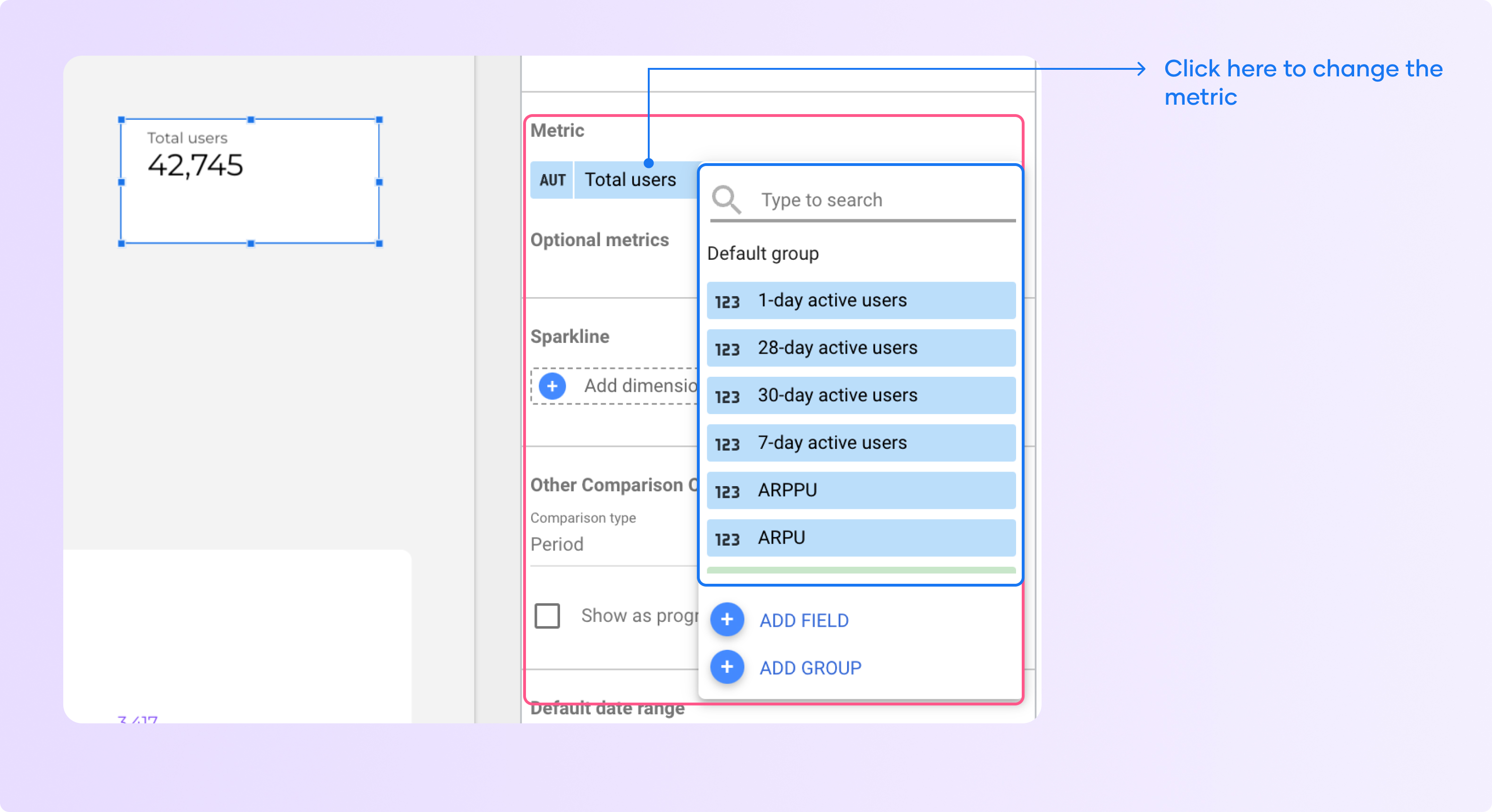
You can also switch between different aggregations like sum, average, min, max by clicking on the pencil to the left of the metric name.
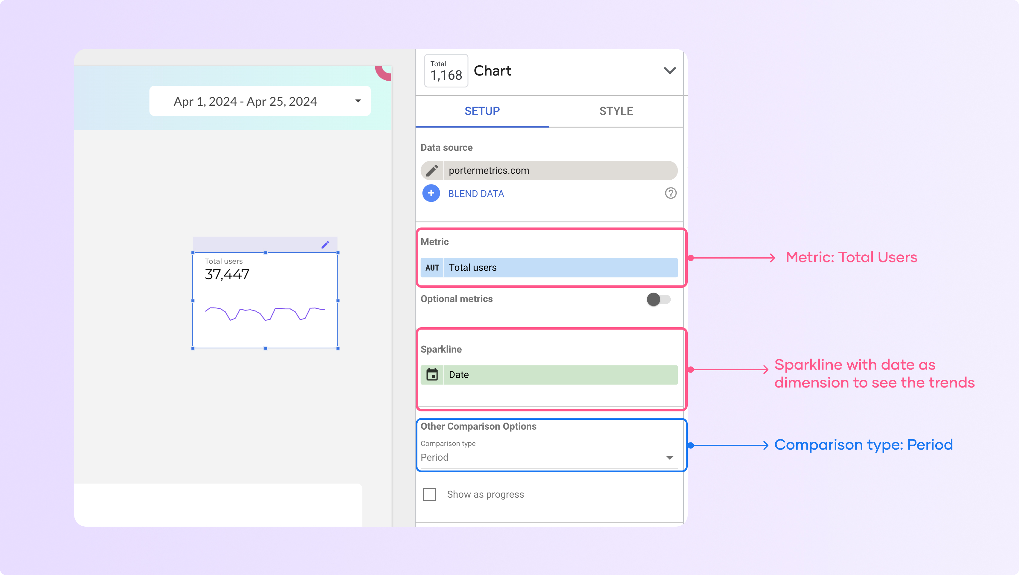
To add a sparkline to a scorecard:
Select the scorecard
In the “Data” tab, choose a date dimension (e.g. date) to show the metric over time
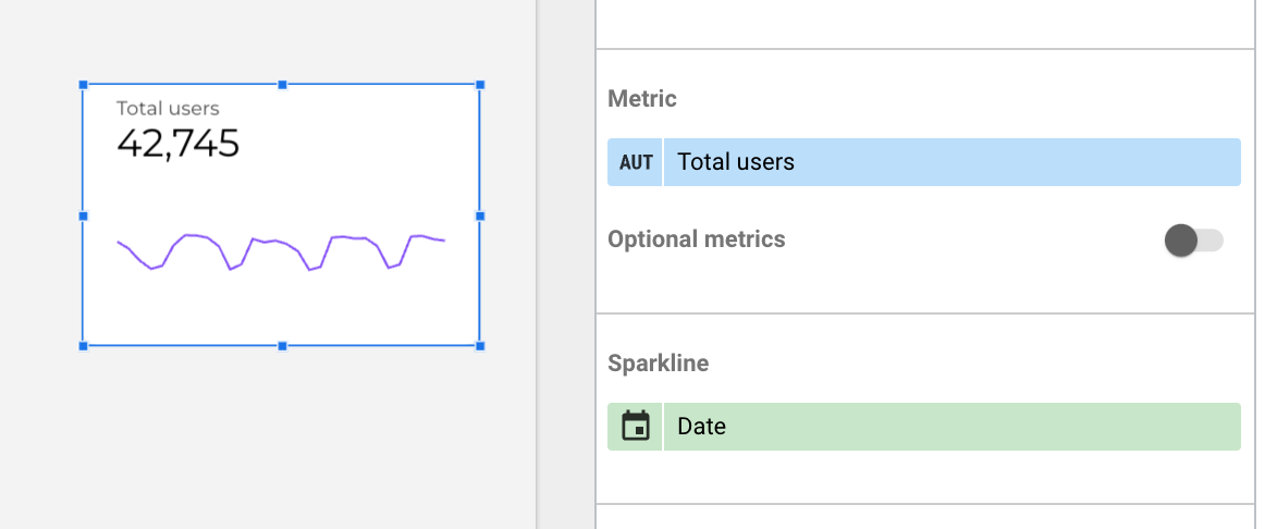
This will add a sparkline trend line below the main metric value
Customize the sparkline style:
Go to the “Style” tab for the scorecard
Under “Sparkline”, you can change the color, fill, and smoothing of the sparkling.
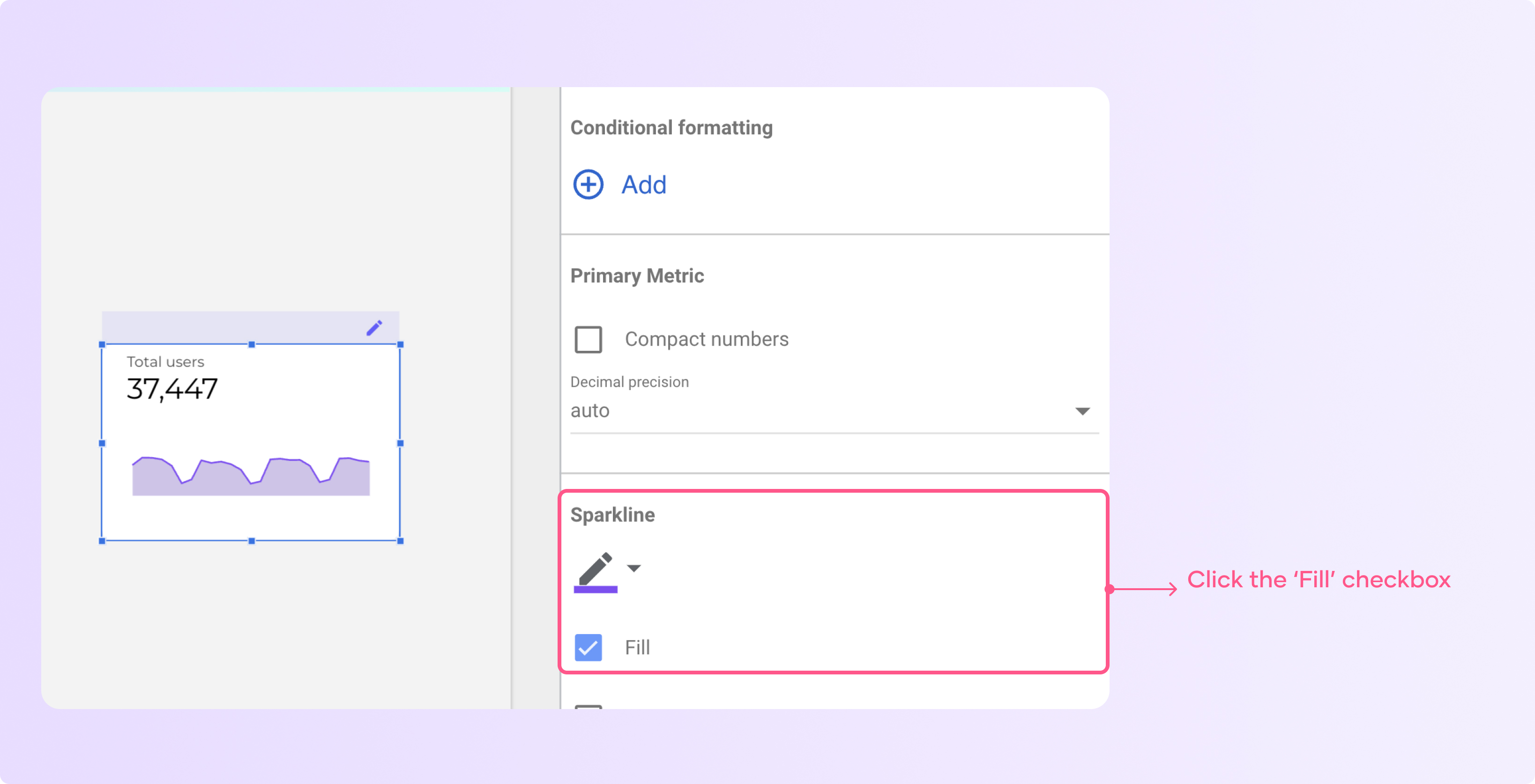
You can experiment with different styles to make the sparkline visually appealing.
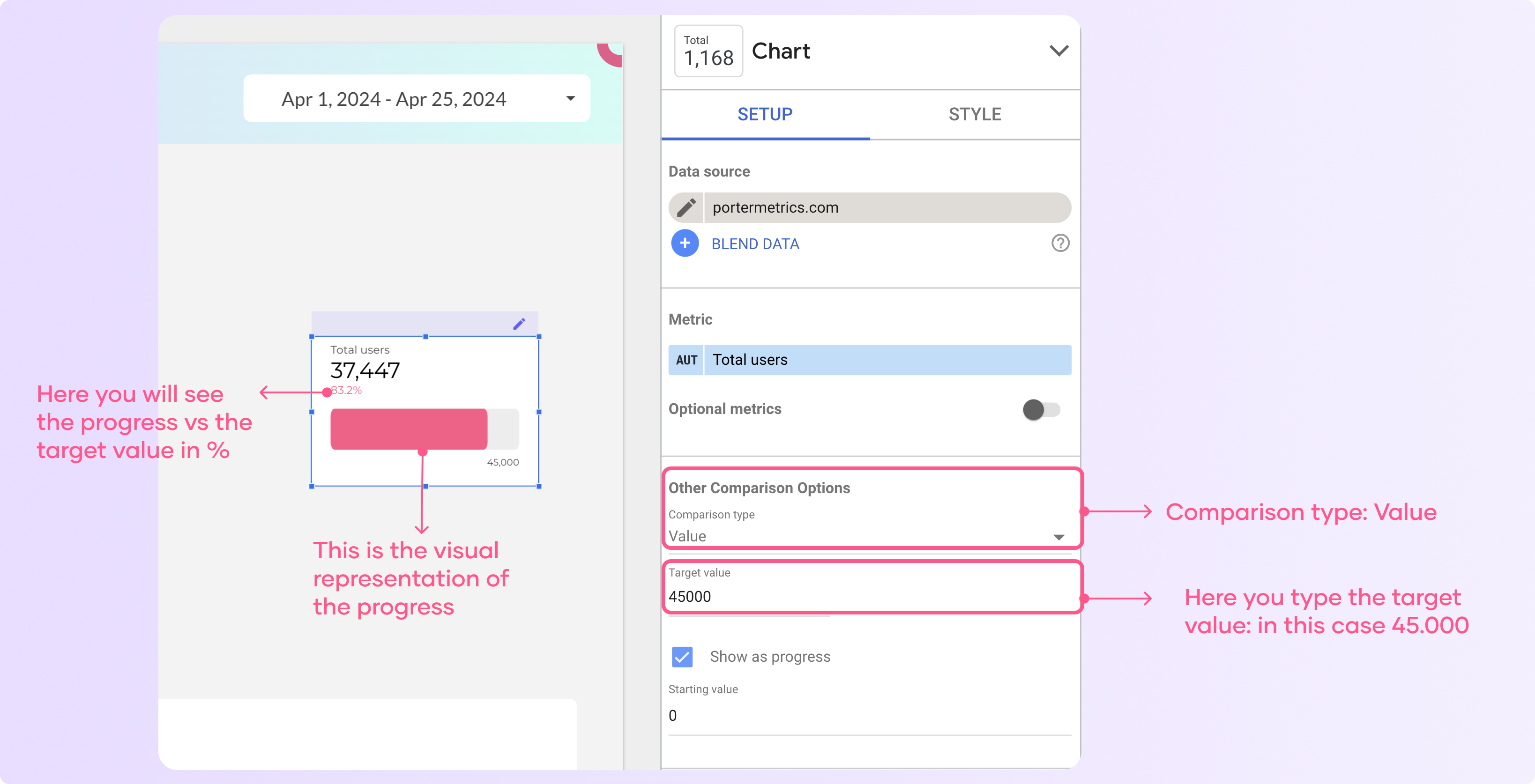
Also, you could use different comparison options to evaluate your marketing or business performance.
For instance, you could select ‘Value’ as a comparison type and type a target value to show the result vs. the progress.
Use date range comparisons in charts
Transforming raw data into a format that highlights relevant data for comparison is crucial in Looker Studio. One tip for creating the best dashboards is to always compare against something. Remember: there’s no insight without context.
For instance, you can add context to your reports using: past performance, objectives, benchmarks, and text.
We will see how you can do it based on past performance with date range comparisons:
Click on ‘add a chart’ and select a table
Now select a chart. I’m choosing a table for the example, but you could use any other chart.
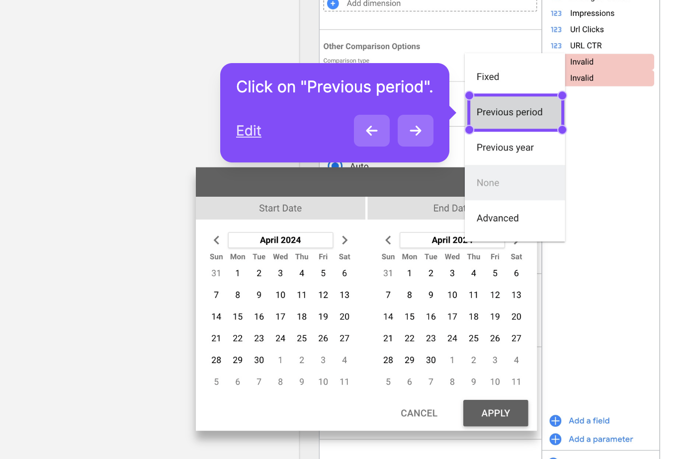
Go to the comparison options in the ‘Setup’ tab and click on the dropdown on the comparison date range function.
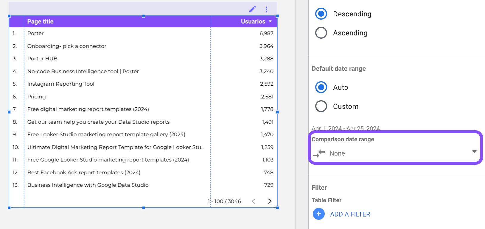
4. Choose an option like “Previous period” to display a comparison against a previous time frame.
This provides useful context and insights when analyzing, visualizing, and comparing your data,
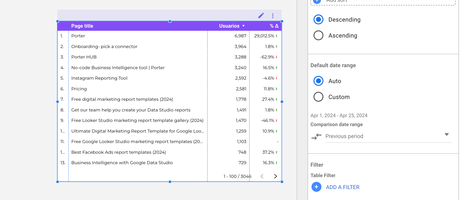
As you can see comparisons help you make data-driven decisions cause they give you context to understand if something is performing better or worse than expected, now it’s your turn to try it.
Copying and pasting styles to multiple charts
If you want to replicate the style of a chart (e.g. colors, fonts, borders) you can use the paste style only function. To use it follow these steps:
Copy the chart you want to replicate to copy the style.
Right-click on the styled chart and select “Paste special” > “Paste style only”
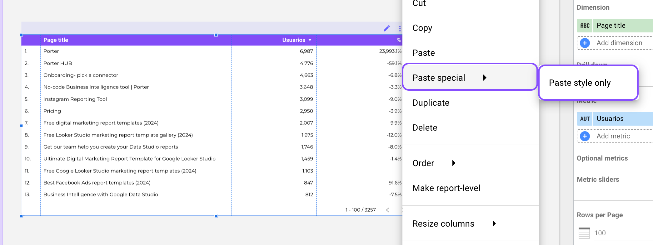
This will apply the same visual styling to any other charts you paste the style onto.
This is a fast way to consistently style multiple visualizations in your report.
Add data source controls to your reports
Controls and filters transform your report from static to interactive custom reports. That’s why I always recommend adding controls to your reports so you can play with your data and promote better decision-making by making it easy to gain better insights.
You have eleven different types of filters, such as drop-down, date range, and advanced filters. If you want to learn all the nuances about how to use them and when to add them, we created a complete article around how to add, edit, and manage controls and filters on Looker Studio.
Now let’s go to the basics, to add a control to your report:
Click on ‘Add a control’ and select the type of filter you want to add
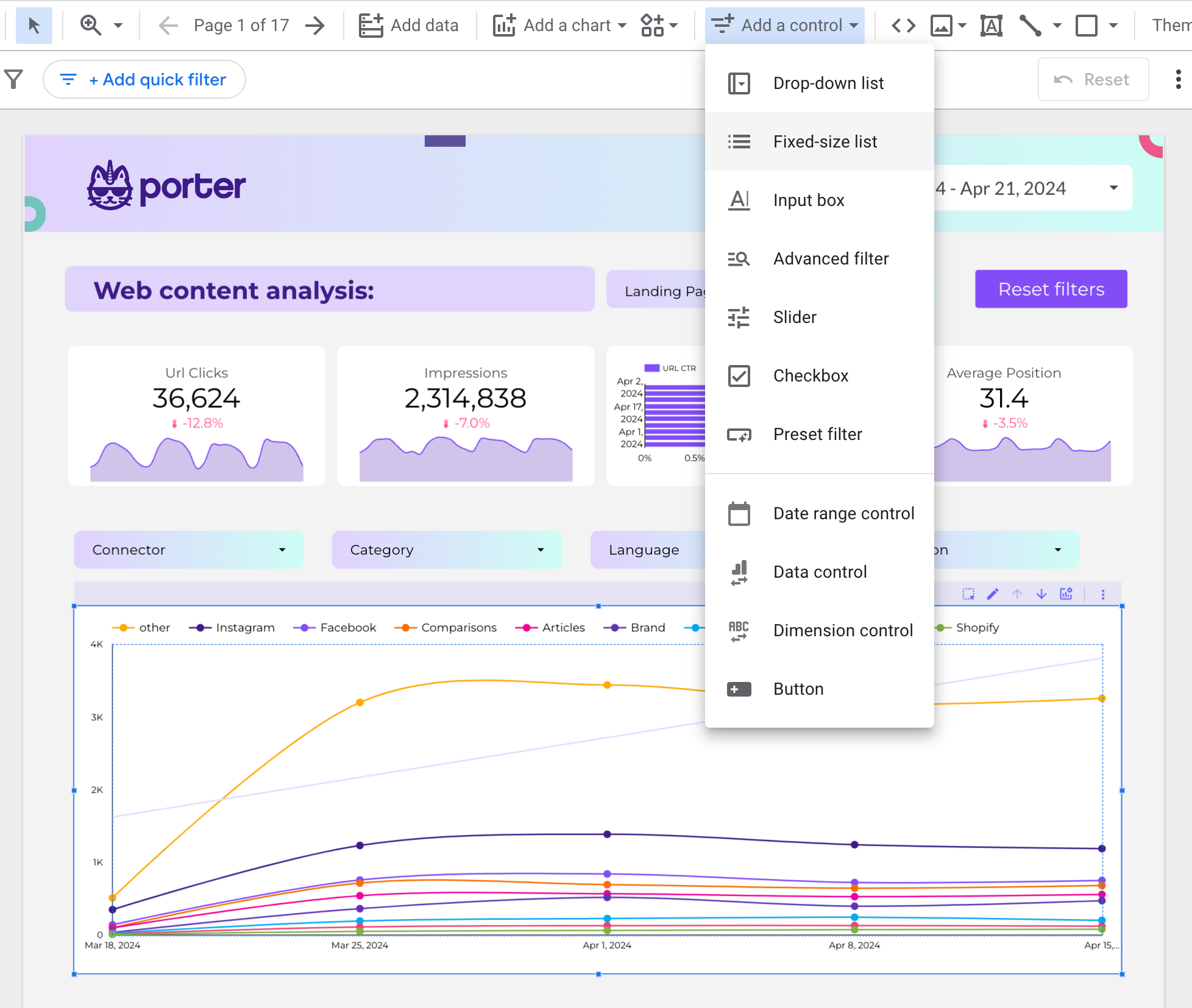
I’m going to select the ‘Drop-down’ list that is the most common one
Then I’m going to select the ‘Control field’. Iin this case, I’m using Google Analytics 4 as the data source and I’m going to select ‘Source’ as the dimension in the control field
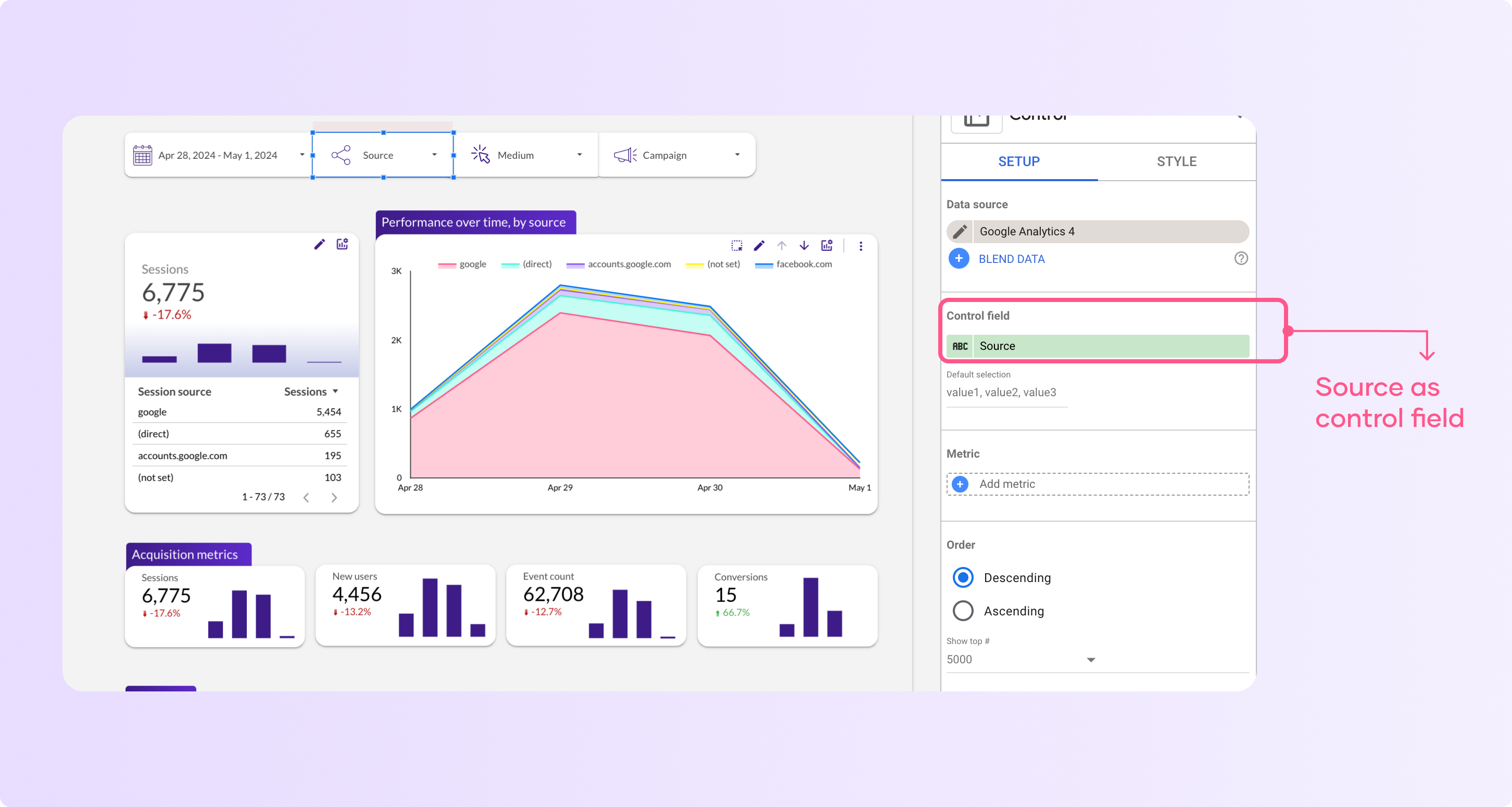
You can also add a metric so it’s shown when you click on the drop-down along with the dimension
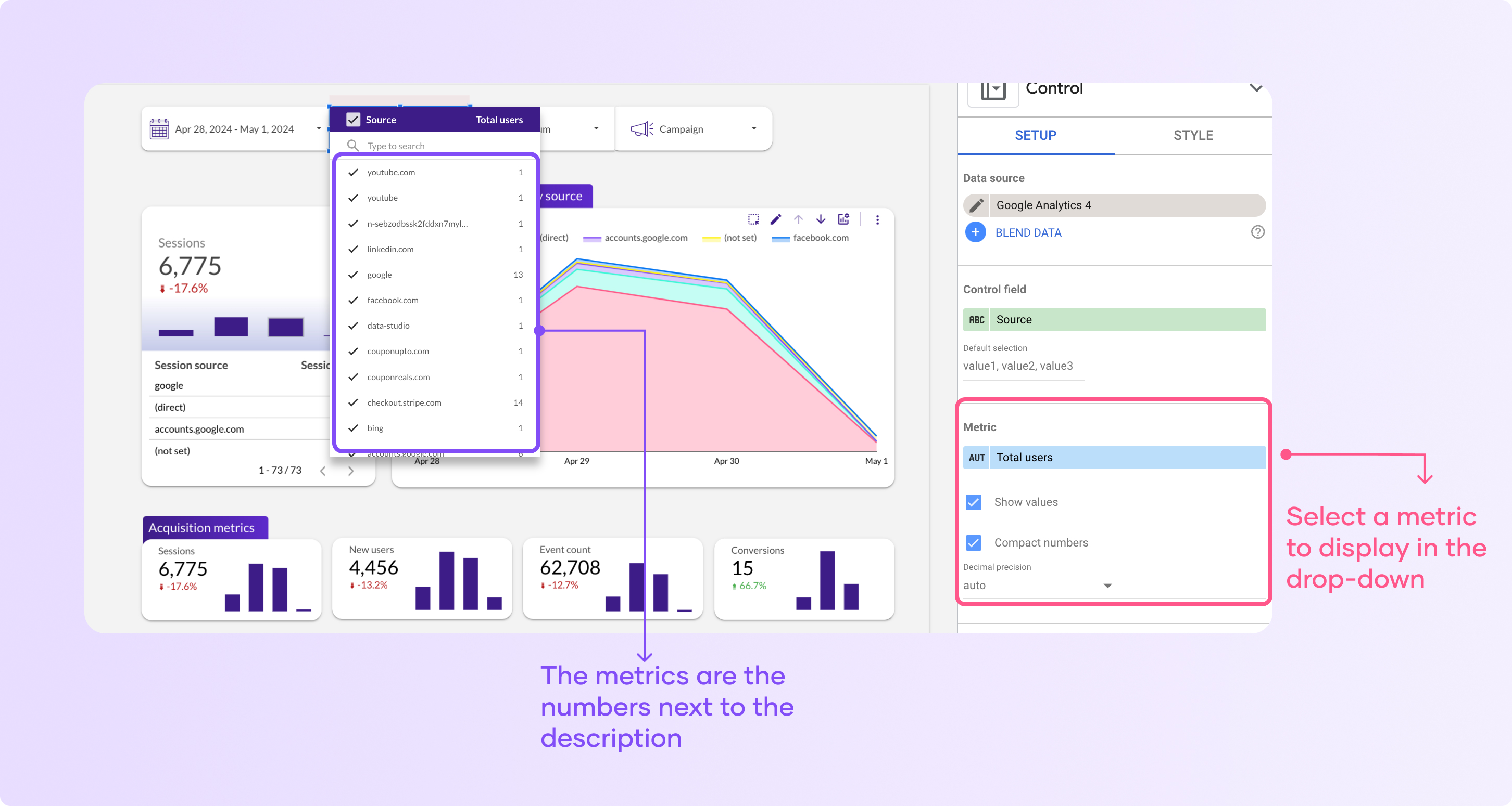
Now you can click to filter your report. As you can see, Looker Studio it’s an awesome data visualization and reporting tool that enables users to create interactive custom reports.
Adding interactive buttons to your report
Buttons will help you create interactive reports on Looker Studio, they will allow you to:
Click “Add a control” and select ‘button’
Click to add the button to your report
By default your button will have your report design and style and the ‘action type’ is ‘Navigation’ which will allow you to send users to different report pages or a specific landing pageYou can edit the link of the button by clicking ‘Insert link’ and selecting a report page or a custom page.
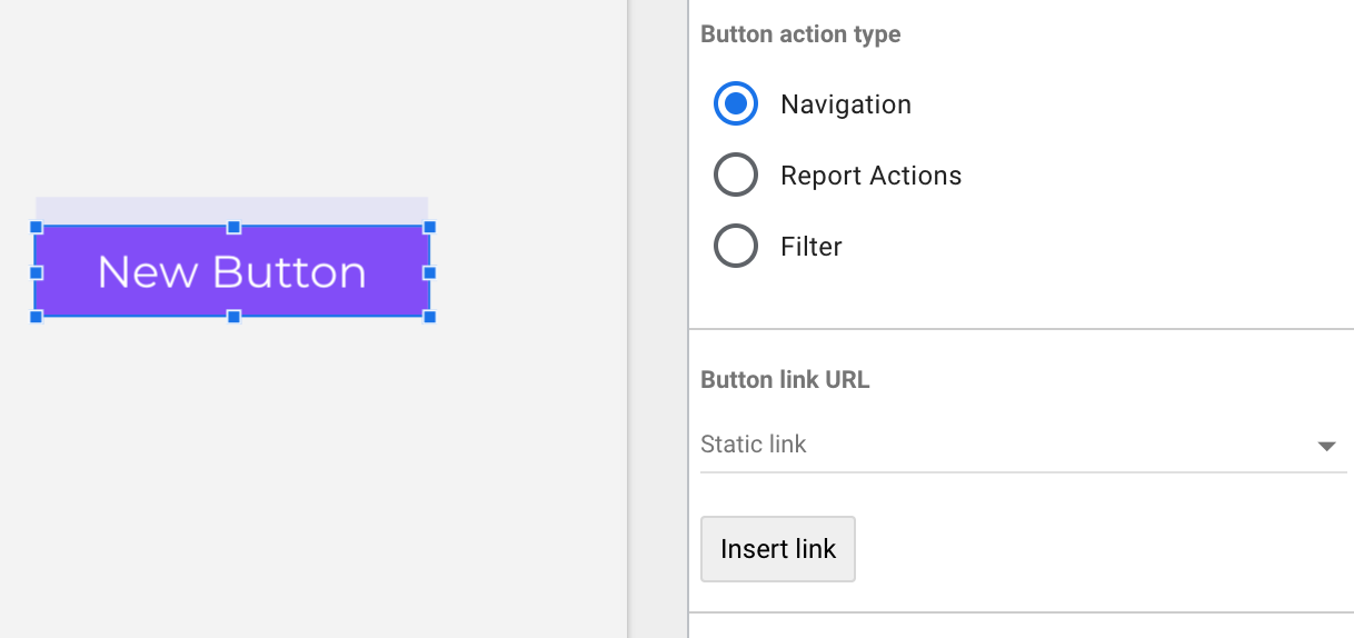
You can also use ‘Report actions’ that will allow you to: invite people, get report link, download report or reset filters just by clicking the button.
Customize the overall look of the report (background, fonts, colors)
Editing the theme and layout
Go to the “Theme and Layout” section in the top right corner of Looker Studio.
The first thing you will see are suggested themes that are templates that you can copy and edit and apply to all your report. You can select one to apply one of the suggested themes.
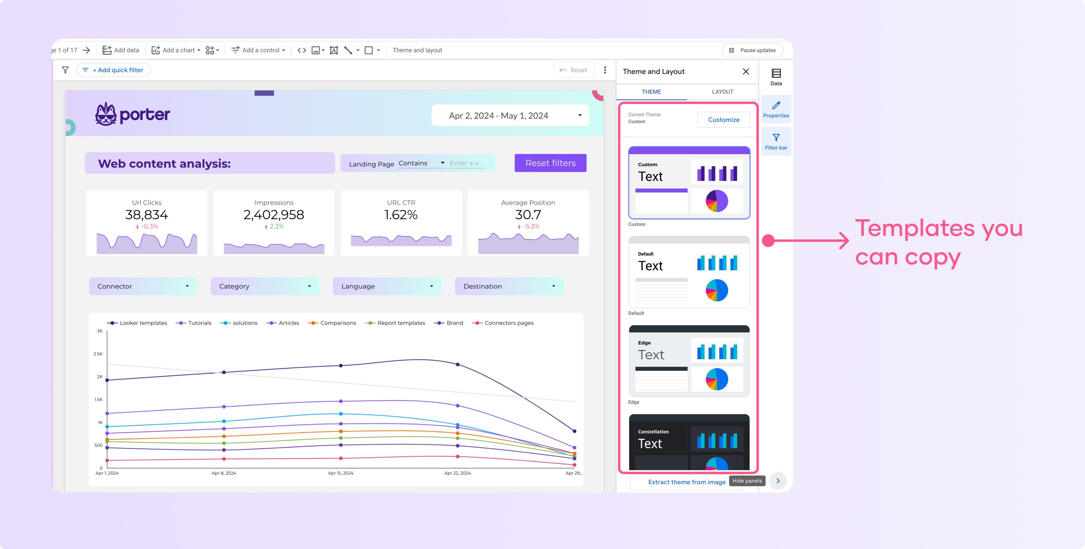
Click on “Customize” to access the options for changing the overall report style.
In the “Customize” menu, you can:
Change the background color of the report
Modify the font used throughout the report (e.g. switch to Montserrat)
Adjust the colors used for text, borders, and other elements
You can experiment with different color schemes and font choices to brand the report with your company’s style.
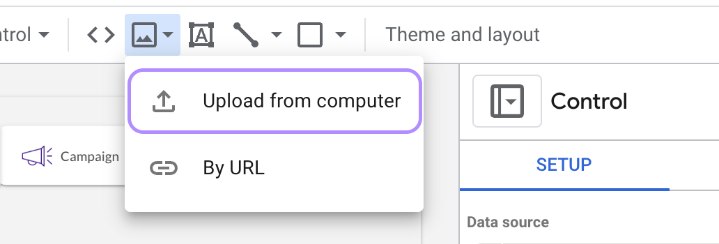
How to extract theme from image
You can extract a custom team from an image, find it at the bottom of the theme section.
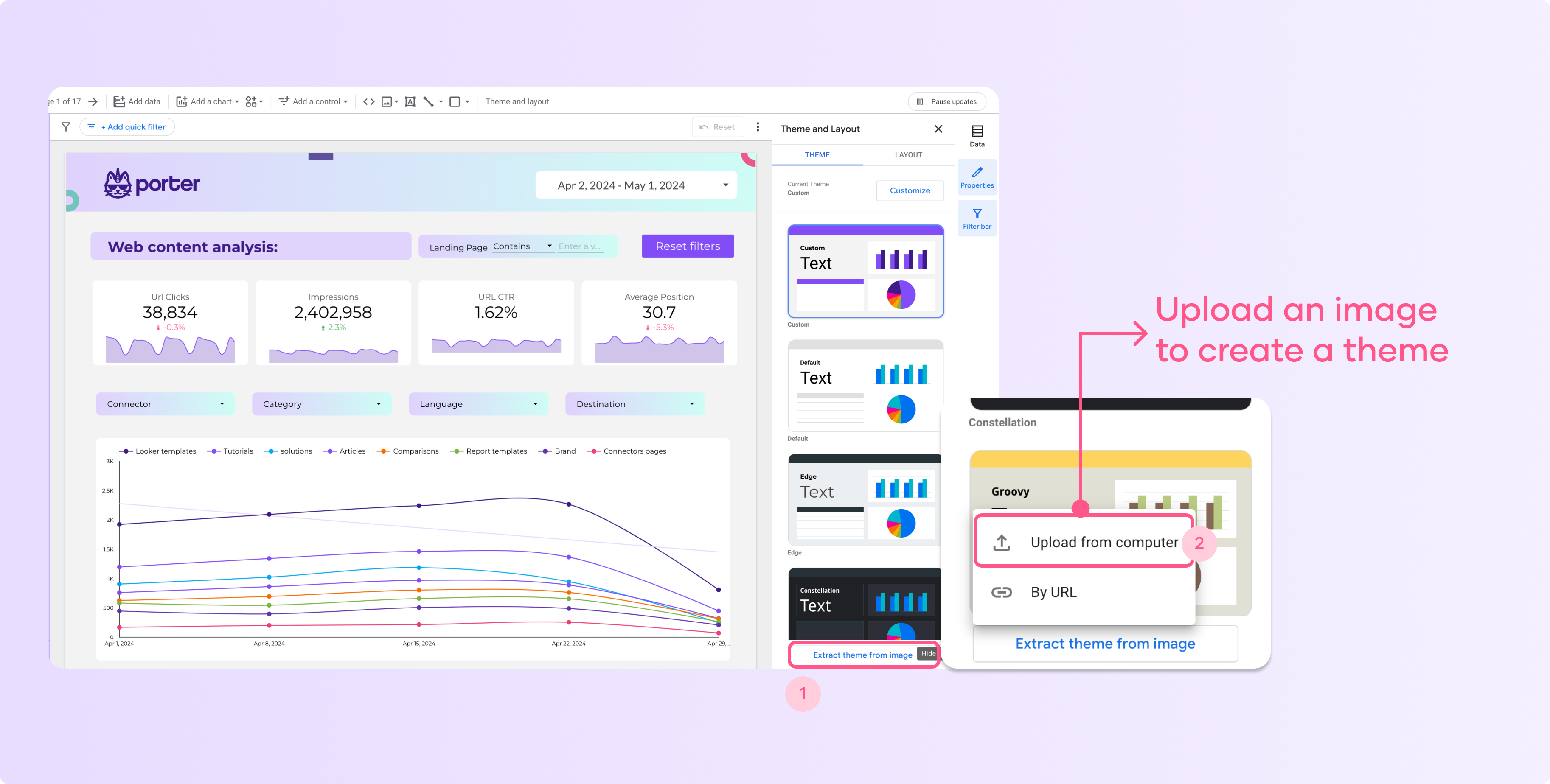
Click ‘Upload from computer’ and select the image you want to extract the style from. After you upload the image, you will see three different alternatives:
This is one of the fastest ways to add your color palette and style without wasting a lot of time.
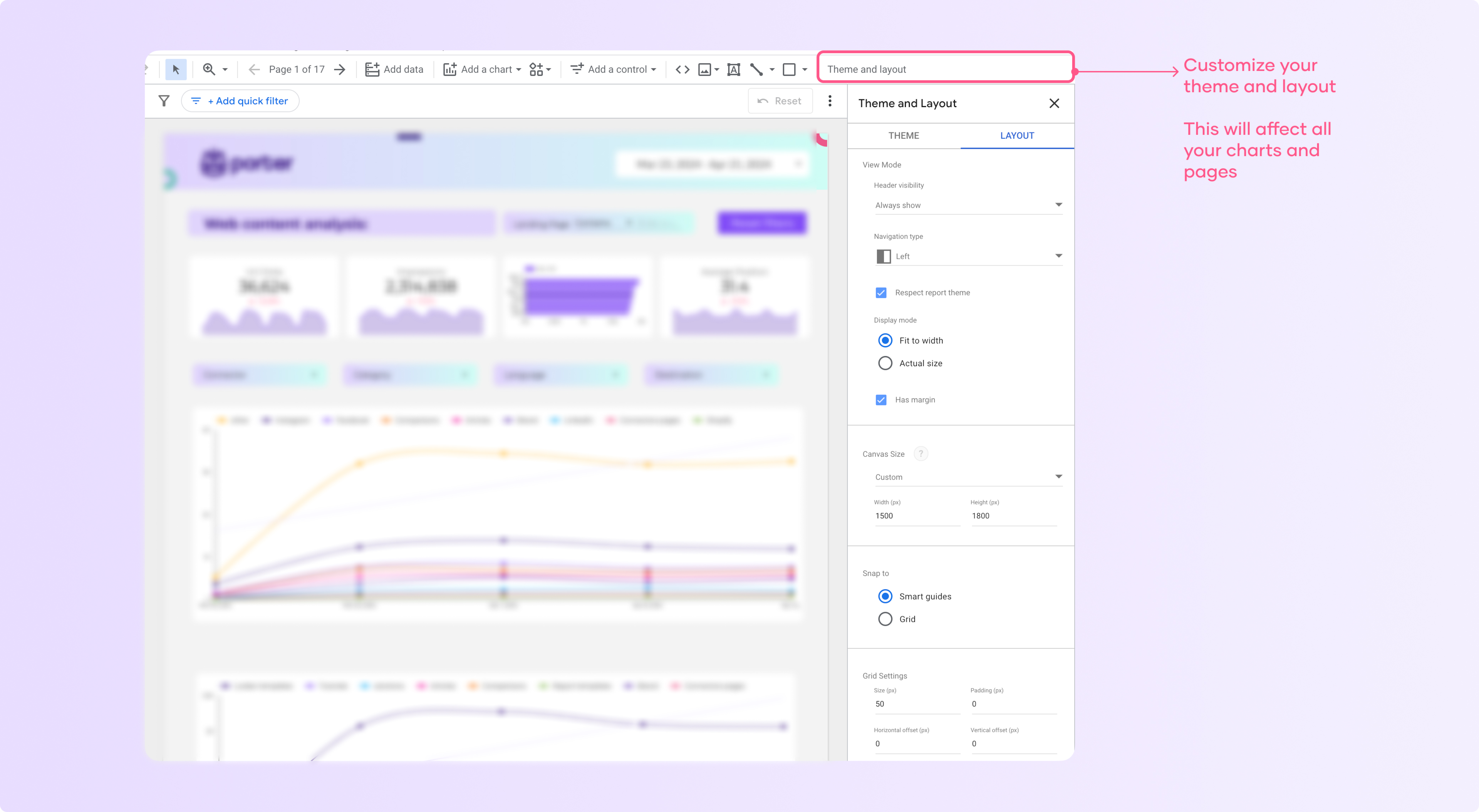
Change the layout and size of your report
You can customize your layout or canvas, which will affect the size and how your report is displayed.
To edit your layout size, follow these steps:
Go to Theme and Layout
Select theme
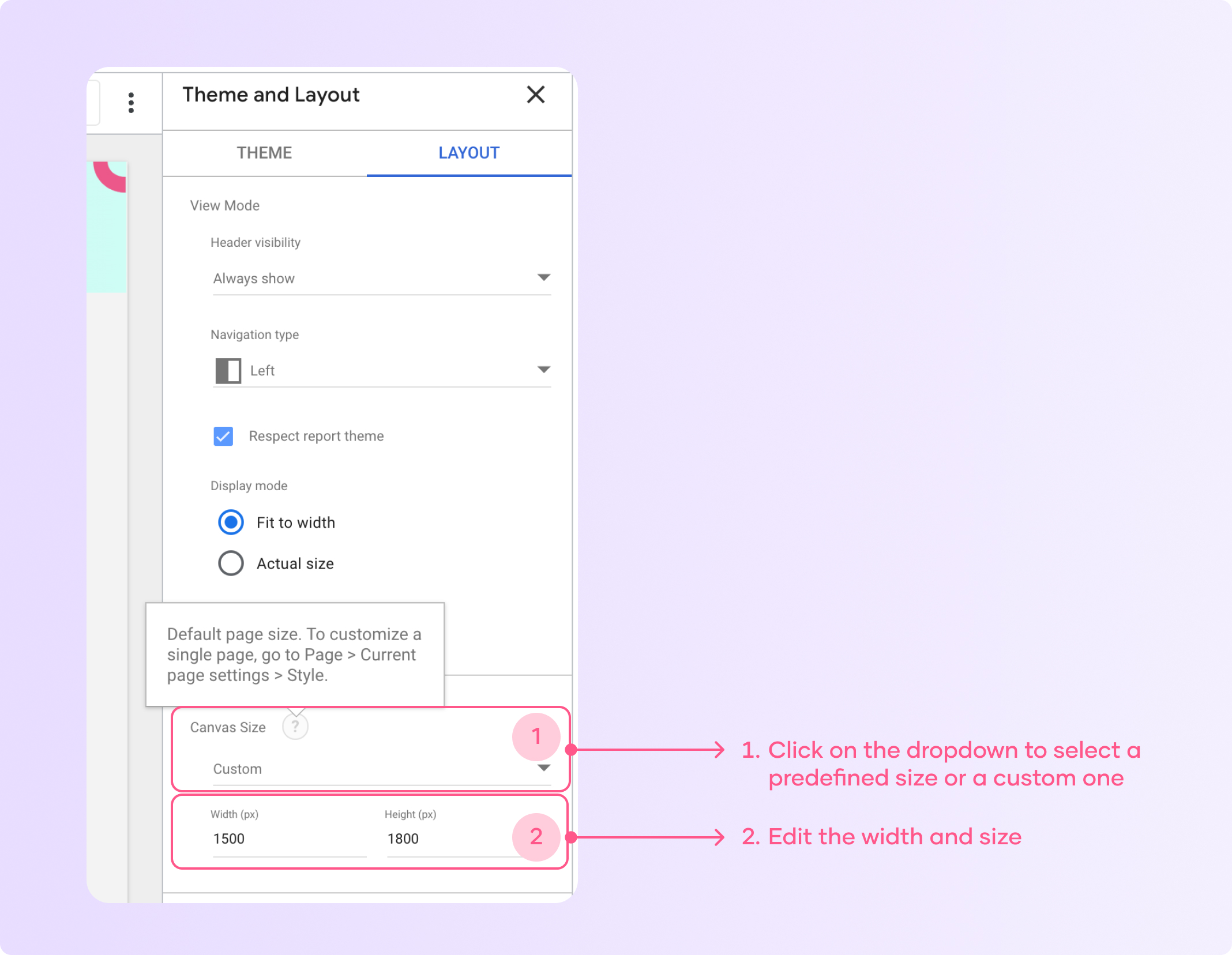
Click on ‘Canvas size’ and select ‘custom
Then add a custom width and height in pixels. The changes you make will be applied to all your report automatically.
Here’s a tip for you: select ‘Fit to width’ in the display mode so your report adapts automatically to your canvas size and is easier to navigate.
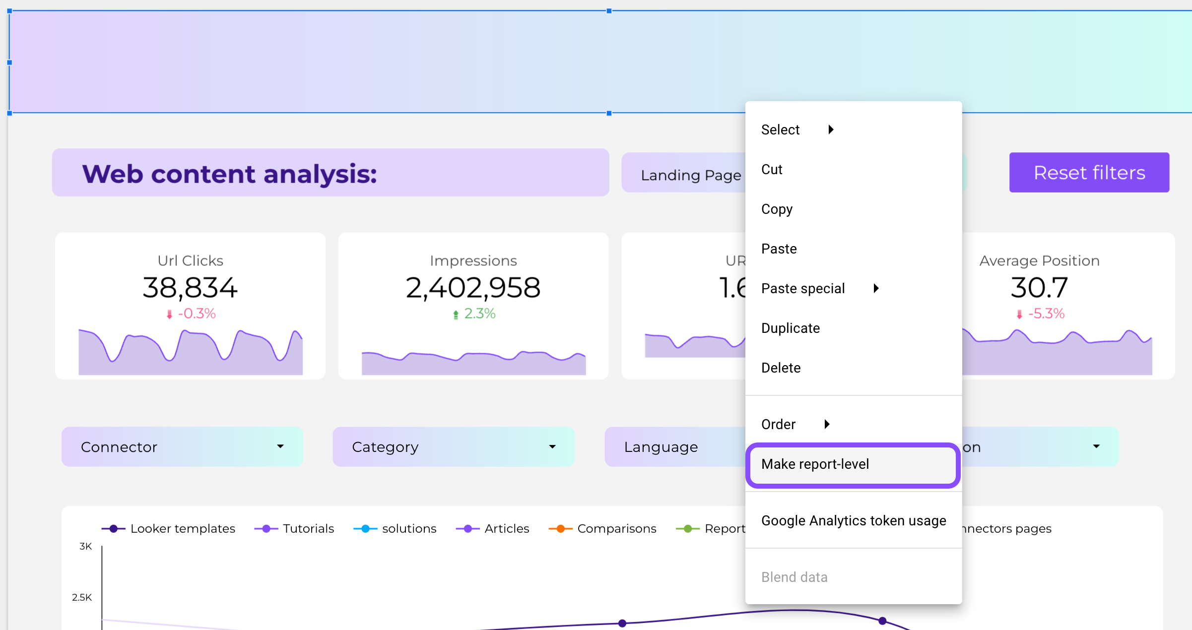
Creating a custom banner
You can add different shapes and images to your reports, and by combining these elements you can create banners, customize buttons, and white-labeling any marketing report you create.
To add a banner, just click on the rectangle on the menu bar
Then adjust your rectangle size to the canvas size of your report
Change the color on ‘Rectangle properties’
Click right and select ‘Make Report Level’. Now your banner will be included in all your report pages.
Adding icons, images, and logos
Looker Studio allows you to create white-labeled reports. You can customize your report by adding your logo and brand colors to the header and charts.
To add a logo, follow these steps:
In the “Insert” menu, choose the Image icon to upload your company’s logo.
Select your logo and then add it in the header area of the report.
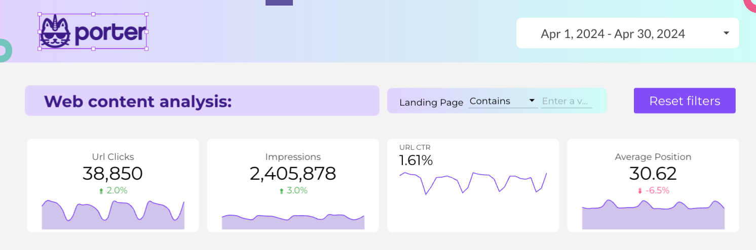
You can also add logos from the data sources you are using so it’s easier to understand where the data is coming from.
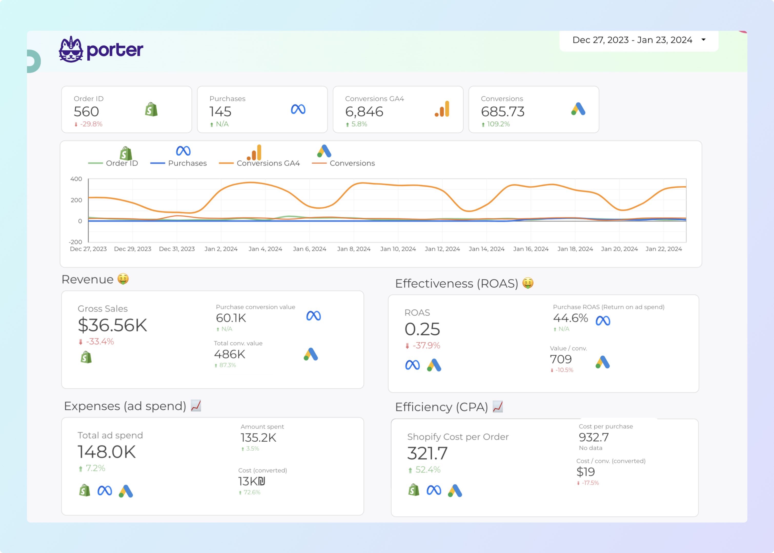
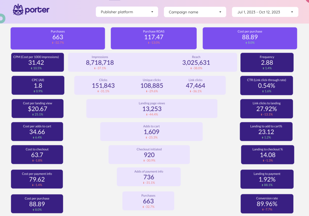
Here you can clearly see how you can add images to make your report easier to understand. In this example, you can see the specific chart and the data source associated with it.
Remember, you can also use the “Text” tool to add a title or other branded elements. My advice is that you experiment with different font styles, sizes, and placements to achieve the desired look.
Customize the navigation menu on the report
You can create custom menus with sections, pages, and icons. To edit your menu settings follow these steps:
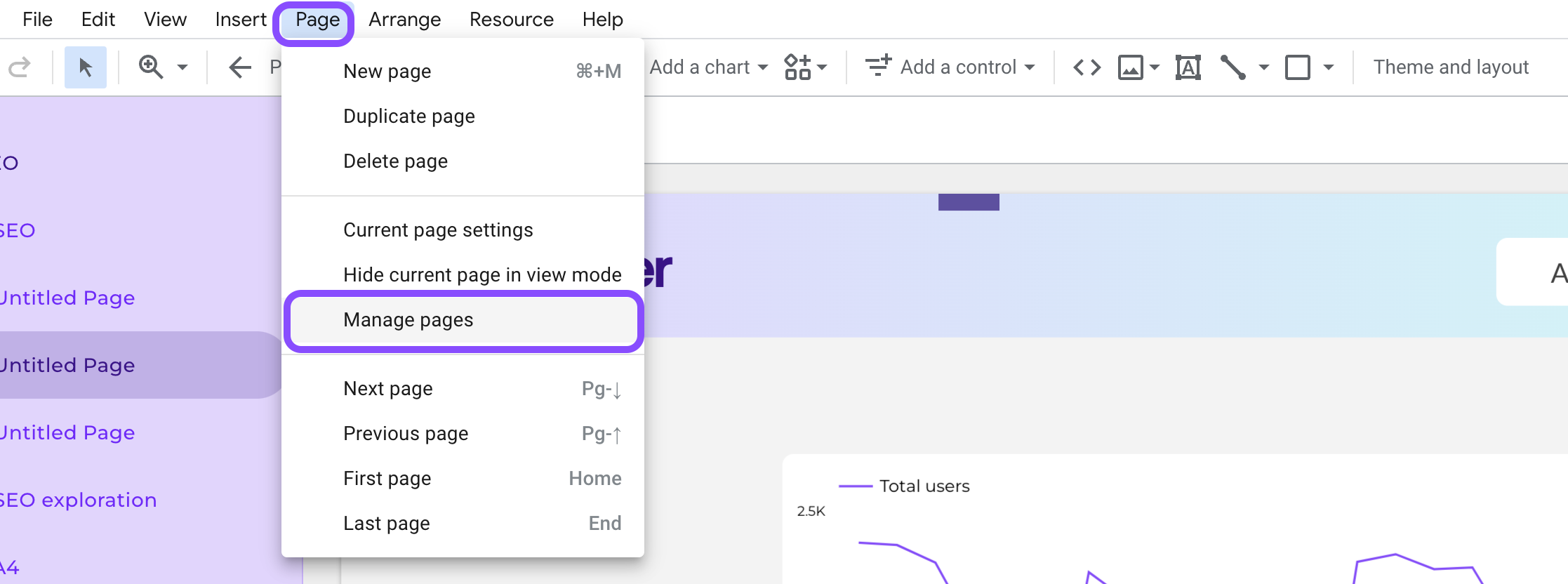
Go to page and click ‘Manage pages’
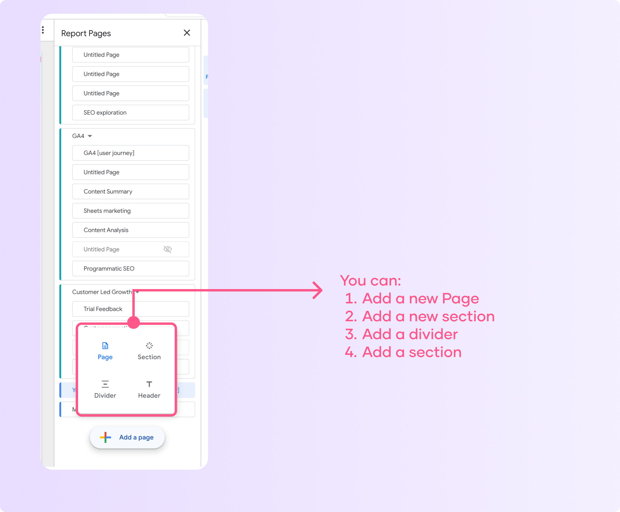
Now you can edit your report menu by: adding pages, sections, dividers, and headers.
Experiment with different navigation styles like a left-side menu or tabbed layout.
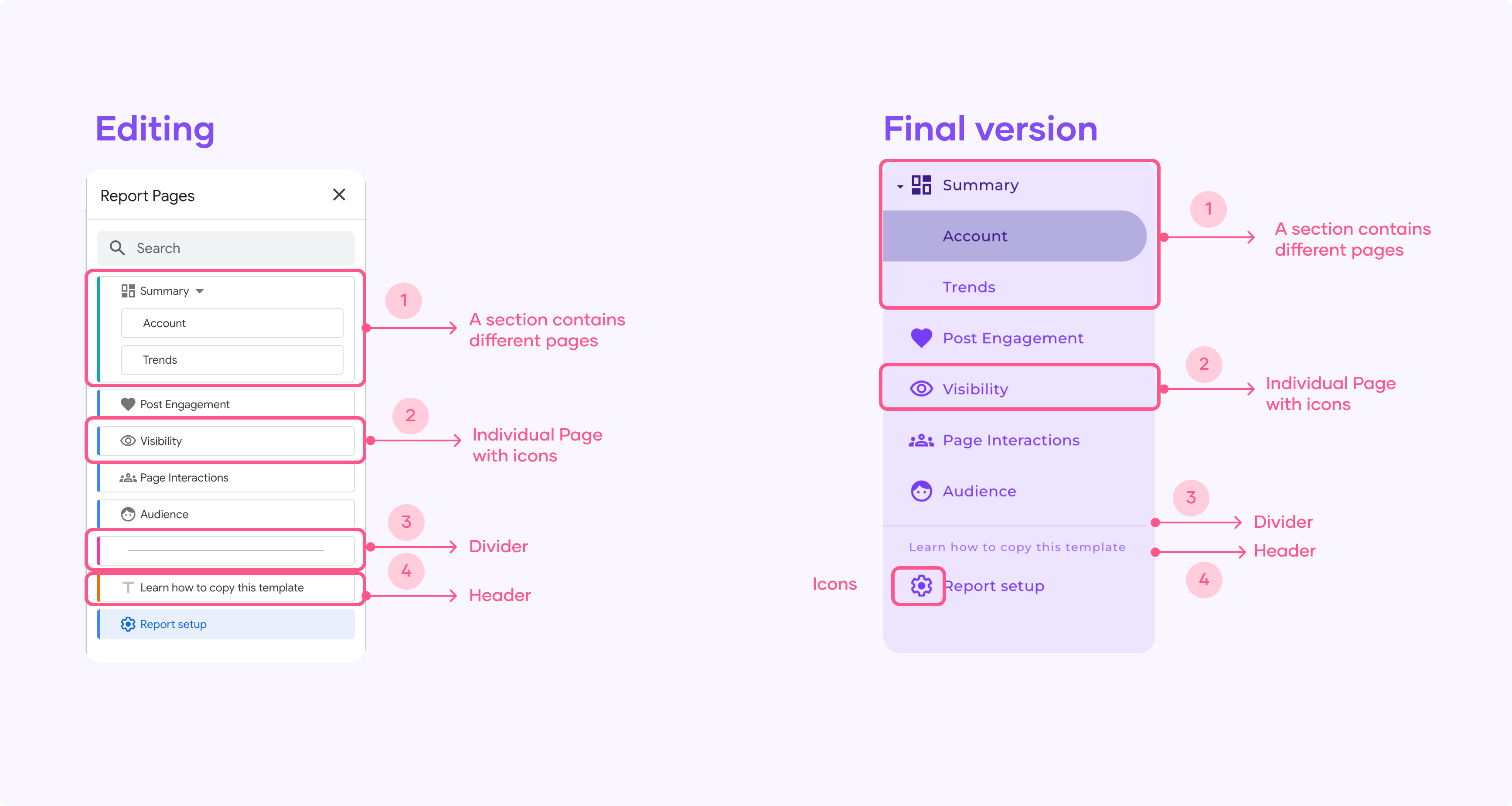
For instance, in this example you can see how I grouped related pages into sections with descriptive titles and also I assigned icons to each section to provide visual cues for users.
Tip: You can hide specific pages from viewers while keeping them accessible for editing, to hide a page follow these steps:
Go to the “Page” settings for any page and toggle the “Hidden” option.
This allows you to work on incomplete pages without showing them to report viewers.
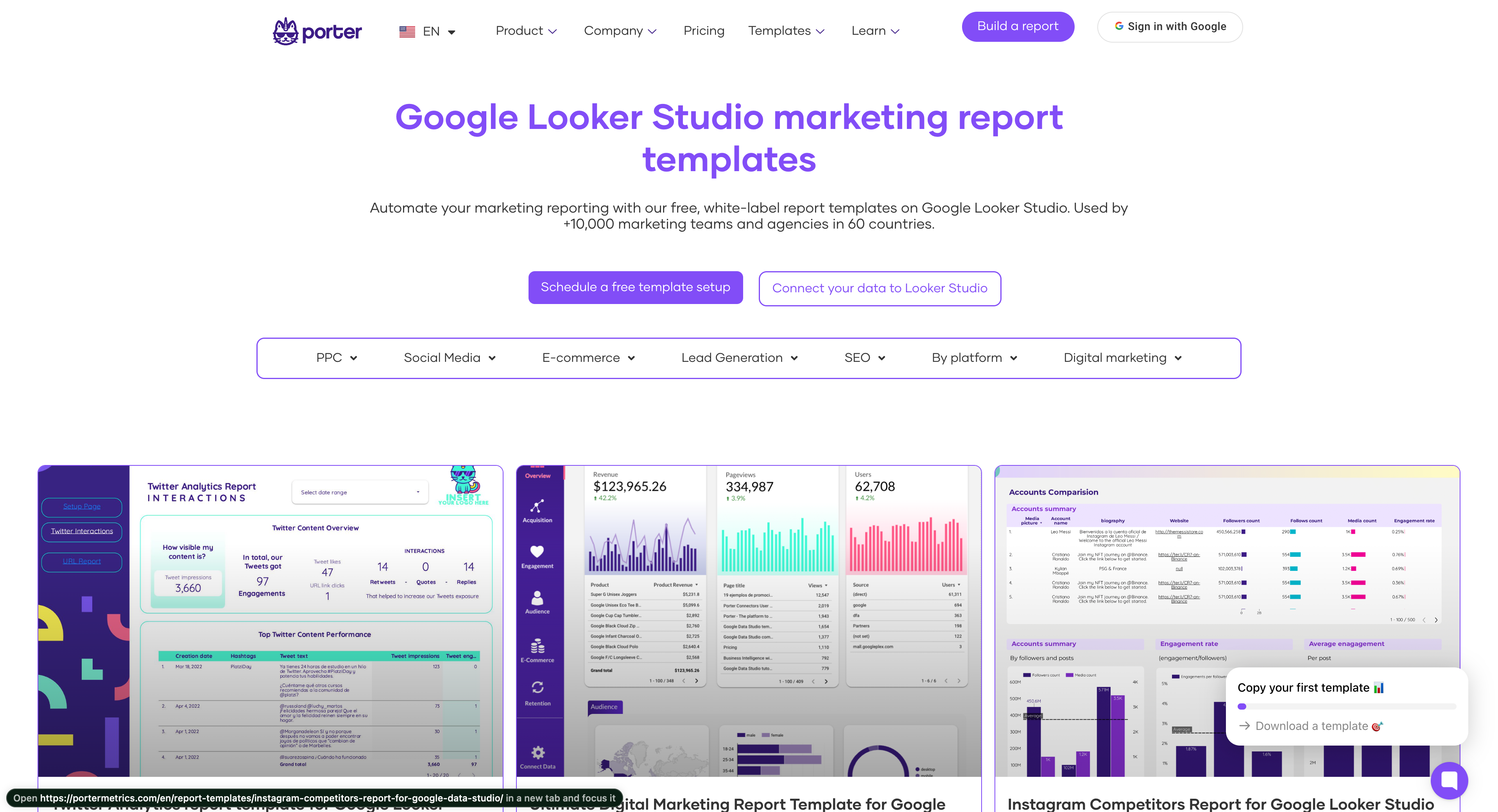
Copy a Looker Studio template to save time on the design
The easier way of creating reports is by copying a Looker Studio template, the process is very simple, you have to duplicate the report and replace the original source.
If you are a marketer, you can browse our Looker Studio marketing template gallery and start automating your reporting.
Conclusion
After reading this step-by-step guide you are ready to create great reports on Looker Studio, if you want to become a Looker Studio pro, you can check all our Looker Studio free tutorials