In this Google Data Studio (formerly Looker Studio) tutorial, we will go through all the steps needed to automate your reports and tell stories with actionable visualizations:
- Why does Google Data Studio matter: understand the reason why (or when) Data Studio should be your preferred Business Intelligence tool.
- Connect and manage data sources: learn to set up Google Data Studio connectors.
- Data types: understanding metrics, dimensions, and the kind of data you can visualize on Data Studio.
- Creating charts and graphs: visualize your data through scorecards, time series, pie charts, maps, and more.
- Filters and controls: make your dashboards interactive and clean your data with dynamic filters, internal filters, optional metrics, and drill-downs.
- Custom formulas and calculated fields: like Google Sheets, you can run mathematical operations on Data Studio.
- Case statements: learn to apply conditionals (if) to create rules to visualize your data.
- Regular expressions: get started with SQL to create custom queries. Learn to ask more specific questions to a database.
- Combining multiple data sources: learn to join and blend data sources.
- Styling and report design: customize your report’s look and feel; how to white-label your Data Studio reports.
- User management: learn to share your reports with your team and customers.
I also made a complete YouTube video tutorial you can watch:
Why does Google Data Studio matter?
We’ve already published an article about why businesses—especially marketers—should learn Google Data Studio, data visualization, and Business Intelligence.
We encourage you to read it here: Why marketers should learn Google Data Studio?
We built Porter and have hundreds of customers thanks to Google Data Studio. Our business is built around it. We love it. And we hate it sometimes, too.
Yet, I must say it is one of my favorite software products along with Manychat, Hubspot, and Zapier.
Here’s why, to me, you should learn it:
- You will stop wasting time copying and pasting data on a sheet
- Analytics and reporting is the most important skill to develop for digital marketing, according to this Sparktoro’s survey
- It’s easy to learn. Yet, it will make you look smart and techie
- It is a good starting point to join the data science industry
- It will help you dedicate more time to answer important questions of your business
- Data Studio gives you the databases and Business Intelligence logic, so you can understand how other tools like Power BI and Tableau work.
- It’s a free yet powerful Business Intelligence tool that millions of people around the world already use
- The internet is plenty of documentation to help you get started
- It integrates seamlessly with Google Marketing products like Google Analytics, Search Console, Google Ads, and so on
- Data Studio will help you develop a mindset to become truly data-driven.
Google Data Studio connectors and data sources
We have a blog post to explain with great detail everything you need to know about how to import data on Google Data Studio by using connectors and data sources.
To report and visualize data, you need to get it from somewhere. That’s why Data Studio offers connectors—others call them data sources, plugins, integrations, whatever.
So, to help you quickly answer how to import data on Data Studio, you have multiple options:
To help you quickly answer how to import data, Data Studio has a connectors gallery, which has more than 900 connectors, so you have multiple options:
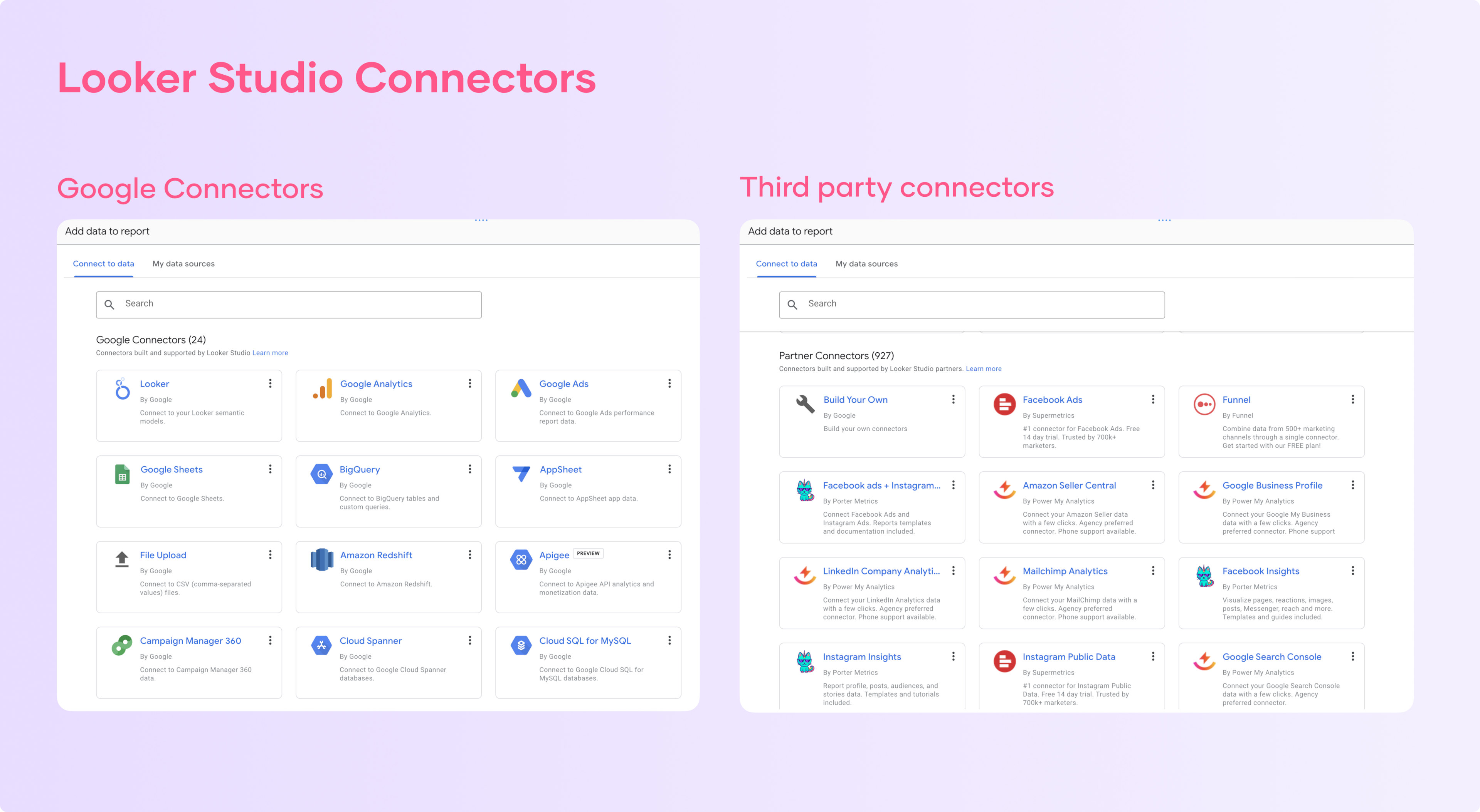
Google already offers free connections for Google products such as:
- Google Sheets
- Google Analytics 4
- Google Ads
- Google Search Console
- Campaign Manager 360
- Google Surveys
- Youtube
If you want to connect 3rd party apps like Facebook, Instagram, LinkedIn, or your CRM. You may rely on partner connectors just like Porter Metrics.
You may check out some of our connectors:
- Facebook Ads for Looker Studio
- Facebook Insights for Data Studio
- Instagram Insights for Data Studio
- Google Business Profile for Data Studio
If Google Data Studio doesn’t offer direct integration with its native or partner connectors, you may want to connect to a database or Google Sheets. With these tools, you may visualize virtually any data as soon as it’s structured in rows and columns.
Google Sheets for Data Studio is the most flexible and easiest-to-use connector. To show you an example, we created a CRM dashboard template with Data Studio and Sheets.
If you’re comfortable with coding or SQL—or you’re a larger company—you may use other connectors such as:
- BigQuery
- PostgreSQL
- MySQL
If you want to know how these Data Studio connectors work or how to build yours, we suggest you, again, to reference our guide.
Connect and manage data sources
In the 1st section, we’ll learn to connect our data to Google Data Studio and how to set their parameters and level of access.
Connect your data
Go to lookerstudio.google.com
Then, click on Create or Blank Report.
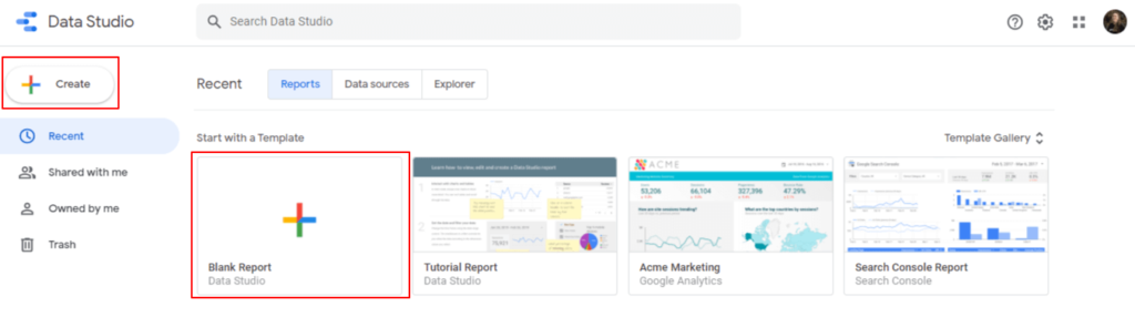
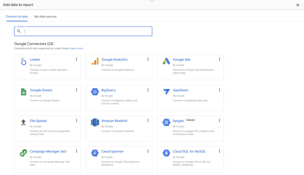
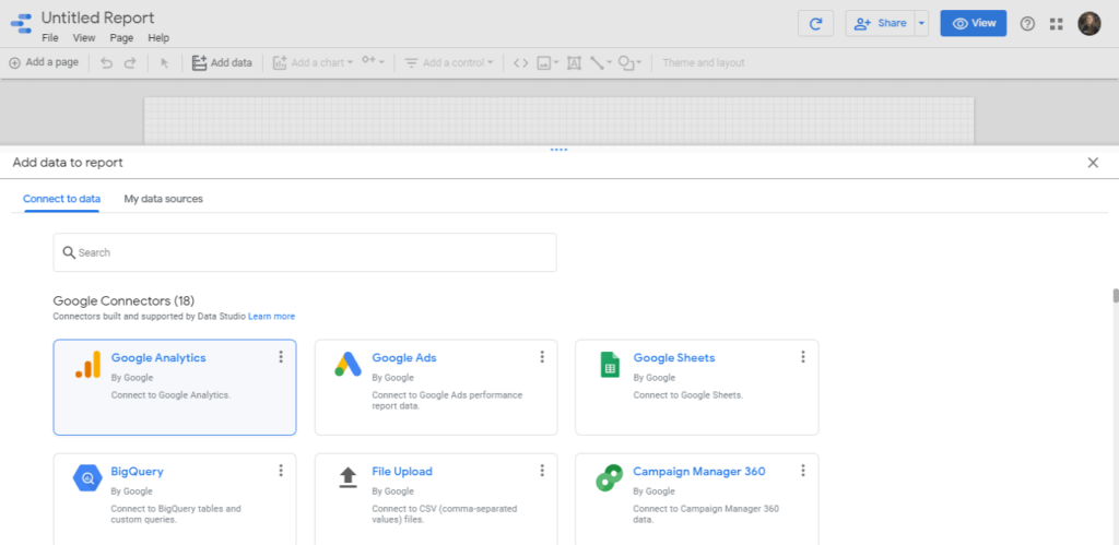
You’ll see the Google Data Studio connectors gallery.
You will choose a data source. As Google Data Studio—and all their products in general—are more adopted by marketers, the most popular connectors are Google Analytics, Google Sheets, Google Ads, and Facebook Ads.
Google offers free connectors for their products, and you can use Porter’s Facebook Ads connector for Data Studio.
All connectors work pretty much the same way, except for their initial parameters and, of course, the data they bring.
For this exercise, we will suggest you use Google Analytics AND the Google Sheets connector.
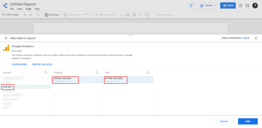
If you don’t have an Analytics account, you may use the demo account. That’s what I’ll use for this tutorial.
We will start with Google Analytics.
To connect your Google Analytics account 4, if you have one, choose the correspondent connector (the 1st one listed).
If you choose the demo account, go to My Data Sources and type “Sample” in the search bar, and choose the [Sample] Google Analytics Data connector.

As you will find, there are more sample or demo data sources.
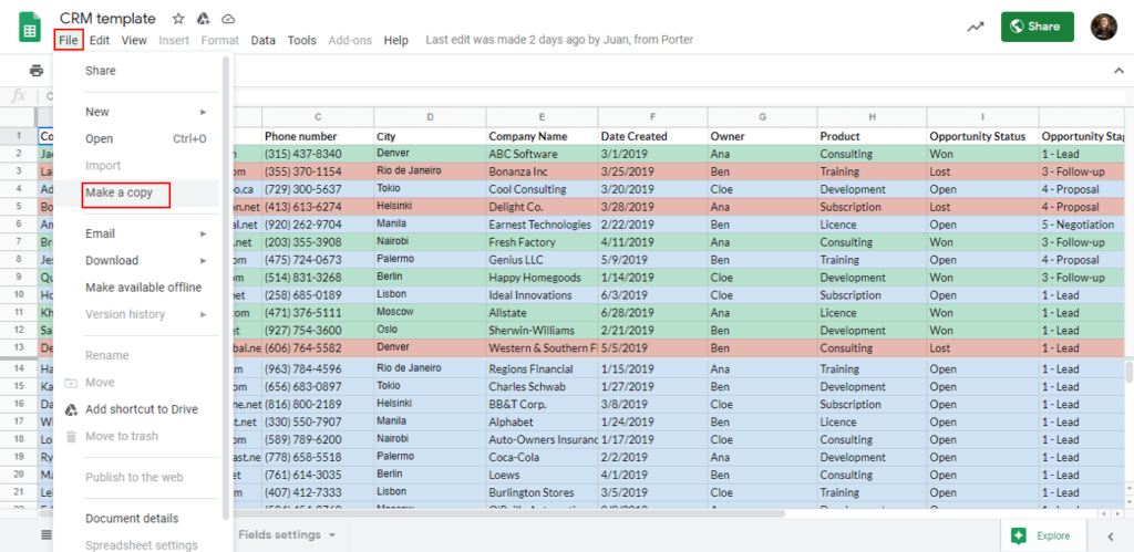
Now, we’ll connect to Google Sheets. You might have, already, some documents, but I’ll suggest you work with our sample sheet.
Create a copy of the sheet by using the same Google account you used to log in on Google Data Studio.
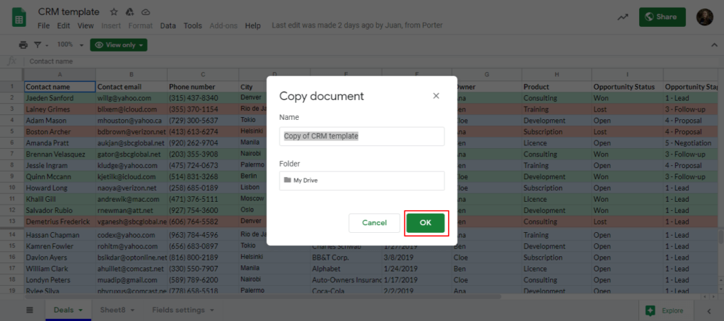
Once you create a copy, go back to Data Studio.
Click on Resource – Manage added data sources, located on the menu.
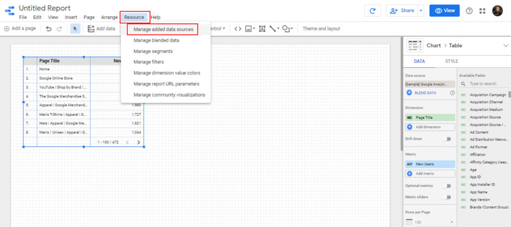
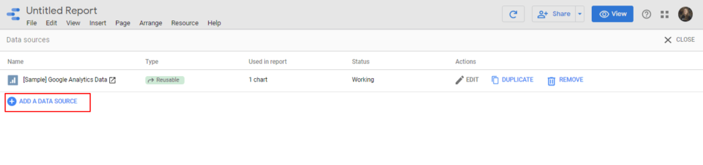
You’ll see a window that shows your connected data sources. To connect our sheet, click on Add new data source and choose the Google Sheets connector.
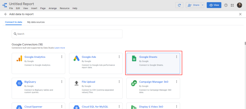
Next, sign in with Google so Data Studio can bring all the documents associated with such email.
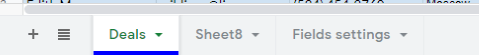
You can follow this setup:
If you created a copy of the sample sheet we provided, you should see the CRM template sample sheet first. Also, choose a worksheet. In this case, use the worksheet Deals.
If you’re wondering what a worksheet is, it refers to these tabs on Google Sheets:
Leave the additional options as default. Click on Add.
You will be directed to the connected data sources window.
There, you will see some options:
- Name: you may change the displayed name of every data source so you can identify which website or account you’re visualizing.
- Type: data sources can be embedded or reusable. Embedded data sources let other users in this report access the data source fields and create formulas and do changes that will only affect the current report. Reusable data sources are only accessible by the owner, and their changes may affect all the reports where this data source may be connected.
- Used in report: displays the number of graphs and charts connected to a data source. Yeah, you can create charts with different data sources in the same dashboard.
- Actions: you can edit your data sources, which we’ll mention right away.
- Duplicate
- Remove
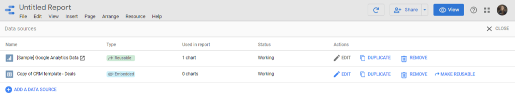
As you may see, you don’t have access to edit all your data sources but those you have access to; you may have connected them yourself, or it’s an embedded data source.
If you’re using the Google Analytics sample account, you’ll be restricted to edit it, but you can do it with the Google Sheet, to which you have full access.
Editing a Google Data Studio data source
Here are all the ways you can set up a Google Data Studio data source.
Change the data source name by clicking on Edit and clicking on the source name in the top-left corner. Especially recommended when you add multiple accounts of the same data source in the same report.
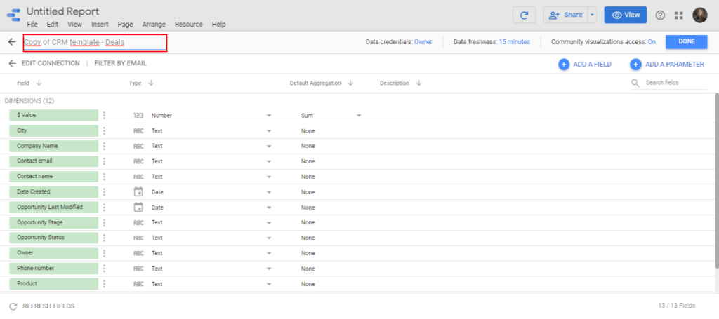
- Edit connection: this option lets you change the Google Data Studio data source. For Google Sheets, it brings you back to connect a specific sheet and worksheet; for Google Analytics, to choose again a Google Analytics property, account, and view.
- Data credentials:
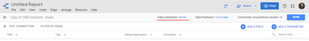
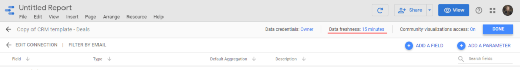
- Data freshness: you can decide how often you can update or “refresh” your data. By default, it’s 15 minutes. You can also set it for 1, 4, and 12 hours. Most of the time, you will want to have your data as fresh as possible, but for some companies that have a data infrastructure like a data warehouse, every refresh may represent a cost, so they should aim to be more efficient.
- Community visualization access: you can allow community visualizations—which we explain later—to work with the data source.
- Filter by email:
- Add a field: you can create custom formulas with the data source underlying data. We will explore this feature later, too.
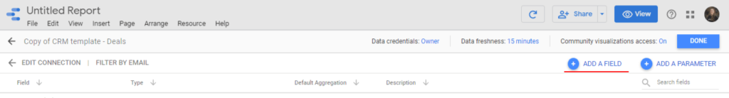
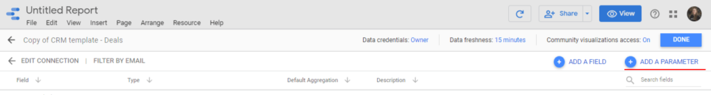
- Add a parameter: parameters let you add inputs to your reports so users can add data right from
- Field names: by clicking fields you can edit their name. You would do it to make field names friendlier for users e.g. translating the field name to the user language.
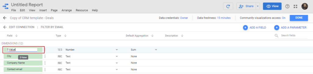
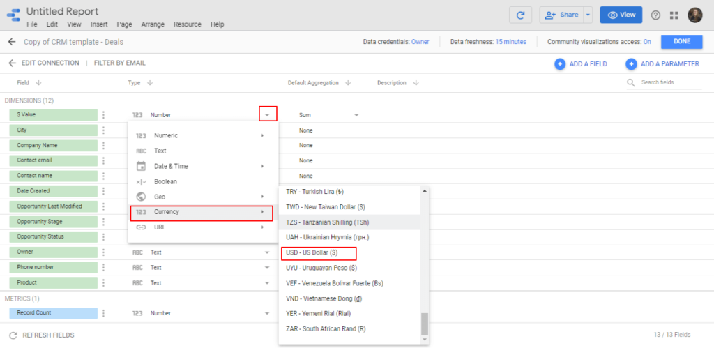
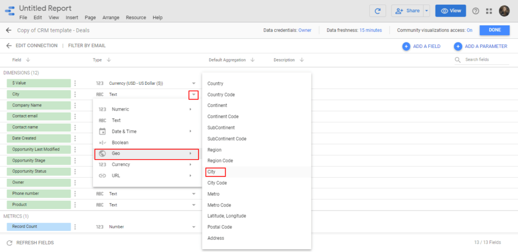
- Data types: if you connected the Google Sheet data source, Google may interpret correctly most of the fields. However, you can indicate a more accurate data type: the Value$ field represents sales which, instead of a number, could be a currency. On the other hand, the field City could be set as geographical data so we can visualize it through a map.
- Aggregation: data aggregation refers to the way a numeric field (aka a metric) is operated by default, it’s a sum, but you can switch to average to display the average sales or MAX, to display the highest value in the data set.
- Description: you can click the description field, to help users understand what data every field is bringing.
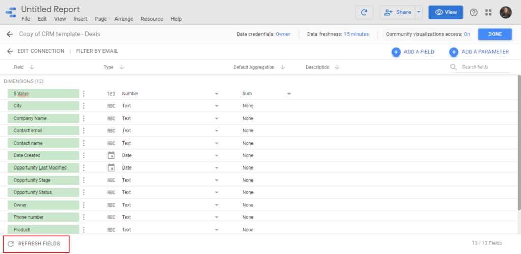
- Refresh fields: you may refresh the data source when the underlying data changes. For instance, with Google Sheets, you could add a column after you connected the sheet to Data Studio and want to update such a field.
Before creating our first dashboards, we will explain what kind of data we can visualize on Google Data Studio.
Google Data Studio metrics and dimensions
Let’s talk about the types of data that you can visualize on Google Data Studio (or any visualization tool).
This chapter will help you understand how Business Intelligence tools interpret data. In other words, you will understand the standards to visualize and analyze any data.
Metrics and dimensions: how to ask questions to your data
Any visualization requires at least two components: a metric and a dimension.
A metric is a numerical value; a dimension is a value that breaks down the metric or adds context to it.
Let’s do an example by asking a question.
What is the best performing product on our website?
So, in this case, I want to visualize sales (the metric) by-product (the dimension).
Mostly always, when you ask a question to a database, you answer it with a metric by a dimension:
- Sessions per day
- Users by country
- Conversion rate is broken down by device
- Website speed by browser
And so on.
Metrics help to quantify something; dimensions give a context to those quantities.
If I told you that our website has 5,000 visitors, is it good or bad?
It lacks context. But if I told you that it has 5,000 visitors per day, I have a more clear picture.
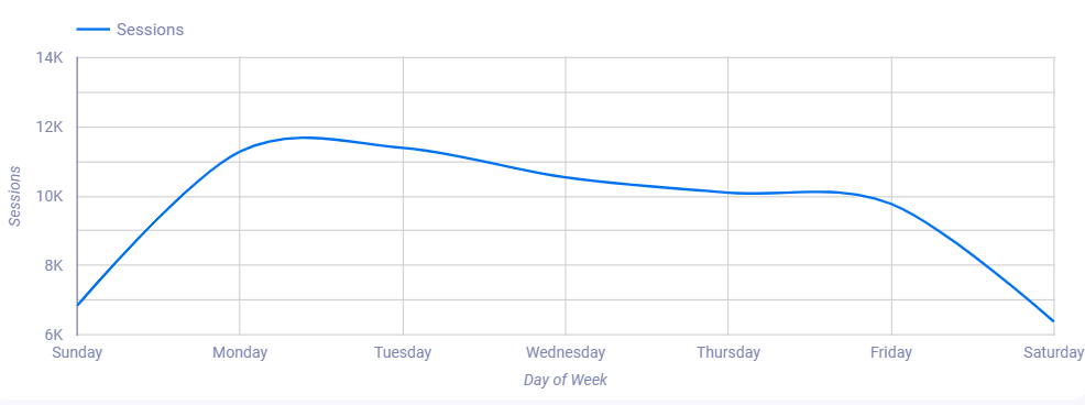
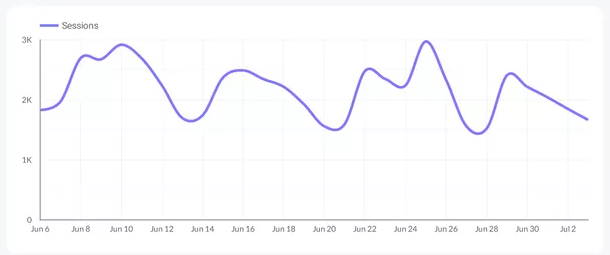
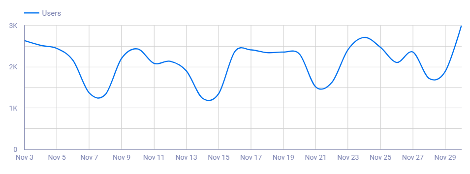
And if we show a time series that shows that we used to have 2,000 visitors/day, and now we have 5,000. We’re telling the story and provide context.
This time series below, for instance, shows sessions (the metric) by days of the week (the dimension).
Let’s see what kinds of metrics and dimensions we can bring and visualize on Google Data Studio.
Google Data Studio data types
If you follow the tutorial, we should keep it in the Manage added data sources window, which you will find in Resources, in the menu on Data Studio, and you should have connected the Google Sheet sample we provided.
We’ll focus this time on the data types.
As you can see, by default, Google Data Studio interprets our Sheet template data as follows:
| Field | Default data type |
| Contact name | Text |
| Contact email | Text |
| Phone number | Text |
| City | Text |
| Company Name | Text |
| Date Created | Date |
| Owner | Text |
| Product | Text |
| Opportunity Status | Text |
| Opportunity Stage | Text |
| $ Value | Number |
| Opportunity Last Modified | Date |
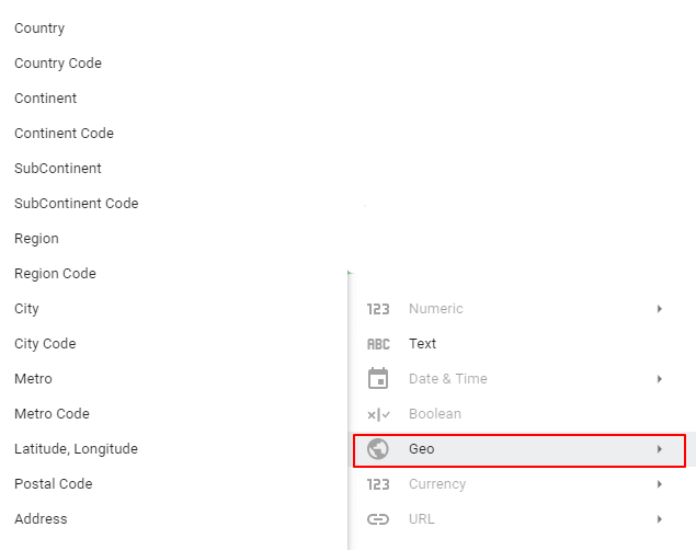
Most of them are interpreted correctly: names, emails, owners, and products are text or strings. While $Value is valid as a number, a more accurate data type as a currency in Dollars.

Also, City works as text, but if we want to visualize geographical data, we should indicate to Data Studio that these values refer to actual cities.
For changing the data types, click on the dropdown, and choose the correct option.
Here’s how you find currencies:
And here’s how to find cities:
We won’t cover all the field types as they’re self-explanatory, but we’ll show some regular use cases that you’ll definitely face.
Time dimensions
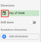
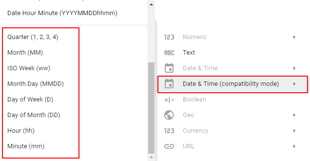
If you have a date format, you could switch it to other time dimensions like days of week, week of year, month of year, quarters, and so on. Yet, you may want to keep that default value.
What you can do, instead, is duplicating the date field by clicking the edit icon beside the field label. Then you can use your new field, add a new name—like “day of the week”—, and set Day of Week.
Geographical dimensions
You can let Google Data Studio interpret your data as geography so you can visualize on a map: countries, regions, states, cities, and even coordinates by setting “latitude, longitude.”
Here’s how you can visualize countries, regions, or cities:
If your data source offers a latitude, longitude value as the structure shown below, you may visualize the exact position of a specific value.
Here’s how coordinates (latitude, longitude) looks like on Google Data Studio:
Google Data Studio hyperlinks
Google Data Studio lets you transform regular strings into clickable links that will redirect to a URL.
If the URL turns out to be an image, you can display it on tables, just as shown below.
Get this Facebook Ads post engagement report template.
Creating charts and graphs on Google Data Studio
Once we have prepared (and understand) our data, it is time to create our first dashboards and reports on Google Data Studio.
Start with questions; answer them with metrics and dimensions.
Data visualization with Business Intelligence tools becomes pretty easy. Yet, simplified thinking is underrated.
Instead of thinking of complex dashboards and sophisticated mathematical formulas to impress people, consider making a chart so simple and actionable that, doesn’t require deep analysis.
The main tasks of data analysts seem conflicting:
- Find non-obvious insights from your data
- Making those insights obvious for your audience through visualizations
A good way to think of data visualization and Business Intelligence is by asking questions and answering them through charts.
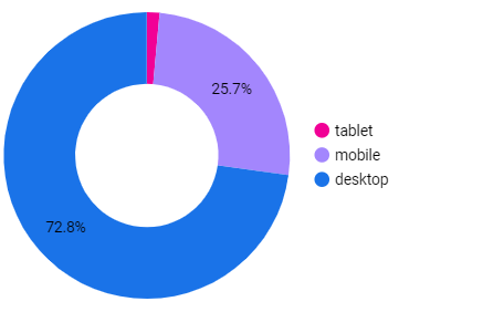
For instance, this pie chart helps us know which is the best performing device for our ads?

This time series helps us have a context of our month-to-month website traffic performance.
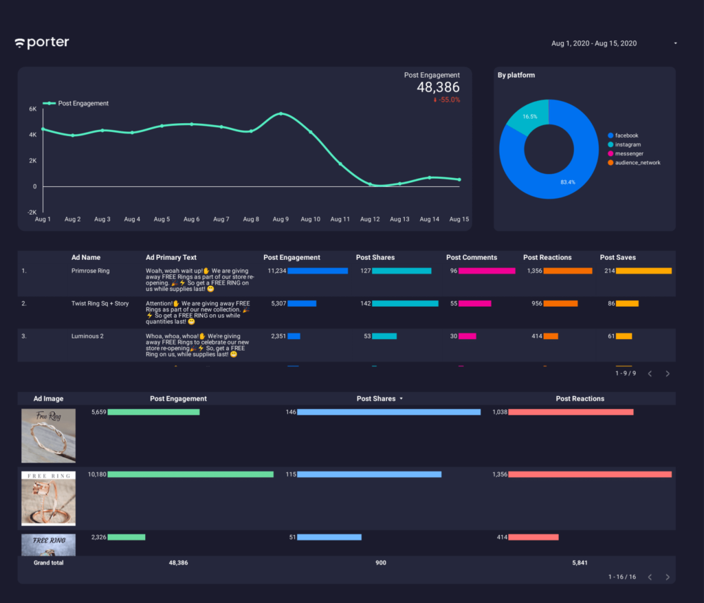
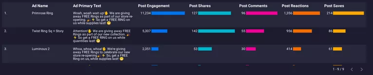
This table lets us know which is our most engaging post on Facebook.
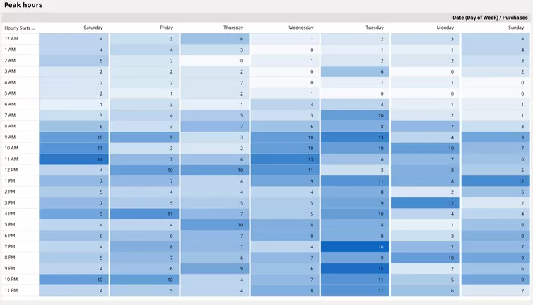
And this heatmap shows our peak hours: the best time to run Facebook Ads.
As you can see, thinking of visualization by answering questions becomes simple. You should choose four main elements:
- Data source: where the data I will use to answer my questions will come from?
- Charts: what type of visualization— tables, charts, time series, etc.—answer the question more clearly?
- Metrics: what value would you like to analyze?
- Dimensions: how do you want to break down the metrics to provide context?
With this four-step structure in mind, we will create our first charts.
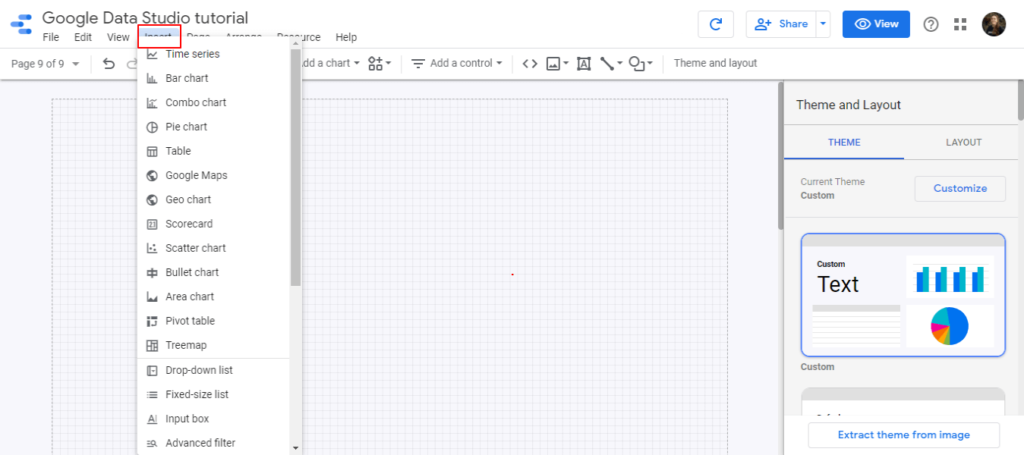
Go back to your Google Data Studio dashboard and choose Insert in the menu or Add a chart.
In both options, Data Studio will display a set of charts, as shown below.
By clicking insert:
By clicking add a chart:
They work the same way. I still wonder why they do it like that. Anyway, let’s create some charts!
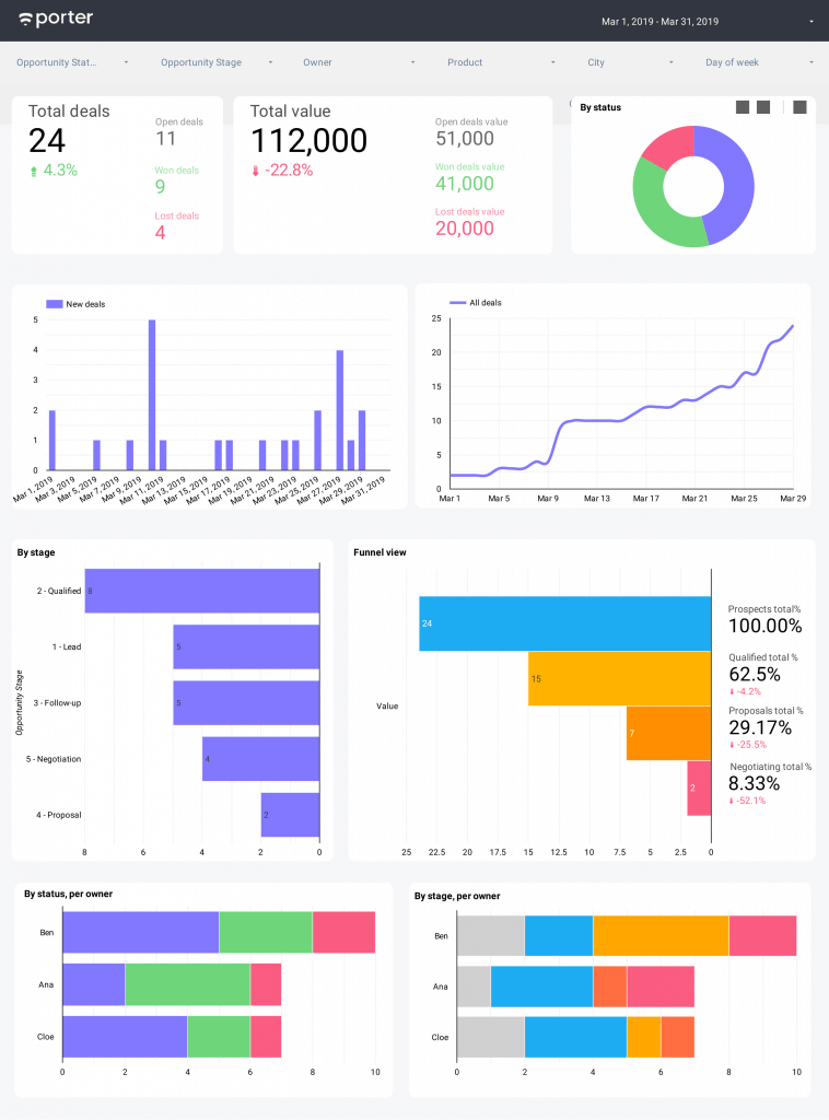
Remember that you can follow our master template to follow up on your progress.
We’ll create a dashboard that looks like this with the Google Analytics demo account. Don’t worry about the design and other details. We’ll cover them later.
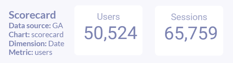
Scorecards
Scorecards let us display plain metrics. You only need to choose the scorecard option and drop it wherever you want on the report canvas.
It will only ask you to add a metric and a time dimension to set the range you want to visualize.
In this case, you may want to choose “Users” or “Sessions” as metrics, just as in the example shown below.
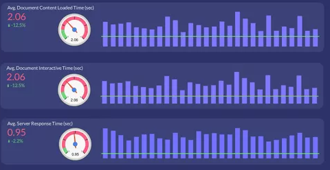
Time series
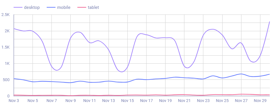
Time series shows the performance of a metric over time. As such, you should add a time dimension (e.g. date, month, day of week), along with a metric.
You can also enable breakdown dimensions to divide those time series into different values. For instance, we can break down our traffic into devices.
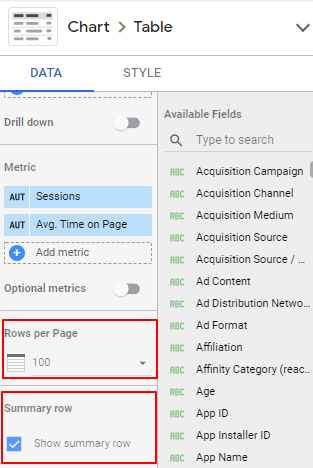
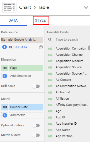
Tables
Tables are the most standard kind of visualization. Most data is visualized through tables. While there are other insightful and underrated charts like maps or heatmaps, tables definitely give more data, sacrificing, sometimes, the ease of reading.
On Google Data Studio, there are three types of tables. We’ll choose the standard, with no colors.
This time, you don’t need to set a time dimension when using tables. Yet, tables are flexible enough to add as many dimensions and metrics as needed.
As shown in the example below, we add both page URL and page title as dimension, and sessions and AVG time on the page as metrics.
We’ll see some particularities of tables. For instance, if you scroll down below the metric setup, you will be able to:
- Check to display the summary row
- Add the number of rows per pagination
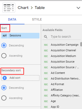
Unlike time series and scorecards, you can define the sorting of your data. So, this time, we can sort this table by default to show the pages from the ones with larger traffic, but you could choose to sort alphabetically, for instance.
Bar charts
Bar charts are helpful to visualize distribution. They’re similar to pie charts, except pie charts are better to sort the data making it easier to understand most of the time.
Unlike pie charts, metrics don’t need to be expressed as a percentage of total but can have any kind of aggregation like sum, average, maximum value, etc.
If these terms look abstract and unclear, we will explain them with examples.
By now, to set up bar charts, you can use up to two dimensions and as many metrics as you want.
This is a table showing website traffic by age groups. And it’s sorted by ages.
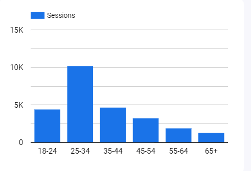
So, this time, the dimension is Age on Google Analytics, and the metric is Users.
If we used a pie chart, we could visualize the most popular age group. But it could be harder to find a pattern, as we cannot sort the data: in general, younger ages seem to perform better.
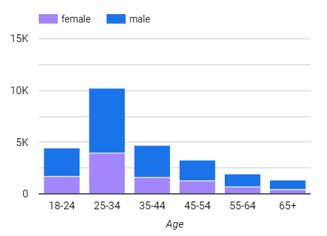
We can also add a Gender breakdown to see if distribution changes by gender in different age groups (it doesn’t, in this case).
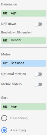
If you enable a breakdown dimension, Google Data Studio will also allow you to set a secondary sorting, to define the order of the bar charts on each value. In this case, Male is displayed before Female, but you could change it by sorting by gender, ascendingly.

Pie charts
People like pie charts as they tell a specific story: the share of a total.
Their downside is that we lose the context of time; you cannot visualize evolution over time with pie charts.
They’re not ideal for ordinal values like bar charts are. Ordinal values are those data that have an order: days of week, rankings, or age groups, for instance. As you need to display the data with sorting, you cannot do it with a circle.
On the other hand, pie charts are good for cardinal values like breaking down your data by gender or device, as the order of how this data is displayed doesn’t affect its context.
And finally, they’re restricted to display data aggregated as percentages.
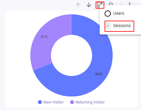
To create a pie chart on Google Data Studio, you need the following setup:
Date dimension: for Google Analytics, you may choose Date, which will define the range of data you will use to display on the chart.
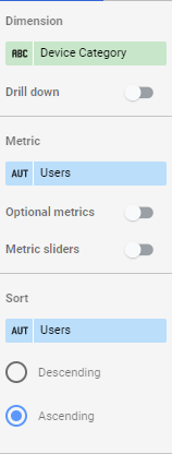
Breakdown dimension: in this case, we want to visualize traffic by device, so choose Device category.
Metric: for this example, I’ll suggest you visualize Users.
Geo maps
Geo maps are the best option to visualize geographical data like:
- Country
- Region
- ZIP code
- Coordinates (latitude, longitude)
- City
- Metro area
Most of the members at Porter are from Colombia. You’d be surprised that we’ve managed to visualize data from remote locations and towns on Google Data Studio, so we’re confident that you’re likely to get the granularity you need.
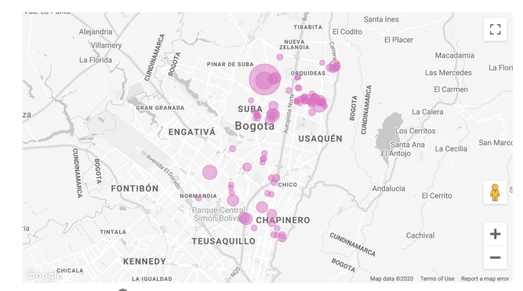
If you wonder how an actual example of coordinates visualization looks like, here it is:
And here’s how the dataset looks like to make it work:
There are three kinds of geo maps on Google Data Studio: standard geo charts, bubble maps, and filled maps (the last two work with Google maps).
For this tutorial, I’ll show the standard geo chart.
You have to choose a geographical dimension; the data source you use should have a source whose data lists cities, countries, regions, etc.
Google Analytics offers all sorts of geographical fields; our Facebook Ads connector, for instance, offers countries and regions.
The metric you define—in this case, we may use Sessions or Users—will define the location and the color scale.
While we write a better article on geo maps on Google Data Studio, we’ll suggest other blog posts that go deeper on them if you want to learn other neat features and use cases for them:
- Comparing Geo Maps and Google Maps in Google Data Studio
- Google Maps Chart Type in Google Data Studio
If you made it here, you know, already, the basics of creating dashboards on Google Data Studio. Yet, there are many more data visualization charts to learn.
Now, we’ll make our reports more powerful by making them interactive, detailed, and visually appealing.
Filters and controls on Google Data Studio
Filters and controls help you make your dashboards interactive and more actionable, too.
Filtering your data has two core advantages: it helps you clean your data (or remove the noise) and find more specific insights that lead to new perspectives.
I’ll prove both statements with examples.
Cleaning data
We have a webpage in Spanish that ranks 1st on Google for “Ejemplos de Promociones de Ventas” (or sales promotions examples, in English).
Every SEO person would blame me for showing the keyword we rank for as it allows competitors to focus on it, too.
Feel free to steal it. It drives thousands of visitors every month that are not relevant to our business.
If you work in B2B, this may sound familiar to you: we want to attract small businesses and agencies, but this webpage brings only students and businesses in the very early stages.
It’s not a big deal if we get traffic from it, but it affects our remarketing audiences and also our reports.
For every report we create for our website, we must exclude this webpage traffic, that easily represents 20% of total traffic.
And with excluding, I mean filtering, so that’s our first use case!
Adding context
Is your website fast?
Businesses answer this question with tools like Google Speed Insights or Web.dev.
These tools are great, but they lack context as they lack sampling.
They give you a score based on a simulated website visit, but no device, browser, and pages are the same.
Some of your pages will load fast, some countries’ connection is poorer, and your website’s desktop version will not perform the same as mobile.
To have context and a good interpretation of data, you need to segment or separate your data. To have better judgment.
It’s the same with the bounce rate. An overall bounce rate is meaningless as your product and blog pages will differ dramatically.
I encourage you to watch this TED Talk, where Malcolm Gladwell talked about how Howard Moskowitz didn’t come up with the perfect Pepsi, but the perfect Pepsis, a lesson on breaking down data.
Now, let’s make our Data Studio reports interactive and meaningful with filters and controls!
Add date ranges and comparisons
In this section, we will see how to define the date ranges to visualize your data.
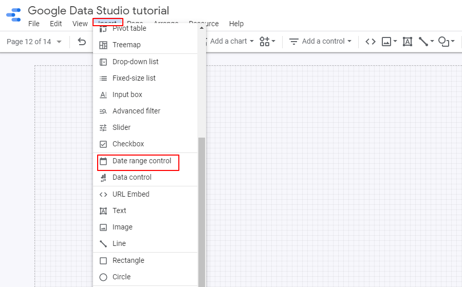
To create a date range widget that will work on all the charts of a dashboard, go to Insert and choose Date range control and place it somewhere in the dashboard.
In the edit mode, you can choose the default time range. In the date modals, you can choose a manual range or set an automatic one, like Today, this week, this month to date, and so on.
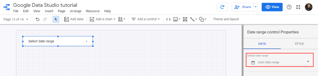
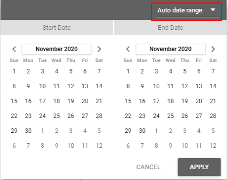
If automatic, your dashboards will always update to the date range defined.
You can also choose to have a specific date range for each chart.
On the edit mode, click a chart and, in the data setup tab, scroll down to the default range section. If automatic, it will be the same as the date range control, or you can choose a fixed range for that chart.
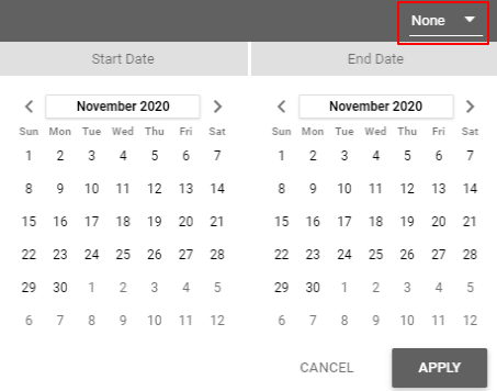
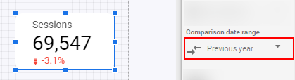
We can also add comparisons to our charts, to know if there’s a variation between a range VS another.
For instance, we can choose a scorecard, table, or time series, and on the edit mode, you’ll see a date range comparison option at the bottom of the data setup tab.
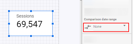
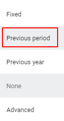
You can choose a custom, fixed comparison date range, or compare against the last period or the last year.
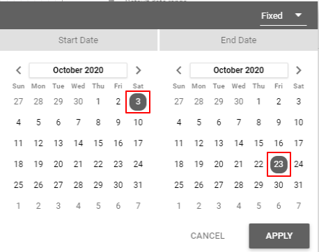
If the date range you choose is September 1st to September 30 in 2020:
- By choosing last period as the date range comparison, it would compare against August 1st to August 30.
- By choosing last year as the date range comparison, it would compare against September 1st to August 30 of 2019.
Add a control
Controls are widgets that let users interact on the dashboard and affect all the charts.
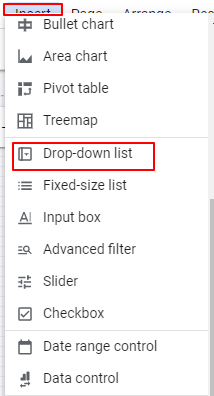
You can go to both Insert or Add a control to find them.
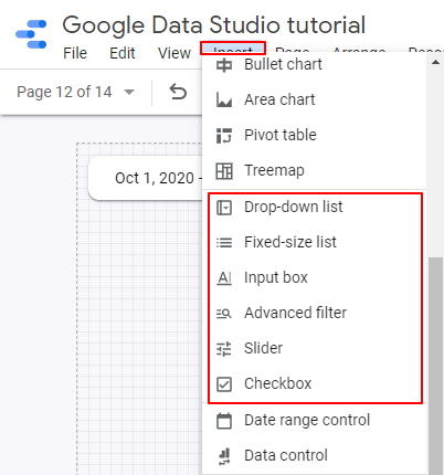
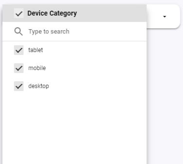
Drop-down lists
You can display a set of values that users can filter to visualize, just as shown below.
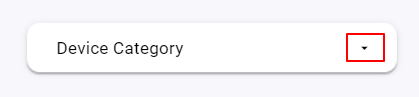
I will suggest you use drop-downs only for dimensions that don’t have too many possible values. In this case, we’re using the Device category, which only allows Desktop, tablet, and mobile.
If we used the dimension Country, for instance, it may display hundreds of options, making it hard to use.
Dropdown lists also let you display metrics to sort the data. You can sort the options by what device category has more users. Yet, metrics and sorting are optional.
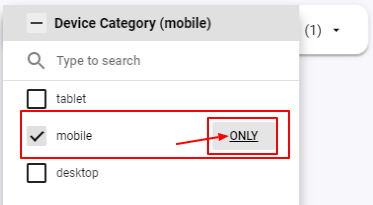
Once in the view mode, we can see how these dropdowns work.
As you can see, you can check multiple values, un-check them all, or only allow one.
In this case, I want to visualize website traffic coming from mobile, as shown below.
Fixed-size list
Fixed-size lists work the same way as dropdown lists. The only difference is that drop-downs need the user to click to display the list. In this case, as its name suggests, this control remains fixed.
I’d use more drop-down lists, to have our dashboards as minimal as possible.
I’d use fixed-size lists on the other hand if filters are a core component of the dashboard and I don’t want a non-technical audience to miss it.
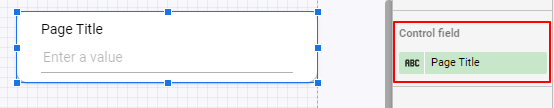
Input box and advanced filter
Input boxes and advanced filters let you have a search filter based on a string you add.
They’re way ideal when you want to filter specific data when a dimension has many string values.
For instance, you may want to visualize a table with the keywords your website ranks for that only include the name of your brand.
Or you want to see a list of your best-performing web pages whose URL contains /blog/ so you can make sure you’re filtering blog posts.
Their setup is quite simple as you only need to choose a single dimension, just like shown below.
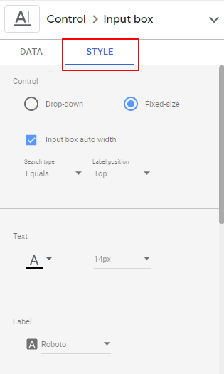
Yet, we can do some customizations in the Style tab.
With the input box, you can choose if you want to display a dropdown or a fixed search bar. You can also display the search type you want to set.
For this exercise, that you can find on the Google Data Studio tutorial template on the Controls and filters page, we’ll test input boxes and advanced filters with a table whose data source is the Google Analytics sample account, and dimensions are Page title and page (for URL).
Equals: this is the most restrictive rule of all. If we type the word “Home”, the table will only display results where the page title is exactly “Home”.
- Contains: this search type is the most common as it is more flexible for your queries. It lets you filter your data if the string you apply is contained anywhere in the values. So, if we use it with “youtube”, the table will show all the pages where the word Youtube is shown somewhere in the URL.
- Starts with:
- REGEX: you can run regular expressions on Data Studio, like if you used SQL. we’ll see this feature later in this tutorial.
- IN: the IN operator lets you set multiple conditionals that can match your condition. It’s like an OR.
Add a filter
While controls are external—they’re widgets displayed in a dashboard—, filters are internal and unique to each visualization.
Filters, therefore, let you clean the data for each chart, and cannot be modified by end-users.
The logic is the same, but their use case is different.
For instance, we have a customer who always wants to exclude Sundays on their traffic data. Sundays are irrelevant for them and don’t even want to waste the time filtering them with a control.
Or, as I mentioned before, we always want to filter the traffic of a webpage that drives no value to our business.
To create filters, you should click on each visualization and scroll down to the button of the data setup options.
For this exercise, I will create a bar chart to display website traffic broken down into the dimension Mobile Device Branding, which will show the brands of the mobile devices people use to access our website.
There, you will click on Add a filter.
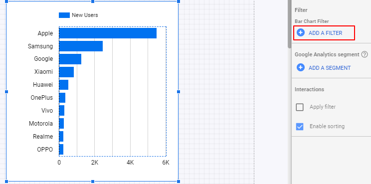
In this case, I will name the filter “Exclude Apple”.
I will follow these parameters:
- Filter type: Exclude
- Select a field: Mobile Device Branding
- Select condition: Equals
- Value: Apple
Once applied, our bar chart won’t show Apple in the bar chart, and you can save this filter for other charts.
Let’s do another example. I will visualize US traffic over time.
So, we’ll create a time series whose metric is Users and dimension is Date.
Now, let’s create a filter to include US traffic only, by following these parameters:
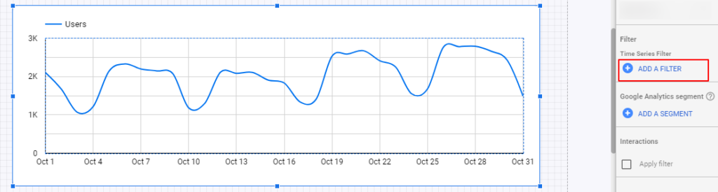
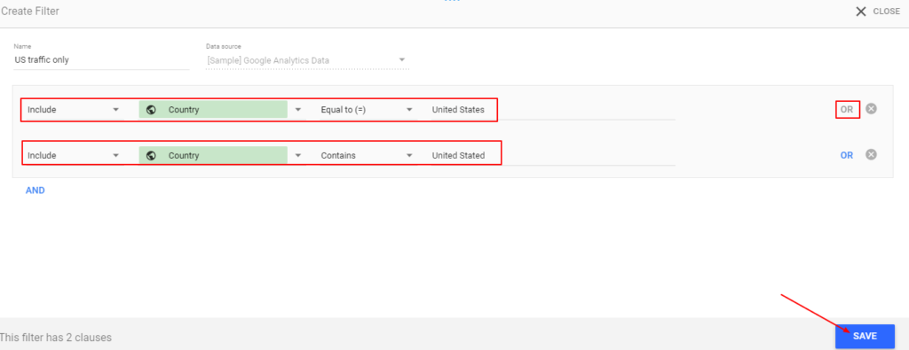
- Filter type: Include
- Select a field: Country
- Select condition: Equals or Includes
- Value: United States.
You’ll see other filter types like RegExp Match and RegExp and Is Null, which we’ll cover later.
The conditions that Google Data Studio displays vary based on the type of data of a field.
If you wanted to filter by dates, the conditions would be:
- Equal to (=)
- RegExp Match
- RegExp Contains
- Between (>= && <=)
- Greater than or equal to (>=)
- Greater than (>)
- Less than or equal to (<=)
- Less than (<)
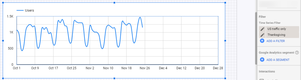
If we wanted to exclude black Friday or Thanksgiving it would be like this:
- Filter type: Exclude
- Select a field: Date
- Select condition: Between (>= && <=)
- Value: 26/11/20
Just as a final example, you can also filter strings, like filtering by email or URL.
You may filter pages whose URL contains /blog/ to only visualize blog traffic or exclude Gmail, Hotmail, Yahoo emails in your contact list to only show business emails.
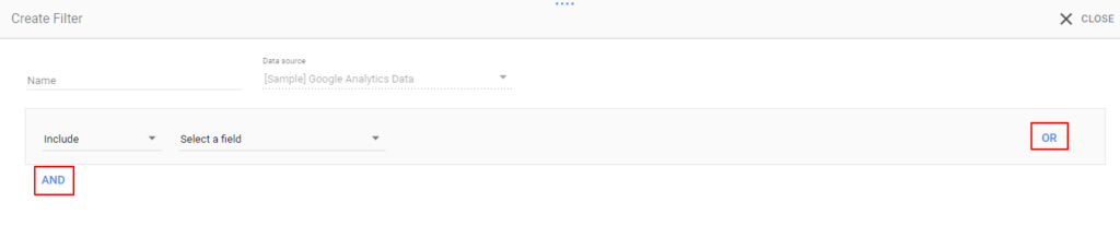
Heads up: in the filter section, you can also choose AND/OR conditions to add multiple rules.
Drill downs
Both drill-downs and optional metrics let you do more with your visualizations. They let you interact with your charts to modify their queries.
As you get more familiar with Google Data Studio, your users or you would like to ask more questions about your data—and create more charts.
Drilldowns let users interact with charts to toggle between different dimensions.
Let’s start with a time series.
Create a time series where you display website traffic by day with the Google Analytics sample connector, just as shown below:
Set Date as time dimension and Users as the metric.
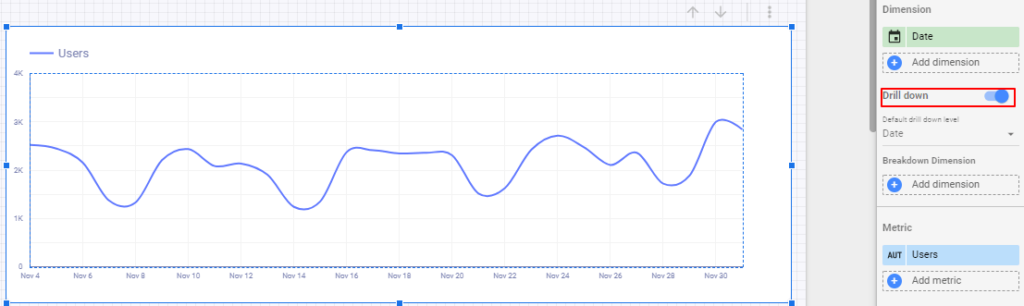
Once you enable Drilldown, it will display other time dimensions such as Year and Month of Year.
Go to the view mode to see how they work.
Hover on the time series chart, and you will see arrows in the top-right corner.
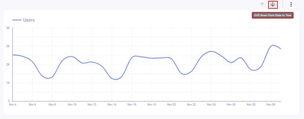
Click on them, and your charts will change their time dimensions to display users by month and by year.
If Google Data Studio didn’t offer drill-downs and users wanted to display their data by date, month, and year, they would need three separate charts.
With drill-downs, you can get more charts without creating them or crowding your report.
If you go back to the edit mode and click on the chart, you could select other time dimensions like day of week or week of year to add them to the drill-down.
Drilldowns don’t only work with time dimensions, but with breakdown dimensions for charts like tables and pie charts.
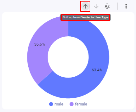
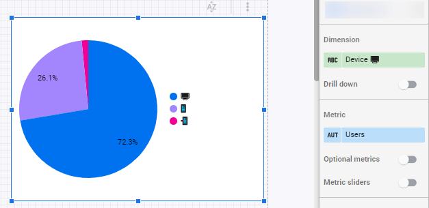
Let’s create a pie chart whose dimension is User type—which breaks down your traffic by new and recurrent users—, and Users as the metric.
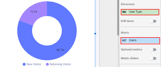
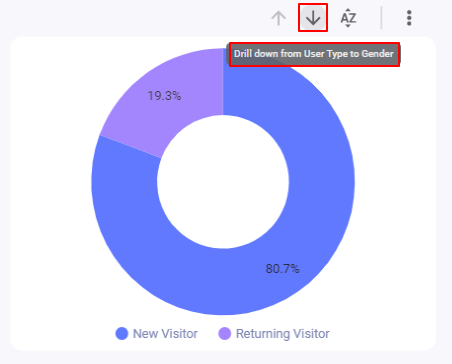
Once you enable the drill-down, you may choose more dimensions, like Gender.
When going back to the view mode, you will see that you can break down users by both User type and Gender without creating two pie charts.
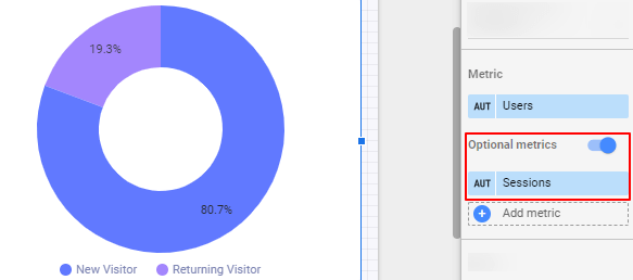
Optional metrics
Just like you can toggle dimensions to break down your data, you can toggle metrics to change the queries within the same visualizations.
To “turn on” the optional metrics, click the switch below the metrics setup on any chart. You can use the same time series and pie charts we used for learning drill-downs.
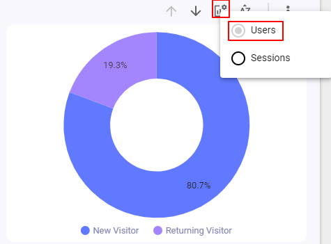
Once you choose some optional metrics, you will go back to the view mode and see a graph icon to switch metrics.
Interactions: apply filter
The last way we want to share to make your Google Data Studio contextual and interactive is enabling the option Apply filter, found at the bottom of all charts setups:
I will enable it on the pie chart we’re using for this exercise and then go to the view mode.
Now, click on any of the values and you will see that all the charts in your dashboard will be filtered by the value you clicked. In this case, we’re filtering to only include traffic from women (Gender: Female).
Custom fields
Custom formulas, or calculated fields, is one of the features that make Google Data Studio a business intelligence and not just a reporting tool.
Like you operate formulas like percentages, averages, dates differences, counts, and hundreds of operations on Google Sheets, you can do it on Google Data Studio.
Formulas, like Sheets, is an extensive topic, so I will focus on showing some examples and ways to transform your data.
You have two ways to create custom formulas: on each chart or the data source.
If done in the data source, you will be able to use the custom formula in your filters and charts connected to the source.
If you create the formula on a chart, it will only show up on that chart.
To create a custom formula, create any chart—let’s say, scorecard—and click on the metric blue dropdown:
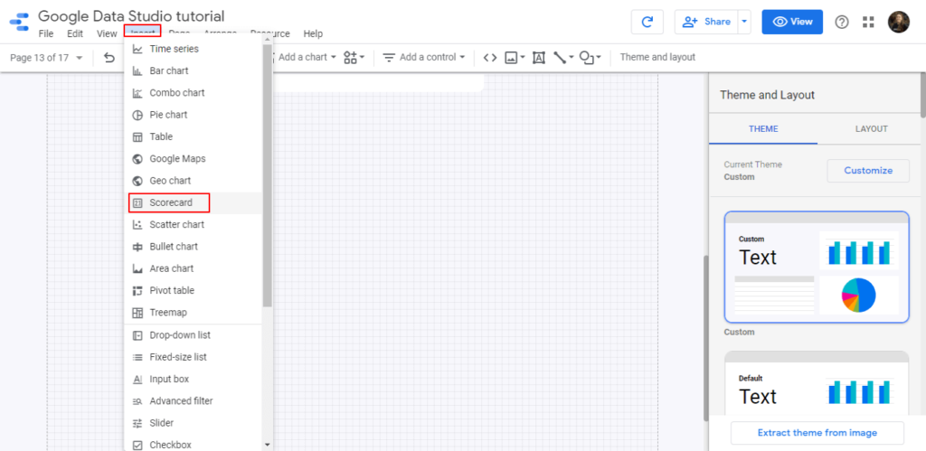
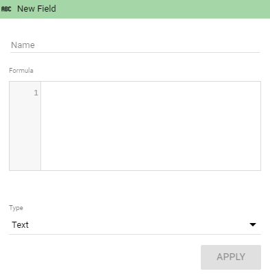
Now click on the Create field option.
You will see a modal that displays a tab to insert formulas and parameters to change a data type, set a comparison, or add a running calculation. We’ll explain each.
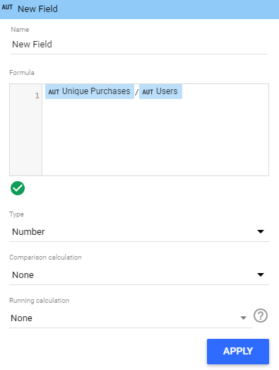
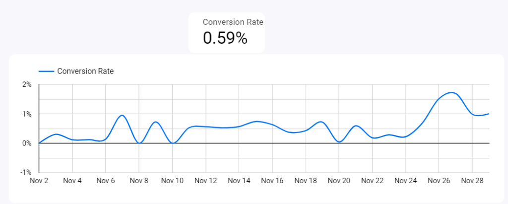
In this case, I will calculate a website conversion rate with the Google Analytics demo account in a way that is not offered by default: instead of conversions/sessions, it will be unique purchases/users.
So, I will type, exactly that:
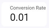
Once I click on Apply, I will see a new conversion rate value! But it’s expressed in decimals when it can be a ratio.
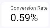
So in the data type I will set it as a percentage.
And here we have our new conversion rate!
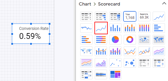
Quick tip: you can copy and paste your charts to duplicate them. I will do that and will change the chart type for a time series, so I can visualize the new conversion rate performance over time.
Remember that our custom metrics created on charts will only work for those charts, so we will create a new metric from the data source that can be replicated anywhere in the report (or other reports).
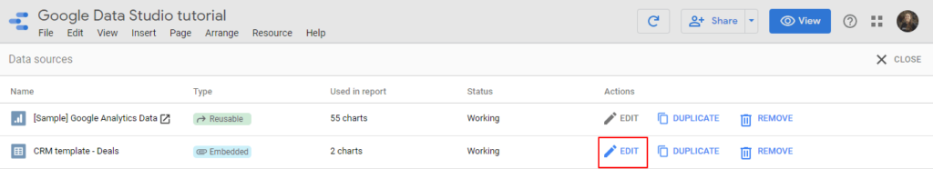
Go to Resource – Manage added data sources and edit the data source.
As we’re using the Google Analytics sample account, we cannot edit the data source, but you can do it with your own Google Analytics account or the Google Sheet we have connected.
Once you click on Edit, you will see an Add a field option. The setup is the same.

There are many more calculated fields examples on Google Data Studio.
Here you have a list of dozens of functions for Google Data Studio. Also, if you’re a Facebook Ads user and would like to report Cost per Lead, Cost per Purchase, or other cost-related metrics, we explain how to set up those calculated fields in this guide.
Case statements
Custom fields are not only for operating metrics. You can also run operations with dimensions.
You may set conditionals depending on the string value of a dimension.
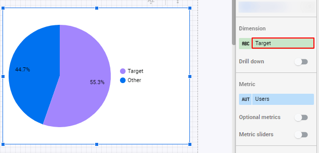
Let’s say that at Porter, we want to mainly target customers from the US, Canada, and the UK; we can get customers somewhere else, but they’re not our focus.
I’d like to know which percentage of our traffic corresponds to our actual target traffic.
So, if the traffic comes from the US, Canada, or the UK, I will call it “Target”; if not, I’ll call it “Other.
To do this, I will create a pie chart that displays Users as a metric. When choosing a dimension, choose Create field, instead.
To create conditionals, we will always start with a CASE statement. Why? Because that’s how SQL works.
Here’s the statement that we will use to say Google Data Studio—or any Business Intelligence tool that supports SQL—to get our query:
CASE
WHEN Country IN (‘United States’,’Canada’,’United Kingdom’) THEN ‘Target’
else “Other”
END
Let’s explain this formula:
- CASE: we declare that we’re starting a conditional statement
- WHEN: we use it on every line to define specific rules. We can have multiple WHEN in a single conditional statement
- Country: we’re declaring that the conditional will check this dimension
- IN: it’s an operator that allows you to specify multiple values in a WHERE clause. The IN operator is a shorthand for multiple OR conditions.
- (‘United States’,’Canada’,’United Kingdom’): we’re defining the criteria of our conditional. In this case, we wrap every value into quotation marks (‘’) and separate them by commas.
- THEN: we set the result if the condition is applied.
- ELSE: the result if the condition is not met.
- END: the case statement is ended.
Once you run this statement, you’ll see the result:
Let’s see another case statement example.
Breaking down data by the device is cool, but we can also display emojis, instead of text, by using this statement:
CASE
WHEN device category IN (‘desktop’) THEN ‘’
WHEN device category IN (‘mobile’) THEN ‘’
WHEN device category IN (‘tablet’) THEN ‘’
else “Other”
END
And this is the result:
Regular expressions
If you analyze data, you must know regular expressions.
The good news is that learning REGEX (how most refer to regular expressions) is not as hard as they sound; the bad news is that most non-technical people are reluctant to learn them as they seem complex.
As a result, the good news is that knowing regular expressions will give you a competitive advantage as most professionals avoid them.
REGEX on Google Data Studio
Regular expressions refer to characters you can use to make a query on string values (Strings are text).
In simple words, REGEX are commands that you write to “explain” a software complex queries. For instance, how would you tell a computer to return these results?
- Email addresses
- Words that start with “A” and end with “S”
- Sentences with more than three words
- All keywords that contain “Porter” (no case sensitive)
There are many use cases of REGEX for marketers on Google Data Studio. These are some real examples we have seen from customers:
- Grouping their Facebook Ads campaigns names by product to analyze their conversions and acquisitions costs.
- Breaking down branded VS non-branded searches on their SEO reports.
- Grouping web pages by brands
- Cleaning or simplifying URLs in their reports
- Fixing typos or variations of words in their reports
- Grouping all Facebook-related traffic sources like m.facebook, web.facebook, etc., into just “Facebook”
Just as you use mathematical operations to do queries that work with metrics or numerical values, you use REGEX to create queries from string values.
Google Data Studio offers three REGEX functions:
- REGEX_MATCH: it creates a value if a condition is met (like we show in this guide)
- REGEX_REPLACE: replaces a string that matches a condition for a new value that you define. It’s ideal to clean or transform your values
- REGEX_EXTRACT: it searches a string to remove it
REGEXP_MATCH
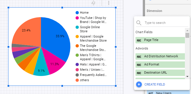
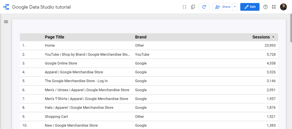
By using the Google Analytics sample account, we could group pages by their brand and content. This demo account connects with the Google Merchandise Store.
It turns out that Google offers merchandise from brands like Youtube, Android, and Google itself. It’d be great to break down our website traffic to find out the most demanded brand of the store.
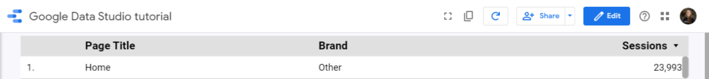
The REGEX that we would run will identify words like Google, Youtube, Waze, and Android in the Page Title value. Remember that we can only create this regex on charts individually and not the data source as we don’t have access to edit it.
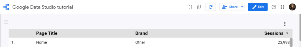
Let’s create a table whose dimension is Page title and the metric is Sessions.
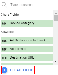
Then you will add a new dimension, but instead of adding a default dimension, you will create a new field.
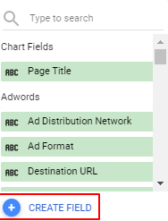
Our new field will be a regular expression. As we want to separate pages by brands, the dimension could be called “Brand.”
In this case, our expression would look like this:
CASE
WHEN REGEXP_MATCH(Page Title, ‘.*(?i)youtube.*’) THEN “YouTube”
WHEN REGEXP_MATCH(Page Title, ‘.*(?i)Android.*’) THEN “Android”
WHEN REGEXP_MATCH(Page Title, ‘.*(?i)Google.*’) THEN “Google”
ELSE “Other”
END
Let’s break down this expression:
- CASE: starts the case statement
- WHEN: starts a conditional
- REGEXP_MATCH: the function looks for a string that matches the value we look for
- Page Title: is the field that the conditional will check
- ‘.*(?i)youtube.*’: looks for the word YouTube anywhere in the string, not case sensitive
- ‘.*(?i)Android.*’: looks for the word Android anywhere in the string, not case sensitive
- .*(?i)Google.*’: looks for the word YouTube anywhere in the string, not case sensitive
- .*: this is the most common REGEX as it’s permissive: when added at the beginning and the end of the regular expression, it tells to look for a value anywhere in the string, from starting or from the end.
- (?i): removes case sensitiveness
- ELSE: the result if no condition is met
- END: ends the case statement
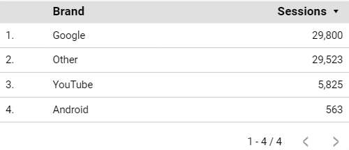
The result of our new field would look like this!
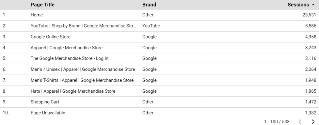
If you remove the initial dimension (Page title), you’ll see your data broken down by brand.
I can duplicate this chart and make it a pie chart:
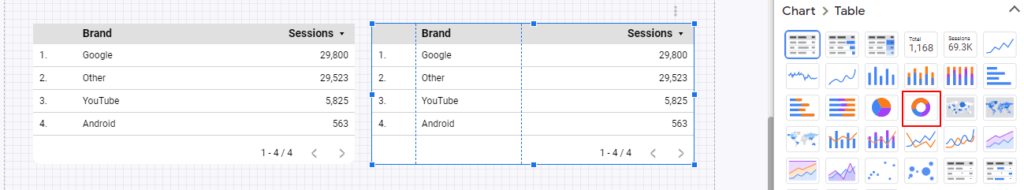
The vast majority of traffic goes to Google-related products or pages with no brand names in their titles.
Blending data on Google Data Studio
One of the most powerful features of Google Data Studio is its ability to blend data sources.
With this feature, you could join data from multiple connectors and automate the process of calculating some KPIs that generally takes some manual effort.
A common use case would be combining your Facebook Ads and Google Ads data to calculate total ad spend and ROAS. For this use case, we have actually two Google Data Studio free templates.
- Facebook Ads + Google Ads Report Template On Google Data Studio
- Facebook And Google Ads Performance Data Studio Template (By An Ex-Googler)
Customizing your Google Data Studio reports style
Let’s add personality to your reports. You can customize your Google Data Studio reports entirely, making them look white-label.
We’ll share some tips and features to impress your audience and tell the big story with your visualizations.
Customizing your Google Data Studio report theme
You can customize your report’s main elements, like, the background and the default colors of your visualizations.
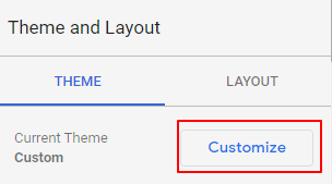
Go to the edit mode on your report and click anywhere in the canvas where there is not a chart. You will see a Theme and Layout window.
You’ll find a set of default options Google Data Studio already brings to change your report theme.
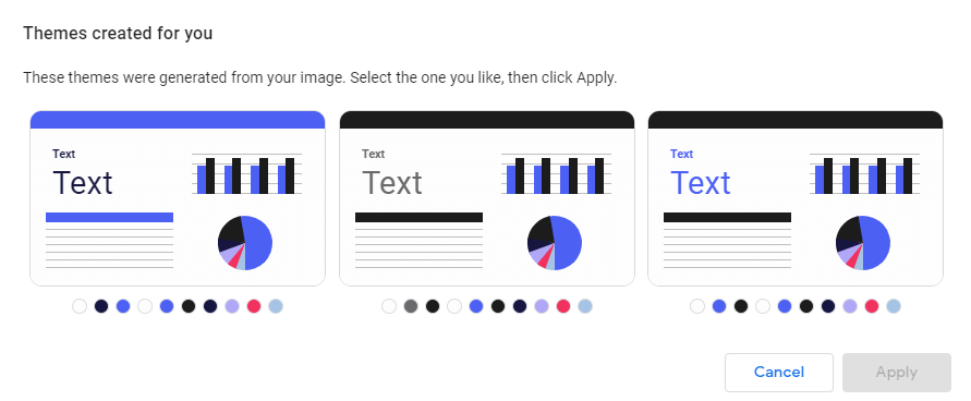
A cool feature is Extract them from image, which lets you grab the colors of an image like, for instance, a screenshot of your website so you can automatically add your brand colors on your Data Studio reports.
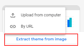
Once you drop an image—or a URL that points to an image—, it will show three suggestions of themes based on the colors of the image.
If default themes or themes extracted from images are not enough, you can go to customize all the elements within your Data Studio reports by going to Customize in the Theme tab.
- Report background-color
- Font family, color, and size
- Charts backgrounds and borders
- Charts color palettes
- Enabling/disabling chart headers
Here are some examples of reports layouts:
Report layout
The layout setup is, to me, an underrated feature of Google Data Studio.
For those asking if Google Data Studio view mode can be mobile-friendly, can be white-label, or make navigation smooth even for end-users not familiar with the BI tool, yes it is.
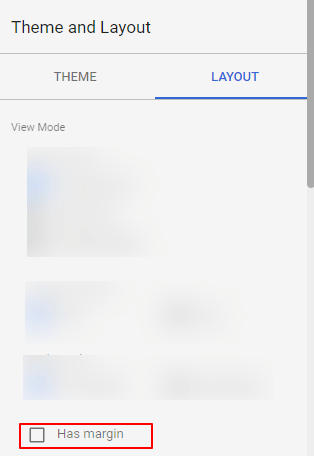
Just as you did with the Theme setup, click on a blank space in your canvas, and select Layout.
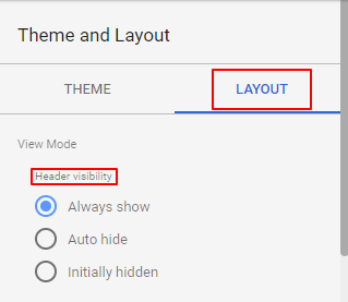
First, we can change the header visibility.
Here’s how the Always show option looks like:
Auto-hide:
Initially hidden, which shows the header by hovering the top of the report.
We can also change the navigation position.
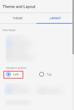
Chances are that users not familiar with Google Data Studio won’t find your report pages, so I’d encourage you to display the navigation menu on the left so they can browse between pages.
The display mode lets your report adapt to different screen sizes.
You can opt to have a fixed size by choosing Actual side.
Your report can also adapt to any device by choosing Fit to width.
And if you disable the margin, your Data Studio will display fully on the screen (so it doesn’t look like Data Studio).
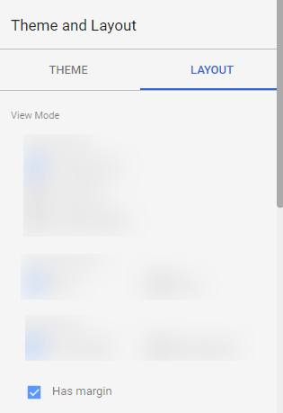
Finally, we can set up the Canvas size to make your report as large or small as you need it.
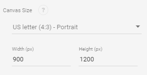
As for 2020, Google Data Studio is not responsive, but it can be mobile-friendly, by making your report layout to fit width, disabling the margin, and setting the proper dimensions (600*1500 works fine).
Here it is a Google Data Studio template with mobile-like dimensions.
Charts styling
To find the styling setup, click on a chart and go to the Style.
Every chart type offers a different styling setup, so we encourage you to navigate them.
Yet, some configurations are consistent across all visualizations on Data Studio, such as:
- Chart colors
- Decimal precision of the data
- Labels colors, size, and fonts
- Elements position (left, centered, right)
- Background and border colors, radius, and weight
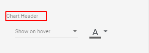
- Chart header
- Missing data options (displaying 0, no data, blank, null, etc.)
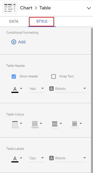
Chart headers
Yet, you can use headers to display optional metrics and drill-downs and display them always or by hovering over.
Google Data Studio headers disappoint some users that expect to be able to title their charts. You can’t. To add titles in the headers, you must use a text element.
Conditional formatting
Just as with Google Sheets, you can change the colors of your data based on your values.
This way, you can know if your KPIs are going well or wrong (in green and red, respectively, generally).
We can use conditional formatting on scorecards and tables.
Let’s do it this time with a table.
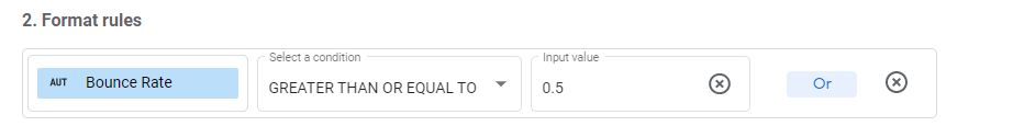
In this case, I want to highlight the webpages whose bounce rate is above 50% to spot pages that need improvement.
To do it, click on the table, go to Style, and choose conditional formatting:
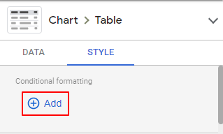
You can create a rule at a time and use color scales or single color as color type.

I’ll choose a single color to highlight the first pages whose bounce rate is over 50% in the format rules, like this:
And the color and style like this:
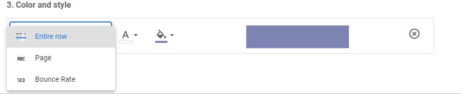
You can choose to color the value, the entire row, or the dimension (page, in this case).
This is the result:
Reference lines
Reference lines on Google Data Studio let you compare current values against a benchmark or target, and you can display them on time series, bar charts, and area charts.
Just like we did with conditional formatting, we will highlight the pages whose bounce rate is over 50%.
Create a bar chart whose metric is Bounce rate and dimension is Page.
Then, we will go to Style.
Optionally, display the bar chart horizontally.
And set a Reference line like this:
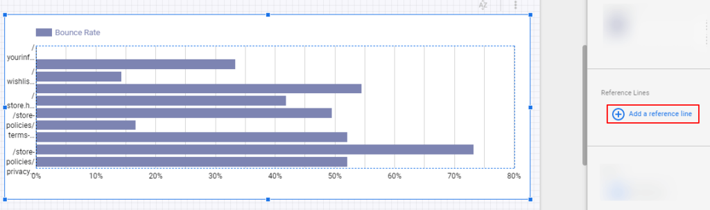
- Type: constant value (it can be another metric or a parameter)
- Value: 0.5
- Label: max bounce rate
A great example and use case of conditional formatting and reference lines is our website speed insights Data Studio template dashboard, which displays the 7 core website speed metrics, and highlights with colors if they’re above or below a benchmark.
Reports elements
Besides charts and controls, you can add images, shapes, text, and hyperlinks to your Google Data Studio report.
Go to Insert, and find these elements at the bottom of the list.
With them you could, for instance, add a margin for your report to display a clickable logo and a menu.
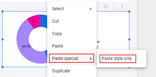
Copy-pasting styles
You don’t need to set up every chart styling. Just copy a chart and, when clicking another one, do a right-click, and choose Paste special – Paste style only.
Report elements arrangement
Like Google Slides, you can choose the order of your elements on Google Data Studio, to choose which one is in front, or which one is in the background.
A time-saving feature is making charts and elements report-level and page-level.
In this case, we will select the rectangle, logo, menu, and time range filter to make them report level.
The result is that these elements will show up in the same positions on all pages of your reports.
Once you select the elements, right-click and choose Make report level.
User management: sharing your reports
Once we have created and designed our dashboards, it’s time to decide who will access them.
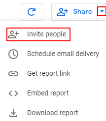
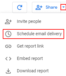
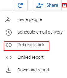
You can find all the sharing options in the top-right corner of the page, by clicking the arrow beside the +Share button.

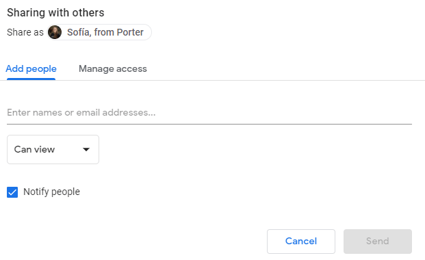
Invite people
This is the standard way to manage users across Google products.
In the Invite people tab, you can give viewer or editor permissions to users by typing their Google email address.
- In the Manage access, you can define the level of access of those who land to your report through a link.
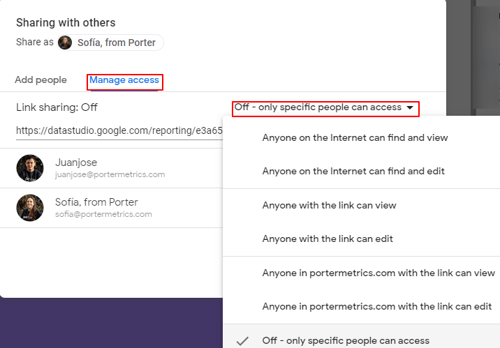
- If you want to create a report to share with your company, restrict access to only those with your business email address.
- If you’re planning to share these reports with multiple stakeholders, let anyone with the link can view (or edit)
- If you want to create Google Data Studio templates with others, let anyone on the internet can find and view. With this option, your Data Studio reports will be indexed by Google’s search engine.
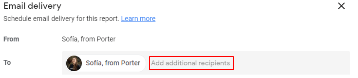
Schedule report email delivery
By far, this is my favorite option to share reports. You can schedule to send reports via email.
First, choose the emails to whom you want to send the reports.
Optionally, you can personalize the email subject and message.
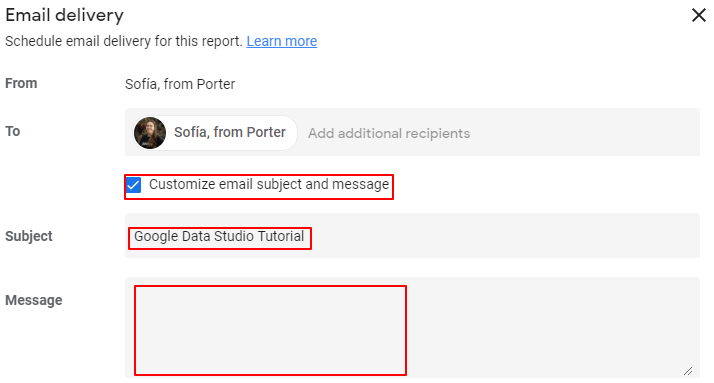
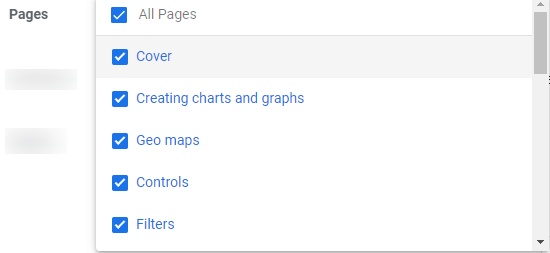
You can also filter the pages that you want to show on the reports.
Then, you can choose the day, hour, and periodicity to send your reports.
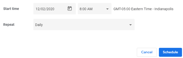
Once scheduled, recipients will get a snapshot of their reports, a link to access it on Data Studio, and a PDF version.
Get report link
The simplest way to share a Data Studio report is through copying and pasting a report link.
Embed your report on a website
You can insert or embed your Google Data Studio on any website (WordPress, Wix, Shopify, etc.). Go to Embed report, define the dimensions, and generate a script that you only need to paste on an HTML canvas.
This is an example of an embedded Data Studio report:
Download report as PDF
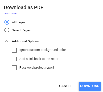
Click on Download report.
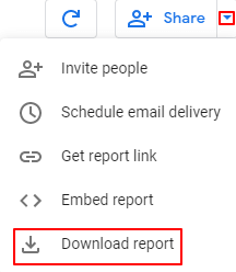
You can choose these configurations:
- Choosing the pages you want to send
- Attaching a link on the PDF to direct to the Data Studio report
- Add a password to access the report