To connect Twitter Ads to Google Data Studio (formerly Looker Studio), go to Create report (or to the Data Studio community connectors gallery), choose the Twitter Ads integration by Porter Metrics, connect your Google account, connect your Twitter profile, choose your ad accounts, see the list of fields available, and generate a default report template to monitor your campaigns performance and automate your marketing reports.
By the end of the tutorial, you’ll know:
- 3 free and paid ways to connect Twitter Ads to Data Studio
- Customize your Twitter Ads reports
- Available Twitter Ads metrics and dimensions
- Custom Twitter Ads metrics and dimensions
- Free Twitter Ads Report templates for Google Data Studio
Free and paid ways to connect Twitter Ads to Data Studio
You can connect Twitter Ads to Data Studio through a connector (suggested for this tutorial), or importing data first to a Google Sheet automatically or manually.
As an additional resource, learn to connect any data to Data Studio, or, if you present any problems during the setup, go to our troubleshooting guide.
Twitter Ads connector for Data Studio
The advantage of using a direct connector is that you can create charts by freely combining metrics and dimensions, without managing queries or Sheets in between, making it faster and easier to build reports.
In a nutshell, follow these steps when using a Twitter Ads connector for Data Studio.
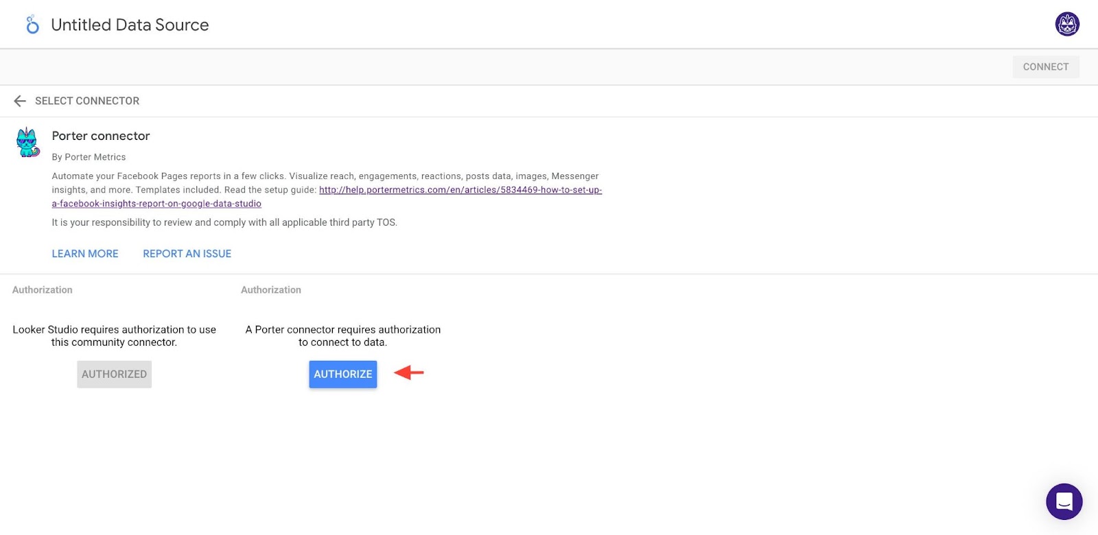
Go to the Porter Metrics onboarding or the Google Data Studio connectors gallery and choose the Twitter Ads connector (by Porter).
Connect the same Google account you’re using on Google Data Studio.

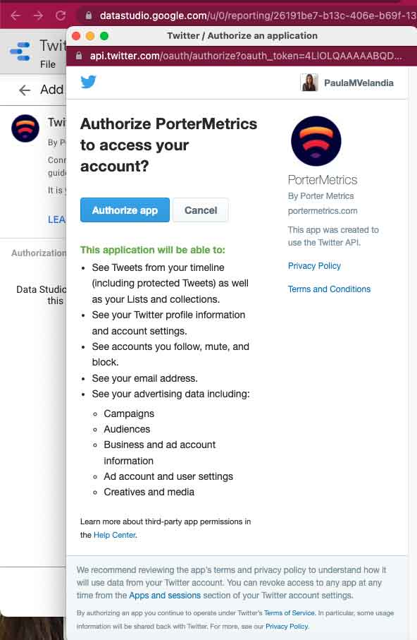
Click on Authorize to connect Porter and Twitter..
Connect the Twitter profile with access to your ad accounts. It doesn’t need to be the same one as the one from Google.
Optionally, connect other Twitter profiles to connect Twitter Ads accounts your profile doesn’t have permissions for.
Close the authentication popup and go back to Data Studio.
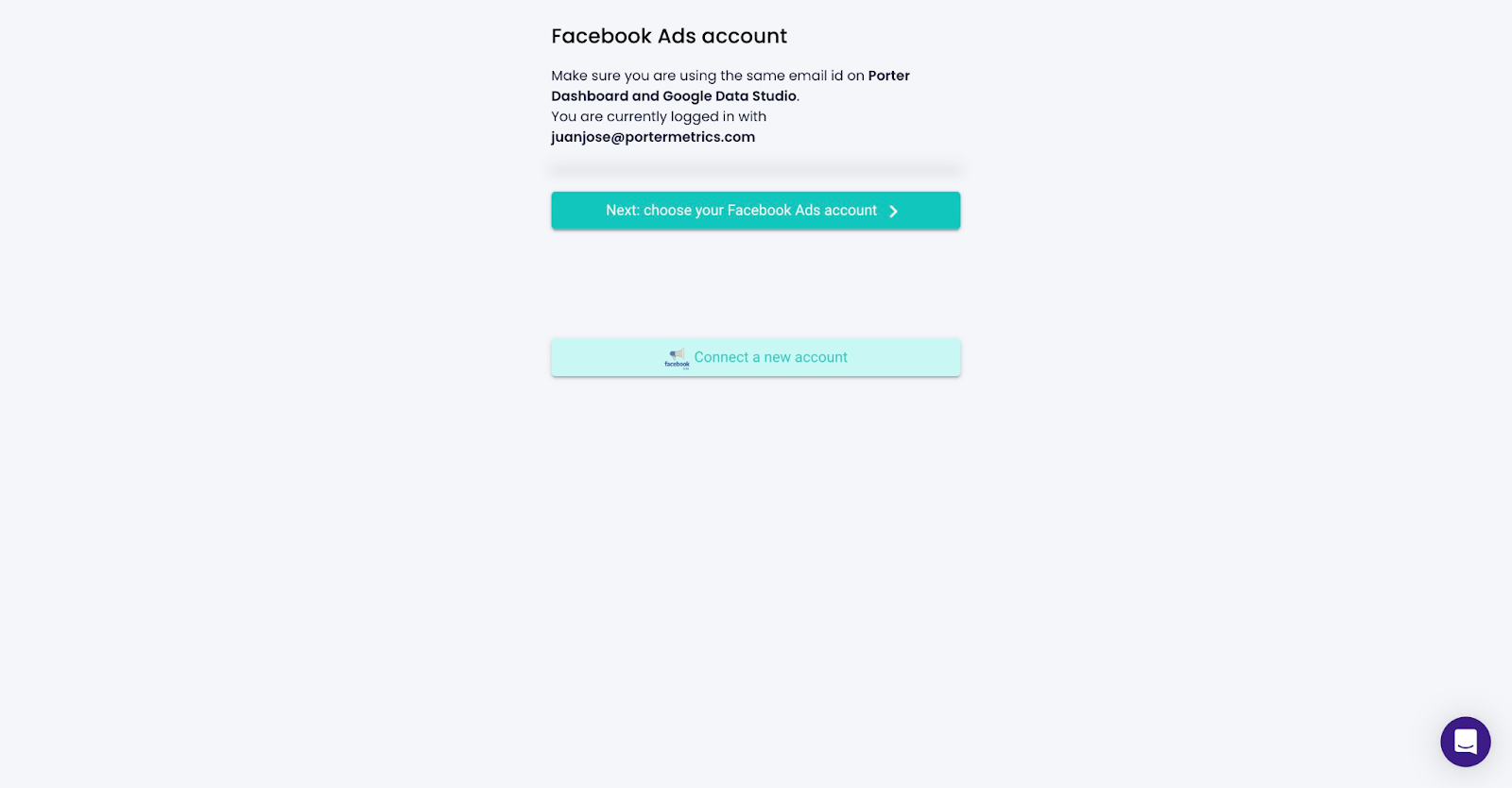
Choose the ad account(s) to add to the report, include the data from the Twitter Audience Platform, include data from deleted Promoted tweets, media creatives, ad groups, campaigns, and funding instruments., and click on Connect.
See the fields and go to Create report.

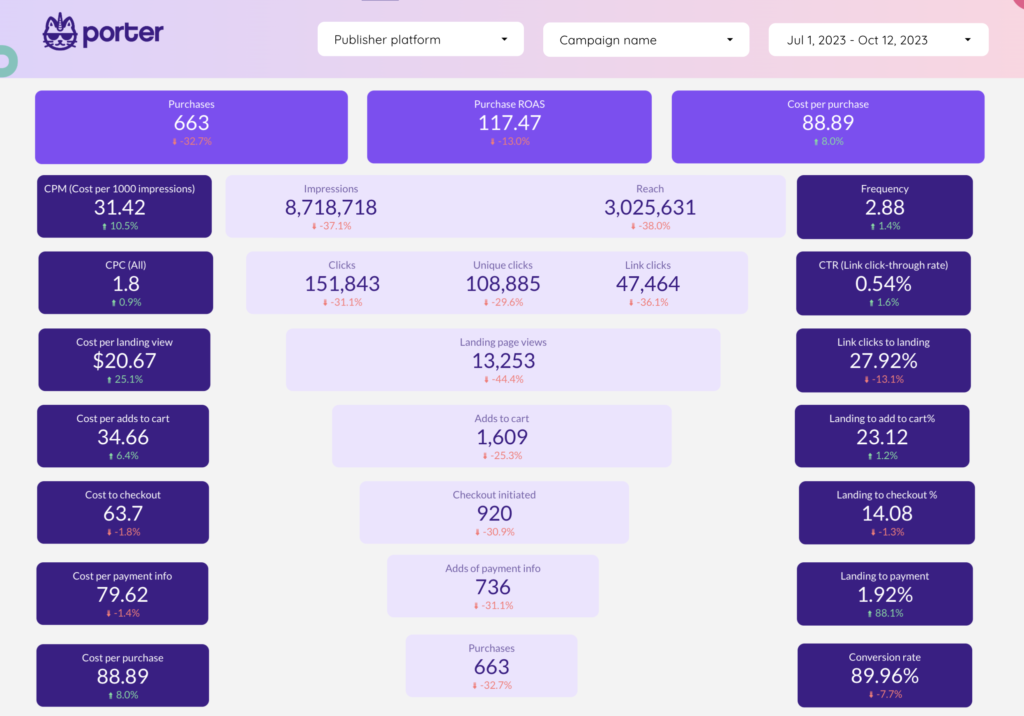
Download our free Twitter Ads report template for Data Studio, and start a 14-day free trial:
Importing Twitter Ads data on Google Sheets
The advantage of using Google Sheets as integration is instant load time when querying small amounts of data, and guaranteed stability, as you’re using Google’s native integrations.
With Sheets, also, you can edit your data. For instance, you could set goals, agency markups or commissions.
As a downside, connecting to Google Sheets first hinders the use of templates and removes data granularity (i.e. freely combining metrics and dimensions when creating charts).
Use the Porter Metrics Google Sheets add-on to automatically import your Twitter Ads data on a Google Sheet to later connect that Google Sheet to a Data Studio report.

Uploading a CSV file
As a free option, manually download your Twitter Ads data as a CSV file and import it on a Google Sheet, but:
- Data won’t refresh and update automatically
- Up to100 uploads
- Max 100MB per CSV
- All CSV files structure must be identical

Customize your Twitter Ads reports
To continue with the report setup, you can add a new page on the report template just downloaded, or create a new report from scratch, and go to the Edit view.

If you opt to create a new report, here’s how to connect again your data on Data Studio.
Adding charts
Add scorecards, time series, tables, pie charts, and more chart types to visualize your data.
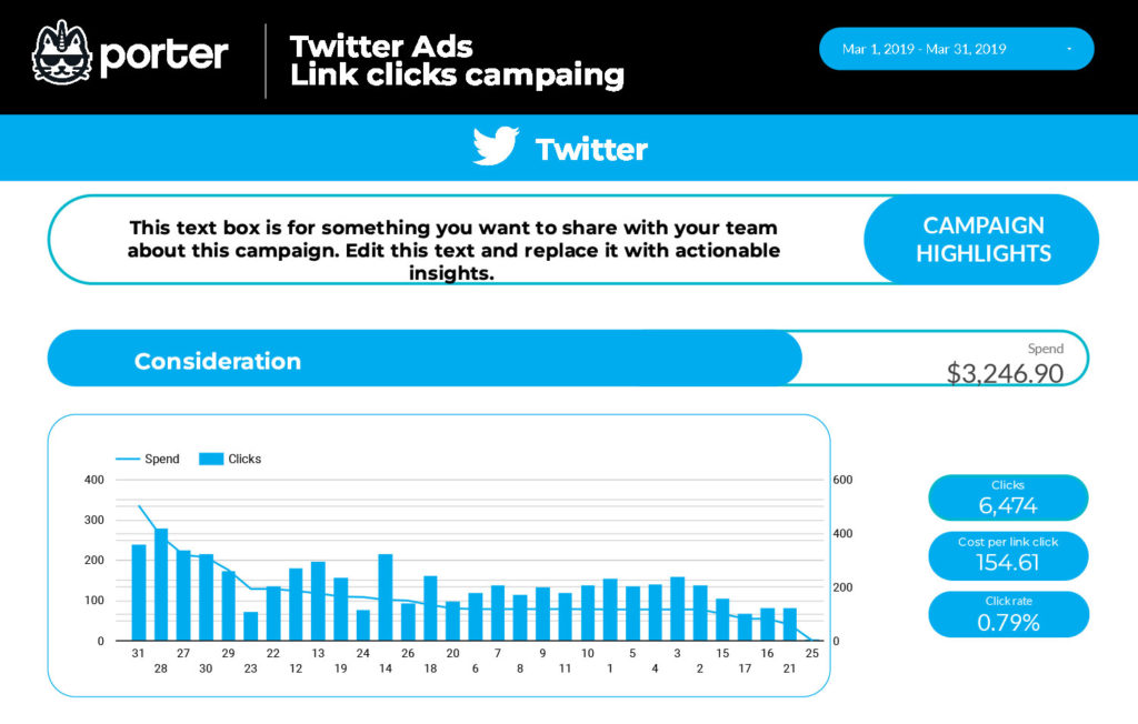
Scorecards
Scorecards are the most simple way to display your data, by only showing a metric.
Go to Insert, choose a scorecard, and paste it in the canvas.
We’ll use Spend as the metric that corresponds to ad spend on Twitter Ads.
Create 2 more scorecards by repeating the process or copy-pasting the original scorecard.
Optionally, use Clicks and Impressions, Retweets, or +100 fields.
Time series
Time series charts are useful to visualize trends over time.
Go to Insert – Time series.
Use date as date dimension. Use Spend as the metric.
Optionally, use other date dimensions like month, week, day of week.
Tables
Tables are the most flexible and complete way to visualize data, letting you add as many metrics and dimensions as you want.
Go to Insert – Table.
Use Campaign name and Tweet image as dimension; Use Spend, Clicks, Retweets, and Impressions as the metrics.
Bar charts, pie charts, and maps
Both bar charts and pie charts let you visualize your data by breakdowns. Bar charts are better for cardinal and ordinal data; pie charts are better for nominal data.
Go to Insert – Pie chart.
- For the bar chart, use Objective as the dimension.
- For the pie chart, use Placement as the dimension.
- For the map, use Country as the geo dimension.
As metrics use Spend, Clicks, Tweets,, Impressions, or any of your preferences but conversions. ,
Comparisons
Add goals, reference lines, or conditional formats to compare your data and add context.
Comparison date range
Select the scorecards and set Previous Period as the comparison date range.
Reference lines
Select the time series Go to Style – Add a Reference line, choose Metric as type, and Average, as aggregation.
Conditional formatting
Select the time series Go to Style – Conditional formatting, choose Color scale and any metric.
Adding controls
Use dropdowns, search bars, data range controls, or parameters to make your reports interactive by applying filters. Learn more about controls.
Date range controls
Go to Add a control – Dropdown. Choose Date range control to visualize your marketing data daily, weekly, monthly, etc.
Dropdowns
Go to Add a control – Dropdown. Choose Campaign name or Tweet type as the dimensions to filter your data by Tweet or campaign.
Design
To influence your team or clients, design and white-label your marketing dashboards. Also, follow our recommendations on designing marketing reports.
Shapes
Use rectangles or circles to draw sections or headers. Right-click the rectangle – Order – Send to back.
Text
Use text to add headers, chart titles, or complementary analysis or comments to your charts.
Go to Text on the Data Studio menu and paste it in the header of the report. Customize the font family and size.
Colors
Customize the colors of every single chart.
Select the scorecard and go to Style. Change the value size, colors, backgrounds, and borders.
Optionally, select and copy a chart, and copy-paste its style in another chart with right-click – paste special – Paste style only.
Logo
Change the current logo or add your own by choosing Image and uploading a PNG file.
Theme and layout
Change your report’s canvas size, navigation menu, background colors, and default charts’ style.
To customize the theme, go to Theme and Layout – Theme. Choose one of the default templates or customize it.
To customize the layout, go to Theme and Layout – Layout.
- View mode: set the header visibility to Initially hidden; set the navigation type to the left; and set the mode to fit to width and remove the margin to make your report mobile-friendly.
- Canvas size: we’d suggest 1024×768 for a slide view, or 900×1200 for a vertical view.
Navigation
You can create multiple pages for your report, divide them by sections, and add icons.
Go to Page – New page. On Page settings, you can do any customization at a page level, without impacting the whole report.
Share
Share your Google Data Studio reports with an audience through permissions, links, embeds, PDF, or email schedules.
Permissions
Grant editor or viewer permissions to users with Google accounts within or outside your company.
Schedule delivery
To schedule an automatic report delivery, go to Share – Schedule delivery.
Set the subject, recipients, pages, filters, start date, and frequency to send your reports via email.
Download PDF
Download a PDF version of your reports and, optionally, exclude pages.
We encourage you to take our Google Data Studio tutorial for marketers and learn to present your marketing reports.
Twitter Ads metrics and dimensions
As reference, see the Twitter Ads fields list and suggestions for choosing Twitter Ads KPIs.
The Twitter Ads connector for Google Data Studio offers all the +200 metrics and dimensions available on the Ads API, including:
Twitter Ads metrics
- Conversion: Twitter offers custom and standard conversions (and values) for purchases, signups, leads, etc., in both mobile and web.
- Engagement: engagements, retweets, replies, for video, cards, posts, and ads.
- Visibility: Impressions, reach
For analyzing Twitter Ads data with breakdowns, some popular use cases are:
- Ad spend and pacing (Hourly, daily tracking)
- Campaign, Tweets and cards monitoring
- Best-performing creatives
- Peak hours with heatmaps
- Audience analysis (Gender, age, location, devices)
Custom Twitter Ads metrics and dimensions
Often, you need to calculate your own metrics:
- You have a different way to calculate formulas
- Need to clean and filter data
- Need to combine from other data sources
To analyze Twitter Ads data and get accurate marketing KPIs, customize metrics on your Data Studio reports.
Custom metrics with calculated fields
With Google Data Studio, you can create custom formulas like done on Sheets. With Twitter Ads data, some popular use cases include calculating your own:
- Conversion rate
- Cost per Acquisition (CPA)
- ROAS
- Custom goals and budgets
- Total conversions and Spend
Custom dimensions with REGEX
Regular Expressions (or REGEX) on Google Data Studio let you create custom dimensions to tag or group your data in ways not available by default from the data sources.
Some popular use cases of REGEX for Twitter Ads are grouping Tweets or campaigns by client, product, funnel stage, hashtags, or business line.
Clean your data with filters
Set filters at chart, page, or report level.
Select the scorecards (or any chart), go to Setup – Add a filter.
Name your filter, set to Include, Placement that CONTAINS “PUBLISHER_NETWORK”.
With this filter, you’ll visualize your performance only from the Publisher Network from Twitter.
Blend data for cross-channel reporting
To fully visualize your funnel or calculate general marketing KPIs accurately, you may need to blend data on Data Studio from ads, social media, CRM, e-commerce, or GA4.
For Twitter Ads, some use cases of data blending include:
- Blending Twitter Ads + GA4 to track actual CPA and conversions
- Cross-channel reporting on Google Data Studio
- Blending Twitter Ads + Google Ads to calculate total ad spend, clicks, and conversions
- Combining Shopify sales data with Twitter Ads spend to calculate CPA and ROAS
- Blending HubSpot and Twitter Ads data to calculate actual CPL
Free Twitter Ads report templates for Data Studio
To download a Google Data Studio report template, go to the report, click on the ellipsis icon in the top-right-corner, click on Make a copy, connect a new data source that matches the original data source, and Copy report.
Suggested Twitter Ads report templates for Data Studio: