
The best free Data Studio templates in 2026 are Google Ads, Meta/Facebook Ads, PPC Multi-channel, SEO, Google Analytics 4, Social Media, Shopify, Cross-channel Marketing, Instagram Insights, HubSpot CRM, YouTube, TikTok Ads, LinkedIn Ads, E-commerce, Google Business Profile, and Email Marketing dashboards — all free, white-label, and ready to use in minutes.
We’ve built and tested over 100 Data Studio templates at Porter Metrics over the past 6 years, used by +10,000 marketing teams and agencies in 60 countries. This guide covers the 16 best templates across paid advertising, SEO, social media, e-commerce, and cross-channel marketing — each one hand-picked because it solves a specific reporting need that marketers actually have.
Quick answer — Best free Data Studio templates in 2026
- Google Ads Dashboard — Campaign performance, spend tracking, and ROAS
- Meta/Facebook Ads Dashboard — Ad performance across campaigns, audiences, and creatives
- PPC Multi-channel Dashboard — Unified view of Google Ads + Meta Ads + TikTok + LinkedIn
- TikTok Ads Dashboard — Campaign spend, conversions, and video ad performance
- LinkedIn Ads Dashboard — B2B ad campaigns with lead gen metrics
- SEO Dashboard — Organic traffic, keyword rankings, and Search Console data
- Google Analytics 4 Dashboard — Website traffic, events, conversions, and user behavior
- Google Business Profile Dashboard — Local visibility, reviews, and map performance
- Social Media Dashboard — Multi-platform social performance in one view
- Instagram Insights Dashboard — Followers, engagement, Reels, and Stories analytics
- YouTube Dashboard — Video views, subscribers, and audience retention
- Shopify Dashboard — Orders, revenue, AOV, and product-level analytics
- E-commerce Dashboard — Multi-source e-commerce with Shopify + Google Analytics
- Cross-channel Marketing Dashboard — All channels unified: ads, SEO, social, and web
- HubSpot CRM Dashboard — Contacts, deals, pipeline, and email marketing
- Email Marketing Dashboard — Opens, clicks, unsubscribes, and campaign performance
All templates free and white-label ready. Browse all 110+ templates →
Disclosure: I’m Juan, founder of Porter Metrics. We build Data Studio connectors and templates. Every template in this list is free and available to use — connecting your data through Porter gives you automatic data blending, scheduled refreshes, and one-click setup.
Quick Comparison Table
Here’s how all 16 templates stack up at a glance:
| Template | Best For | Data Sources | Setup |
|---|---|---|---|
| Google Ads Popular | PPC managers tracking campaign ROAS | Google Ads | 2 min |
| Meta/Facebook Ads Popular | Social advertisers and agencies | Meta Ads | 2 min |
| PPC Multi-channel | Teams running ads on 2+ platforms | Google Ads, Meta, TikTok, LinkedIn | 5 min |
| TikTok Ads | D2C and e-commerce brands on TikTok | TikTok Ads | 2 min |
| LinkedIn Ads | B2B marketers and agencies | LinkedIn Ads | 2 min |
| SEO Popular | SEO teams tracking organic growth | Search Console, GA4 | 3 min |
| Google Analytics 4 | Website owners and marketing managers | GA4 | 2 min |
| Google Business Profile | Local businesses and multi-location brands | Google Business Profile | 2 min |
| Social Media Popular | Social media managers | Facebook, Instagram, LinkedIn, TikTok | 5 min |
| Instagram Insights | Instagram-focused brands and influencers | Instagram Insights | 2 min |
| YouTube | Content creators and video teams | YouTube Analytics | 2 min |
| Shopify | Shopify store owners | Shopify | 3 min |
| E-commerce | E-commerce marketing managers | Shopify, GA4, Meta Ads | 5 min |
| Cross-channel Most Complete | Marketing directors and CMOs | All marketing channels | 10 min |
| HubSpot CRM | B2B sales and marketing teams | HubSpot | 3 min |
| Email Marketing | Email marketing teams | HubSpot, Mailchimp, ActiveCampaign | 3 min |
All templates are free and white-label ready. Setup time assumes data source accounts are already connected.
What is Data Studio?
Data Studio (formerly Looker Studio) is Google’s free data visualization and reporting tool. It connects to multiple data sources — Google Analytics, Google Ads, Google Sheets, BigQuery, and hundreds of third-party platforms through connectors — and turns that data into interactive, shareable dashboards.
Data Studio templates are pre-built dashboards that you copy and connect to your own data. Instead of building charts, tables, and scorecards from scratch, you start with a professional layout and just swap in your data sources. This saves hours of design and configuration work.
1. Save 5-10 hours per report. Templates come with pre-configured metrics, dimensions, calculated fields, and chart types already set up.
2. Follow reporting best practices. Each template includes the KPIs and views that marketing professionals actually need, not guesswork.
3. White-label ready. Most templates can be rebranded with your logo, colors, and client branding in minutes.
4. Always up to date. Once connected, your dashboard refreshes automatically with live data.
How to Choose the Right Data Studio Template
Not every template fits every use case. Here’s what to consider:
| Criteria | What to Look For |
|---|---|
| Data source | Make sure the template connects to the platform you use. Non-Google sources need a connector like Porter Metrics |
| Audience | A client presentation template looks different from one for internal daily monitoring |
| Single vs. multi-source | If you only need Google Ads data, use a single-source template. For cross-channel, use templates with data blending |
| White-labeling | For agency reporting, choose templates that support custom logos and brand colors |
| Depth vs. overview | Some templates give high-level KPIs for executives; others drill down to keyword or creative level |
The 16 Best Free Data Studio Templates in 2026
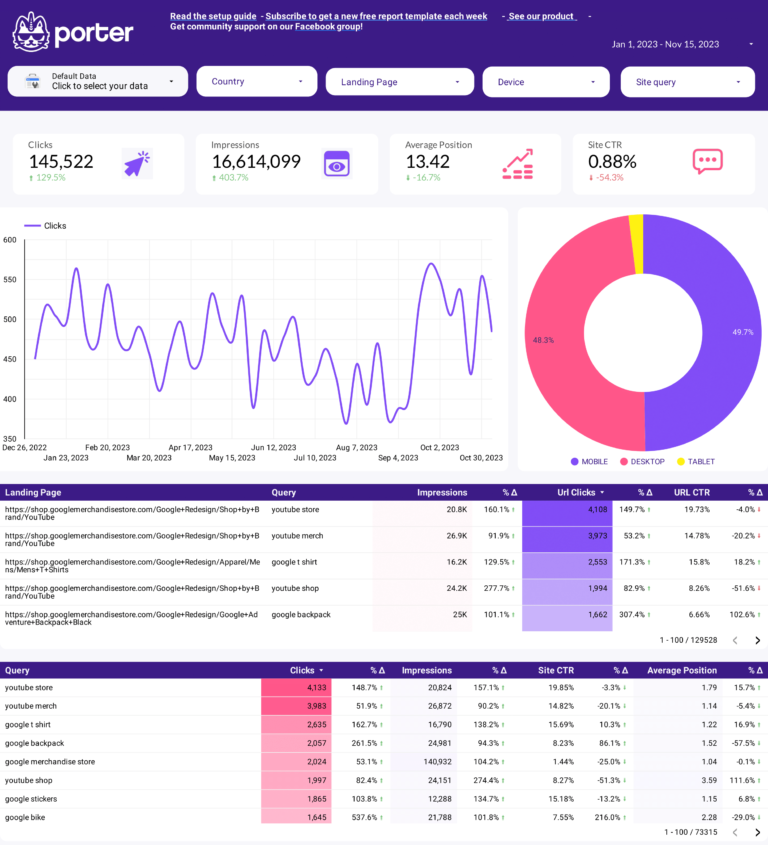
Google Ads Dashboard Template 
Most Popular
The Google Ads Dashboard template gives you a complete view of your paid search and display campaigns. Track spend, impressions, clicks, conversions, CPC, CTR, and ROAS across campaigns, ad groups, and keywords — all updated automatically.
Designed for PPC managers who need to monitor campaign performance daily and report results to clients or stakeholders weekly or monthly. Includes campaign-level breakdowns, keyword performance tables, device and network segmentation, and time-series trends.
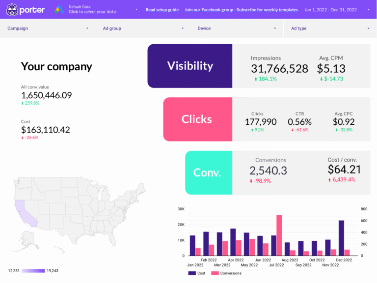
What’s included
- Campaign performance overview with spend vs. conversions
- Keyword-level CPC, CTR, and quality score tracking
- Device and network breakdowns (Search, Display, Shopping)
- Time-series trends for budget pacing
- ROAS and cost-per-conversion tracking
- White-label ready with custom branding
Best for
- PPC managers monitoring daily campaign performance
- Agencies reporting Google Ads results to clients
- Teams optimizing keyword bids and ad groups
Meta/Facebook Ads Dashboard Template 
Popular
Facebook and Instagram Ads in one view: reach and frequency (are people seeing your ads?), CTR and CPC (are they clicking?), conversions and ROAS (are they buying?). Segments by placement — feed, stories, reels — to show where each dollar works hardest across Meta’s platforms.
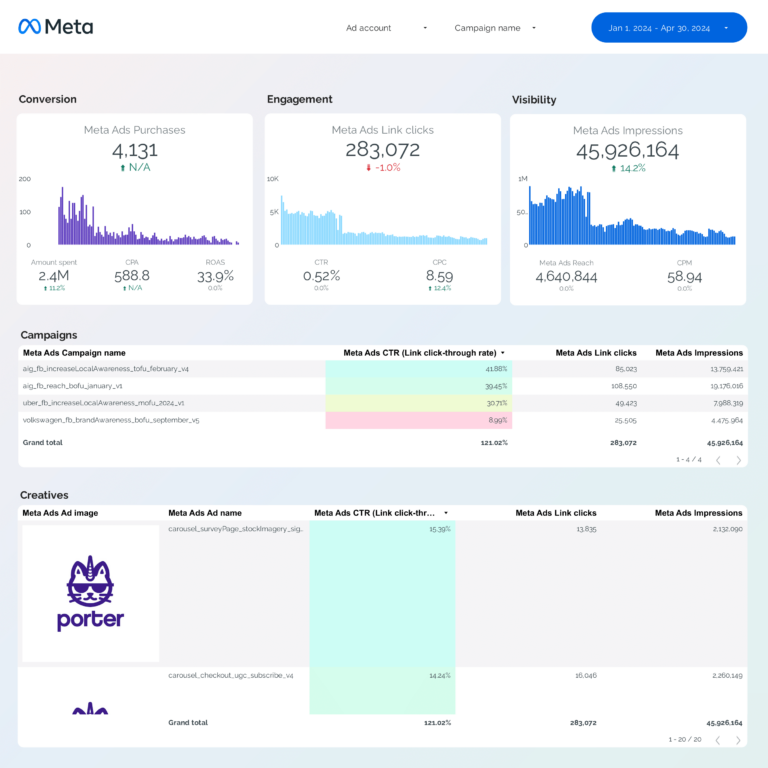
What’s included
- Campaign, ad set, and ad-level performance breakdown
- Creative performance with visual previews
- Audience demographics: age, gender, location
- Placement analysis (Feed, Stories, Reels, Audience Network)
- ROAS, CPA, and conversion funnel tracking
- Attribution window comparison
Best for
- Social media advertisers running Facebook and Instagram campaigns
- Agencies managing multiple Meta ad accounts
- E-commerce brands tracking Meta Ads ROAS
PPC Multi-channel Dashboard Template
Multi-source
Unifies data from Google Ads, Meta Ads, TikTok Ads, and LinkedIn Ads into a single dashboard. It automatically blends spend, impressions, clicks, and conversions across platforms using Porter’s data blending — so you can compare ROAS and CPA across channels without spreadsheets.
This is the template agencies and performance marketing teams use when they need one dashboard to show total paid media performance across all channels.
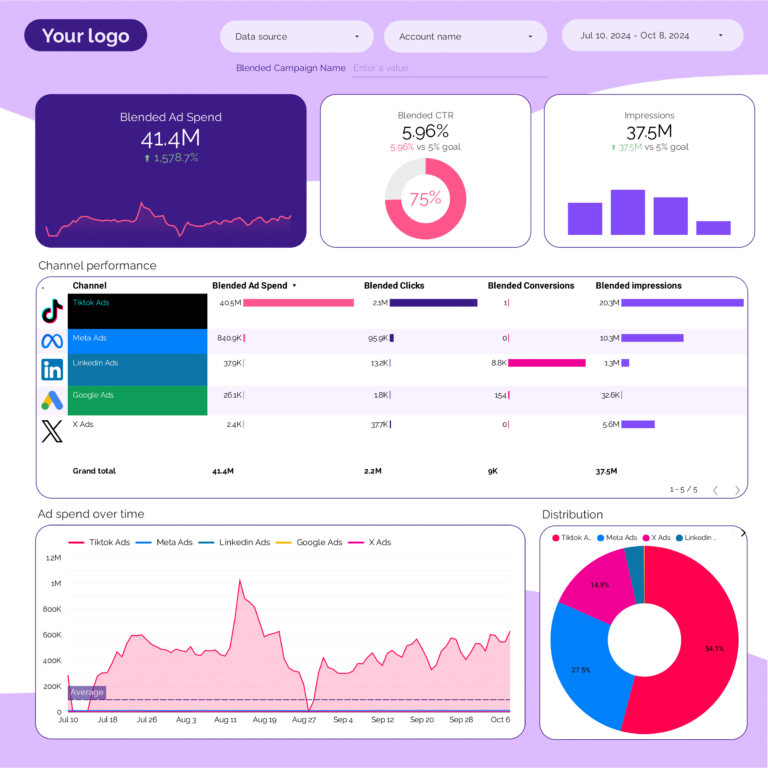
What’s included
- Unified spend, impressions, clicks, and conversions across all ad platforms
- Channel-by-channel ROAS comparison
- Automatic data blending (no manual joins or formulas)
- Campaign-level drill-down per platform
- Budget pacing and spend trends over time
Best for
- Performance marketing teams running ads on 2+ platforms
- Agencies reporting total paid media performance to clients
- CMOs comparing channel efficiency
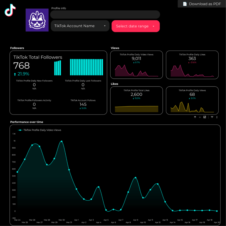
TikTok Ads Dashboard Template 
Built for D2C brands, e-commerce marketers, and agencies running TikTok campaigns. Track campaign spend, video views, click-through rates, cost per conversion, and ROAS — with creative-level breakdowns that show which videos are driving results.
LinkedIn Ads Dashboard Template 
LinkedIn Ads funnel for B2B: impressions by job title and company size (visibility to decision-makers), clicks and CTR (interest), leads and CPL (conversion). Shows whether the 3-5x higher CPCs on LinkedIn produce leads that justify the cost through higher close rates.

SEO Dashboard Template 
Most Popular for SEO
SEO funnel in Data Studio: Search Console impressions and keyword positions (visibility in Google), clicks and CTR (engagement from search results), organic sessions and conversions in GA4 (business outcomes). Connects ranking improvements to actual traffic and revenue gains.
This is the template SEO professionals and agencies use for monthly SEO reporting. Shows both search-side data (impressions, positions) and site-side data (sessions, conversions) to give a full picture of organic performance.
What’s included
- Keyword ranking tracker with position changes
- Top pages by organic clicks and impressions
- CTR optimization opportunities
- Organic traffic trends vs. previous period
- Branded vs. non-branded search split
- Page-level performance with conversion data
Best for
- SEO professionals tracking keyword rankings
- Content teams measuring organic content performance
- Agencies delivering monthly SEO reports
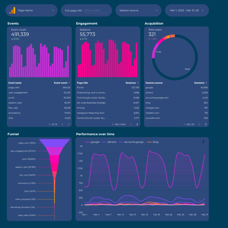
Google Analytics 4 Dashboard Template 
Designed for website owners and marketing managers who need a clear view of website performance. Track users, sessions, page views, engagement rate, events, conversions, and traffic sources — without navigating GA4’s complex interface. A much simpler way to read your GA4 data than the native reports.
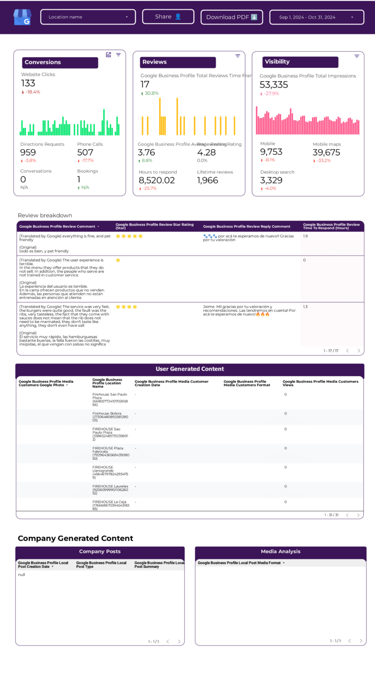
Google Business Profile Dashboard Template 
Google Business Profile funnel: search appearances and map views (visibility), direction requests, calls, and website clicks (engagement), and review volume and rating trend (reputation). Shows whether local search visibility converts into foot traffic and customer actions.
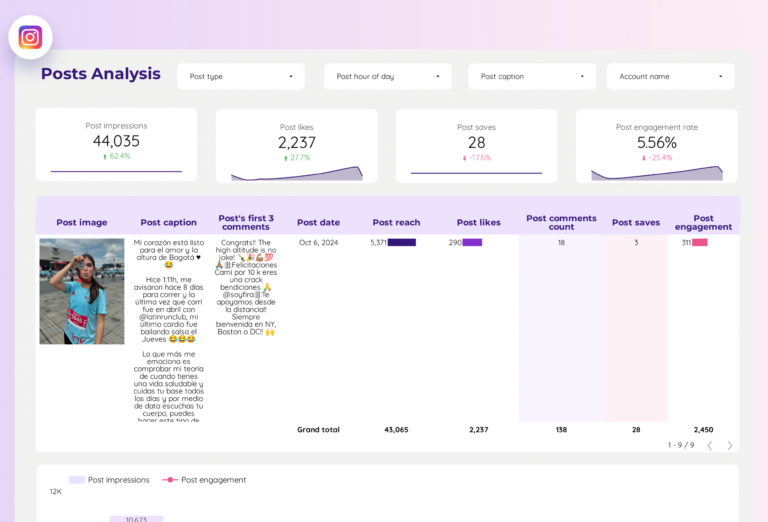
Instagram Insights Dashboard Template 
Covers everything for Instagram marketing: profile overview, feed posts, Stories, Reels, follower demographics, and engagement tracking. See which content types drive the most reach and engagement, and track follower growth over time.
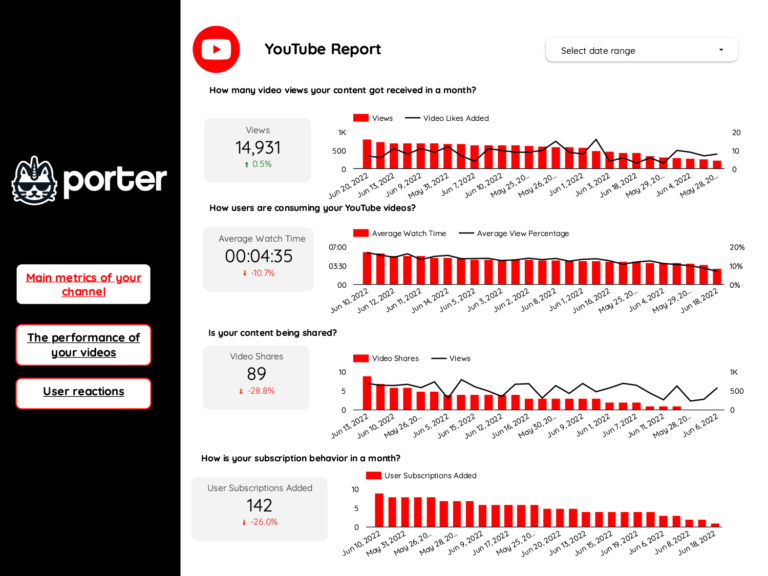
YouTube Dashboard Template 
YouTube funnel: impressions and thumbnail CTR (did they notice your video?), views and average watch duration (did they stay?), subscribers gained and traffic sources (did they commit?). Watch time retention curve tells you the exact second viewers lose interest.
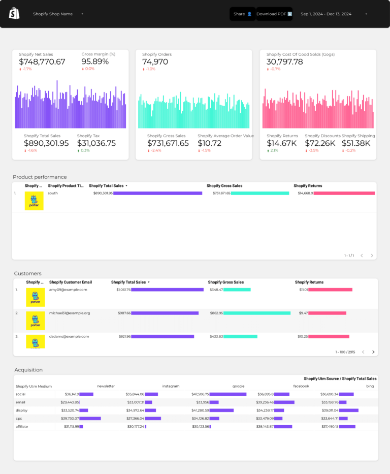
Shopify Dashboard Template 
Shopify store funnel: sessions and traffic sources (who arrives), product views and add-to-cart rate (what interests them), orders, revenue, and AOV (what they buy). Conversion rate from session to purchase is the number that tells you whether your store experience works.
E-commerce Overview Dashboard Template
Multi-source
E-commerce across platforms: combines Shopify sales (conversion data) with GA4 traffic (engagement data) and Meta Ads spend (acquisition cost). Shows the full picture — which marketing channels bring visitors that actually complete a purchase, and at what ROAS.
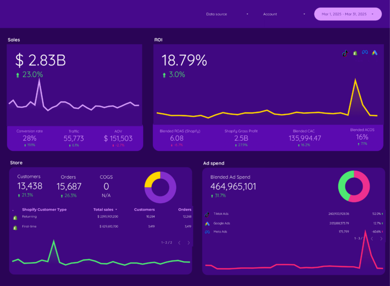
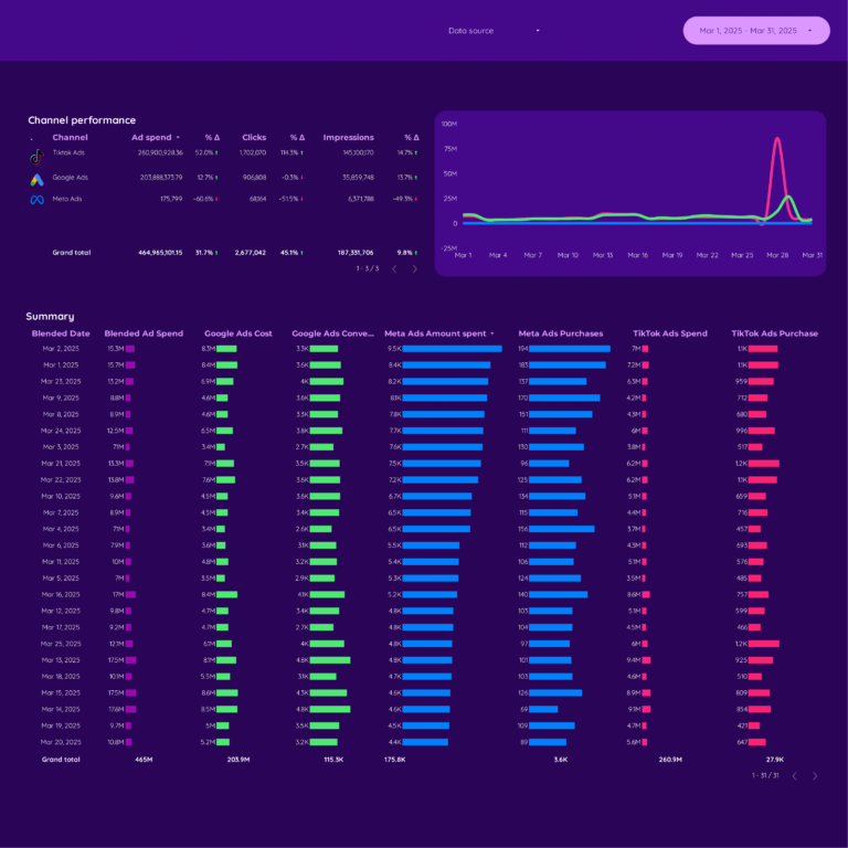
Cross-channel Marketing Dashboard Template
Most ComprehensiveAll marketing channels in one report: organic, paid, social, email, and referral — each measured on reach (visibility), engagement quality, and conversion contribution. Shows which channels drive revenue vs which drive vanity traffic. The executive view that informs budget allocation.
Uses Porter’s automatic data blending to unify metrics across platforms: total spend, total impressions, total clicks, total conversions, and overall ROAS — without manual data exports or spreadsheet formulas.
What’s included
- Total marketing spend and ROI across all channels
- Channel-by-channel performance comparison
- Unified conversion tracking from all sources
- Campaign-level drill-down per platform
- Organic vs. paid traffic split
- Executive summary page for stakeholder presentations
Best for
- Marketing directors and CMOs
- Agency owners reporting overall marketing performance
- Teams running campaigns across 3+ channels
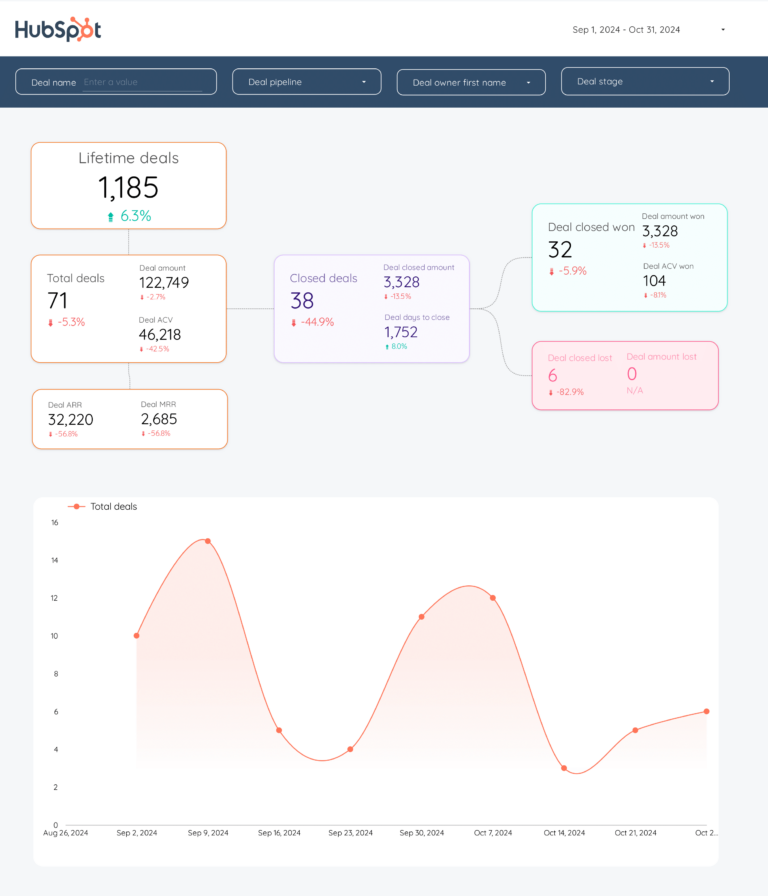
HubSpot CRM Dashboard Template 
Connects your HubSpot CRM data to Data Studio — contacts, deals, pipeline stages, and email marketing performance. Track lead generation, deal velocity, and marketing-to-sales conversion rates. Connected through Porter’s HubSpot connector with built-in BigQuery warehousing, which solves HubSpot’s API rate limit issues.
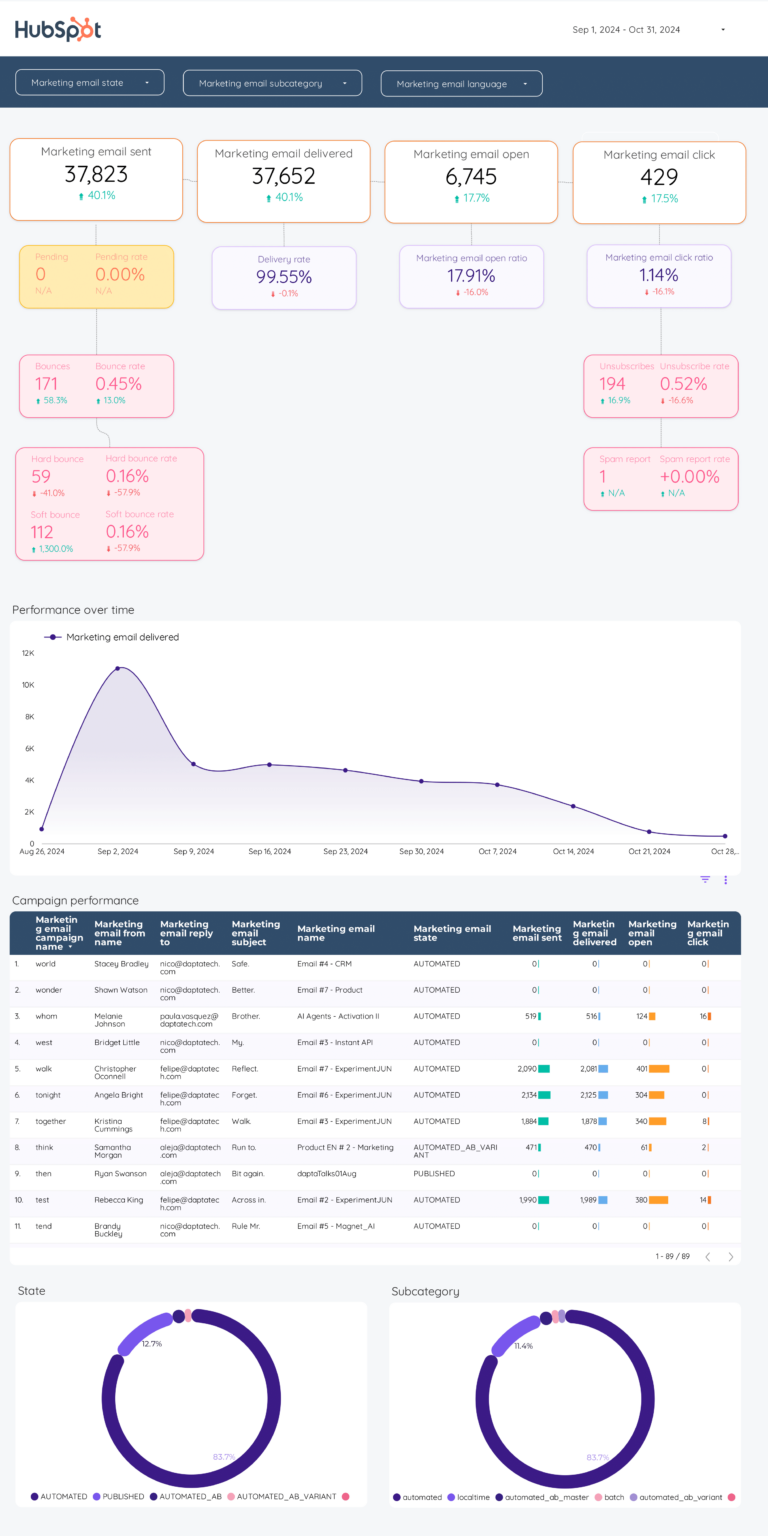
Email Marketing Dashboard Template 
Tracks email campaign performance: opens, clicks, unsubscribes, bounce rates, and revenue attribution. Supports HubSpot, Mailchimp, and ActiveCampaign through Porter connectors. Shows campaign-by-campaign performance with A/B test results and audience segmentation data.
How to Use a Data Studio Template
Getting started with any template takes just a few steps:
- Choose a template from the list above or browse all 110+ templates
- Click “Get this template” to open the template page with a full preview
- Copy the template to your own Data Studio account (click “Use Template” or “Make a Copy”)
- Connect your data source — Google-native sources connect directly; non-Google sources (Meta Ads, Shopify, HubSpot) connect through Porter Metrics connectors
- Customize — add your logo, change colors, adjust date ranges, and modify charts
What Should a Data Studio Dashboard Include?
The most effective Data Studio dashboards — also known as Google Data Studio dashboards — are organized around three layers of the marketing funnel, with context and segmentation to make the data actionable:
1. Visibility metrics (is your audience seeing your content?)
Start with top-of-funnel metrics that tell you whether your looker studio efforts are generating reach: data source connections, report views, template copies. These are the leading indicators that show if your campaigns are getting in front of the right audience.
2. Engagement metrics (are they interacting?)
Once your audience sees your content, are they responding? Track chart interactions, filter usage, date range changes. The gap between visibility and engagement reveals whether your messaging, creative, or targeting needs adjustment.
3. Conversion metrics (are they taking action?)
The bottom line: client presentations, automated reports, data-driven decisions. A dashboard without conversion data is just a vanity report. Connect engagement to business outcomes to prove ROI and justify budget.
4. Add context to every metric
Raw numbers mean nothing without comparison. Include period-over-period trends, efficiency rates (CTR, conversion rate, CPA), and progress against goals. This turns data into decisions.
5. Segment to find insights
Aggregate data hides opportunities. Segment by campaign, audience, content type, device, and time period to find what actually drives results.
Data Studio Dashboard Best Practices
- Match the dashboard to the audience. A media buyer needs granular campaign data. A CMO needs a high-level summary. Build the right view for the reader.
- Use period-over-period comparisons, not just totals. “5,000 clicks” is meaningless. “5,000 clicks, up 18% month over month” tells a story.
- Include conversion data, not just engagement. Impressions and clicks are leading indicators. Revenue, leads, and ROAS are what the business cares about.
- Automate the data refresh. Manual exports kill consistency. Use Data Studio with native connectors so the dashboard updates every time you open it.
- Set goals with pacing indicators. The first question stakeholders ask is “are we on track?” Add progress bars or target lines for top KPIs.
- Segment by campaign and audience. Site-wide or account-wide averages hide your best and worst performers. Always include a breakdown table.
- Keep it focused. A dashboard with 50 charts is a data dump, not a dashboard. Aim for 5–8 key visualizations per view.
Frequently Asked Questions
How to create a Data Studio template?
You can create a template from scratch in Data Studio by adding charts, tables, and scorecards manually. But the fastest way is to copy an existing template: click "Use Template" or "Make a Copy" on any template page, then connect your own data sources. Porter Metrics has 110+ pre-built templates you can copy in one click.
Is Data Studio the same as Data Studio?
Yes. Google rebranded Google Data Studio to Data Studio in October 2022. All existing Data Studio reports, templates, and connectors continue to work without any changes. The product is identical — only the name changed.
Is Data Studio good for beginners?
Yes. Data Studio is free and has a drag-and-drop interface that does not require coding. Using a pre-built template makes it even easier — you skip the design phase entirely and just connect your data. Most templates take 2-5 minutes to set up.
What are the steps to use a Data Studio template?
1) Find a template from Porter Metrics or the Google Gallery. 2) Click "Use Template" to copy it to your account. 3) Select your data sources when prompted. 4) The template populates with your data automatically. 5) Customize colors, logos, and date ranges as needed.
How to build a dashboard on Data Studio?
Start with a template — it saves 5-10 hours of design work. Copy the template, connect your data source (Google Analytics, Google Ads, or a third-party connector like Porter Metrics for Meta Ads, Shopify, HubSpot), and your dashboard is ready. Then customize the charts and layout to match your reporting needs.
What metrics should I track in a looker studio dashboard?
Organize metrics in three layers. Visibility: data source connections, report views, template copies. Engagement: chart interactions, filter usage, date range changes. Conversion: client presentations, automated reports, data-driven decisions. Add context with period-over-period comparisons and segment by campaign, audience, or content type to find actionable insights.
How often should I check my looker studio dashboard?
For operational monitoring, check daily or every few days. For performance management and client reporting, weekly or monthly. The right cadence depends on your role: media buyers need daily data, account managers need weekly summaries, executives need monthly overviews.
Can I white-label these templates for my clients?
Yes. Every Data Studio template is fully customizable. Add your logo, change colors, adjust date ranges, and remove Porter Metrics branding. Share via live link (always updated) or scheduled PDF export for professional, branded reporting.
Do I need a connector to use these templates?
It depends on the data source. Google-native sources (Google Ads, GA4, Search Console) connect directly to Data Studio for free. For non-Google sources (Facebook, Instagram, Shopify, HubSpot, LinkedIn, etc.), you need a connector like Porter Metrics to bridge the data.
Where can I find free Google Data Studio templates?
All templates on this page are free Google Data Studio templates (now called Data Studio). You can copy any template to your own Google Data Studio account, connect your data sources, and start using it immediately. Porter Metrics offers the largest gallery of Data Studio dashboard templates with 100+ options across marketing, SEO, social media, and e-commerce.
How do I create a Data Studio template from scratch?
To create a Data Studio template, open Data Studio, click Create > Report, and connect your data source. Add charts, scorecards, and tables. However, starting from a pre-built Data Studio report template saves hours — copy one of the templates below, swap in your data source, and customize the layout to match your brand.
Is there a GA4 Data Studio template available?
Yes. Several templates on this page include a GA4 Data Studio template that connects directly to your Google Analytics 4 property. They track sessions, users, events, conversions, and traffic sources using the GA4 data model. You can also find Google Ads Data Studio templates and Google Search Console Data Studio templates for paid and organic search reporting.
Start with a free Data Studio template
Every template in this list is free, white-label ready, and takes under 5 minutes to set up. Choose the template that matches your use case, connect your data, and start reporting today.
If you’re not sure which template to pick, start with the Cross-channel Marketing Dashboard — it gives you a single view of all your marketing performance across every channel.
Browse all 110+ templates →Other Dashboard Templates
Explore more free Data Studio templates by category:
Social Media Dashboard Template
PopularThe all-in-one view social media managers need. Combines Facebook Pages, Instagram, LinkedIn Pages, and TikTok data into a single dashboard — followers, engagement rate, reach, impressions, and top-performing posts across all platforms.
Includes platform-by-platform breakdowns and a unified overview so you can compare performance across channels without switching between native analytics tools.
What’s included
Best for