You’ll learn a proven methodology that will help you create actionable marketing dashboards based on my own experience as a Marketing leader and consultant.
In my experience, to achieve marketing results, you need to build a repeatable system.
To do that, you need data, but the truth is that you can have a dashboard. However, if the report doesn’t help you take action and understand what comes next for you and your team, you won’t use it.
Why your reports are not actionable and what to do about it
Reports often fall short on the actionability scale due to a combination of the following issues:
- Lack of clear goals
- Absence of meaningful comparisons
- Insufficient business context
- Overwhelming clutter of unnecessary data
That’s where the VISTA methodology comes in. I’ve been applying it, and I know it can be a game-changer for you.
A proven five-step system to analyze your marketing data
Before even starting a dashboard you have to create a clear growth model starting with the business goal and then go backwards.
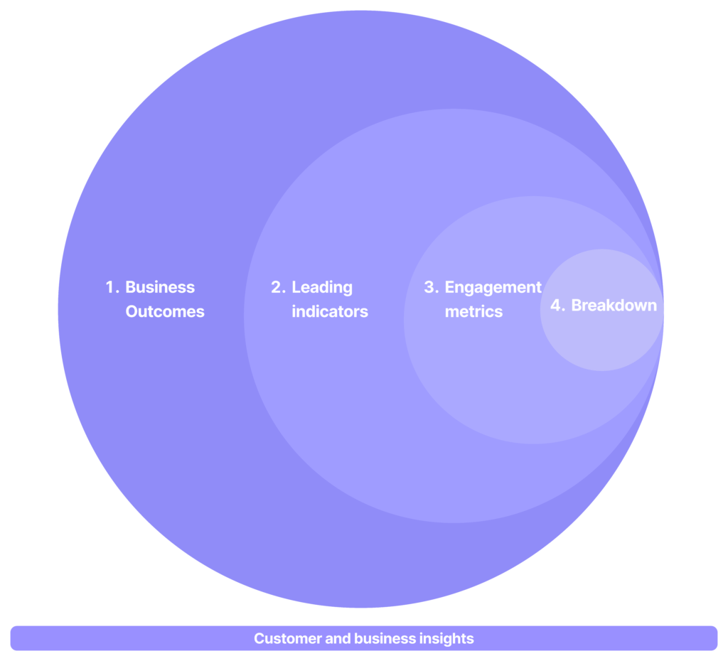
I call this the VISTA Methodology, and it has five steps:
- Validating and defining your business outcomes: goals, and north star metric.
- Identifying leading indicators: to understand what influences the results.-
- Studying engagement metrics: that’s how you know before conversions that you are on the right track.
- Targeted segmentation and analysis: Breakdown your data by date, channel, campaign, product, content.
- Analyzing qualitative information: combine customer insights, implementations and other business knowledge to the analysis.
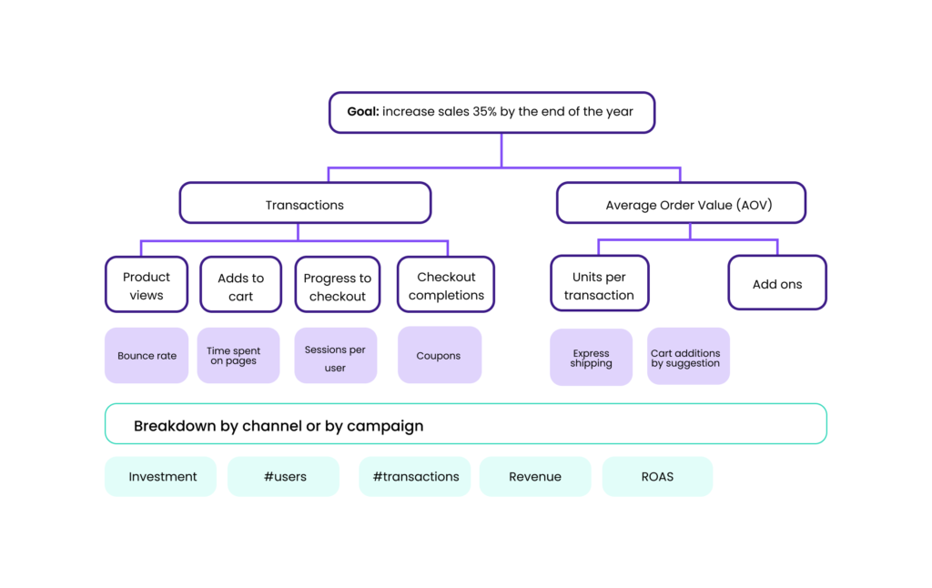
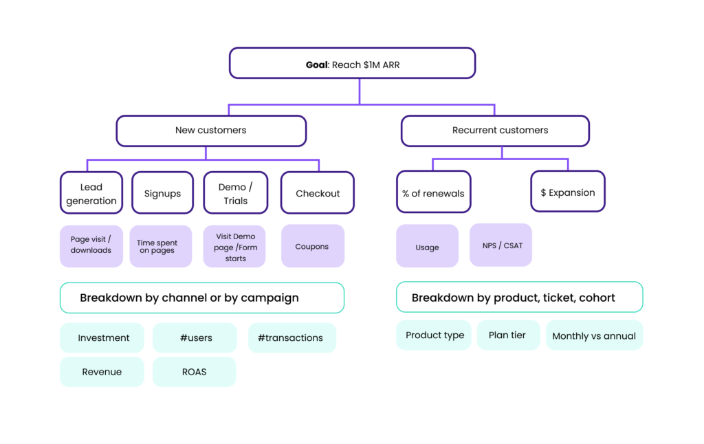
I like to represent visually this system with a metrics map. Let’s check two of the most common cases: E-commerce and B2B SaaS.
Metrics map example: E-commerce
Metrics map example: B2B SaaS companies
How to make decisions using your marketing data
Now you have your metrics map based on the VISTA metrics system we just saw.
But to make decisions you should focus on the leading indicators—those that have a direct impact on your results.
For instance, if your goal is to generate more sales you need to understand your sales process your leading indicator for sales could be generating sales qualified leads, in this case I can break it down by channel or content type to understand what’s driving leads more effectively.
If you understand what’s the journey, you can define actions to improve the metrics that are driving the results combined with qualitative feedback and insights from the team.
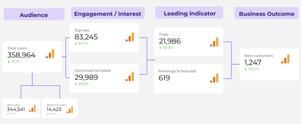
Let’s use Porter Metrics as an example:
- What we do and for whom: At Porter Metrics we help marketing teams of agencies and SMBs to track all their marketing data.
- Our business model: We are a B2B SaaS with a recurring subscription.
- Marketing customer acquisition system: Content marketing mainly SEO.
Let’s asume we are applying the VISTA system to Porter Metrics:
- Goal: 10% increase in MRR every Month
- Business outcomes: New customers.
- Leading indicators: number of trials, number of report setups, number of sales calls.
- Engagement metrics: number of template downloads, report loads during a trial period,
- Breakdown by: product, channel and content.
You can build a dashboard like this using Looker Studio, providing you with a comprehensive overview of your critical metrics.
And then you can break down that data to understand where the results are coming from.
For instance, to understand where the ‘Trials’ are coming from, I combined the landing page name with the event ‘Activations’ and segmented the data by new and returning users.
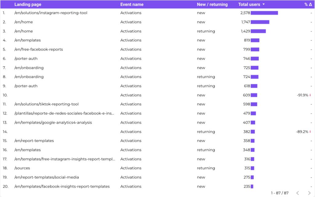
Now, I have an idea about what drives conversions for ‘new’ and ‘returning’ users.
I can formulate hypotheses and track the changes in results on these pages.
You can do all of this with the Google Suite (Google Tag Manager, GA4, Looker Studio). You can create a really good system to track your marketing KPIs -we’ll go there-.
Automate the marketing data collection process to save hours
You can automate all of this with the Google Suite (Google Tag Manager, GA4, Looker Studio).
You can create a really good system without the complexity of other alternatives.
Depending on the platforms you use and your business model, you can connect all the platforms you use to your reports. For instance:
E-commerce marketing platforms:
- Paid media: Facebook Ads, TikTok Ads, Twitter Ads, Google Ads.
- Social Media: Instagram, Facebook, TikTok.
- Stores: WooCommerce, Shopify, and GA4.
- CRM: Klaviyo.
Lead Generation (B2B) platforms:
- Paid media: Google Ads, LinkedIn Ads.
- Social Media: LinkedIn Pages.
- CRM and Email Marketing: Hubspot, Active Campaign.
- Search: Google Search Console.
Gathering conversion insights on GA4 and with Google Tag Manager
You’ll typically give more weight to the conversions and UTM parameters provided by GA4, your CRM, or CMS because they attribute conversions.
You can configure most of them with low-code or no-code at all just using Google Tag Manager and GA4. We have a step-by-step tutorial on how to configure your GA4 account.
On the other hand, the sales data reported on Shopify, Leads data from your CRM, and GA4 conversions, are easier to track and manage as a whole.
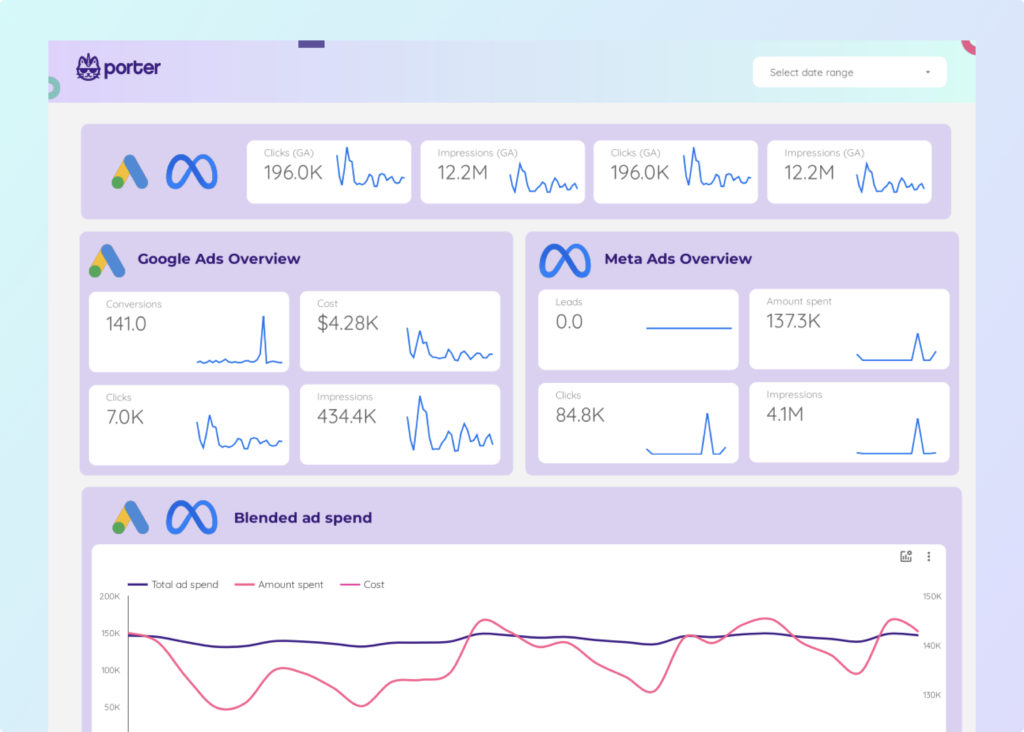
Visualizing all your marketing data using Looker Studio
Your data is stored across different platforms, that’s why you need a system to visualize your marketing data in one place to visualize your whole funnel.
I’m not going to get into the nitty gritty of the process but I will tell you how we do
A fast-easy way to do it is connecting your marketing data to Google Looker Studio.
You can use the native connectors for free (Google Sheets, Google Analytics 4, and Search Console) and third-party connectors that allow you to connect data sources such as: Facebook Ads, LinkedIn Pages, TikTok Ads, Shopify, Hubspot, etc.
Actually that’s that we do at Porter Metrics: helping marketing teams to automate and visualize their multichannel marketing data on Looker Studio and Google Sheets without having to code.
Here a short preview of what you can accomplish by connecting your marketing data to Looker Studio:
Define a frequency, test hypothesis and track changes
f you don’t track your progress and test your hypothesis. How are you going to improve?
Depending on your role and your goal you can define a different frequency.
Here is a rule of thumb for the most important marketing activities:
| Activity | Frequency |
|---|---|
| Goal progress checkpoints | monthly or biweekly |
| Budget review and refinement | monthly |
| Business review | quarterly |
Be sure to define an implementation board and document changes.
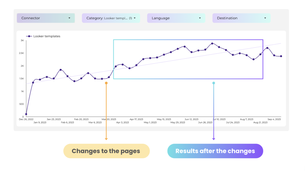
For instance, here is an example of changes we made on the most-qualified traffic pages:
After two weeks from the implementation we started see improvements in traffic.
If you don’t document things, you won’t be able to track and integrate your results and learnings.
Recommendations to present your marketing data
Answer the ‘so what’
When you are exploring or presenting data you should have always in mind ‘what are we going to do about it’
Analyze the data and mix it with your customer and business insights to have an implementation backlog.
Be sure to at least understand:
- What’s your hypothesis
- What changes are you going to make
- How will you measure the changes
If you are using slides your titles should give the insight
Start with the insight, don’t make your audience guess.
Good title example: We improved in 10% our pipeline by implementing a click-to-call button on high intent pages.
And then adding the evidence using charts.
Bad title example: Sales pipeline results.
And dropping the evidence with charts and graphs but without explanation.
Adding context to your reports
Add comparisons to give context. You don’t know if something is considered good or bad until you put in context.
- Date
- Category
And also add text and additional explanations when necessary.
5 examples of Actionable Dashboards
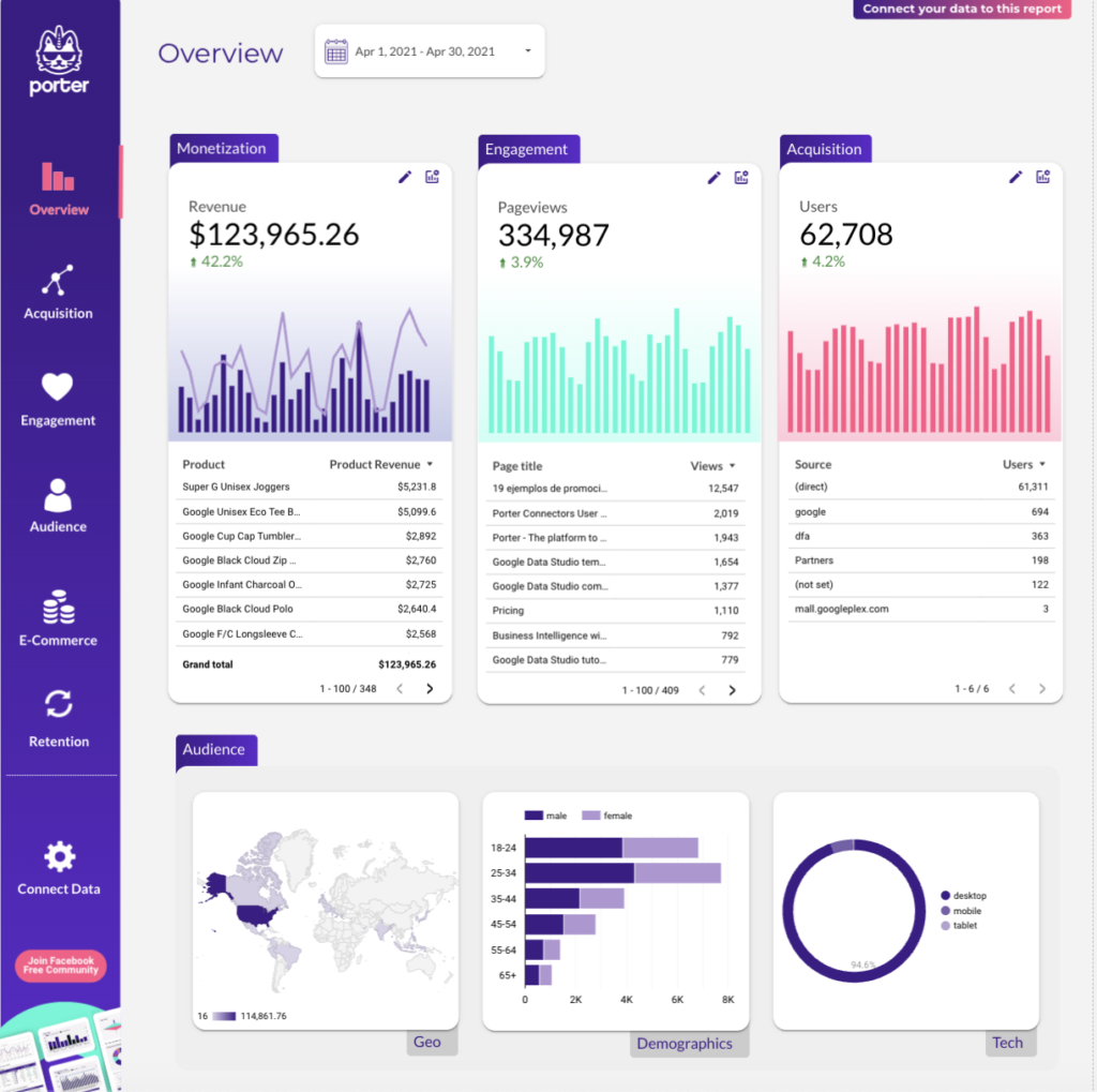
Ultimate Digital Marketing Report
One of the most popular marketing dashboard is the Ultimate Digital Marketing template because combines all the data sources of a digital marketing strategy: website data, social media data and paid media analysis in one place.
GA4 dashboard
Analyze your traffic, events, campaign results, landing pages, conversions and get insights about your website results. Make decisions by breaking down your results by campaign, content and landing page.
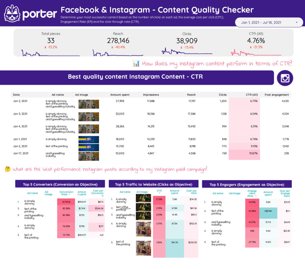
Facebook Ads creative report template
Discover which ad creative is performing best and optimize your Facebook Ads results based on your insights.
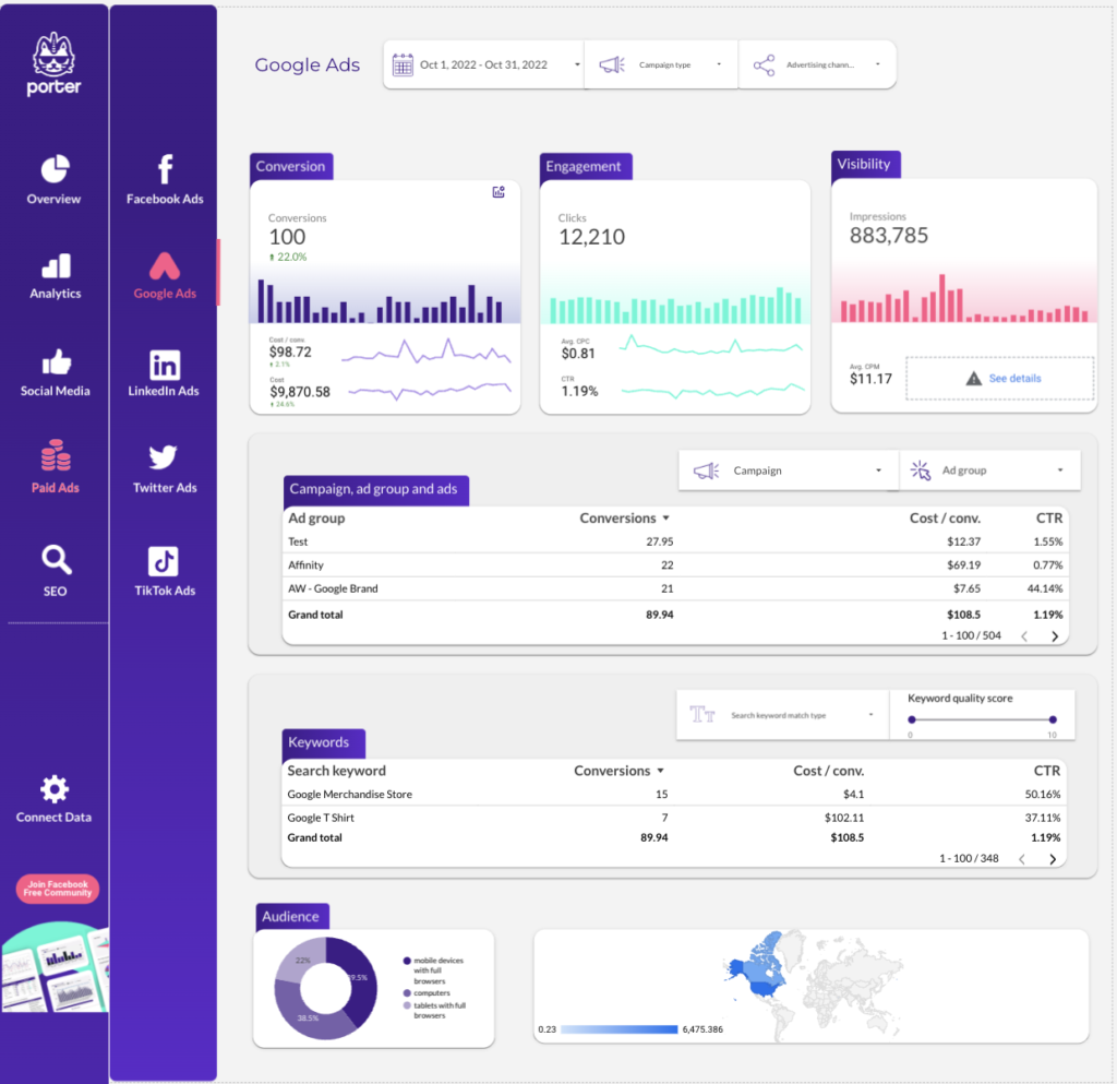
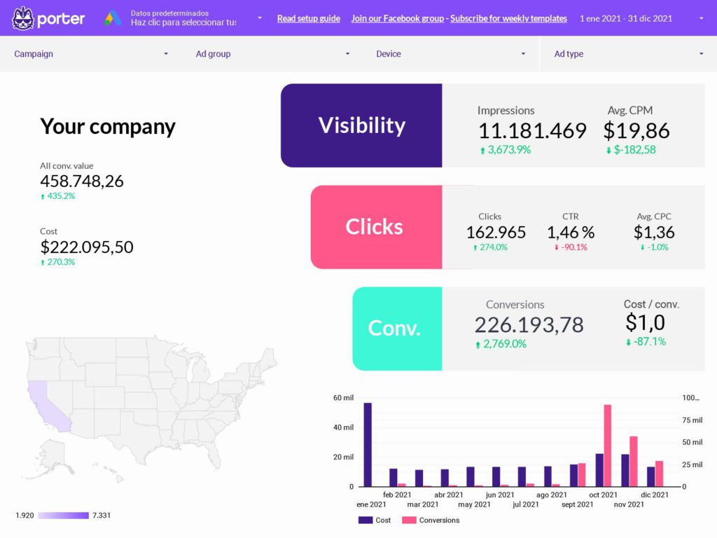
Google Ads report
With this template you can visualize your Google Ads funnel, ad spend and sales—all in a single view. Break down your data into campaign, ad sets and devices.
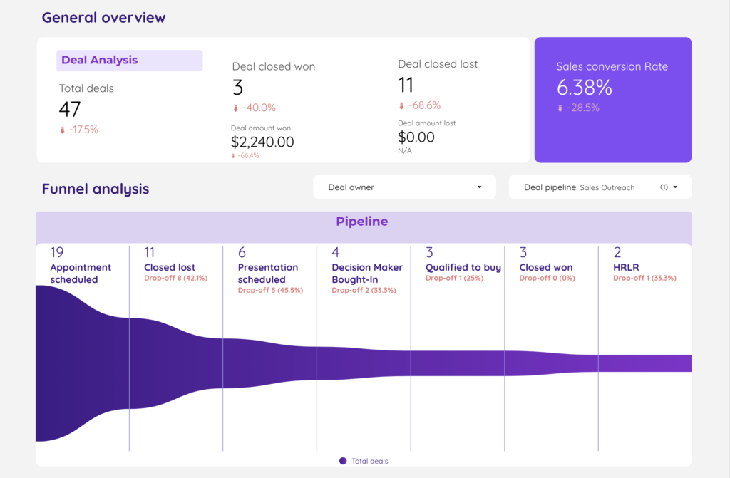
Hubspot Marketing and Sales Template
Track your marketing, contacts, deals, companies, and sales from HubSpot on Google Looker Studio. Understand what’s driving results.