Skip to content
🇺🇸
🇺🇸 English
🇪🇸 Español
🇧🇷 Português
Pricing
Product
Connect
Blend marketing data
View 20+ connectors →
Store
Scale & performance
BigQuery
NEW
Visualize
Automate reports
Google Sheets
Data Studio
Power BI
Analyze
✨ AI
Query builder, alerts & notifications
Data blending
Custom fields
Schedules
See more →
Templates
Learn
Tutorials
YouTube Channel
Help Center
Field Documentation
Sign in
Book a call →
Pricing
Product
Connectors
BigQuery
Data Studio
Google Sheets
Templates
Learn
Tutorials
YouTube
Help Center
Book a call →
Sign in
🇺🇸 EN
🇪🇸 ES
🇧🇷 PT
Data Studio course for marketers – Enroll for free
Hands-on Looker Studio tutorials made by practitioners doing the job in startups and agencies.
How to use Google Data Studio complete tutorial (2024)
Read guide »
How to Create Calculated Fields on Data Studio (2024)
Read guide »
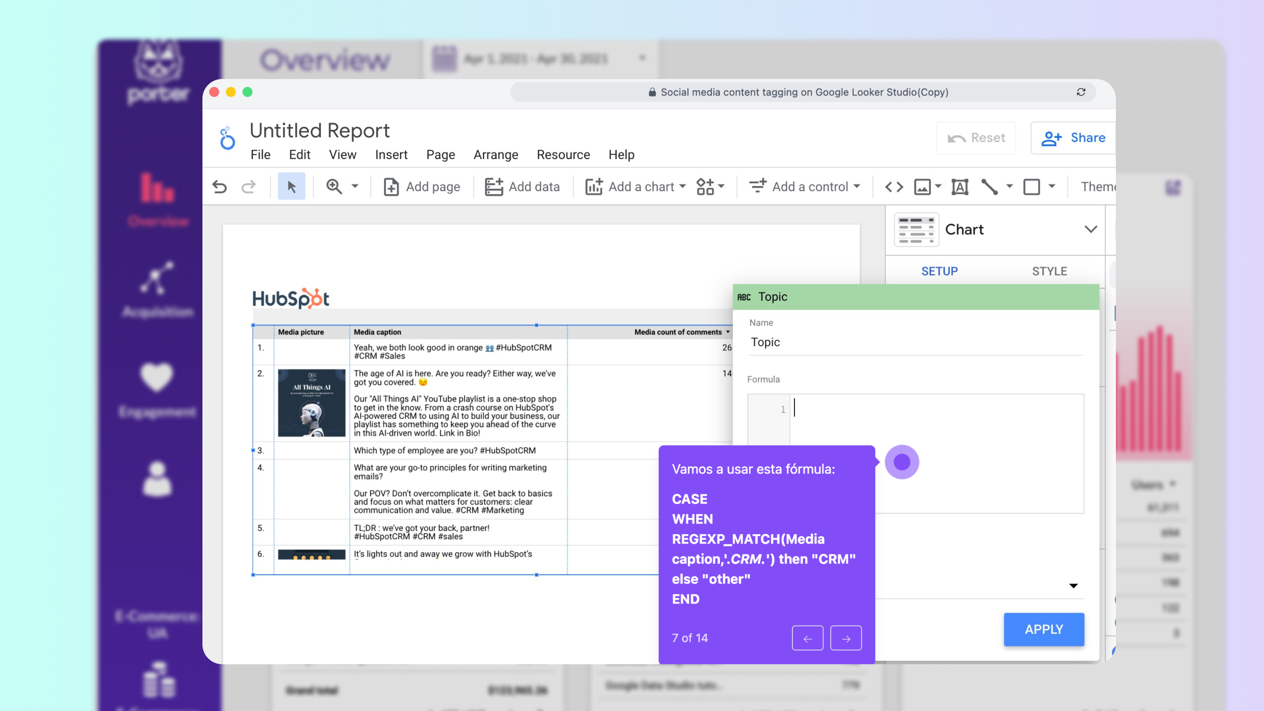
How to Use Regex on Data Studio: Regular Expressions with Examples for Marketers
Read guide »
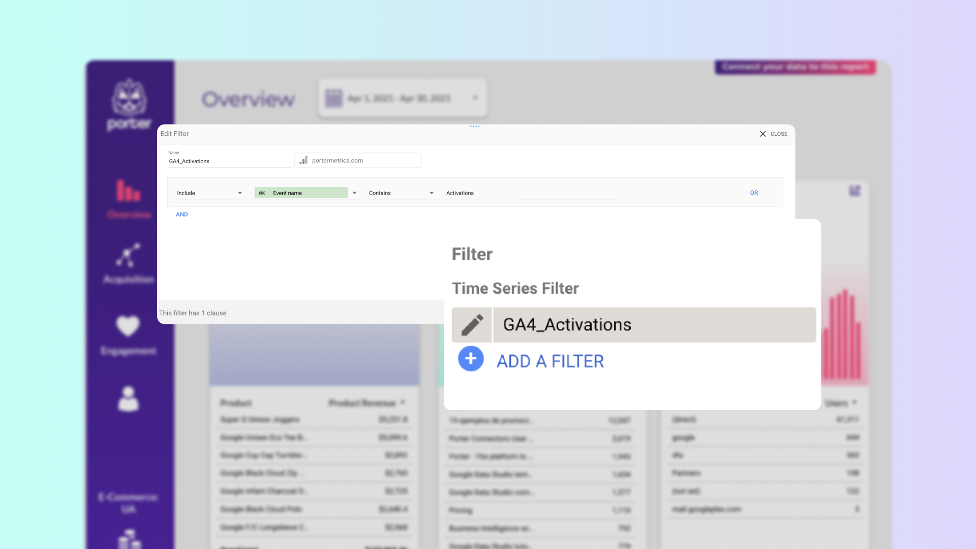
How to create filters on Data Studio
Read guide »
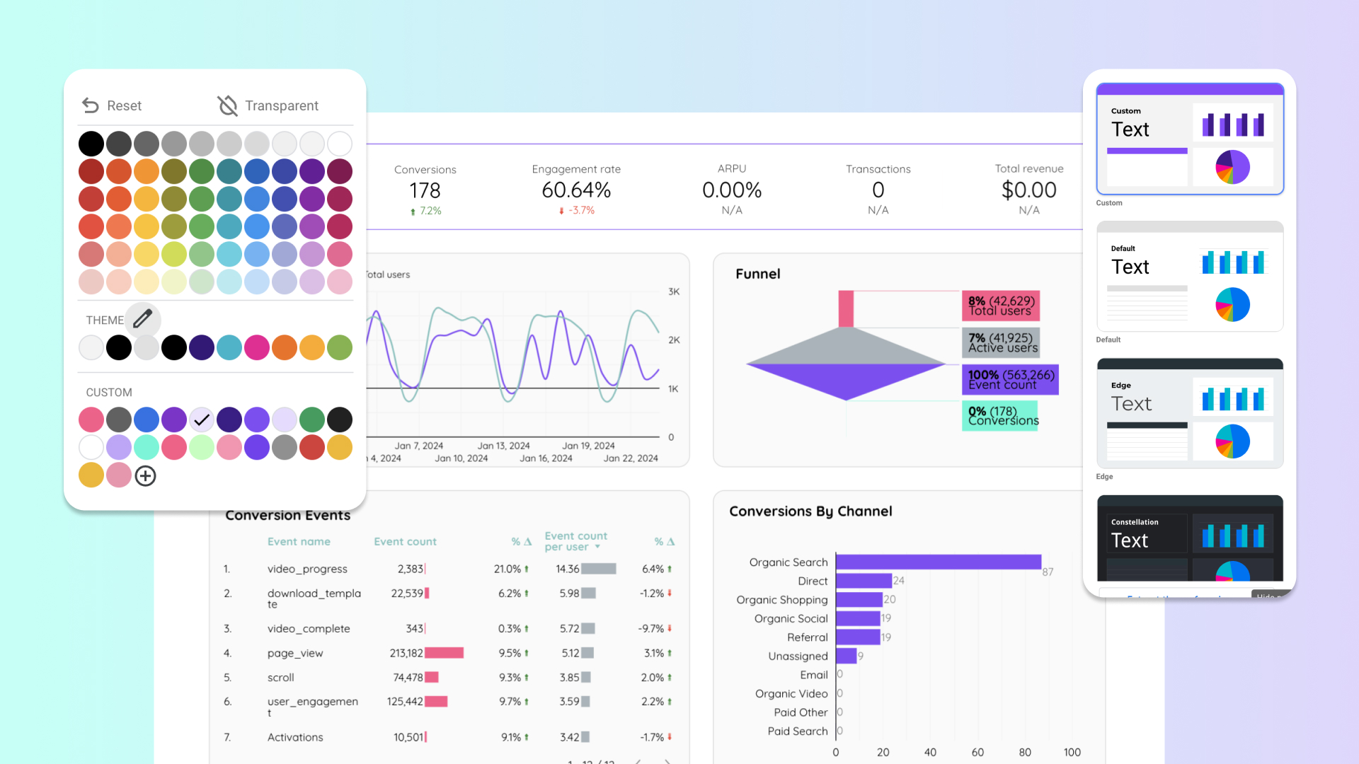
How to design Data Studio reports and customize them
Read guide »
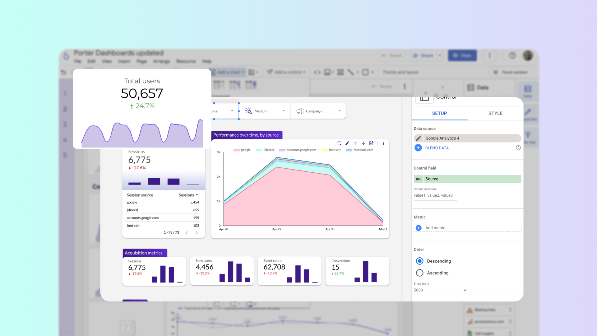
How to add charts and graphs to Data Studio
Read guide »
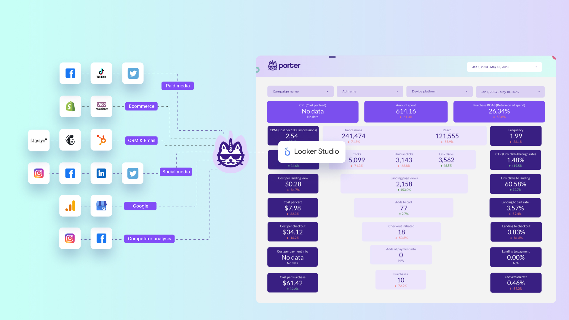
How to connect data sources to Data Studio
Read guide »
How to Share Google Data Studio Reports
Read guide »
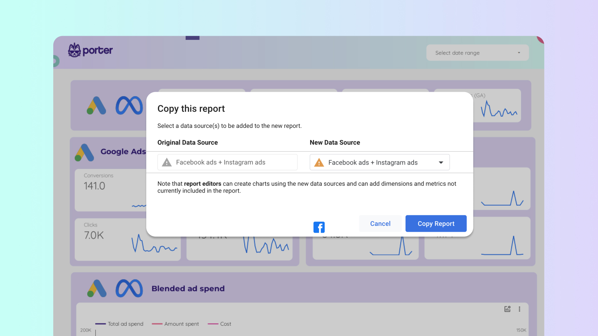
How to copy a Data Studio Report Template
Read guide »