This is a step-by-step guide to help you set up your LinkedIn Ads reports on Google Data Studio so you can automate your PPC (Pay-Per-Click) and lead generation reports.
It’s also an in-depth guide to understanding the LinkedIn Ads metrics and dimensions available. Access the Google Docs version of this post here.
LinkedIn Ads connector for Google Data Studio
First, we’ll learn how to automatically import LinkedIn Ads data to Google Data Studio through a connector.
For this tutorial, we will use our Porter Metrics LinkedIn Ads connector. We will guide you through the functionalities and show you why we consider it the best solution available on the market.
You can access the LinkedIn Ads connector in three ways:
- By using this link
- By using our ‘Try for free‘ call to action on our website
- Or by searching for it on the Google Data Studio connectors gallery by typing “Porter”.
If you access it through our website, you will download our default report template to speed up your reporting; if you access it through the connector gallery, you will start with a blank report.
Signing up with Google and LinkedIn
Once on the connector, signup with your Gmail account to create your Porter account. You only an email account to sign up, Porter does not take any personal information.
Then, you should sign in with your personal LinkedIn account so Porter can retrieve all the LinkedIn Ads accounts associated with that profile.
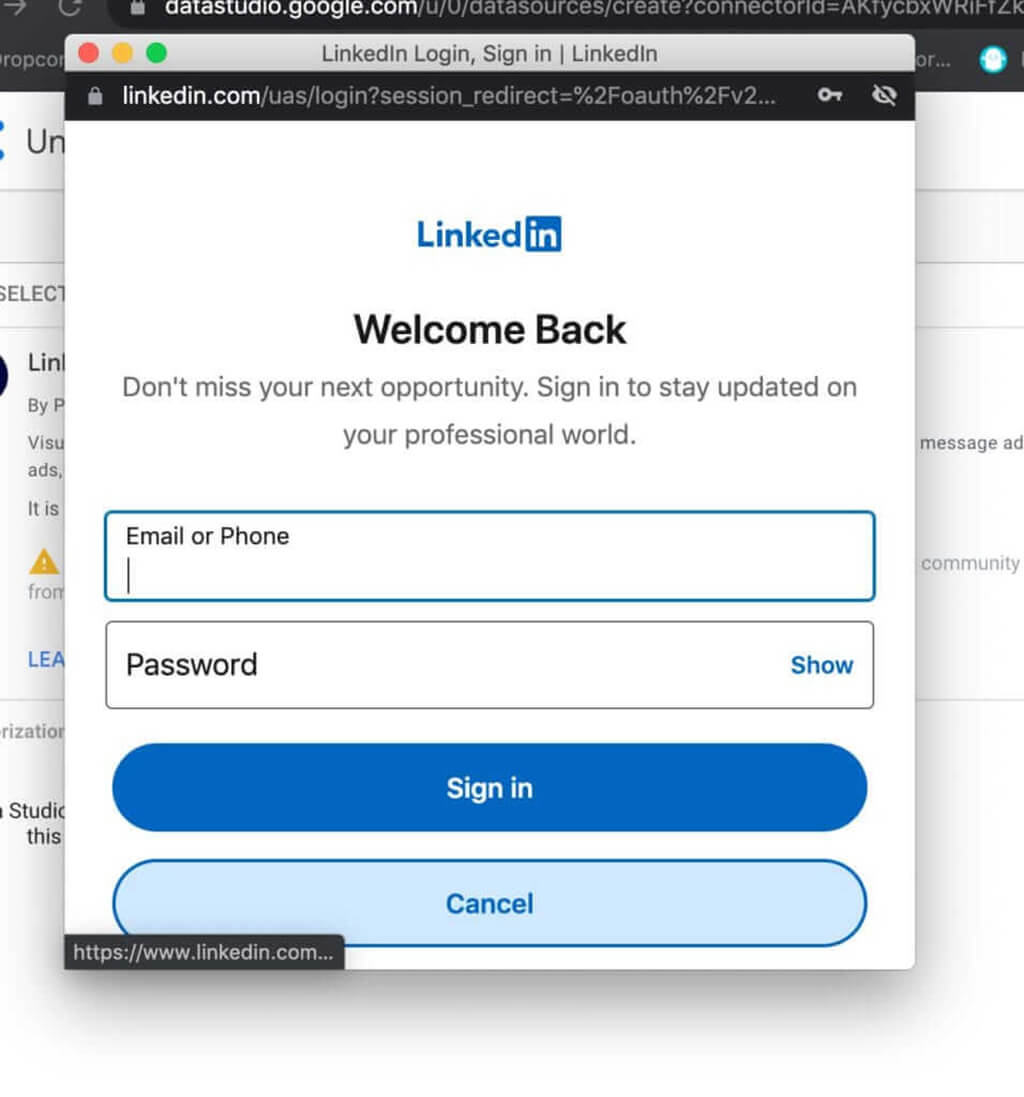
About privacy: only your email is needed to create user accounts and start pulling data. We don’t take your personal information or share it (on purpose) with third parties.
Here’s our video tutorial on connecting your data to Google Data Studio.
Selecting your LinkedIn Ads accounts
Once signed in, you will be allowed to bring one or more LinkedIn Ads accounts to your Google Data Studio report.
We made it possible to bring multiple (or all) LinkedIn Ads accounts in a single data source so you could combine metrics such as ad spend and conversions.
This way you can have a wider vision of all your paid efforts on LinkedIn.
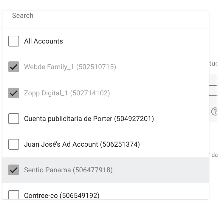
Just click on Connect in the top right corner of the page.
In the next view, you will see all the fields available on our LinkedIn Ads connector for Google Data Studio.
With a single connector, you will see a list of 203 fields available (so far) with all of your campaigns, accounts, posts, video data, and much more. We are committed to bringing all the fields that the API allows us.
Here’s the list of LinkedIn Ads metrics and dimensions that our connector brings.
Now click on Connect on the top right corner to generate our default report template.
If you successfully bring Linkedin Ads data to your Google Data Studio report, you’re officially starting a 14-days free trial. You may want to check out our friendly pricing here.
Again: If you started using the connector from the link we provided, you’ll get our report template; if you did it from the Data Studio connector gallery, you will load a blank report.
The report template is meant to save you time, but you’re free to start to report from scratch.
So far, we have already created our first LinkedIn Ads report on Google Data Studio, but we can play around a bit more with the connector to see what else it offers.
Here, you can choose three ways for reporting:
- Create your Google Data Studio report from scratch (read or watch our tutorials)
- Download our LinkedIn Ads reports templates for Data Studio
- Browse our default report template
Before playing around with the charts, we’ll explain the LinkedIn Ads metrics and dimensions.

Understanding LinkedIn Ads metrics and dimensions
We can set up our LinkedIn Ads report on Google Data Studio by navigating all its fields, metrics, and dimensions available.
For us Google Data Studio it’s a canvas where you can display any type of chart, combining any metrics and dimensions.
Metrics are the numerical values, such as clicks, spent, and conversions; dimensions are how you break down the metrics; by campaigns, by country, by creative, etc.
The LinkedIn Ads connector is super flexible and lets you combine metrics and dimensions any way you want.
If it’s your first time with Data Studio, I would recommend you to check this resource to create your first Google Data Studio report.
To help you navigate the LinkedIn Ads metrics, we would recommend watching this tutorial on creating charts and graphs.
LinkedIn Ads account dimensions
The account-related dimensions on the LinkedIn Ads connector have fixed values; they don’t change over time. They are:
- Account type: determines whether it’s a business account (as most) or if it’s another category.
- Account currency: the default currency you use for your ad spend on the account.
- Account name: the commercial, visible name of your ad account.
- Account reference: it’s the account’s unique name, a combination of numbers, and a name.
- Account test: a true or false value (aka boolean); if it’s a test account or not.
- Account status: if it’s active or not.
- Account ID: the unique identifier of your account.
Below you can see a table we created within our Data Studio report to show all these account-related fields:
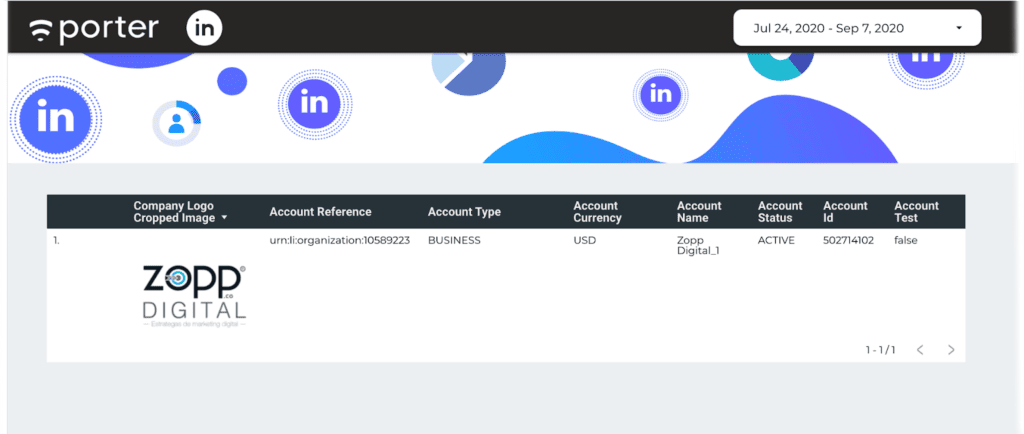
As they all work as dimensions and not metrics, we would only use them on tables for informational purposes.
The reason why we would use these fields is to display information of the ad account we’re reporting on.
A good practice, for example, is that you can display the ad account profile photo. With this, you don’t need to add the logo manually for every report template you copy on Data Studio. Nice, huh?
Another use case of these fields might be to bring more ad accounts to the data source connected to have an overview of all the ad accounts that an agency manages:
This is how the LinkedIn Ads account summary table looks like:
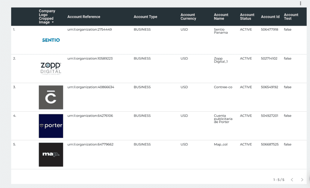
If we add metrics like conversions, and total ad spend, this table is useful for an overview of the performance of all the accounts your company manages.
LinkedIn Ads company dimensions
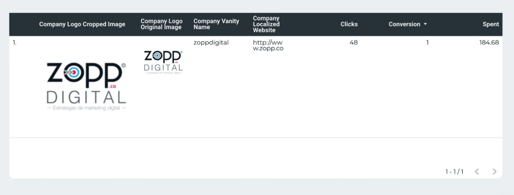
Just like the account dimensions, we can bring fixed data from the company associated with the LinkedIn Ads accounts, with fields such as:
- Company vanity name (simply the company name)
- Company logo
- Company localized website (the URL)
For this example, we’ve created a table with some company fields. It is useful to make our white-label report by automatically displaying such company data.
LinkedIn Ads campaigns report
These fields let you break down your ads performance by campaigns, groups, and ads, so you can see which performs best. The campaign-level fields include:
- Campaign name
- Campaign objective type
- Campaign optimization target type
- Campaign run schedule start
- Campaign run schedule end
- Campaign status
- Campaign test
- Campaign type
- Campaign format
Generally, we recommend using them in tables along with performance metrics such as clicks, impressions, CTR, and conversions, but other chart types like bar charts, pie charts, and time series would also work well.
When playing around with these fields, we have noticed some interesting findings.
The Campaign Cost type refers to the bidding type; LinkedIn is charging for CPM (not clicks, or conversions).
When breaking down the data by campaign format, the Standard Update — the most common LinkedIn Ad that you see on the feed — had 1 conversion, and the carousel with way more impressions didn’t have any.
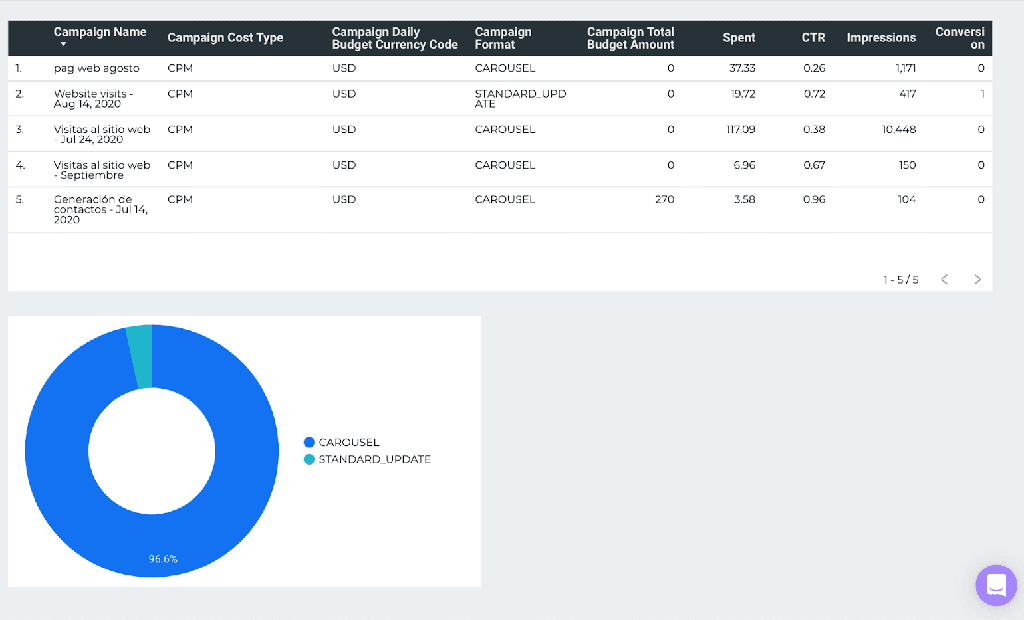
The CTR, just for the record, is expressed in percentage. All these campaigns had a CTR under 1%. That’s low but we still lack context.
For this example, we also created a pie chart, breaking it down by Campaign format and using the metric Impressions to understand in what type of ad the budget was located.
LinkedIn Ads campaign groups dimensions
LinkedIn Ads campaign structure is pretty similar to Google or Facebook: Campaigns, groups, and ads.
Btw, #TryPorter Facebook Ads connector!
For this example, we’ll explore campaign groups reports, which brings dimensions such as:
- Campaign Group name
- Campaign Group Run schedule start
- Campaign Group Run Schedule end
- Campaign Group ID
- Campaign Group Status
- Campaign Group Test (if it’s a test campaign or not; a boolean)
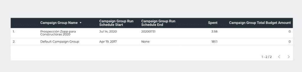
You can bring the name and ID of the groups. But you can also bring the group start date and end date. The start date is set automatically when you create and activate a campaign group.
But setting an end date is optional; you may run and control your ads daily. You can also bring the metric Campaign Group Total Budget Amount, which is the budget you can set for every group.
You may also bring the dimension Objective, to break down your performance metrics by campaign objective.
LinkedIn Ads Creatives dimensions
One of the coolest things about Google Data Studio is that you can display images. This connector can pull the ad creatives and see which one performs better.
Clients and non-technical users may understand the names you put to your campaigns, but they will love the visuals.
Sometimes, the images displayed on Google Data Studio seem blurry. The reason is that Data Studio doesn’t create images but pulls them from a URL.
Sometimes, the images are too small (aka thumbnails) and that’s why we recommend limiting the query of fields with images included, and keep the images as Data Studio pulls them from LinkedIn, since increasing the size will affect the quality of visualization.
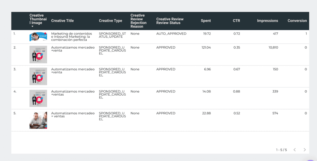
This LinkedIn Ads creative report table shows some cool stuff.
- We can see that the only ad that had results was the banner; none of the carousel ads drove any conversions, while in general all their CTR was poor.
- With the field Creative Title we can see the copy used in the ad.
- It’s interesting that LinkedIn also shows if the ads are approved and the reason why they’re denied. We recommend quickly communicating internally with teams to adjust the strategy.
LinkedIn Ads performance metrics
Here’s the official documentation on LinkedIn performance metrics.
We’ll browse other metrics associated with any conversion. We will share a list of conversion-related metrics for LinkedIn Ads that you can bring to your dashboards:
- Conversion: this field logs all the events that you mark as conversions. The available conversion types on LinkedIn Ads are Lead, signup, purchase, add to cart, download, install, key page view, and others. The LinkedIn Ads connector for Google Data Studio doesn’t report by conversion type but by conversions as a whole.
- Conversion in Local Currency
- Post click conversion: Post click refers to the conversions that happen when a user clicks on your ads and then converts.
- Post view conversion: Post view conversion refers to those instances when a user only views but doesn’t click your ads, and ends up visiting your website by other means (like a follow-up email) and then converts.
- Viral External Website Conversions: these “viral” conversions occur when someone reached by your ads shares the content and other users convert through the shared content. It’s like the collateral result or effect of your ads.
- Viral External Website Post View Conversions: these conversions occur when someone reached by your ads shares the content and other users see it but don’t click the content, and eventually convert by other means.
- Viral External Website Post Click Conversions: these conversions occur when someone reached by your ads shares the content, and both other users and themselves eventually convert after clicking the ad.
- Post-click conversion rate: it’s the division between post-click conversions/impressions.
- Post-view conversion rate: it’s the division between post-view conversions/impressions.
A conversion is any action that you set as the desired behavior. For instance, someone visiting your ‘thank you pages’ after filling a form on a landing page or a LinkedIn form, it will be registered as a conversion.
LinkedIn is better for B2B, so a lead is the most common conversion.
You’ll see that key results are reported on the LinkedIn Ads Manager. Key results is the metric that adds the number of times your campaigns meet your objectives.
Unfortunately, the LinkedIn API doesn’t offer it today, and no LinkedIn Ads connector for Google Data Studio offers key results as a metric.
Also, at Porter, we wanted to save you time by creating the “cost per x” for all the performance metrics, such as cost per post view conversion. Read this guide to learn how to calculate the relative cost of a given metric on Data Studio.
Conversion window on LinkedIn Ads
You should understand some caveats and concepts to interpret your conversion data, such as post-click, view, and conversion windows.
The difference between post-click and post-view conversions on LinkedIn Ads is that they define whether the user clicked the ad before converting or not. When a post-view conversion happens, it means that the user didn’t click the ad, but did a conversion eventually.
That may happen, for instance, when they see ads but they go to the website and convert by opening up an email.
Now, if Linkedin logs post-view conversions, it means that there’s a time span it will wait between the moment a user sees or clicks an ad and converts. That time is called the conversion window.
According to LinkedIn documentation, the conversion window on LinkedIn Ads “… is the timeframe within which conversions will be attributed to a LinkedIn ad.”
In other words, when you create a LinkedIn Ads campaign, you can set the conversion window to 1 day, 7 days, 30 days, or 90 days for a user to do a conversion from the moment he or she sees or clicks the ad. If the user converts within that time frame, the conversion is counted; if it’s after that, it won’t.
This means that the longer you’re willing to set a conversion window for, the more conversions you may get.
For e-commerce, people make decisions fast, so the conversion window can be short.
In B2B, sales cycles may take months, and you may set a longer conversion window like 30 or 90 days, to convert.
LinkedIn Ads engagement metrics
Engagement means any interaction with your post, like:
- Comments
- Shares
- Likes
- Reactions
- Follows
- Clicks to LinkedIn page
- Clicks to landing page
All these metrics can also be “viral” which, remember, refer to the engagements happening when the content is shared.
LinkedIn also offers an aggregated view of these engagement metrics by combining them.
- Total engagements
- Other engagements
- Viral engagements
Here you can find great documentation and explanation about LinkedIn Ads engagement metrics.
LinkedIn Ads carousel ads metrics
To get started, here’s a guide on LinkedIn Ads carousel ads best practices.
Carousel ads are sets of images with more brand assets called “cards” that let you tell a more rounded story.
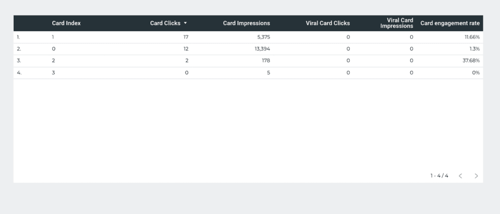
Our Linkedin Ads connector for Google Data Studio brings all these cards metrics, like:
- Card clicks
- Card impressions
- Viral Card clicks
- Viral card impressions
We created a custom formula to calculate Card engagement rate: Card Clicks/Card impressions.
You can break down the data by Card Index, which refers to every card individually. Sadly, LinkedIn doesn’t display a thumbnail or preview of the carousel ad.
LinkedIn Ads Video metrics
Here’s the official documentation on LinkedIn Ads video metrics.
Our Google Data Studio connector lets you bring them all together:
- Video starts
- Video views (officially, after 2 seconds)
- Video views at 25%
- Video views at 50%
- Video views at 75%
- Video completions
With these metrics, you may create a LinkedIn Ads video funnel report to understand where people stop watching your LinkedIn video ads.
Like other metrics, all these metrics have a “viral” version (e.g. Viral video starts), so you can visualize video engagement of those who watched your videos through shared content.
We also calculated the average cost of these video metrics; our connector brings by default cost per video view, cost per video start, and all the other respective combinations.
LinkedIn Ads demographic dimensions
Some cool fields of the LinkedIn Ads connector for Google Data Studio is that you can break down all your metrics by:
- Job title
- Job function
- Country
- Company size
These dimensions will help you understand the audience your ads is reaching.
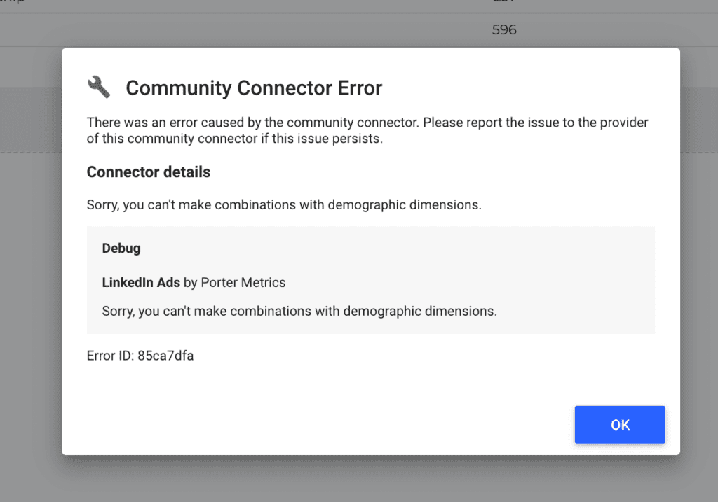
As demographic data might be sensitive, these dimensions come with certain limitations from the LinkedIn API:
- You can’t combine them among them and with other dimensions
- All the metrics data will be inaccurate; they will be under-reported or display zero.
For instance, if you try to combine Campaign Name and Country in the same chart, you will see an error message on Google Data Studio that says “Sorry, you can’t make combinations with demographic dimensions.”
However, you could create eye-catching demographics reports with LinkedIn Ads data like this:
A map to visualize any metric, broken down by country:
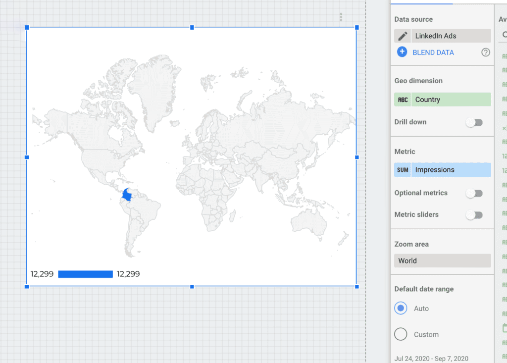
In this case, we selected impressions to see the countries the ads reach most. Clearly, this ad account is just for Colombia.
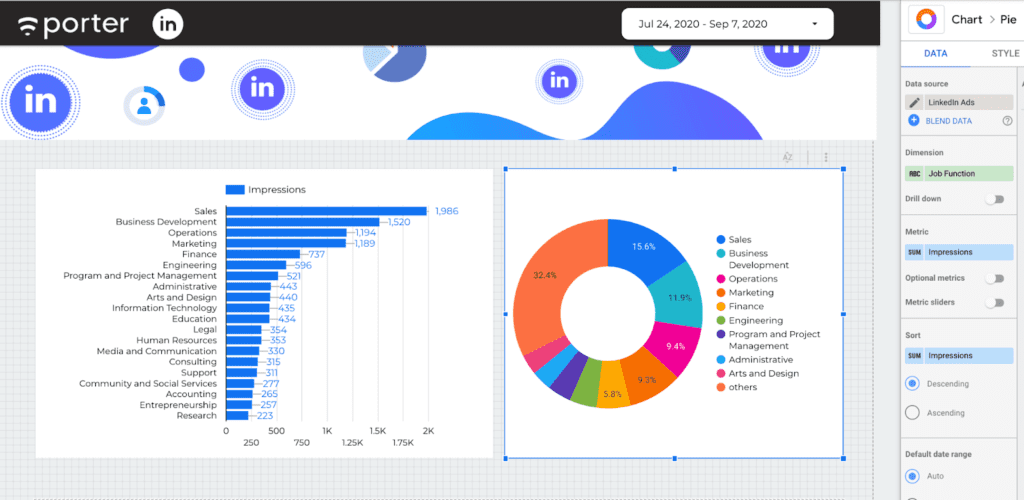
We can also see the most common Job Function from the audience we’re reaching through our ads. We created a pie chart and a bar chart breaking down impressions by Job Function.
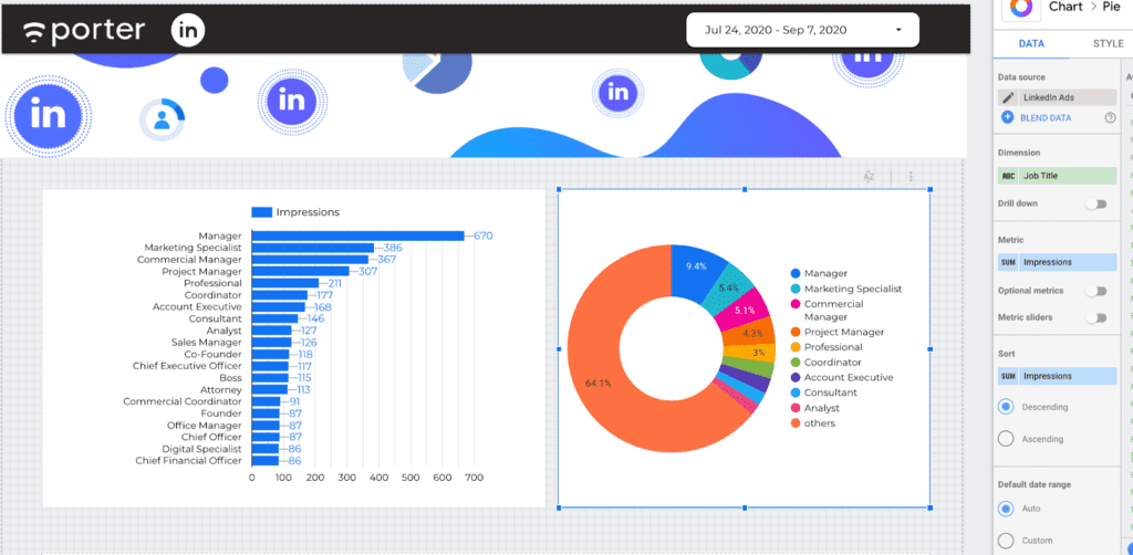
We did the same exercise but with a Job Title as the dimension.
And a table breaking down impressions by company size (i.e. number of employees), too.
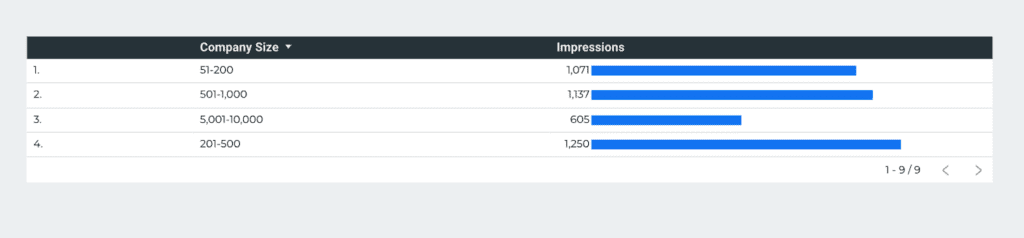
While it’s a shame that LinkedIn Ads cannot report this data accurately, it will give us a proxy of the kind of users we’re reaching through the ads.
Setting up the LinkedIn Ads report on Data Studio
Creating charts
Once you understand the LinkedIn Ads metrics, you’re ready to create your first charts if you haven’t. We prepared a video tutorial on how to create your first charts and graphs on Google Data Studio:
Follow these steps to create your first charts:
- Open the Google Data Studio report on the edit mode.
- Go to the menu and select Insert or Add a Chart.
- Choose a chart type (scorecard, time series, tables, pie charts, and bar charts are the most common).
- Make sure the chart is linked to the LinkedIn Ads connector.
- You should select a combination of metrics and dimensions depending on the chart.
A good one could be visualizing post-click conversions as a scorecard and over time by choosing Date as the time dimension. Don’t forget to drive the extra mile on your visualizations by using the Heat Map function to boost your analysis. - Set to compare the data against the last period.
Filters and controls
Filters and controls on Google Data Studio make your reports interactive with accurate and transparent data.
A good use case for filters and controls with LinkedIn Ads data may be filtering your campaign objectives or campaign names.
You can analyze the performance of your main KPIs, you can even exclude the campaigns that were meant for engagement rather than lead generation.
We prepared this tutorial on how to create filters and controls on Google Data Studio.
Custom formulas
When it comes to formulas, think of Google Data Studio like Google Sheets, you can calculate any metrics with countless math functions.
However, the most common formula marketers use is conversion rates, just dividing one metric with another.
Our connector brings a default conversion rate metric that divides conversions/clicks to landing pages.
Watch this tutorial to learn how to create custom formulas on Data Studio.
Case statements
As you set formulas to create metrics, you can also use case statements to create new dimensions.
With LinkedIn Ads data, you may want to group your campaigns by the brands or products you’re promoting.
Here are our tutorials to know more about the case statements and regular expressions.
Blending LinkedIn Ads data with Google and Facebook
A great use case of the LinkedIn Ads connector for Google Data Studio is combining it with other connectors, such as Facebook Ads and Google Ads.
With those, you may create a cross-channel ads report and visualize in one dashboard, the total ad spend and conversions across your paid channels.
You may want to follow this video tutorial on blending data on Google Data Studio to discover how to gather and display data from different sources at a glance.
Follow these steps to combine your data:
- Open the Google Data Studio report on edit mode.
- Click on Manage added data sources and make sure to connect your Facebook Ads, Google Ads data (or any other connector you might use).
- Create a table for each connector whose dimension is equivalent to the date, metrics, conversions, and ad spend (or any metric you want to compare with).
- Make sure the tables are beside each other on the same page.
- Select the three tables and do a right-click.
- Select Blend data.
- Google Data Studio will automatically create a table combining the metrics of the three connectors.
- To verify the data was correctly blended, edit the blended data source and ensure that the dimensions are equivalent to the date work as the join keys. For Facebook Ads and Linkedin Ads, they’re both called Date; for Google Ads. it’s Day.
Customizing your report
We prepared a video tutorial showing you ways to customize your LinkedIn Ads reports (and even whitelabel them).
Sharing your LinkedIn Ads report
Google Data Studio has great collaboration and sharing features like other Google products. You can:
- Choose the Gmail/G Suite users who can access your reports as editors or viewers
- Schedule email deliveries
- Share a link to access the report
- Download a PDF version
- Embedding the report on another website
We covered all of these in our tutorial How to Share your Google Data Studio reports.
LinkedIn Ads report templates on Google Data Studio
It’s ok if you don’t want to set up your Data Studio reports. We prepared a set of LinkedIn Ads Google Data Studio report templates covering all the possible use cases so you don’t have to start from scratch.
We also have a complete tutorial about how to use Data Studio report templates. And last but not least, there is a common question: how can you add these templates to your current reports?
Well, you need to select all the elements of your Data Studio report, copy, and paste them into your other reports.
Share this tutorial with your teams and colleagues on social media, and use the hashtag #TryPorter to join the conversation.
We’d love to hear more about your use cases to provide more resources for you to make better decisions for your business growth.