


Data visualization is a powerful way to communicate information visually. A time series chart shows trends and patterns in data over a period of time.
For instance, you can see how much revenue you generated each month, how many new customers you’ve acquired over time, or how many views a particular page on your site has during a particular time frame.
In this article, I’ll take you through how to create a time series chart in Google Data Studio, Google Data Studio chart properties, different chart types in Data Studio, how to style Data Studio reports, and some advanced tips for marketers and analysts.

What is Google Data Studio?
Data Studio is a free tool that helps transform your data into insightful, simple-to-read, shareable, customizable dashboards and reports.
Here are some of Data Studio’s features:
- Use data to tell your story.
- Make use of highly customizable charts and tables to visualize your data.
- Connect to various data sources with ease.
- Share your findings with your team or with the world.
- Work on reports with your team.
- Speed up your report creation process with templates.
What are Time Series Charts?
Time series charts show the time dimension as the X-axis (horizontal axis), with the measurement scale represented by the Y-axis (vertical axis).
Respective metrics are plotted as a series of data points (also known as “markers”) between the two axes.
You can display up to five metrics in your time series chart. You can display each series as a line or bar in the chart.
How To Add A Time Series Chart?
Here’s how to create a time series chart in Data Studio:
- First, head to the data studio site, then select the account you want to use to create a time series chart.
- Now, create a new report by clicking Blank Report.

- Next, you’ll need to add a data source. I’ll be using a sample Google Analytics data source in this tutorial.


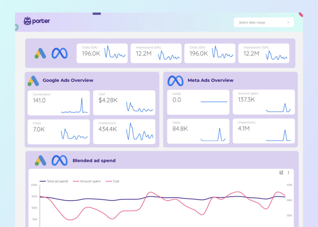
NOTE: If you’re searching for a connector for your Shopify, Facebook, Instagram, LinkedIn, Google My Business, TikTok, Twitter, WooCommerce, HubSpot, or Mailchimp accounts and ads, search for Porter Metrics in the data sources and follow the steps in this help article on how to connect your data to Google Data Studio.
- After you’ve added your data source, click Add a chart in the toolbar.

- Next, select any time series charts (time series chart, sparkline chart, or smoothed time series chart). I’ll be selecting the first time series chart.

- Drop the time series chart anywhere you want to place it in your report.

NOTE: The time series chart will automatically choose a metric and a time dimension to plot the time series chart.
- Next, select the dimension and metric you would like to visualize. I’ll leave the Date dimension, but I’ll change the metric to Sessions.

Now, you can create a time series chart in Data Studio.

Keep reading if you want to visualize your data for longer.
Google Data Studio Chart Properties (Settings)
One of the many upsides to Google Data Studio is the wide range of customization and flexibility it offers its users.
This tutorial section will take you through some of the most popular Data Studio chart properties (or settings).
Data
You may customize the chart data in the data source section of the Setup tab. Find a data source that provides data for the chart you’re currently working on.
Most of the chart data in this tutorial will be from the Google Analytics demo account; however, it’s possible to choose any of these sources and connect the chart to the data source.
After selecting your data source, you can pick which dimensions and metrics you want to display.
Source/Medium and Sessions
You might also want to create a table showing how many sessions are initiated from various media sources. Here’s how this table will look:

To create this table, select a table in the Add a chart tab in the toolbar. Then, set the dimension to Source / Medium and the metric to Sessions.
You will find these fields in any Google Analytics data source.
Date Ranges
Date ranges control what period the graphs show. The default date range setting for displaying a chart is auto which will last 28 days.
But if you choose a custom chart, the chart will automatically select the custom chart’s date. You can pick a fixed date range using the starting and ending dates.
Then choose dynamic date ranges in dropdown menus. You can determine the dynamic date range from the actual day of the review.
In other words, the last seven-day date range dimension will show the information from the last seven days whenever you view the report.
Filters
Table and chart filters allow us to limit the type of data displayed on the chart. Let us assume we want a table to only show sessions via mobile devices.
You can add filters and name it Mobile Sessions. Then, add Device category equal to (=) mobile and then save. It now displays sessions on mobile devices.
Check out this tutorial on How To Create Filters On Google Data Studio for more details on filters.
Segments
In Google Analytics, a segment is a subset of your data. You can see a list of all the segments added to your report using the Resources > Segments menu.
You can also display this list by selecting a component with an added segment, and then click the “View” icon next to the segment name.
Check out this Data Studio help article on Managing Segments for more details on segments.
Style
The style setting depends on which kind of graph you select. The style tab changes how the chart is displayed, looks, and feels.
While the different chart types have specific edge styling, the most common settings are similar.
Background and borders, chart headers, missing data, and other font styling features are common to most charts and tables.
Different Chart Types In Data Studio
Visualizing different metrics and dimensions requires different chart types. The choice of visuals can also depend on what you’re comfortable with.
Below are the different chart types in Data Studio:
Scorecards

Scorecards show an overview of one metric. Scorecards are usually used to visualize key performance indicators (KPIs). KPIs are some metrics that measure your business’s relative health or effectiveness.
For example, a scorecard can summarize your average bounce rate, total sales, maximum hold time, count of ad impressions, minimum failure rate, etc.
Tables

Tables illustrate your data in a grid of rows and columns. Each column represents a metric or dimension, while each row is one record of your data.
Tables in Data Studio automatically group your data. Each row in the table shows the unique blend of all the dimensions included in the table definition.
Each metric in the table is aggregated based on the aggregation type for that metric (sum, count, average, etc.).
Time Series

This chart shows how your data changes over a period of time. A time series chart shows the time dimension as the X-axis (horizontal axis), while the Y-axis (vertical axis) represents the measurement scale.
Say sessions have been trending over 28 days. You can then view this trend with a time series. You can create time series charts directly from the toolbar.
Area Chart

You can modify a line or time series chart into an area chart. This chart type uses shaded areas under the plotted lines on the graph to show the magnitude of data represented by the lines.
Like a time series, area charts help see how your data trends over time. Using the area chart, we can see how channels contribute to the traffic and trends over time.
Line Chart

The line chart is similar to the time series. The difference is that the time series chart only has a time dimension of values along the x-axis. In a line chart, you can have any dimension and any category.
Combo Chart

Combo charts let you represent different series by lines and bars. You can use this to analyze the relationship between two or more metrics.
Bar Chart

A bar chart compares two or more categories using vertical or horizontal bars (vertical and horizontal bar chart, respectively).
The longer the bar of the chart, the greater the value it conveys. One axis shows the categories (dimensions) being compared, and the other represents a discrete value (metric).
The data series comes from your metrics when your chart includes one dimension. You can display up to five metrics in a single-dimensional bar chart.
Map Chart

Map charts display the metric differences between various geographic zones and geographical places. The user list is countrywide, and the chart indicates that the darker the shade, the more people use it.
Pie Chart

Pie charts portray your data in a circular representation, with sections (slices of the pie) representing your data series. The sizes of the slices depend on the quantity or relative value of the metric you are plotting.
In general, pie charts are most valuable when comparing a few data points with relatively significant proportion differences.
Scatter and Bubble Chart

You can use scatter and bubble charts to look for relationships between variables. These charts show your data as points or circles on a graph using the X (left to right) and Y (top to bottom) axes.
Scatter charts can include a trendline that shows how the variables in the chart are related.
Tree Map Chart

A treemap shows your data organized into dimension hierarchies. You can use treemaps for comparison among metric categories within a given dimension in a given tree.
Besides showing high-value colors, it also allocates an extensive area for this class.
Pivot Table

Pivot tables let you narrow down an extensive data set or explore relationships between data points.
With pivot tables, you can quickly summarize your data and identify relationships that might otherwise be difficult to identify.
Bullet Chart

Bullet charts let you quickly see how well a particular metric performs against target benchmarks. Bullet charts are simple, having just three components:
- A center bar that shows the actual value of the metric you are graphing
- A vertical line that shows a target value
- Colored bands that define threshold ranges, such as poor, average, and good
How To Style Data Studio Reports – Charts & Tables
You can style charts and tables by adding other visual elements, altering the theme and layout, adding controls, and adding text or chart titles.
The subsequent headings will take you through the various ways to style a Data Studio report.
Adding a Scorecard
Here’s how to add a scorecard to your report:
- First, ensure you’ve set up your report and added your data source.
- Then, click Add a chart in the top menu bar.

- Now, click the scorecard (scorecard or scorecard with compacted numbers) you want to add to your report. I’ll select the scorecard with compacted numbers.

NOTE: Scorecards only require a metric.
- Next, drag and drop the scorecard to where you want to place it on your report.
- After that, change the metric value to the metric you want to display with the scorecard. I’ll change mine to Impressions.

Now, I can visualize how many impressions my property gets with a scorecard.

Adding Data Sources
Here’s how to add data sources to your report:
- First, ensure you’ve set up your report and the primary data source.
- Then, click Add data on the top bar.

Alternatively, you can click the Add Data button at the bottom right of the window.

- Then search for the data source if you’ve not previously connected to it. Here’s a help article on adding data sources to your Google Data Studio reports

- However, if you’ve previously connected to the data source, click My data sources and search for the data source.


- Next, select the data source and click Add.

- Finally, click ADD TO REPORT.

You can confirm that the data source has been added successfully by checking the data tab on the right-hand side of the window.

Adding a Bar Chart
Here’s how to add bar charts to your report:
- First, ensure you’ve set up your report and added your data source.
- Then, click Add a chart in the top menu bar.
- Next, click the bar chart you would like to use. Google Data Studio has 6 bar chart formats (column chart, stacked column chart, 100% stacked column chart, bar chart, stacked bar chart, 100% stacked bar chart). I’ll be using the bar chart in this tutorial.

- Then, drag and drop the bar chart anywhere on your report.
- Change the dimension and metric you want to visualize in a bar chart. I’ll choose Device Category as my dimension and Sessions as my metric.

Now, I can view my bar chart showing how many sessions each device category has.

Adding Theme and Layout
Now, we want to style our report. Here’s how to add a theme to a report:
- First, click Theme and layout in the toolbar.

- In the THEME tab, click the theme you want to apply.

Source: support.google.com
Here’s how to add a layout to your report:
- First, click Theme and layout in the toolbar.
- On the right side of the window, select LAYOUT.

- Here are some of the layout options available in Data Studio:
- Heading visibility (Always show, Auto-hide, Initially hidden)
- Navigation type (Left, Tab, Top left)
- Display mode (Fit to width, Actual size, Has margin)
- Canvas Size (US letter (4:3)-Portrait, US letter (4:3) -Landscape, Screen (16:9) -Portrait, Screen (16:9)-Landscape, Customize)
- Snap to (Smart guides, Grid)
- Grid Settings (Size, padding, horizontal offset, vertical offset)
- Report-level Component Position (Top, Bottom)


Now you know how to customize the theme and layout of your report.
Adding a Sliding Control
Here are the steps to adding a sliding control:
- First, ensure you’ve set up your report and added your data source.
- Then, click Add a control in the toolbar and select Slider.


- After that, drag and drop the sliding control onto your dashboard.
- Now, you’ll need to set a numeric control field. In this tutorial, I’ll use Page Depth (the number of pages users visit during a session).


- Once you’ve selected the control field, you can now filter your dashboard based on the slider. For instance, the sliding control image below will filter the number of new users from various sources with a page depth from 0 to 10.

Adding “Text / Chart Title”
Below are the steps to adding a text or chart title:
- First, ensure you’ve set up your report and added your data source.
- Then, click the text icon in the toolbar.

- After that, head to the chart you want to add text to, then click, drag, and release your mouse to create a text box.

- Now, add the text into the text box.

NOTE: There are formatting options in the Text Properties tab where you can change the font, font size, alignment, font color, text styling (bold, italic, underline, strike-through), and add hyperlinks.
You can also alter the overflow settings, background, border, and padding settings.


Creating a “Dual-axis Line Chart”
A dual-axis line chart (also called a multiple axes chart) uses two axes to skillfully depict the relationships between two variables with different magnitudes and scales of measurement.
Here are the steps to creating a dual-axis line chart:
- First, ensure you’ve set up your report and added your data source.
- Then, click the Add a chart button in the toolbar.

- From the dropdown, pick the third option in the Line visuals.

NOTE: You can also do this with a Time Series chart.
- Then, drag and drop the chart where you would like to place it in your dashboard.
- You’ll need to select two metrics and one dimension to create a dual-axis line chart. In this tutorial, I’ll use Clicks and Sessions as my metrics and Month of Year from the sample Google Analytics data as my dimension.

NOTE: You can also add a date range control to specify your time frame. Now, you can visualize both clicks and sessions for any time range in the same chart.

Advanced Tips For Marketers And Analysts On Data Studio
Several advanced tips allow users to customize their dashboards and reports. In this heading, I’ll share some of my favorite tips for Data Studio you can adopt as a marketer or analyst.
Grouping Data by Month & Date Range Options
To group data by month, you can change the type to Month or use a Month field from your data source.
Here’s how to change the type to Month:
- First, ensure you’ve set up your report and added your data source.
- Then, head to the menu bar and click Resources.

- From the dropdown list, click Manage added data sources.

- Then, click Edit in the data source row you want to edit. I’ll be editing the CRM Template – Deals data source.

- After that, click the Date dropdown of the row you want to edit. I’ll be editing the Date Created field.

- Next, select Date & Time, then click Month or Year Month.

Now, the field will display only the month instead of the entire date. You can also change this during the initial configuration of your data source.
To use the date range control, follow these steps:
- First, ensure you’ve set up your report and added your data source.
- Next, click Add a control in the toolbar.

- From the dropdown, click Date range control.

- Now, drag and drop the control to where you would like to place it on your dashboard.
- Next, click on the control, specify your preferred start and end month, or select one from the predefined ones.

Now, you can group data by month and date range.
Using Advanced Data Blending Tools
Here are some tips when using advanced blending tools:
- Blends should contain only a subset of the available data: As a best practice, you should only include the exact fields you’ll want to visualize in charts based on a blend.
- Blend multiple tables from the same data source: Blending numerous tables from the same data source lets you intriguingly combine your data and work around connector limitations.
Check out Data Studio’s Help article on Blending Tips and Advanced Concepts for more blending tips and concepts.

Using Parameters with Google Data Studio
Parameters let you interact with user-provided data. You can create calculated fields and pass values back to the SQL query with parameters.
Parameters can make your reports more interactive. You can also use them to build report templates.
Check out Data Studio’s Help article on Parameters for more information on using parameters with Google Data Studio.
Take Advantage of the Advanced CASE Function
CASE defines at least one condition and returns a result when a condition is met. You can also define a default result if none of the conditions set are met.
A common use for CASE is when you need to categorize data. For instance, to group selected country values into a Sales Region dimension, you might develop a CASE expression like this:
CASE
WHEN Country IN (“USA”,”Canada”,”Mexico”) THEN “North America”
WHEN Country IN (“England”,”France”) THEN “Europe”
ELSE “Other”
END
Check out Data Studio’s help article on CASE for more information on taking advantage of the advanced CASE function.
Customizing Your Bar Chart
After creating your bar chart, you might want to improve the aesthetics. All you need to do is head to the STYLE tab and tweak the styling elements you want to alter.
Here are some of the customization options for a bar chart:
- Changing the orientation (horizontal or vertical)
- The number of bars the bar chart can contain
- Displaying data labels, compacting numbers, and decimal precision.
- Adding a reference line.
- Axes styling (Showing axes and reversing y and x-axis direction)
- Showing the left y-axis title.
- Changing to log scale.
- Showing axis title.
- Grid, legend, background and border, and chart header styling.
Conclusion
With this tutorial on how to create a time series chart in Google Data Studio, you’re now proficient in visualizing your data trends and patterns in Data Studio.
The choice of visuals depends on your goals, data, context, and intended message. A time series chart is excellent if you’re interested in visualizing changes over time. A bar chart is better if you’re interested in comparing values. Experiment with other chart types to find the best that suits your needs.
Creating reports from scratch can be a lot of work. You should check out some of our Data Studio templates to make your data reporting and automation tasks easier and faster.
You can always contact us if you’re finding it hard to create your Data Studio report. Our support team is available 24/7 to assist you with creating your report.
Frequently Asked Questions
How do I use time series in Google Data Studio?
To use time series in Google Data Studio, follow these steps:
- First, ensure you’ve set up your data source(s) and report.
- Click Add a chart in the toolbar.
- Next, select any time series charts (time series chart, sparkline chart, or smoothed time series chart). I’ll be selecting the first time series chart.
- Drop the time series chart anywhere you want to place it in your report.
NOTE: The time series chart will automatically choose a metric and a time dimension to plot the time series chart.
- Next, select the dimension and metric you would like to visualize. I’ll leave the Date dimension, but I’ll change the metric to Sessions.
Now you know how to use time series in Google Data Studio.
Which chart is best for time series?
Data Studio offers a built-in time series chart type you can use to create a time series. You can also use line charts by setting the x-axis to a date or time dimension.
How do I make a chart in Google Data Studio?
Here are the steps to making a chart in Google Data Studio:
- First, ensure you’ve set up your data source(s) and report.
- Next, click Add a chart in the toolbar.
- Select the chart type you would like to visualize.

- Then, drag and drop the visual anywhere on your report.
- Lastly, select the metric(s) and dimension(s) you want to visualize.
You can also watch our YouTube video to learn more about creating charts in Google Data Studio.