


Pivot tables allow you to view your data in multiple dimensions simultaneously, making them ideal for summarizing trends and answering business questions!
This guide will show you how to make pivot tables in Google Data Studio (formerly Looker Studio) and the benefits, drawbacks, and unique features they provide. So let’s get started!
What Are Pivot Tables?
Pivot tables are a simple interface that organizes data by multiple categories at once, providing you with a high-level view of your data.
Pivot tables are a quick and dynamic way to avoid writing formulas that summarize and analyze your data, and they’re great for presentations.
As a result, they’ve always been popular among data analysts in spreadsheet applications such as Google Sheets or Excel.
So, in 2017, Google added pivot tables to their Data Studio product, making them even more useful for client-centric (or upper-management-centric) reports.
Pivot tables and other graphic representations can tell a story with data in Google Data Studio. Adding tooltip annotations to your Google Data Studio reports is a great way to add extra information!
Of course, for pivot tables to tell a good story, you must understand how to use them correctly. So let’s get started with pivot tables in Google Data Studio!
Importance of Pivot Tables in Google Data Studio
To improve the visualization of our raw data, we use Google Data Studio. Apart from the visualization, we have no other reason to use it. Additionally, pivot tables are created for improved visualization.
Pivot tables are primarily intended to improve message delivery and to create more communicative data. Users should immediately understand what the data says when they see the pivot table.
Pivot tables in Google Data Studio allow us to be more specific and in-depth with information.
For example, if you want to show a website’s traffic from various sources, a standard table will only show you the numbers for each page.
While a pivot table will allow you to display all of the pages and their traffic numbers from all sources, it will also generate a multi-column table to precisely display all of these insights.
All of these comparisons will be covered later in this article. So, these are some of the reasons why we should learn Pivot tables in Google Data Studio.
How to Create a Pivot Table in Google Data Studio
We’ll be using a prepared sample sheet with sample audience data from Google Analytics for this tutorial.
Click Add a chart in Google Data Studio and scroll down to find a Pivot table.
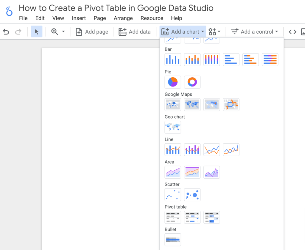
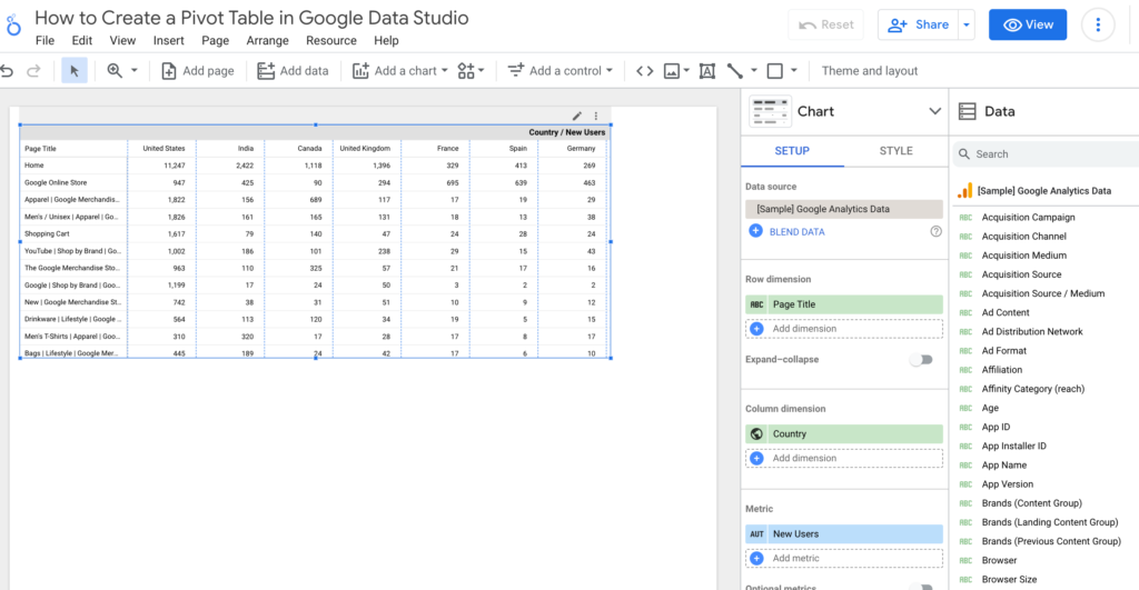
A pivot table will pop-up, pre-populated with relevant data from your data source.
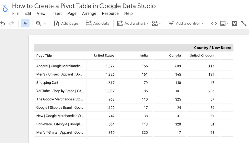
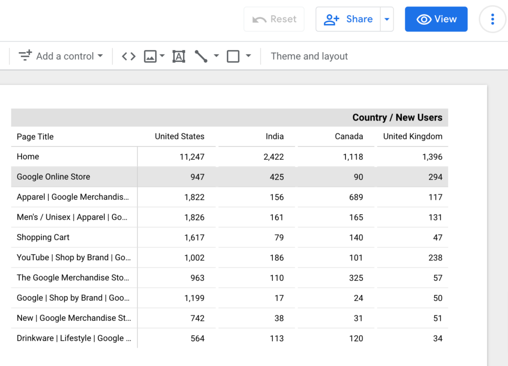
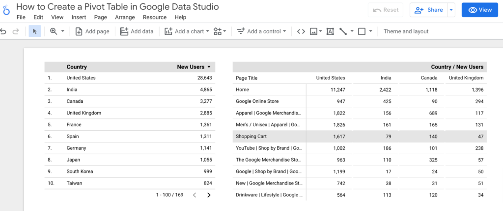
Unlike a traditional data table, metrics do not appear as column headers and dimensions as row headers.
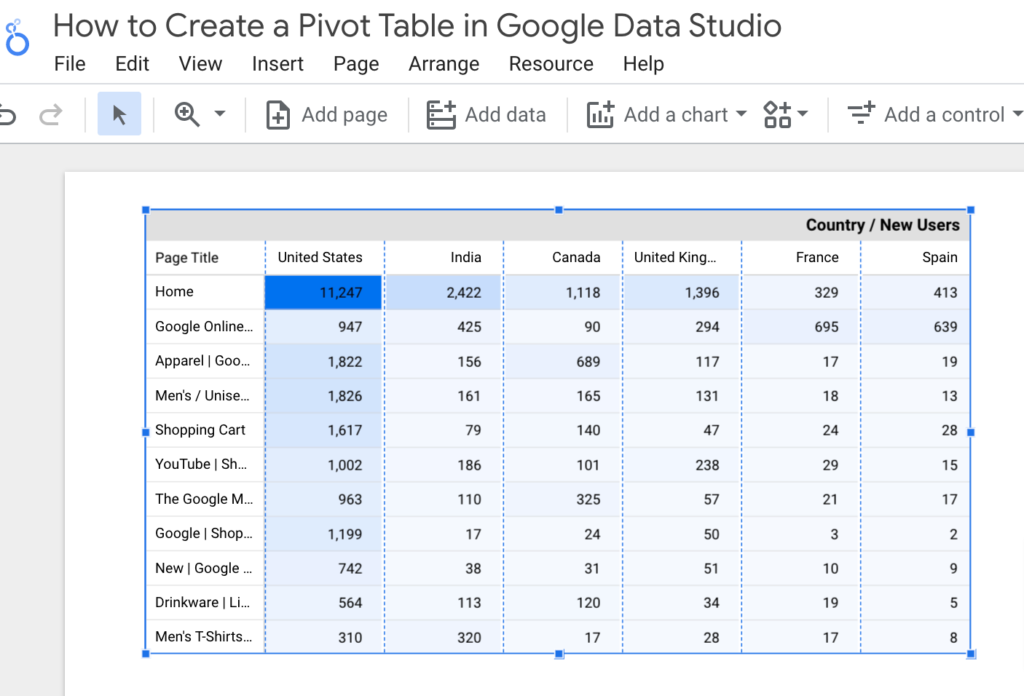
Instead, the metric serves as a table header, with columns and rows denoting dimensions. The Row Dimension, in this case, is the Page Title, while the Column Dimension is the user’s Country.
This allows you to examine any metric in depth and observe relationships between dimensions such as age, location, source, ad campaign, product page, and more.
This is where pivot tables come in handy. When we use the correct features, they can automatically organize similar datasets and filter the results.
Let’s learn how to use them!
Pivot Table Structure in Google Data Studio
Metrics, row dimensions, and column dimensions are the three main components of pivot tables.
Let’s take a closer look at these three components to see which fields we should include to get the most out of our pivot tables.
When you change the fields in your metrics or dimensions, the table may take a few moments to load. Please be patient! There’s a lot of information to sort through.
Metrics
Metrics are the numbers that describe everything we track, such as the number of users, pageviews, conversions, and so on.
A pivot table aggregates and sorts your metrics from all of your tabular data points (i.e., each row).
This pivot table uses New Users as a metric to display the total New Users from all website visits at each intersection of Page Title and Country.

You can also use multiple metrics in a single pivot table, but be aware that depending on your data, this can become a bit cluttered.
Here’s an example of a pivot table with the same dimensions (only one row dimension and one column dimension) but two metrics, Age and New Users.
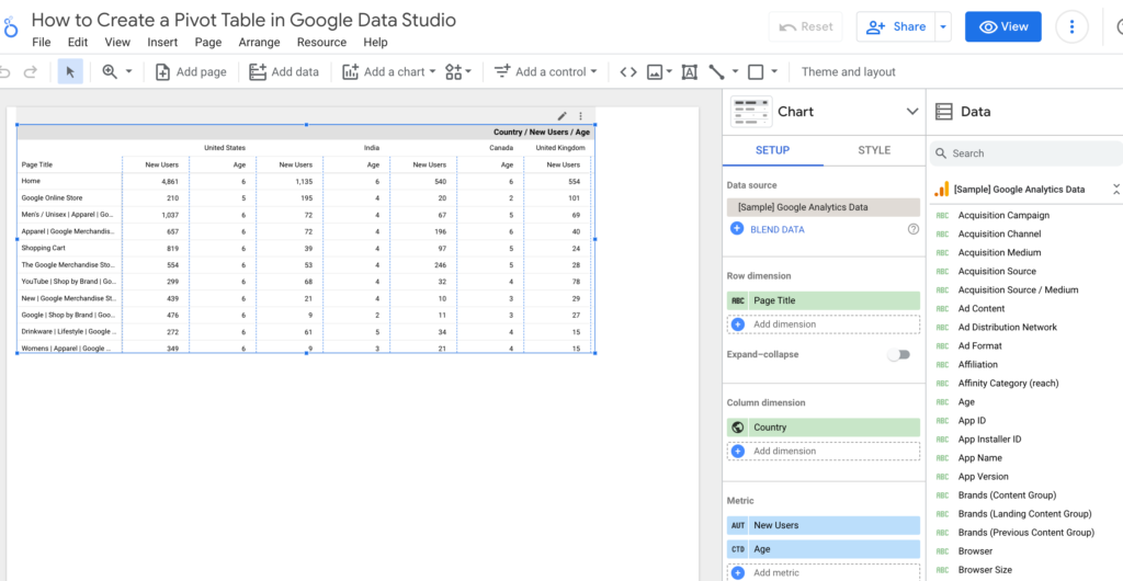
As you can see, pivot tables are excellent for performing in-depth analyses of a single metric.
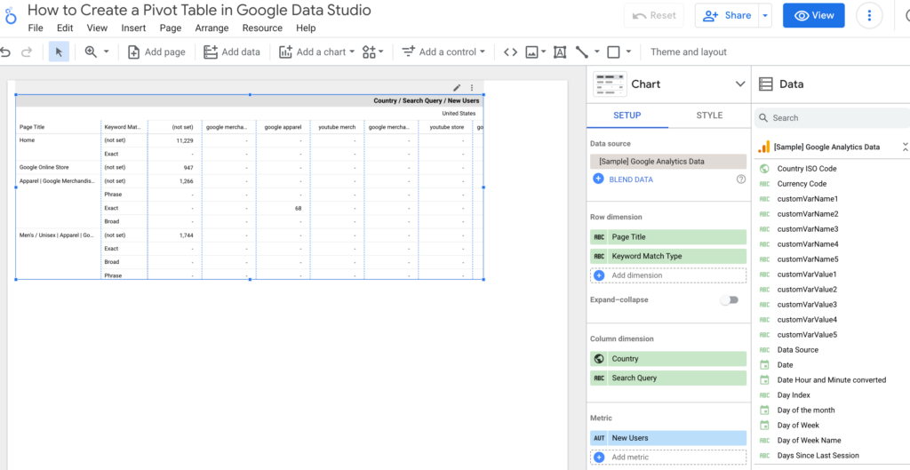
Rows and Columns Dimensions
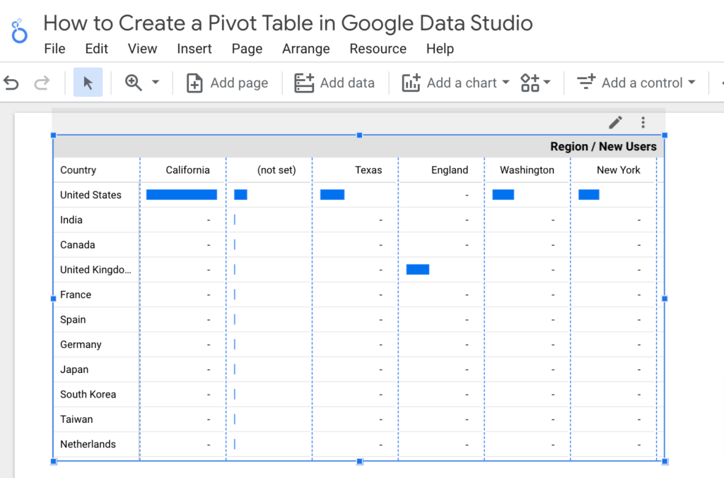
Technically, you can use row and column dimensions interchangeably — your entire table can “pivot” (turn) to produce the same results in either direction, hence the name “pivot table.”
For example, the pivot table below shows the Pages visited by New Users across different countries – the Row Dimension is Page Title, and the Column Dimension is the Country.
Like metrics, you can use multiple dimensions in each row and column. You’ll probably get the most out of this function if you group similar or related dimensions as rows or columns.
Using Pivot Tables to Organize and Filter Data
Filters give you more control and flexibility in data analysis, making your pivot tables more accessible to clients.
Tables on a client dashboard may not appeal to many users, especially those who hired you specifically to do this for them! Many of them do not want to sift through numbers.
They want to see outcomes. Pivot tables, on the other hand, synthesize data into more digestible, meaningful numbers in a single table.
When properly configured with filters, the numbers in a pivot table show the big picture and help clients answer specific business questions.
Sorting, date range, table filters, and dashboard controls are all options for organizing and filtering data in your pivot table. You configure the first three in the report’s backend.
On the other hand, dashboard controls allow users to explore and analyze data independently.
Sorting, Date Ranges, and Table Filters
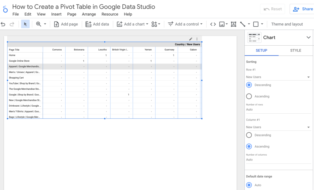
The Sorting fields in the Data sidebar of your pivot table organize your rows and columns.
We wanted to focus on the highest revenue groups in our previous example, so we sorted the first row by Revenue in descending order.
This kept all of the pivot table’s most important revenue figures at the top.
If, on the other hand, you want the list of countries down the left side of the table to be alphabetized, choose Page Title to be sorted in Row #1 in Ascending order.
Row #2 New Users are sorted in Descending order, so the new users increase as you move across the column header.
For each pivot table, you can also specify a default date range. When set to Auto, the last 28 days are usually the default.
But you can set custom ranges using a calendar or by counting backward from the current date.
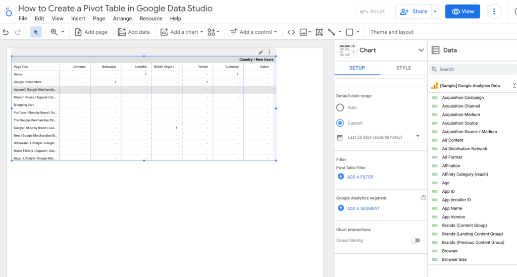
Pivot Table Filters can narrow down the data you want to display, but we’ll skip this for now because it requires access to your chart data source.
Dashboard Controls
Finally, dashboard controls provide your pivot tables with the interactive quality that makes them so appealing to clients.
Simply click Add a control and choose the type of control you want to make to create a new dashboard control. There are several options, but we’ll use a simple Drop-down list to demonstrate.
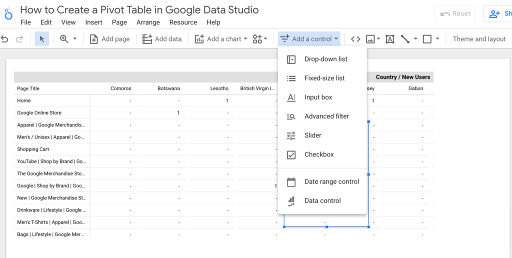
When a user views your dashboard (you can preview it by clicking the View button), they can select which filters to apply to the data by clicking the control dropdown.
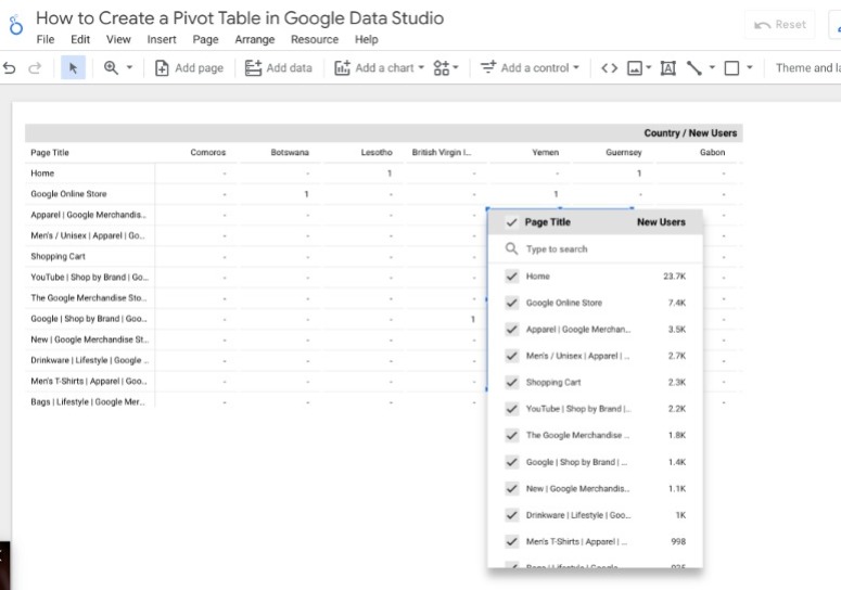
They can choose one or more groups to include in the pivot table here.
Pivot Tables vs. Tables in Data Studio
This section focuses on the difference between pivot tables and normal tables in Google Data Studio.
Step 1 – Go to “Add a chart” and select the table.
Step 2 – Go to “Add a chart” and select the pivot table.
Step 3 – Click the View button in the upper right corner.
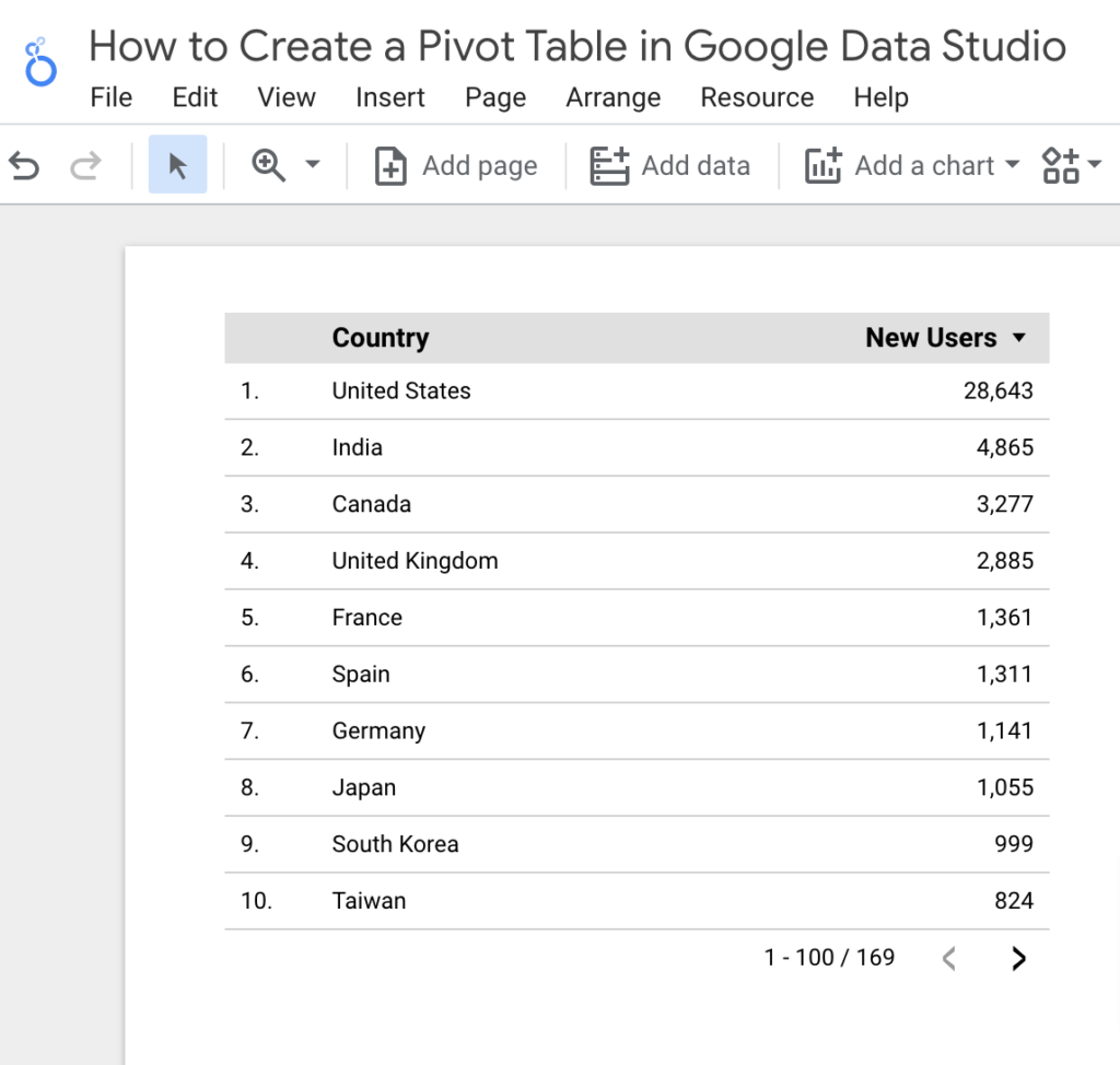
A normal table only displays the number of new users who visit the website on a single page.
However, in a pivot table with the same data and metric dimensions, we can see that the table represents new users on the pages and their sources.
You have more control over our data when you use pivot tables, and now a viewer viewing this report can easily understand the data that this number of users is coming on these pages from these sources.
We can’t get multiple metrics like this in a normal table, other than the optional metric feature.
Let’s look at the pivot table variations in Google Data Studio.
Pivot table Variations in Data Studio
Pivot tables are classified into three types: pivot table, pivot table with bars, and a pivot table with heatmap.
Let’s look at how these features can improve the quality of our table’s delivery. On the same data, we will test both of these variants.
Step 1 – Go to “Add a Chart” and select the Pivot table with bars.
A pivot table with bars does not display numerical values but uses a bar to represent the value. You can now customize these bars in terms of color, expand, border color, thickness, and so on.
Step 2 – Click the “Add a Chart” button, then the Pivot table with heatmap.
Here you go, the values are still present, but the overall table has been converted into a heatmap that depicts the table values with colors.
The darker color box has the highest values, while the lighter one has the lowest.
Conclusion
That’s all there is to it for getting started with pivot tables in Google Data Studio! Pivot tables aid in the creation of a better data experience for clients.
Thanks to pivot tables, Data Studio makes analysis and exploration far more accessible. You can dynamically pull data without requiring the user to deal with spreadsheets.
Furthermore, using pivot tables is just one of the many useful features provided by Google Data Studio. There is a lot more you can do with this tool. Check out our other Data Studio Tutorials.