


With Google Data Studio’s default comparison tool, you can allow end users to compare data with a specific period, a previous year or month, or even yesterday or today plus or minus x day/week/month, etc.
The default comparison options in Google Data Studio are sufficient for most use cases. Still, you require more flexibility to compare any date range with any other one.
In that case, other alternatives are available when you create a custom date range comparison in Google Data Studio, which is what this article is about.
So, keep reading as we show tips, tricks, and ideas for you to use to create a custom date comparison in Data Studio.
How To Create A Custom Date Range Comparison In Google Data Studio?
Create a blended data source in Google Data Studio.
Data blending combines data from various sources into one new dataset that can be processed, examined, or shown in a visualisation tool.
In Google Data Studio, all charts are connected to one data source. However, using Data Studio’s data blending features, you can produce charts based on many data sources.
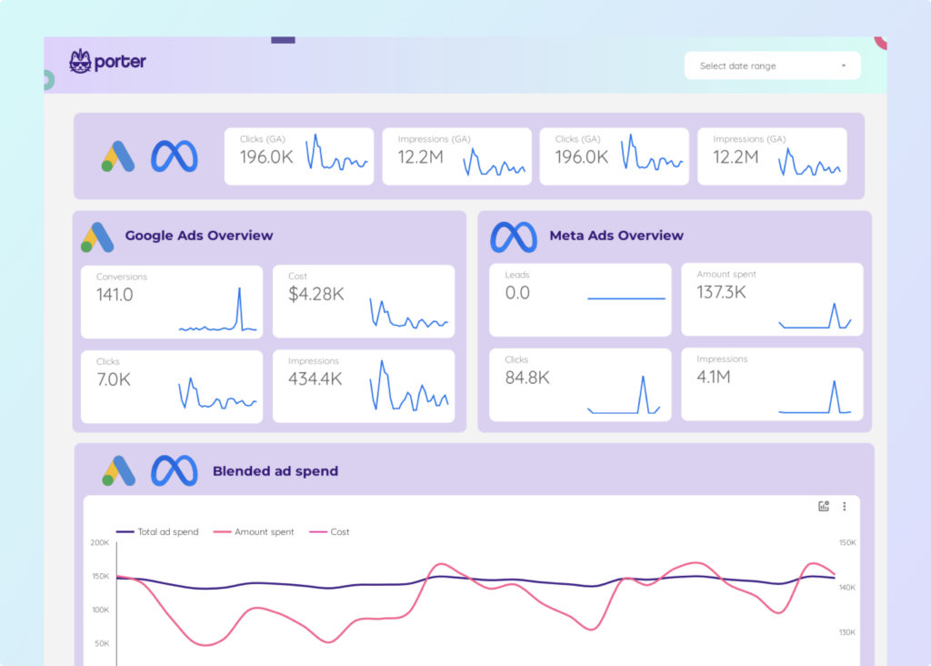
So, for example, you can have a blended data of Google Ads and Google Analytics to give you a proper representation of your campaign performance.
- To create blended data, sign in to your data studio. You could either create a blank report or use an already created one.

- Next, in your report dashboard, click “Resources” in the top menu and select “manage blended data.”

- It opens up a window. Click on “add a blend”

- A new window will open where you can choose from new/available or existing data sources to add to your report. You can add as many data sources as possible (up to 5). Pick the data source you want and add it to your report.

- Google won’t automatically blend everything. The second data source, metrics, and dimensions you want to add must be specified to Data Studio. They can be added by dragging and dropping them into the menus’ “dimensions” and “metrics” sections or, better still, searching for them in the little search bar.

- Whatever dimensions or metrics you add, you will see them on the right side of the screen. Once you are gotten all the metrics, you need. Click “save” and exit the window. Then it will take you back to your report dashboard.

Add data controls
Now, we add a data control that can make it easier for you to choose any custom date to streamline your data and show only the date, events, and data that happened during that period.
Click on “Add a control.” Select “date range control” and drop it on the dashboard.

Next, click on the date range control and the upper right tab.

You should see a dropdown list, scroll to advanced and choose that.

Now, you can play with the parameters present to choose your custom date or advanced date range.

Once you select it, the data will refresh, showing only the data for that period.
Create the table using the blended data source
Click on “add a chart.” And select Table. Drop it on the data control widget, and you should get a table showing only the metrics and dimensions of your event for your custom period.

How to Create Custom Formatted Date Comparisons in Google Data Studio
Connect to Any Dataset with a Date Field
I’ll use search console data as my example, but this applies to any dataset with a Date field and a sufficient amount of data to use as a comparison period.
While year over year (Y/Y) is the most optimal comparison time, it can also be adjusted for any comparable period.
Create a Comparison Date Field in your Dataset
To create a comparison. You should have two sets to give that comparison. So, you could have a scorecard with metrics impressions.
But the date could be set to last month, duplicate it, and choose another date like this month. Now with these two, you can compare your data.
Create Your Visual
Next is a chart visualization to correctly display our two time periods. We can use a time chart, scorecard, or any chart to create the needed visuals to differentiate the two.
How to compare any date with any date or multiple dates with multiple dates?
Create a blended data source in Google Data Studio
First thing is to have your data source. We already treated how to create a blended source in this article. Just scroll up. Once you have your blended data source, pick the metrics you want and drop them in the dashboard.
Add data controls
Click on “Add a control.” Select “date range control” and drop it on the dashboard. Next, click the date range control and select any date you want.
There are two boxes, the start date and the end date. The start date is usually the left box, where your date starts from, and the correct box is the end date and where the end is.
So, for example, if I want to see results from the 1st to the 30th of November. 1st will be selected on the left and 30th on the right. Then click “Apply”

Once you click Apply, the data will refresh, showing only the data for the period you chose.


Create the table using the blended data source.
For this one, we are using a scorecard, so we insert the scorecard from “add a chart’ and drop it on the dashboard. Then we click on data control, the date range control, and select our dates.
Once you select it, the data will refresh, showing only the results for your chosen period.
Next, go to the setup and scroll down to the comparison date range, and once again, chose a date you want to use as a comparison.


Once again, the dashboard will update with the necessary information, and you will see the comparison. For us, it’s the red number showing us that there was a decline in clicks when we compared two days to one week of data.

How to compare any week with any week or multiple weeks with multiple weeks?
Create a blended data source in Google Data Studio.
Have your blended data source ready or create it through the “manage added resources” section. In the dashboard, pick the metrics you want from the blended source and drop them in the dashboard.
So, you can have blended data of YouTube Ads and Google Analytics if you want.
Add data controls
Click on “Add a control.” Select “date range control” and drop it on the dashboard. Next, click the date range control and select any week you want.
It could be a week or two weeks to compare against one week. For example, we will pick two weeks in the date range control.
There are two boxes, the start date and the end date. The start date is usually the left box, where your date starts from, and the correct box is the end date and where the end is.
So, for example, I would select 1st on the left and on the right select 14th, which is two weeks.

Once you select it, the data will refresh, showing only the data for your chosen period.
Create the table using the blended data source.
We are using a table, so we insert it and drop it on the dashboard. Then we click on the date range control in the dashboard and select our weeks. In our case, it’s two weeks.
Once you select it, the data will refresh, showing only the results for your chosen period.
Next, go to the setup and scroll down to the comparison date range, and once again, choose the week you want to use as a comparison. We choose a random week in a random month.
Once again, the dashboard will update with the necessary information, and you will see the comparison.

How to compare any month with any month or multiple months with multiple months?
Create a blended data source in Google Data Studio.
Have your blended data source ready or create it through the “manage added resources” section. In the dashboard, pick the metrics you want from the blended source and drop them in the dashboard.
Add data controls
Click on “Add a control.” Select “date range control” and drop it on the dashboard. Next, click the date range control and select any month you want. That is from the 1st to the last date of the month.
There are two boxes, the start date, and the end date. The start date is usually the left box, where your date starts from, and the correct box is the end date and where the end is.
So, for example, the 1st will be on the left side and the 30th on the right side.
Once you select it, the data will refresh, showing only the data for the month you chose.
Create the table using the blended data source.
We are using a table, so we insert it from “add a chart’ and drop it on the dashboard. But you can use any chart you want and still get the same results.
Then we click on the date range control in the dashboard and select the month. Once you select it, the data will refresh, showing only the results for your chosen period.
Next, go to the setup and scroll down to the comparison range, and once again, choose the month you want to use as a comparison.
The dashboard will update with the necessary information, and you will see the comparison.

How to compare any year with any year or multiple years with multiple years?
Create a blended data source in Google Data Studio.
Have your blended data source ready or create it through the “manage added resources” section. In the dashboard, pick the metrics you want from the blended source and drop them in the dashboard.
Add data controls
Click on “Add a control.” Select “date range control” and drop it on the dashboard. Next, click the date range control and select any year you want.
Now unlike months where it’s 31 days, the year is more, so it‘s a bit different. You can click on the little upper dropdown menu and pick either “This year” or “last year” if that’s what you want.

But if you still want a bit of customisation, click on the “month year” banner (November 2022). It shows you the months, and the two signs (< >) can be used to change the year.

Don’t forget the start date is usually the left box, and this is where your date starts from, and the correct box is the end date and where the end is.
Once you’ve picked the year, pick the month, which we assume is January 1st, and the second box will be December 31st.

Once you select it, the data will refresh, showing only the data for the year you chose.
Create the table using the blended data source.
We insert the table from “add a chart’ and drop it on the dashboard. But you can use any chart you want and still get the same results.
Then we click on the date range control in the dashboard and select the year. Once you select it, the data will refresh, showing only the results for your chosen period.
Next, go to the setup and scroll down to the comparison date range, and once again, choose the year you want to use as a comparison. The same method follows for picking your comparison year.
Once again, the dashboard will update with the necessary information, and you will see the comparison.

How To Add Multiple Comparison Periods in Data Studio
Let’s say, you want to compare how a campaign performed during two different periods, it’s actually quite easy to do. Just follow these simple steps to add multiple comparison periods in data studio.
Connect your data source
Connect the data source you want to use. That’s “add data” which you can practically see anywhere in the dashboard of data studio.
For us, it’s Google Ads, Google Analytics, Google search console, and YouTube Ad data from Google sheets. Yes, you can add up to 5 data sources in one report.

Create your first scorecard.
Create your scorecard with your preferred metric. To do that, click “add a chart,” select “scorecard with compact numbers”, and drop it on the dashboard.

By default, a random metric will be loaded, but you can change it by dragging the metric you want from the setup panel and dropping it on the scorecard.

Select your primary comparison date
This is the initial date you want to use for comparison. Go to the setup panel and scroll down to the comparison date range. We choose the 10th of October 2022 as our primary comparison date.

Click on it and select the date you want. If you want more options, click on “none.” You should see a dropdown list showing a list of options you can use to fine-tune your comparison.

Duplicate your scorecard
Next is to duplicate your scorecard. Luckily, in data studio, Ctrl C and Ctrl V still work. So, all you have to do is click on the first scorecard, press Ctrl C and then Ctrl V. That’s all.

Select your secondary comparison date
Just like we did with the primary comparison date. Go to the setup panel and choose the date you want to compare the initial date to. We choose the 8th of October 2022 as our secondary comparison date.

As you can see, some comparisons have already been made, and immediately we clicked apply.
Make your visual insightful
One thing about data studio is the freedom to beautify your visual to your preferences. You can change the colours, style, size of the font, and all that.
Originally the colour for the scoreboard was white, but I had to change it to blue so that the word and metric could be easily seen.

So, you can change and select the colour that matches your dashboard’s background. All these can be done from the Style section on the right.
Add more data to your dashboard.
You can always add more data and create more scorecards to tell a complete story.

What To Do When Data Studio Date Range Control Is Not Working
For many users, having the ability to specify a specific timeline on your dashboard is useful. This makes it quite frustrating when the Date Range Control in your dashboards stops working.
Fortunately, there are ways to make this choice practical again.
The default date range is set at custom.
Naturally, you have two options for date range settings: “auto” and “custom.” These two options are available on every table, graph, chart, scorecard, and so on. So, always ensure that the “auto” option is selected.

With “auto,” you can use the Date Range Control to change the selected element’s date range.
The Date Range Dimension is not selected.
You might occasionally need to choose a “Date Range Dimension.” for you to be able to use the date range comparison. When you leave this dimension empty, Google Data Studio will provide you with the dataset’s total.
Once you choose the “Date Range Dimension,” be careful to use a “Date type” dimension. Once chosen, you’ll notice that the Date Range Control is functional for your table, graph, scorecard, etc.

Using an incorrect Date Range Dimension type
Sometimes “date type” data is interpreted by Google Data Studio as “text type” info. It’s a simple mistake that happens.
But you can solve this by selecting “Resource,” “Manage added data sources,” and then “Edit.” Next, you will see a list of metrics and dimensions for your selected source.
Scroll down to your date dimension. You can see what kind of type your date dimension has by looking at the second column labelled “Type.” And change it to date-type data.
It’s more complex than it seems to convert a text-type field to a date-type field. To accomplish this, a new calculated field must be created. It would help if you used the PARSE_ date formula to modify the date notation.
PARSE_DATE(“%m-%d-%Y”, select your dimension here)
There are too few bars set.
The option is a simple one. Choose the graph that your “Date Range Control” is having trouble displaying.
After that, select the ‘style’ tab next to ‘setup’ Near the top, you can see “Pubs, Bars,” where the number 10 is by default visible.

Let’s say you want to display a trend graph with data from a year (a whole year). You must adjust the default value of ten to twelve for this to function. Twelve bars rather than ten can now be seen.
Conclusion
The Advanced Date Filters in Google Data Studio provide a variety of features and functionalities that are ideal for presenting your data in an informative and understandable manner.
Marketers wishing to specify their campaigns’ performance over a specific time period will find this tool to be of great use.
The scorecard compares two reports’ statistical changes over a specified period, making it easier for users to compare metrics per specified dates.
If you still need any help with custom date range comparisons, you can always contact Portermetrics for help. We are available 24/7 to help you and your business.
Frequently Asked Questions
What is the difference between data joining and data blending?
Data joining only takes data from one source, while data blending combines data from several sources.
How many sources can Google Data Studio blend?
You can combine up to 5 data sources in one chart using Google Data Studio.
Can I combine data from different reports in Data Studio?
Blended data sources, unfortunately, only belong to the report in which they were produced. Additionally, the calculated fields you created cannot be used as references in other calculated fields in the same blended data source.
What is a date range?
A date range is a number of dates with a particular start and finish date with all the dates in between.
What is the custom date range in Data Studio?
Custom Date Ranges lets you choose your Date Range by selecting the start and end dates. You will no longer be constrained to a pre-defined Date Range anymore.
How do I add the date range in Data Studio?
Simple. Click on “add a control” and then select date range control. From here, you can change the date to whatever date you want.