


Did you know you can use Data Studio (formerly Looker Studio) Community Visualizations to make your report more visually appealing?
Figures are commonly used in workplaces to help employees understand the dynamics of the company’s progress. However, there are times when you need to represent a set of data in our own defined set.
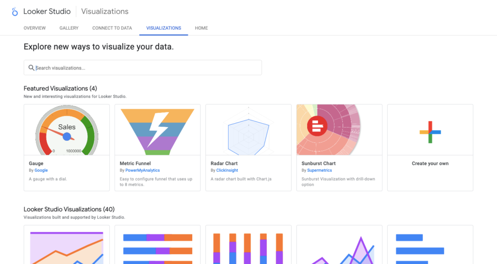
In that case, you can create custom reports using Community Visualizations. There are also a few charts that could fit your needs in addition to the standard charts offered on Data Studio.
Let’s get started!

What are Community Visualizations?
In Data Studio, we learned about all the standard chart types, but what if the type of visualizations we want aren’t possible with any of those default chart types?
The good news is that you can learn everything you need to know to create a currency visualization on the Data Studio Community Visualizations page.
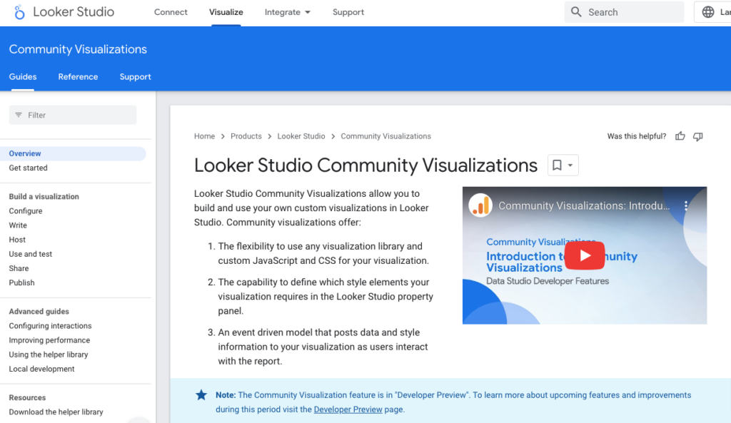
As you can see, it states that you can create your visualizations using any visualization library, JavaScript library, and CSS.
Then, using that JavaScript library, CSS, and some coding knowledge, you can define how to style your element and tell the story with your data.
You do not need a developer or technical expert to create your visualizations. Anyone who creates a custom visualization can share it with others.
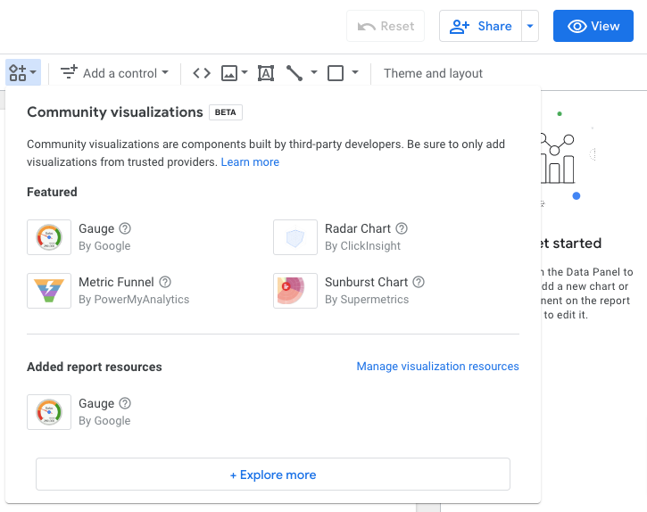
People and businesses are creating community visualizations and sharing them with us if Google approves. They are then shared in this small menu in Data Studio.
Instead of adding a chart menu and using one of the standard charts, you can open a small menu and access Google-approved community visualizations.
This screenshot highlights a few of the community visualizations including Google, PowerMyAnalytics, Supermetrics, and ClickInsight.
Types of Community Visualizations
1. Gauge Chart
Let’s look at Data Studio’s Gauge chart and see how it works.
For the purpose of this tutorial, we will be using a sample data source on Data Studio – “Google Analytics Report”.
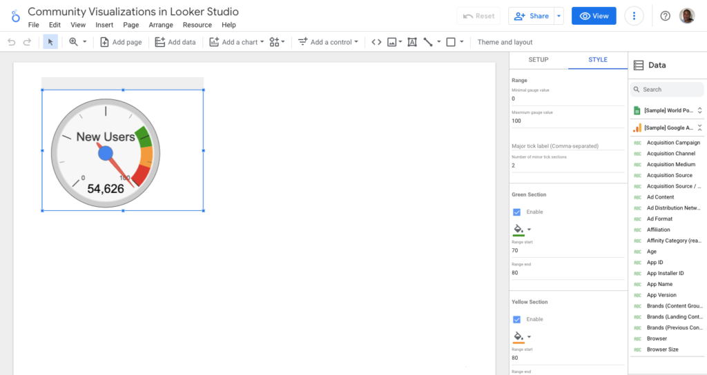
Once the data has been uploaded, you can add the Gauge chart on Data Studio to the new report.
On the right-hand side, you can sort the Metric using the Default date range. On the STYLE tab, you can set the minimum gauge value to zero and set the maximum.
You can set the maximum at 50,000 because this data source shows 54,626 new users. Then, you have to define three distinct sections – green, yellow, and red.
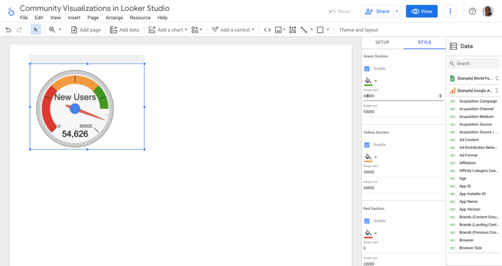
It is green if the website owner is satisfied with 40,000 to 50,000 users in the time slot. They may become concerned if the number of users falls between 20,000 and 40,000.
They have fewer users than anticipated. Anything between zero and 20,000 users is bad, and someone will be flagged.
That’s pretty much it. So it has the same data Properties tab and installs tab as any other standard chart in Data Studio.
2. Sunburst Chart
The Sunburst chart displays a single metric across multiple dimensions. This type of ring is used to depict the distribution of that metric across different categories within that dimension.
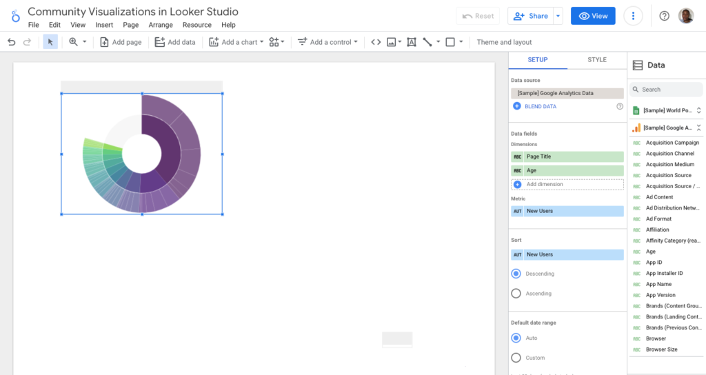
We have the New Users by Page title and Age as a product.
The Page title is represented by the main ring in the middle, which is a darker shade. The Home, Online Store, Men’s/Unisex are all visible.
When you hover over any of these, you can see that the Page Title had a 39% share of New Users.
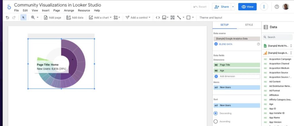
This is just one instance of how you can visualise a story about how people see your website data, which pages they land on, and which pages they see next.
You can add more metric sessions and dimensions: the landing page, the second page, and the exit page.
3. Animated Bar Chart
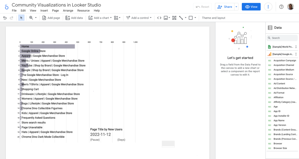
We have the top 20 Page Title by New Users in 2022, and this chart type employs animation to demonstrate how they change from month to month during this period.
Depending on the story you want to tell, you can choose which value from your Page Title to emphasize.
If you want to see how the New Users have grown over time, you can highlight that and watch how it changes.
4. Heat Map
A heat map is simple to create and can be applied to one dimension and metric.
This type of visualization employs various colour shades to depict the highest and lowest values for that metric.
5. Funnel Visualization
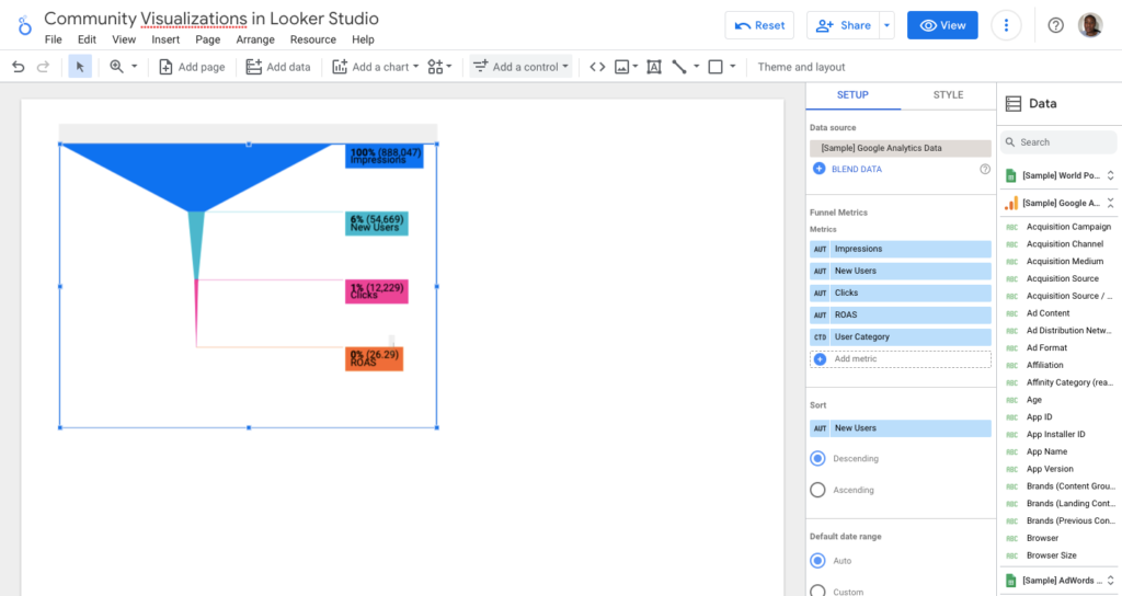
For a long time, creating a funnel visualization in Data Studio required using a static image as a background and then simply overlaying some scorecards over a static image.
Using the funnel visualization for a report in Data Studio, you must select your metrics and arrange them in the correct order.
The funnel will handle the rest. This funnel depicts the impressions, new users, clicks, and ROAS on the website attached to this GA4 sample report.
How many impressions are there? How many new users are there? How many of them get converted (ROAS)?
If this were to be an eCommerce website, you can use the funnel to visualize how many views of product details you have.
How many items were added to the shopping cart? How many checkouts are there? Finally, how many transactions are there?
6. Range Filter
Let us proceed to the next one, the range filter. This is a community component rather than a visualization.
It’s a filter menu that lets you choose a number range between a minimum and a maximum or a date range to filter the rest of the charts and components on the page.
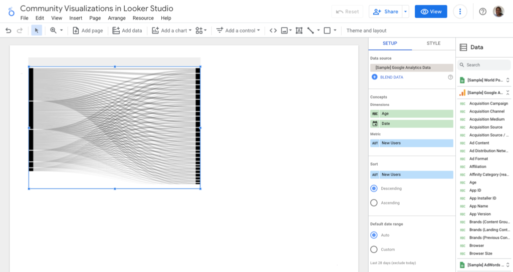
7. Sankey Chart
The Sankey chart is an effective way to demonstrate the relationship between two or more dimensions of categories. This Sankey chart shows the Age, date, New Users.
Conclusion
You now understand that you can create custom visualizations and components in Data Studio and share them with others.
You already know where to look for and how to use them, and we went over some of the most interesting ones together.
These charts allow you to be creative with the report and tailor it to your needs. There are numerous advantages to using Data Studio Community Visualizations.
The main advantage of Community Visualization is the ability to use any tool to represent data in any way you see fit.
Data analysis is a piece of cake with simple legends and interactive elements! You can spice it up by including interactive elements and filters!
Data Studio interactive dashboards can take your reports to the next level regarding interactive elements.
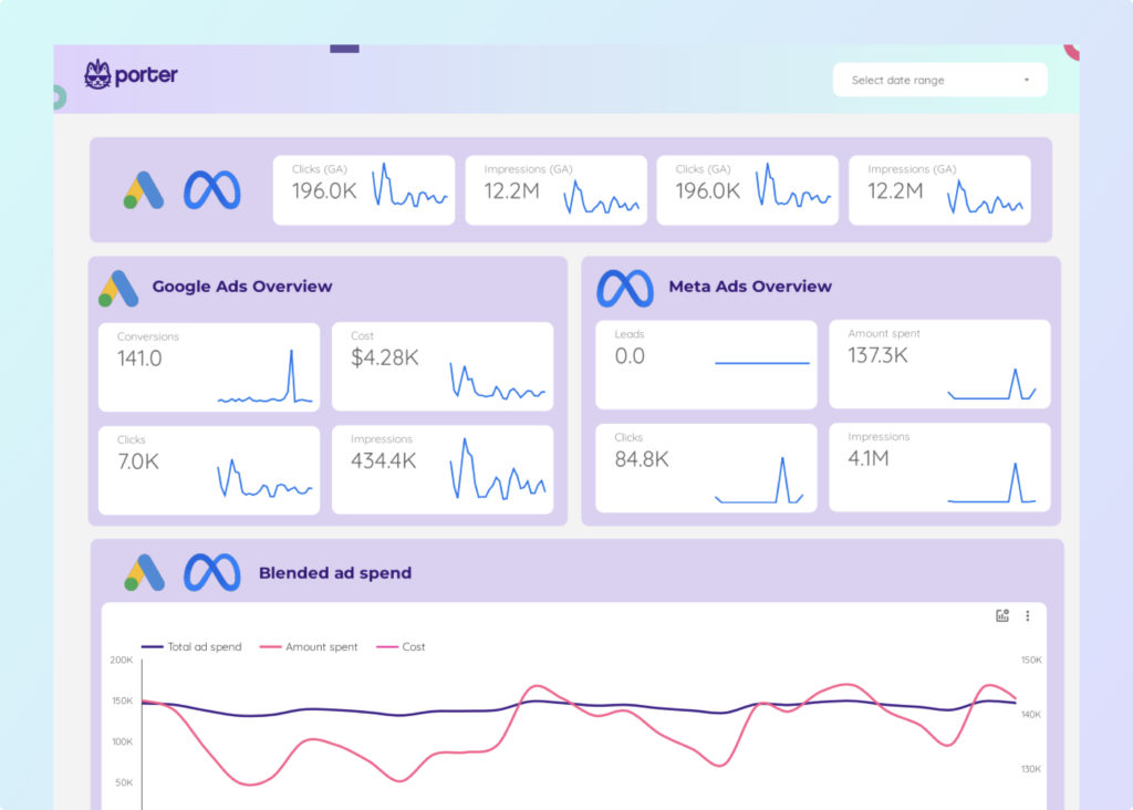
If you’re looking for a simple and efficient way to automate your marketing reporting, try Porter. We offer a 14-days free trial — no credit card needed.