


Google Data Studio is a powerful data visualization tool that can help you make sense of your data. One of the most popular features of Data Studio is gauge visualization.
Google Data Studio’s gauge visualization is a great way to see how your data is doing at a glance.
By default, the gauge shows you the average value of a metric over a period of time, but you can also customize it to show you the minimum, maximum, or specific values for a metric.
The gauge visualization data display format offers a great way to quickly overview your data and spot any trends or outliers.
It is essential for tracking metrics such as CPC, CPM, CPL and metrics that are ideally single sets of digits.
They are essential for marketing use cases where you’ve set a goal and need a certain visualization tool to display and track your progress as you make gradual efforts towards achieving the target.
In that way, gauge visualization is almost too valuable to be ignored when you are setting a marketing goal and trying to track your progress until you achieve that goal.
In this article, we are going to learn how to use Portermetrics, a no-code reporting tool to create visually appealing reports on Google data studio using gauge charts.
Portermetrics gives you access to 80+ report templates to make your marketing reports a breeze in the park. Our connectors allow you to access 600+ custom metrics you can’t find anywhere.
Best part?
If you schedule a call with us right now, we’ll help you safely connect your platform to the dashboard and get you your first free and beautiful report ready in no time.
We’ll even help you visualize your report using some of the most appealing gauge visualization tools on Google Data Stuido.
Click here to schedule a call with Porter Metrics support. Let’s get you up and running.
Alternatively, you can save time and get your data on a beautiful dashboard showing all the metrics you want to quickly see – including the ones we’ve set to display your most important metrics via the gauge visualization tool.
You can get access to our report templates gallery to create your set-and-forget free report here.
How To Configure A Gauge Chart
Before we learn how to configure gauge charts, we need to know what it is.
A gauge chart is a graphical representation of data that uses a single needle to indicate the value of a single data point. Guage charts in data studio visualize a single metric at a time.
The value is represented by the position of the needle on a scale. Gauge charts consist of the following components:
- A center bar that shows the metric’s actual value.
- Optional vertical line showing a target metric value.
- Optional comparison value
- Shaded bands representing ranges, such as poor, average, and good
Connect Your Data Source
The very first step in configuring gauge charts is to connect any Porter metrics connectors like LinkedIn, Google My Business, or Facebook insights & Instagram insights to your data source.
For this article, we are going to use our Facebook Insights connector. We will connect our account on Google data studio to our Facebook insights.
Before we connect Facebook Insights to Google data studio, we need to set up an account with Google data studio.
To open a Google data studio account, simply visit datastudio.google.com.
If you haven’t signed into data studio with your Google account, you will be required to do so before using the tool.
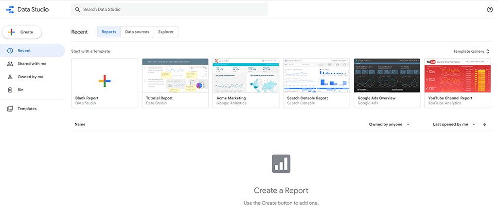
If you click “Blank Report” or “Create,” as shown in the image above, you will be presented with this pop-up.
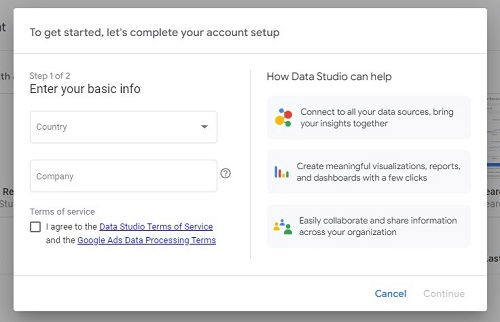
Enter your basic information and click “Continue” at the bottom left corner of the pop-up form. Doing so leads to setting up your Google account’s next step- setting your email preferences.
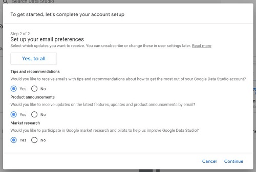
Google gives you options on the types of emails you would like to receive from them. You can choose to accept all of their recommendations by clicking “Yes to all” their preferences or clicking “No.”
Click “Continue” on the bottom right corner after setting your email preferences. Doing this links your Google account to the data studio.
The next step is to link data studio to our Facebook Insights.
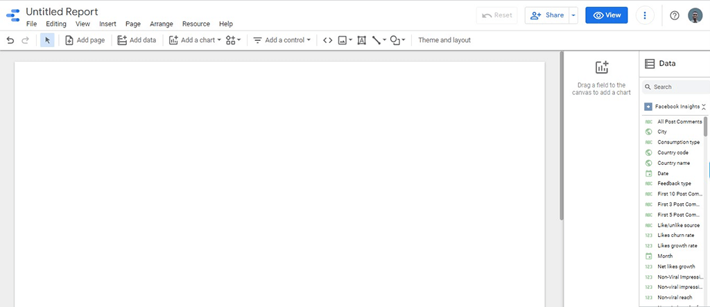
Connecting Facebook Insights to Google data studio is a multi-step process. At the end of the connection, you will have a blank dashboard that looks like this below:
Alternatively, if you log into data studio from Porter metrics, you won’t start with a blank sheet.
You will be required to use one of the beautiful free templates so that you don’t start from scratch. Here’s a free PPC reporting template you should try out.
A lot of our top clients are hooked to this PPC template and can’t seem to get enough of it because it displays essential metrics and KPIs you want to monitor from Google Ads, Facebook Ads and TikTok.
Try it out for free now. Here’s another template that is known as PESO model. One second let me take a sip then I’ll explain how this beauty of a template tracks almost all your conversion-focused metrics.
Ahhhhh yeah! Where were we? PESO model – that’s it.
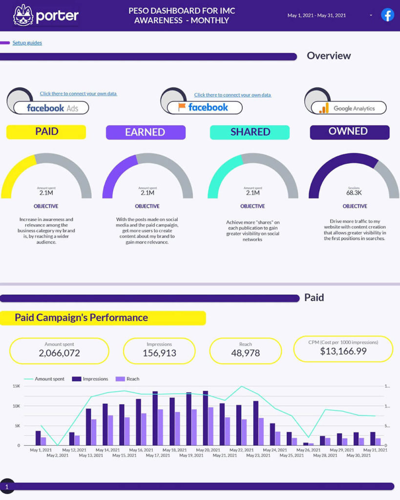
This template helps you track all Owned, Paid, Shared, and Earned media. You can’t go wrong with this one. What makes it even more appealing is the fact that you can edit and recreate it with your logo.
You can customize it to suit your purpose and you can add new connectors to it if you feel like turning this into a spaceship dashboard that will Wow your team members.
I’m serious right now. You’ll love it. Here’s a link to the template… Try the PESO model template for free
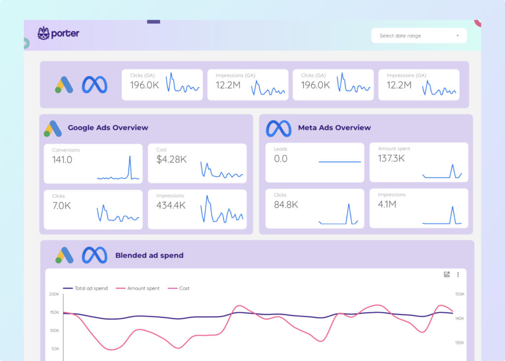
We also have a custom Facebook Page dashboard which we will be using on this occasion to demonstrate the gauge visualization tool.
If you are looking for either a template unique and built to help you monitor your Facebook Insight metrics or another that can monitor Facebook Insights while tracking your Google Analytics data and Search Console as well, you should try this link.
You’ll really love it. On that page, you’ll be able to access great-looking Facebook templates as well as those other ones you can use to track your Analytics and Search Console data.
To learn how to connect your Facebook insights to Google data studio using our Facebook insights connector, read this post.
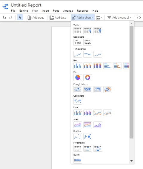
Add A Chart
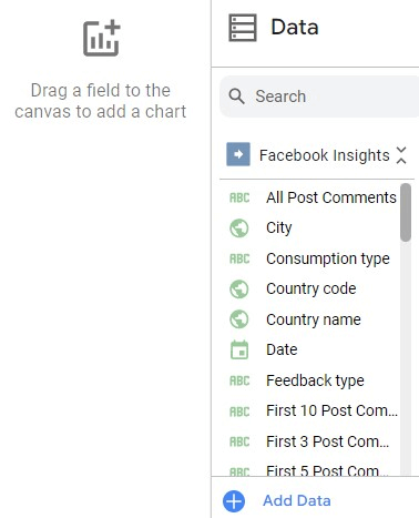
After linking data studio to Facebook Insights, add a chart to start setting up your gauge chart. You have a plethora of charts to choose from to create your reports, but, in this case, we’re going to add a gauge chart.
Add Metrics From The Available Field
Porter metrics connectors allow you to access 600+ custom metrics making your reports detailed.
At the right-hand menu, you can easily access these metrics and drag them to the report dashboard to create your marketing reports.
Simply search for any metric, drag and drop them in the gauge chart.
How to Create A Gauge Chart on Data Studio
Gauge charts are essential in Google Data Studio because they provide a way to visualize data that is otherwise difficult to interpret. They are also used to measure performance KPIs.
By being able to see the data in a visual format, it is easier to understand what the data is telling us and make better decisions about how to use it.
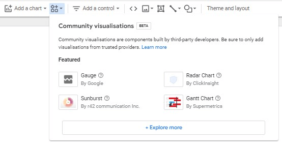
Insert Gauge From “Add a chart” or “Community Visualizations.”
To create a gauge chart on Data Studio, select the “Gauge” option from the chart type menu or click the community visualization icon to add a gauge chart.
Blend Data
The next step is to blend data. There are many benefits to blending data in Data Studio.
Blending data allows you to combine data from multiple sources into a single data set, which can be helpful for creating custom reports and dashboards.
Additionally, blending data can help you to spot trends and relationships that may not be apparent when looking at data from a single source.
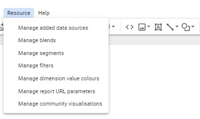
To blend data, click “Resource” on the data studio dashboard and select “Manage blends” from the drop-down menu.
For the purpose of illustration, we’re going to use “Post clicks” as the given metric from Facebook insights we intend to report.
After clicking “Manage blends,” you will be presented with the table as shown below:
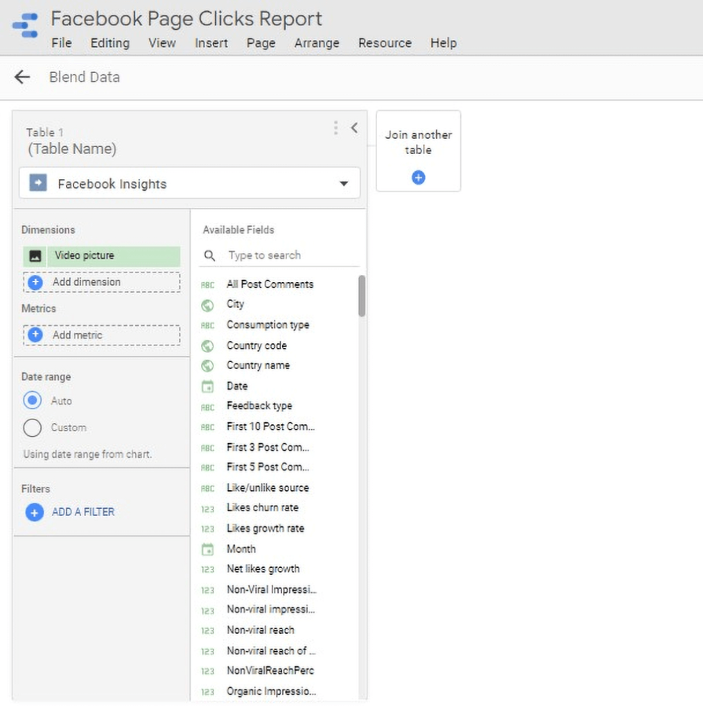
Click “Join another table.” This allows you to blend data for your report. Ensure you select a data source. In this case, we are working with Facebook Insights.
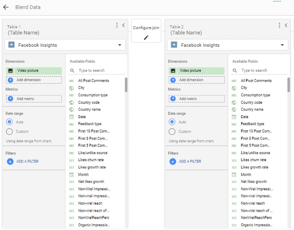
The next step is to configure how you want the data studio to blend your data.
Click “Configure join” between Table 1 and Table 2. This gives a pop-up with options on how to blend your data.
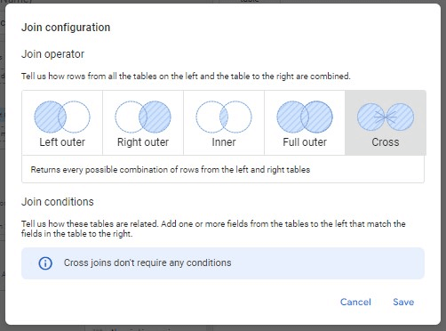
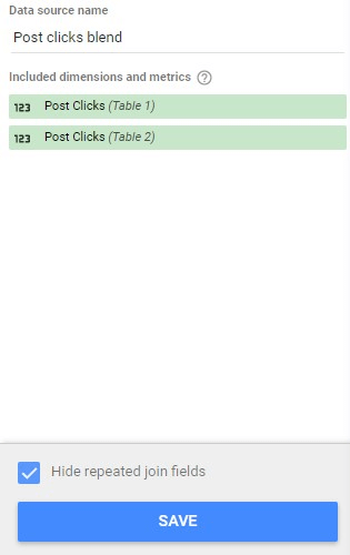
Click “Cross.” This returns every possible combination of rows from the left and right tables. On the metrics tab on both tables, select “Post clicks” and name the blend at the top right.
In this case, we are going to name it “Post clicks blend.” Hit “Save” at the bottom right.
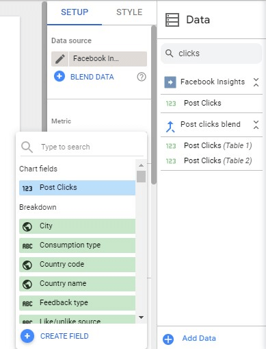
Add Blended Data To Gauge Field
Select the gauge you added on the dashboard. Change the data source to the blended data you just created.
Under metric, click the selected metric (Post clicks) and click “Create field”.
This creates a new field to display on your gauge chart. Name the field and enter the formula below:
((New [Metric]-Old [Metric])/Old [Metric])*100
In this case, our formula will ((Post clicks (table 1) – Post clicks (table 2)/Post clicks (table 2)*100
After entering the formula, hit “Apply”.
Style Gauge
To style, your gauge charts, click “Style”. This gives you many options in styling your charts how you want them to be.
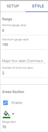
You can select a range of numbers to capture your data. You can also select colors to visualize acceptable ranges for your reports. You could use green for “good”, yellow for “ok” and red for “bad”.
How To Customize Your Guage Chart
There are many reasons you might need to customize your gauge chart. Perhaps you want to change the color scheme to better match your brand guidelines or add an annotation to highlight a particular value.
Maybe you want to change the size or position of the gauge needle, or you need to add a second scale to show comparative data. Whatever the reason, customizing your gauge chart is easy to do with Google data studio.
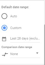
Date Range Comparison
You can compare metrics and see how they change over time by customizing the date ranges for your Guage chart.
This can be done by changing the dates when blending data.
Primary Metric
You can select from a wide variety of custom metrics available on Porter. The metric you start with is usually the primary metric when creating your reports.
This metric can be used to prepare comparison reports against other metrics. Data studio allows you to display this metric as decimals.
Comparison Metric
After choosing your primary metric, you may analyse how it changes over time or simply choose another metric to compare it with over time.
We can decide to compare how the number of likes per post changes over time as page followers increases or choose to pick each metric individually, blend data and compare and analyze changes by date range.
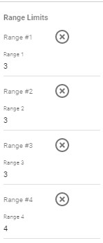
Range Limits
Setting range limits makes it possible to present data concisely. The range limits define the threshold values for the chart.
In gauge charts, ranges indicate poor, average, and good thresholds. On a gauge chart, you can add the five top ranges.
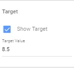
Target value
Target values are usually the targets of your marketing campaigns.
Marketers want to analyse these values to ascertain their marketing efforts’ efficiency. This figure can easily be changed to suit your taste.
Axis
Data Studio allows you to further customize your gauge charts by displaying the axis. This gives a numerical representation of the range of data your gauge chart covers.
Target
This is an indicator- usually a center bar showing the revenue amount. This is usually the target goal of a marketing campaign.
Turning on this option allows you to visualize if you’re hitting your targets or not quickly.
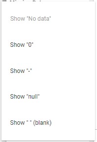
Missing Data
Sometimes, when extracting data from a source, an error occurs, which is usually displayed as “missing data.” Google data studio allows you to customize how this error is displayed.
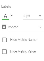
Labels
Labels help you to visualize data points on your gauge charts. The labels option allows you to choose a font type and color. It also allows you to hide or display metric names and values.
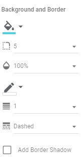
Background and Border
To further customize your data, data studio allows you to add a colored background to your gauge charts.
You can also customize the opacity of the background, add a border-radius and customize the color of the border, increase or decrease the border weight and even add a border shadow.
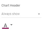
- Chart Header
Inside Google data studio, you can display a header for your chart and customize the color of the header.
When To Use A Gauge Chart as a Marketer
As a marketer, you should use a gauge chart when you want to display data that is tracked over time. This type of chart is beneficial for showing progress or trends.
Marketers generally use gauge charts:
To visualize progressive information.
There are several reasons why marketers might choose to visualize progressive information. First, it can help to create a sense of urgency and encourage customers to take action.
It can also help customers understand the complex relationships between different data points and see how their choices might impact the larger picture.
Finally, visualizing data can make it more attractive and engaging for customers, helping them to pay attention to and remember important information.
To track target metrics.
As a marketer, it is essential to track target metrics to gauge the success of your marketing campaigns.
A gauge chart is an ideal way to track these metrics, as it allows you to see at a glance how well you are performing against your targets.
Additionally, gauge charts can be easily customized to show different information, such as target audience, campaign type, or period.
This makes them a valuable tool for tracking the success of your marketing campaigns and ensuring that you are on track to meet your goals.
To track project progress or deadlines.
Gauge charts are a standard tool used by marketers to track progress or deadlines. They provide a clear and concise way to visualize data, making it easy to see how close you are to your goal.
Additionally, gauge charts can be customized to show different colors or ranges, making them even more flexible and valuable.
For comparing two datasets
A gauge chart is an ideal way to compare two data sets as a marketer because it allows you to visualize the relative differences between the two sets.
By using a gauge chart, you can more easily see how one set compares to the other, which can help you make informed decisions about your marketing strategy.
Pros & Cons of Using Guage Chart
There are a few pros and cons to using a gauge chart. On the pro side, gauge charts can be used to show KPIs in a condensed way that is easy for viewers to understand at a glance.
They can also be used to track progress over time or compare data points side-by-side.
On the con side, gauge charts can be challenging to create if you do not have a good understanding of design principles or are not familiar with the basics of data visualization.
They can also be overwhelming if you try to show too many data points simultaneously.
Top 5 Gauge Chart Examples for Marketers
1. Sales Target Growth
Marketers use Sales Target Growth Guage Chart to measure and track the sales targets and how well they’ve hit them over a given period.
It can identify the areas where the sales target growth is lagging and pinpoint the causes.
2. Gross Profit Margin
Investors and analysts use a gross profit margin gauge chart to evaluate a company’s financial health.
The chart allows users to compare a company’s gross profit margins over time and across industries.
By looking at a company’s gross profit margins, investors and analysts can better understand how well a company is managing its expenses and whether or not it is generating enough revenue to cover its costs.
3. Total sales revenue
Sales revenue is an essential metric for businesses to track. The total sales revenue gauge chart can help businesses see how their sales revenue compares to past periods.
This information can be used to make decisions about pricing, inventory, and other factors that impact sales revenue.
4. Cost per click
CPC is the cost per click. It is a metric used to determine the amount an advertiser pays for each click on their ad.
The CPC can be used to compare the effectiveness of different advertising strategies. The CPC can also be used to gauge the relative value of different keywords.
5. Cost per ad
The cost per ads gauge chart helps online advertisers measure the cost of their advertising campaigns. The chart can track the cost per ad over time and compare the cost of different advertising strategies.
6. Revenue
A revenue gauge chart tracks and compares revenue data over time. This type of chart can be used to assess business performance, spot trends, and make forecasting decisions.
7. Leads
The number of leads is one metric that can be tracked using a gauge chart. There are a few different ways to set up a gauge chart to track lead numbers, but the basic idea is to have a needle or pointer that points to a number on a scale.
The scale can be marked with numbers that represent the range of possible lead numbers, and the needle can be set to point to the current number of leads.
Conclusion
A gauge visualization is a powerful tool that can be used to analyze and explore data. The gauge visualization is a great way to represent threshold ranges and show progress on your KPIs.
You should ideally use it when you’ve set a marketing target and you need a tool for visualizing its progress until such a time when you hit that target. So ideally it’s for goal setting and tracking.
Build your first report and visualize all that data on Google Data Studio via our free connectors or Schedule a call with Porter Metrics Support here so we can guide you to generate that free report right now.
Frequently Asked Questions
How do I apply data filters?
To apply data filters to your gauge charts, on the right-hand menu, under “Filter,” click “Add a filter.”This allows you to include or exclude data from your data source. For more information on data filters, refer to the Gauge chart reference by Google.
What is the minimum and maximum value in data studio?
There is no minimum and maximum value in data studio. Data Studio is a flexible platform that allows users to create and customize their data visualizations. However, you can set a minimum and maximum value when creating your reports.
What are the uses of chart colors?
There are a few different ways that chart colors can be used in data studio. One way is to use them to represent different data sets, another is to use them to show trends over time, and the last is to use them to compare data.
What are optional metrics in data studio?
This is a feature that allows you to pick and choose what metrics to display on a chart.
You can optionally display a minimum and maximum value, target value, and comparison value and set up five ranges.
What are optional colored bands?
Optional colored bands are a great way to add a little bit of personality to your data studio. They can help you quickly identify different categories of data and make your visuals more engaging.