


Understanding the inner workings of your organization requires funnel reporting. You can see where customers are at each stage of the sales process by looking at a full funnel report.
The reports can illustrate how many leads you are producing, what agreements are being worked out, what contracts are being signed, and ultimately how many sales are closing.
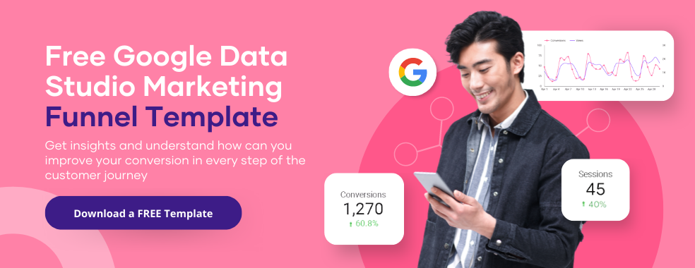
Knowing your funnel will prevent it from drying up and leaving you without leads or regular sales. This article will combine two powerhouses: Google Data Studio and Funnel Reporting.
We will show you how you can easily create a funnel report on Google Data Studio.
What Is Funnel Report?
To understand what a funnel report is, we must first understand what funnel is.
The funnel is used to map out a customer’s journey from when they first see your brand either as an ad or as a landing page to the sweet spot of them becoming customers.
An effective funnel is the backbone of every thriving business.
As a result, a funnel report can help you identify how a client learns about your company and what motivates them to either proceed down the funnel and make a purchase or to stop along the way.
The effectiveness of your marketing initiatives, the number of people entering the funnel, and conversion rates can all be assessed using the funnel report.
Just like how Google Data Studio helps with insights into basically everything, a funnel report helps with insight into your marketing so that you can fix what is not working and optimize what is.
Elements of a Good Funnel Report
Every report has elements that make it stand out, and a funnel report is the same. Every good funnel report in Google Data Studio has:
- 1. Data set
- 2. Blended Data
- 3. Chart Configuration
Data set: The underlying system or item that houses the data you want to report on. The system outside Data Studio where your collected data indeed sits is known as the data set.
Blended Data: Data is created by combining fields from various data sources or different iterations of the same data source. By combining different data sets into a single chart, you can plot information from them, making it simpler to understand how the data relate to one another.
To create blended data, click on the “Resource” in the dashboard of Google Data Studio and select “ Manage blend.” A window will pop up, and you will see “Add blend.” This is where you can add other data sets from all sources and blend the data seamlessly.
Chart Configuration: How the data will be properly and visually represented to pass information that will be easy to understand. This can be achieved using charts, such as bar charts or pie charts. It all depends on what will be best for your report.
A good report should have these three elements for it to be effective.

All the elements and data you need are in the right corner of the dashboard.
How To Create A Funnel Chart In Data Studio with Community Visualizations
In Google Data Studio, we already know how to represent our data with different charts. But what if the visualizations we want can’t be produced using any default chart types?
The good news is that Data Studio has components and visualizations created by the community.
Volunteers make Community Visualizations to help grow the available options and possibilities to highlight and showcase data with a Data Studio dashboard.
To create a Funnel in Data Studio, follow this step-by-step guide below.
1. Update connector settings
Connector settings, by default, prevent you from adding community visualizations to your dashboard. So, to change that, go to the connector settings usually found when you load a data source and turn on the “Community visualization access” to be able to use any components in the gallery.


2. Open community visualizations and components
Besides the “Add a chart” icon is the icon Community visualizations and components. Click on it and see a complete list of various options.

Click “Explore more” in the window to get the complete list of available options.

3. Choose
You can create your unique visualizations in Data Studio or use one already created by individual developers or businesses.

And that’s it. In this case, we need funnel visualization, we look for one and use it, or we create our funnel visualization to our specific need and use.
You can also import any custom funnel visualization just by pasting it into a manifest path. Although it appears to be a URL, this is used to access the Visualization preview, which you can then include in your reports.
A Manifest path might be found in the Community Gallery, in an email given to you, or in a blog post like this one. You don’t need to be a developer or a technical expert to make your visualizations.
Anyone who makes a unique visualization can share it with others, and you can easily use it. Individuals and businesses consistently produce community visualizations and share them with people to use for free.
So, instead of establishing a chart menu and utilizing one of the default charts, you can access community visualizations approved by Google.
Using Community Visualizations in Data Studio
We can do a lot of things with community visualizations. One of which is to create segments. A segment is a portion of your analytics data.
For example, data about 2022 can have one segment for just the months and another segment about a particular day every month.
There are three ways to create a new segment:
- By setting each parameter by yourself, you can create a custom segment.
- Use a suggested segment to start with. These can be customized and tailored to meet your unique needs based on typical use cases.
- By creating a segment from a selection in your context menu. Right-click a data point in your visualization and click on “Add a segment” to use a segment.

Types of Segments
User segments: User segments are a subset of people that have interacted with your website or app. Examples include users who have made past purchases and added things to their shopping carts but haven’t finished the checkout process.
Event segments are subsets of events triggered on your website or mobile application. For instance, all purchase events made in a specified location or app events on a particular operating system are examples of event segments.
Session segments: Session segments are subsets of the sessions that took place on your website or application, such as all the sessions resulting from a specific advertising campaign.
Before using Data Studio, use Google Analytics to segment your data for each stage in the funnel journey.
To ensure you have access to all of your segments before you begin, it is ideal for creating all of your segments the day before you want to create your complex funnel visualization.
Add a connector to your dashboard.
To add a connector, you must click on the “Add Data” and choose the connector you want, either Google connector or through partner connector.
Deleting visualizations components from a report
To delete Visualization components, go to “ Resource” in the dashboard and click on “Manage community visualization.”

Every component in the report will show here from herm click on “revoke” to delete any visualization component you don’t want.

Partner Visualizations in Data Studio for Creating Funnel Report
For creating a funnel report with community visualization, two-component come to mind:
- Funnel Chart by Ayima
- FunnelGraph Visualization by TrueMetrics
Funnel Chart by Ayima
Funnel Chart by Ayima can be added to your dashboard in just four clicks. And adding data for each stage using vital Goal Completions can be done in less than ten clicks.
Reducing the time to build a funnel gives you more time for analysis, allowing you to quickly spot any changes in a customer’s journey to a successful purchase.

FunnelGraph Visualization by TrueMetrics
FunnelGraph by True Metrics creates SVG funnel diagrams using the open source funnel-graph-js package.
The selected Metric is used to summarize the value at each step and calculate drop-offs in the Data Studio visualization, which also adds labels and a legend depending on the specified Dimension.
The Data Studio Visualization tool also creates horizontal and vertical funnel charts using gradients and solid colors. There is also the ability to create multi-dimensional funnel diagrams by including more metrics.
You can access it here and add it to your data studio easily.
How to Build a Funnel on Google Data Studio
This section of the article will show you the following steps to building a funnel in google data studio.
First Step: Adding Data
Once you sign into google data studio, you will be welcomed with a blank page, and on the dashboard, you will see “Add data.” Click on it and select your data source.
If you don’t want a blank page, you can use our free templates and edit it with your actual data. Or better still, use the Porter metric via the partner connector.
You can connect all the data from whatever source and hit the ground running instead of starting with a blank page.

Second Step: Adding a Chart
Select the “Add a chart” icon and pick the horizontal bar chart.

Third step: Adding Dimension and Metrics
Dimensions are collections of values you can use to categorize your data. Information is categorized into dimensions.
Names, descriptions or other details about the data are frequently the values in those categories. For example, a dimension can be “the last decade,” and metrics would be the event you want that happens in the last decade.
A metric is an aggregation of a group of values. The collection or combination could come from an underlying data set or be the result of implicitly or explicitly applying an aggregation function such as COUNT(), SUM(), or AVG().

The dimensions and metrics are usually obtained from your data and located in the “setup” panel.
Fourth step: Modifying the Chart
You can modify the chart’s appearance to what you want by changing the “style” panel on the right.
For example, you can change the horizontal chart into a vertical one and reverse the direction of the X and Y axes. It’s all up to you.


Fifth step: Creating Formulas for the Ratios
Sometimes you need data that are not easily accessible as a variable, maybe something more customized. That’s where creating a formula comes in.
In such a scenario, we use the “Field” functionality in Google Data Studio. Using formulas, you can create new fields that meet your needs from existing ones.
To create a new field, go to the data panel on the right, scroll to the bottom, and click“Add a field.”
Give a name to your field and proceed to create the formula you want. Save the field and click DONE.
With this, you can create ratios for every step to measure the proportion of users at a given funnel stage and to know those moving to the next stage in the funnel.
Sixth step: Adding and Designing Scorecards
You can add a scorecard to the chart to display data. Go to “Add a chart” and select “Scorecard with compact numbers.” or “ Scorecard.” It all depends on what you want.
By default, Google will assign it to a random metric, but you can change that by changing the metric to what you want. Just click on the metric and then change it.

Seventh step: Placing the Scorecard on the Bar Chart
Once you click on the scorecard, place it on your desired bar. As stated earlier, you can change the metric, style the appearance of the scorecard, and even “hide the metric name” to avoid cluttering.
Eight Step: Adding More Scorecards
To add more scorecards, repeat the previous step, from step six, as much as needed.
Mapping a Funnel with Data Connectors (Google or Partner connectors)
There are two ways you can import your data into Google Data Studio. You can either do it through Google connectors or Partner connectors.
Google’s free connectors are more than adequate to get you started in Google Analytics, especially if you want to explore your website data and Google Ads data.
In addition to Google Analytics, Sheets, YouTube, Ads, and Search Console, Google offers 18 connectors. They also have connectors for SQL, MySQL, Extract Data, and a CSV upload.

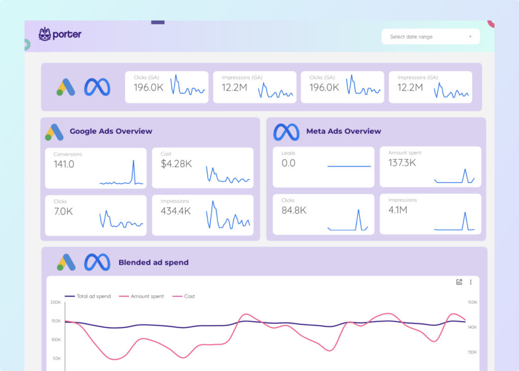
The majority of platforms don’t have their connectors. Facebook doesn’t have its connectors. Other businesses make them like Porter metrics, Supermetrics, Funnel.io, and so on.
Whatever you want depends on its pros and cons. With Porter metrics, you can access free templates that you can easily import and use for creating your funnel.

Both connect your data to a data studio, and the difference is one is from Google, and the other is a trusted third party.
Creating Funnel Reports from Data Sources
You can create a report from any source, be it Facebook ads, Google Analytics, Hubspot, or Shopify. Just link both data studio and your source together, and that’s it.
Creating a Funnel Report with Porter Metrics Template
It’s elementary to create funnel reports with Porter metrics templates. All you have to do is go to our website and click on “resources.”

Then click “templates.” Alternatively, you can just click here and go straight to the templates.

Scroll to see the “By Category” and choose “Funnel.”

From here, choose any template you want for your report. We choose an eCommerce funnel for Facebook ads. You can get it here.

Next, download it. The template will open up with no data. Click on make a copy.

The template will load up, asking for a data source. Select your source.

Note: Your data should already be loaded in the dashboard or the data studio home page. This will make it easier for you to import your source into the template.

Then import it with your data source and click “copy report.”

The template will load up with your data. Now you modify the report with the data you want.

It’s that easy. We can also do all these for you for free. Get in contact with us, provide your details or what you need a report on, and get it in less than 30 minutes.
Conclusion
We’ve shown you in this article how to create a funnel report in Google data studio. There are various ways to achieve this because each user’s KPIs and metrics differ.
Some funnels might track how many people came to the website, and some might be about the sales funnel. As a result, you should look into alternative methods to provide value like Porter metrics.
Frequently Asked Questions
How can I create a funnel report with Google Data Studio?
Connect your data either through Google Connectors or Partner connectors, and then start editing the dimension with the metric you want for your report.
Can I have more than one data source in my report?
Yes, you can have data from up to 5 data sources and blend all the different data seamlessly to create a unified, beautiful report.
What is funnel visualization?
Funnel Visualization allows businesses to flawlessly and visually analyze the users’ journey toward a goal or conversion.
How quickly can I get a funnel report from porter metrics?
In less than 30 minutes, you will get a detailed funnel report of your business. Click here to begin.
How many data points do funnel charts need?
It’s best to use a funnel chart when there are just four to six sections. Anything lower than two sections in a funnel chart can’t have much insight, and anything more than seven could become challenging to comprehend.