


To enhance the platform and advanced data visualization, Google Data Studio has released several new features and updates since its launch in 2016.
Most notably, the Data Studio crew has consistently listened to the criticism of its faithful community, and it has taken it seriously.
As a result, Data Studio has rapidly emerged as one of the most popular and useful data visualization tools available.
However, most people are only familiar with using Google Data Studio’s basic features and are unaware of some of its more sophisticated features, which can benefit them, their clients, and stakeholders by enhancing accuracy, streamlining workflow, and producing more trustworthy data visualizations.
As a result, Porter Metrics has made an effort, through this thorough and well-detailed guide, to help analysts and marketers understand these advanced Google Data Studio tips most comprehensively.
Keep reading to find out what they are!

Advanced Google Data Studio Tips For Marketers And Analysts
1. Make use of advanced data blending
Data analysts and architects frequently use SQL and other languages to join data from several tables. However, you might believe that advanced data analysis is out of the question if you’re the boss of a smaller business without a sizable hiring budget for those positions.
You may combine data from many sources without writing a single line of code with Data Studio’s blend editor. With its drag-and-drop capabilities, the mix editor is made to assist analysts and marketers in producing better work.
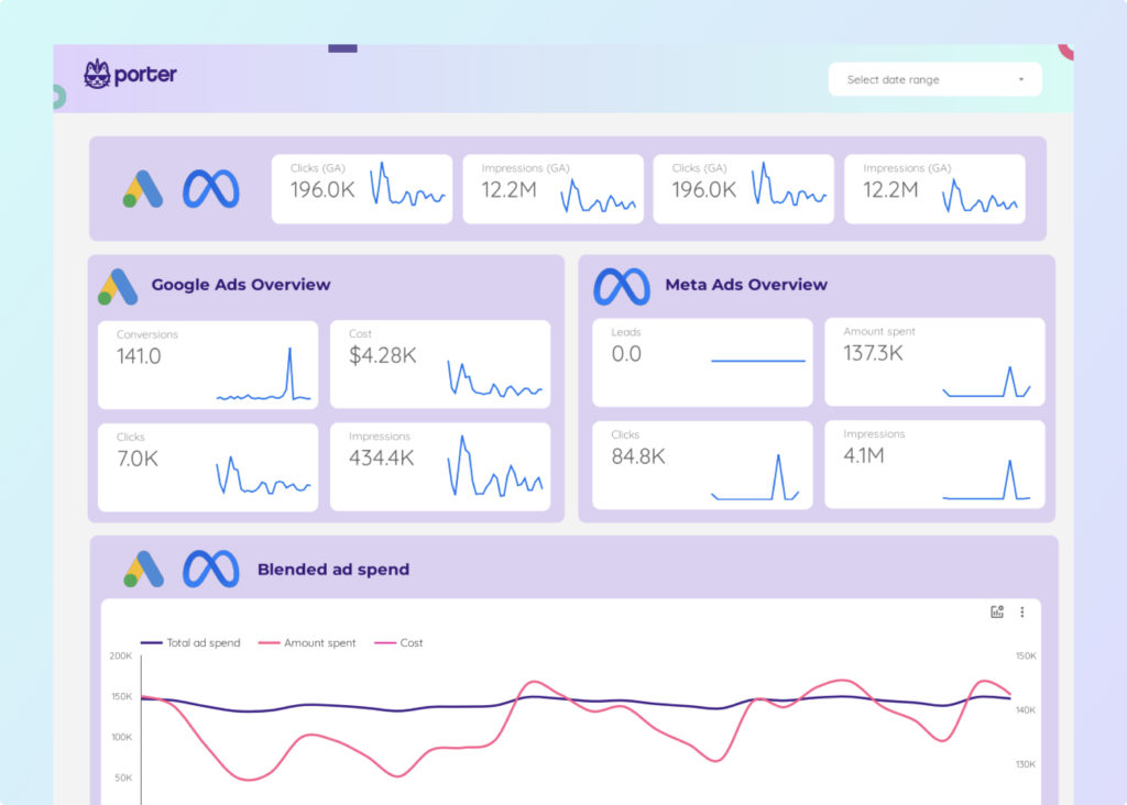
Users can develop table controls and charts based on numerous data sources by blending in Google Data Studio. For instance, you may combine data from your Google Ads, and Google Analytics accounts to get a comprehensive picture of how your marketing initiatives are doing.
A resource known as a blend is produced when data are combined and functions similarly to a data source. But remember that there are particular distinctions between data sources and data mixing. For instance:
- Blends cannot be used in different reports.
- Blends collect information from various sources.
- Since they receive these attributes from the underlying data source, they do not have credential settings or freshness.
Learn more on this unique step on how to blend data on Google data studio with the guide we specially set out for you.

2. Take advantage of the advanced CASE function
With Data Studio’s sophisticated CASE feature, you can organize and sort data more effectively. The CASE method delivers the first result that matches the expression after evaluating a set of conditions.
If no requirements are met, it enables you to establish a default outcome. Let’s see a CASE function example.
- Example of the CASE function: Making a collection of data or categories is one of the CASE function’s most popular uses. You could, for instance, divide the world into regions.
CASE
WHEN Country IN (“Nigeria”,”South Africa”,”Kenya”) THEN “Africa”
WHEN Country IN (“France”,”Belgium”) THEN “Europe”
ELSE “Other”
END
- Advanced CASE syntax: The words CASE and END must come first and last in a CASE statement, respectively. Clauses or sections are placed in between. Let’s examine its meaning and syntax.
CASE
WHEN condition THEN result
[WHEN condition THEN result]
[…]
[ELSE else_result]
END
3. Use parameters with Google Data Studio
Marketers and analysts are processing their reports differently due to Data Studio. You can communicate with user data using parameters.
As an illustration, you may design calculated fields that input data from the report’s users or feed values back to your SQL data source query.
The ability to create report templates using parameters can save you a tonne of time.
- Primary use
- Show outcomes depending on user input
- Provide parameters to a community connector
- Sending parameters to a BigQuery SQL query for data
- Sources of data: These sources of information are available to parameters:
- Panel for component properties
- Url of the report
- From the default setting
- Restrictions imposed on the report
In the data source and report editors, parameters are displayed as purple fields at the bottom of the list of available fields.
- How parameters work: It should be noted that the report editors have access to all the data that the parameters govern. With this functionality, editors can request data that differs from your defaults.
It’s crucial to comprehend how parameters could impact reports before enabling this function.
Additionally, specific parameters may provide private information you don’t want to disclose or even a new schema incompatible with the current report.
You can configure the parameters to only return reliable information, like the weather.
- How to create a parameter: The report can still be edited while a parameter is being made. Choose a component and click the “ADD A PARAMETER” button in the bottom right corner. Always choose a data source based on the one you want.

Enter the parameter’s name, ID, data type, and default values before clicking save.

Read more on our well-detailed guide on how to create a parameter on Google data studio.

4. Automate your data transfers with community connectors
Even though Google built Data Studio, you are not confined to interacting with only Google products. Use Community Connectors if you wish to get data from a platform for which Google does not provide a native connector.
They connect to Google Data Studio without any issues. Here’s how to get in touch with local connections.
Access Google Data Studio by logging in.
Go to “Create” and then “Data Source.”

To find the “Partner Connectors,” you have to scroll down.

Click “Authorize” after selecting a connector.

Editable parameters for the connecter will be displayed at the bottom. Furthermore, connectors with specific parameters come with additional instructions on the website.
To allow or prohibit editing of the report’s parameters, use checkboxes.
In the top right, select “Reconnect.”
Keep in mind that updating the data source requires clicking reconnect.
5. Add multiple pages to a report
In Google Data Studio, a single report may be made that displays various data types. Imagine doing it in a word processing tool like Microsoft Word when writing a report with several pages.
You may, for instance, provide a summary and an overview page before collecting data from many sources on a single page. On Google Data Studio, there are two methods for building a page.
One option is to click the page and then “new page.” You can also click the page and duplicate it if you want to maintain the same format.
You will be saved from the stress of manually inserting the data and charts by having them copied to the new page. Duplicating the page can be extremely helpful when comparing data based on several date ranges.

The style and data sources can be changed after the page is created using the current page settings. Additionally, you can modify the predefined fields to meet your needs better.
Giving your pages meaningful names is critical so your stakeholders and clients can quickly grasp their purpose.
6. Add date range filters
For analysts and marketers, date range filtering is a crucial tool. The most excellent way to learn how something has been functioning over a specific time is to do this.
You can use the information from date range filters to make data-driven decisions. Date ranges must group data to understand how your campaigns have performed.
7. Create advanced dimensions using calculated fields
You may take advantage of countless chances by using formulae, often referred to as calculated fields on Google Data Studio. Using branching logic, they allow you to work with text, geographic data, and data evaluation.
The results of the calculated fields are shown for each row of data. These computed fields, which manifest as additional fields, can be metrics and dimensions.
Calculated fields can be either chart-specific or data source-specific, depending on where you place them. Each has a distinct benefit over the other.
Learn how to create calculated fields in Data studio.

8. Blend data from multiple sources in Data Studio
As a best practice, charts based on a mix should only contain the specific fields you intend to visualize.
This is why: Large data sets can be produced through blending, resulting in sluggish performance and possibly higher query prices for premium services like BigQuery.
Blend-based charts consider every row in the blend, even if it is not included in the chart. Let’s take the example of creating a blend with ten fields.
Then you specify a chart that uses one of those fields. Data Studio calculates the 10-field blend to generate the graphic and then queries the output’s lone field.
Only if your blend includes a portion of the underlying data does reaggregation take place. Data Studio assesses each join configuration in the mix starting with the leftmost configuration.
Each join’s outcomes are then used to inform the right-most join’s subsequent join. Learn how to create charts and custom formulas with blend data on Porter Metrics.
9. Create calculated fields in Data Studio
In essence, calculated fields are formula-based combinations of many dimensions or metrics.
For instance, if X and Y match, the formula REGEXP MATCH returns a certain value or text strings can be combined using the formula CONCAT.
This is what you can do:
- Change the data source.
- By selecting the blue “+” icon located above the “Field” column, you may add a new field and give it a name.
- Type in the new dimension or metric’s formula.
- Establish the field.
The computed field can now be applied to a row of data within a chart. Please be aware that calculated field formulae employ syntaxes for functions or arguments.
- Functions can be used for text strings, logical comparisons, mathematical equations, formulas, and more. A formula itself may incorporate several functions.
- Arguments instruct functions on how to respond to a given command or situation.
10. Change the layout and add a theme
On Google Data Studio, changing the layout and themes is simple. You can choose from the available default options for either or modify them to suit your needs or preferences.
The Google Data Studio’s default themes are Simple and Simple Dark. By looking through the many theme settings in the right sidebar, you can alter it. If not, you can modify it to reflect your company’s colors.
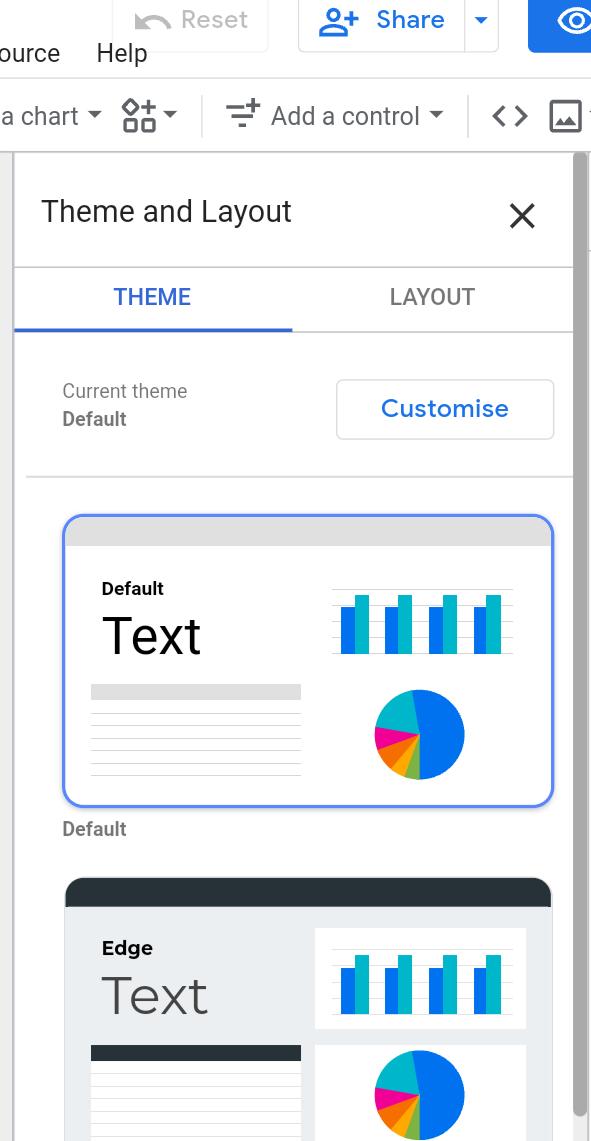
Learn more on how to customize your Google data studio report.
11. Combine several Google Analytics properties in Data Studio
Creating a single complete report could be challenging when there are several Google Analytics properties, possibly under different accounts.
It can be easily handled via the blended data capability in Data Studio. Data from several sources, platforms, properties, and accounts can be imported into a single report. It is included on the top navigation bar under “Resource.”

12. Embed reports in existing Data Studio templates
One Google Data Studio suggestion from a data studio consulting expert that can spice up your report is this one.
You could want to embed real-time reports from YouTube, Google Sheets, other websites, or other sources. You can do this task with the aid of the URL embed capability.
If you want to share a YouTube video in your report, you can easily do that by embedding it.
13. Use Data Studio connectors
While connecting to and importing data from Google’s platforms is straightforward, connectors can assist you in obtaining data from other platforms.
For this purpose, Porter Metrics offers a wide variety of connectors and data connectivity possibilities. Data Studio can be linked to several sources, including:
- Social media channels
- ads networks
- Payment methods
- solution for content management
- CRM systems
- Data warehouses and databases

14. Customize data visualization
Whether you’re a novice or an experienced user, this popular Google Data Studio trick will come in handy as you might want your brand aspects to be present in the reports.
Additionally, different stakeholders can prefer various data perspectives. Usually, a developer is required for such requests, although not in Google Data Studio.
15. Use metric sliders to filter data
You can filter data by value range by turning on the metric sliders option when adding data. For instance, you might wish to look for data for a specific period or CPM for a particular quantity of views.
You can slice and dice data using metric sliders to get better insights.
16. Add reference lines in the Data Studio report
Data Studio graphics with reference lines illustrate how the data in this chart relates to a value. These may be vertical or horizontal lines. Every chart can include up to 10 reference lines.
Reference lines help you evaluate time series, line, bar, and column charts, as well as scatter and area charts, more effectively.
For example, a reference line can assist you in tracking the rise in visits to determine the effectiveness of your SEO activities.
Conclusion
Finally, if you’re wondering how you can utilize these Google Data Studio suggestions to maximize its benefits, you’re in luck.
Users (You) can now take full advantage of all of Google Data Studio’s benefits thanks to these features. However, you’ll remember these suggestions more quickly if you learn them by doing. So start your free trial right away!
Frequently Asked Questions
How hard is Google Data Studio?
It takes some getting used to using Google Data Studio. However, most marketers would give GDS a 2 to 2.5 on a scale of 1 to 5, with 5 being the most difficult. Once consumers get the hang of it, they frequently find Data Studio less confusing than Google Analytics.
How many rows can Data Studio handle?
Depending on the data you’re connecting to, different row dimensions may be accessible. As a result, fixed-schema data sources like Google Analytics and Ads can have up to 5-row dimensions.
Can I use Google Data Studio offline?
No. Since Data Studio is now entirely web-based, an internet connection is necessary to function.
Can Data Studio connect to Facebook?
Most certainly, yes. Visit the Data Studio homepage and select the blank template in the top left corner. The new report that Data Studio generates can be renamed in the top left corner.
The data sources for your Facebook Ads report should then be added. Choose your Facebook Ads data source in the right-hand column by moving there.
Is Google Data Studio a Dashboard tool?
Yes. With the help of the free tool Data Studio, you can transform your data into insightful, straightforward, shareable dashboards and reports.