


This article will show you how to present and design your marketing reports.
Marketers often run into a unique problem when trying to communicate their results through their reports- the problem of their bosses not understanding what they’ve done and the results they’ve gotten.
Most marketers are usually frustrated and sometimes feel like their Managers or Supervisors do not know what they’re doing.
I understand how frustrating this can be. In this article, you will know why your reports are not being read and how you can create reports that genuinely communicate the value you bring to your boss or your clients.
Just a quick update before proceeding: On October 11th, 2022, Google unified all of its business intelligence tools into one umbrella called Looker.
This includes the famous Google Data Studio (formerly Looker Studio). Going forward, Google Data Studio will now be called Data Studio. So, in this article, we will start calling Google Data Studio Data Studio.
That said, I want you also to understand that this doesn’t change anything about our connectors. You can still use any connectors to pull data from your data source and visualize them on Looker studio.
To make creating your reports easier, we’ve designed beautiful templates to enable you to get your reports ready in less than 5 minutes. Best part? They’re all free.
Want to get our free templates? Check out our gallery of free report templates to create reports for every use case.
Why your boss & clients aren’t reading your reports
Before I show you how to create beautiful marketing reports on Data Studio, you must understand why your boss or clients aren’t reading your reports.
If your reports look like the image below, then there might be a problem with how you create marketing reports.

You’re doing it wrong if your reports are filled with rows and columns with lots of figures.
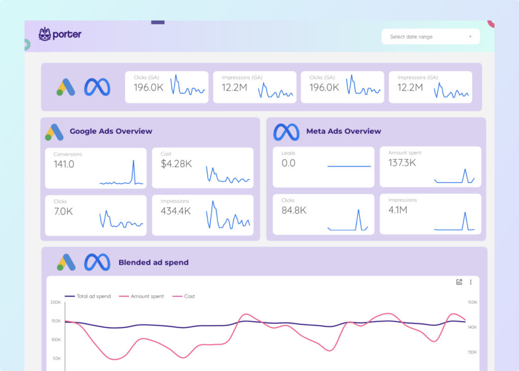
It would help if you created something that catches your boss’s attention. A beautifully designed report like this below is a good starting point:

This is one of the numerous templates we have in our templates library. You will agree that your boss is likelier to read a visually appealing report than a bland-looking one.
Creating a visually appealing report is the first step in creating a good report. But the big question is, how do I do it? Do I throw in charts, series, and tables on a dashboard?
No, there’s a proven process that works, and that’s what I’ll walk you through right now. Ready? Let’s go.
How to create beautiful marketing reports
1. Track the right metrics
You risk getting fired as an employee or agency if you don’t track metrics that matter to your boss. No good report will save unimportant metrics. You need to present metrics that matter to your boss or clients.
You might find this a bit tricky since you don’t want to make your reports too thin, which might suggest a lack of clarity and actionability, nor do you want to report too many metrics, which might suggest a lack of priority.

To strike a balance so that you report the important metrics appropriately, here’s what your report dashboard should display:

As a marketer, your report should cover output metrics such as acquisition and monetization, input metrics such as transactions, average tickets, signups, conversion rates from sign-ups to paying customers, and KPIs.
The input metrics are the essential type of metrics because they dictate the results of the output metrics.
For example, if you track the conversion rate from sign-ups to customers and improve it, you’re directly increasing revenue for the company.
This is what clients and your boss want to see- how your marketing efforts affect the company’s revenue.
2. Break down your data
Now, you understand that reporting the metrics that matter is crucial in getting clients and your boss to understand your input as a marketer. If you’re a Manager, the same applies.
But if your report dashboard is clustered with the right metrics, you still risk getting your reports ignored- that’s not what you want.
So, what should you do? Segment your data. The image below gives a visual representation of what I mean;

Let’s assume I’m reporting the metric- signups on my report dashboard. This way to display this metric is by breaking it into different segments.
So, instead of reporting that the “xyz campaign” had 1,500 signups, break down this data by showing the number of sign-ups from SEO, ads, and social media.
It would help if you got granular. Display sign-ups by country, platform, and topics. This way, you are reporting metrics and helping them understand them.
Think of your report as a cascade. For example, if you notice that you’re getting more signups from socials and less from SEO, what does it tell you?
It means you need to double down on social media marketing because that’s what the data states. Breaking down your reports this way makes them more actionable.
3. Always compare against something.
When creating reports, you should always add context. This way, you tell a story of what’s going on.
For example, let’s assume you want to add your website’s total URL clicks on your report dashboard. Many marketers would most likely report it this way, as shown below;

From the image above, what are your thoughts? Does this tell a good story? I will answer this question by sharing another way to report this metric. Check out the next image below;

Now, there’s a little bit of context. We are comparing the current URL clicks to the previous week. In this case, we’re showing that our URL clicks went up by 1.7% from the previous week.
Are you beginning to see how we’ve presented this metric to look valuable? Let’s take it deeper and link it to core business goals. Check out the next image below;

Now, we’ve shown where our traffic growth came from and what pages were creating these increments in URL clicks.
From the report, your boss can deduce what he needs to do to increase URL clicks by creating more templates and tutorial pages.
In summary, here’s what you should compare your data against to add context to your reports:
- Past performance
- Objectives
- Industry benchmarks
- Text (just like the image above).
4. Add contrast.
One of the best ways to make your reports easier to read by your clients or boss’ is by adding contrasts. This helps to see which metrics should be prioritized. Let’s use some images to explain better.
The image below shows what most report slides look like when aggregating metrics for reports.

Now, let’s compare with the next image below;

Can you see how displaying your metrics psychologically moves your readers to prioritize one over the other?
The giant boxes display the most important metrics, while the smaller boxes display the least essential metrics. Let’s take it a step further. Consider the table below:

Let’s assume we want to create a tabular report and prioritize the most critical metrics. How do we achieve that? We do this by:
- Putting the most important KPI first
- Sorting the KPI from lowest to highest
- Displaying metrics you need

If you observed well, the table prioritized only important metrics- cost per conversion, conversions, and cost. We removed impressions because it’s the least essential metric there.
We didn’t just add these metrics; we prioritized them in the correct order from cost per conversion to the last metric- cost. We also sorted the cost per conversion from lowest to highest.
When your boss or clients see something like this, what’s the first thing they think?
They immediately know their cost per conversion for different campaigns alongside the number of conversions for each campaign.
We can take this a step further by visualizing it on Looker studio. Here’s how:
- Connect your data source to Looker studio
- Use any of our free templates
On your dashboard, set metrics to cost/conversions, conversions, and cost. This is the order we want to visualize our report.

The next thing we will do is to sort our cost per conversion from lowest to highest.

Another way to visualize our data to prioritize important metrics is using the conditional formatting feature on Data Studio.
To do this, navigate to conditional formatting on your dashboard by following this order; Charts>style>conditional format.

Here, we’re going to apply some rules.

We will display the cost per conversion greater than 90 in red and the cost per conversion less than 20 in green. This gives us the result below:

This is how you create contrast on your reports or charts.
Before I move on to the next step in creating an engaging marketing report, let me show you an unpopular way of creating contrast on bar charts.
Consider the bar chart below:

You’d notice that one of the bars (smart shopping ad) is highlighted. This data was pulled from Google ads manager.
Ordinarily, the bar chart on Looker studio would display all bars with the same color, but highlighting the highest-performing metric immediately makes it stand out.
So, how do we do it? Here’s how:
On your dashboard, click Chart, then choose bar charts with breakdown.

The next step is to break down the data by campaigns. On your dashboard, set the dimensions to ad type. Ensure you use the same (ad type) dimension as the secondary dimension.

The next step is to style the chart by selecting the “stack bars” option.

Then choose a colour to highlight the bars on the chart.

This way, you create good contrast between your metrics, making your reports easier to digest.
5. Make your report interactive
One powerful way to build a marketing report that communicates your value is by making it interactive. Consider the SEO report below;

So far, this SEO report has followed the recommended tips mentioned above. We can easily deduce which pages bring in more URL clicks from a glance.
How do I achieve this if I want to get more information about each page without creating multiple report slides?
It’s easy. Through a feature known as cross-filtering and add a control, I can make this report interactive. To learn more about filters and controls, read our guide on how to create filters on Google data studio.
Adding filters and controls lets me view the SEO report above by content type, landing page, and query.
The query option allows viewing “specifics” within our report. Let’s say I intend to view reports of pages that talk about Google Analytics 4. I can enter figure “4” on the Query box, which immediately displays the performance of every page about Google Analytics 4 on my dashboard.
Making your report interactive is a way to keep your report engaging.
6. Develop a narrative.
A narrative helps you to turn your raw data into a story. We all know the importance of story-telling as marketers. The problem with most marketers is that they think of reports as dashboards, just like the one below:

The dashboard above might make sense to you as a marketer, but would it make sense to someone who isn’t analytical?
To make your dashboards easier to read, break them into slide decks, and report one metric, one page at a time. The slide below explains this further.

We have just a metric on the slide alongside a text explaining it. You can do this for all the metrics represented on your dashboard.
To represent all your metrics in a slide,
- Use navigations
- Change the page sizes
- Use text along the chart.
To create a powerful narrative, ensure you present data that are trustworthy. Most agencies always try to “impress” with their reports.
They only show what’s working well and sometimes ignore what isn’t working for their clients. The truth is; Marketing is hard.
So, if you are always trying to impress, i.e., go overboard with it, they will see through it. This could be one of the reasons why they aren’t reading a report.
Always show what’s working and what isn’t, then proffer solutions. To drive an excellent narrative, follow the structure below;

Let’s explain each process.
1. Hook
When starting your data presentation, you need a solid hook to get your readers or audience interested in your presentation. Here’s an example below;

Let’s assume you are presenting paid ad campaign results; you could say, in this presentation, “I’m going to share with you our quick wins, learnings, and an untapped opportunity ahead of our ads strategy.”
This statement excites your readers or audience if you’re doing a live presentation to stick to your reports.
2. Problem
After hooking your readers, the next is to highlight the problem. Here’s an example below;

3. Agitate
After stating the problem, share the insights that led to it. Doing this keeps the reader glued to the report.

As I stated earlier, most people shy away from bad results. This isn’t always ideal because your boss is smart enough to see through it.
Telling them outrightly that there’s a problem would only turn against you if you don’t share insights as to why it’s happening and how you’re going to solve it.
This takes us to the next point.
4. Solution
Always come up with solutions whenever there’s a problem.

Show your boss the steps that need to be taken to solve the problem you’ve highlighted and to prevent it from happening in the future.
Doing this makes you super valuable in the eyes of your boss because you’re doing something they love- solving problems.
Following these steps helps you tell a compelling story throughout your reports.
7. White-label your report
This is an essential aspect of creating reports that would eventually be read. Using your client’s logo and branding is an impressive way to get their attention.
Sharing a report that isn’t white-labeled sometimes appears dull and unrelatable. White labeling your reports makes you look professional in your approach. Not many agencies or marketers do this.
On Looker studio, there are various ways to white-label your reports. You can change the theme and style, add headers, images, sections, and many more.
I advise you read our guide on how to customize your Data Studio report to gain more insights on how to white-label your marketing reports.
For every use case, we have report templates that can be used to white-label your reports. Visit our report templates library to access them.
8. Share it
The final step in ensuring your clients or boss read your report is to share it. On Looker studio, there are various ways to share your reports.
On your dashboard, click share. This shows various ways you can share your reports.

Looker studio gives you five different options to share your reports. Let’s explore them;
1. Invite people
If you’re familiar with Google products, this option shouldn’t be strange to you. It works the same way you invite people to collaborate on Google docs, sheets, and slides.
Here’s an example of how we share reports within ourselves here at Portermetrics.

2. Schedule email delivery
The next option is to schedule a particular time to send your reports to your clients at a particular time and date.

3. Get a report link
This is simple. It’s the same step you would take to share a Google doc or sheet link. All you need to do is to copy the link and paste it wherever you want for your client or boss to view.
4. Embed report

Not everyone uses this option. You can embed your reports on your website. Take a look at a sample below;

Everything seen above was built on Looker studio. Presenting your reports this way is an ingenious way to impress your clients.
Conclusion
The most intelligent way to prepare your marketing reports is to use Portermetrics.
Portermetrics is a reporting tool and analytics platform that supports marketing teams in tracking, measuring, and visualizing data.
It is easy to create marketing dashboards and actionable marketing reports with over 100 customizable templates using Portermetrics, which integrates with your data sources (Social Media, Ads, E-Commerce, CRM, Payment, and SEO).
To make creating your reports easier, we have a course that teaches you everything you need to know about Data Studio.
Every user of our connectors and templates has access to unlimited chat and video support to ensure you get your reports right. We even offer free custom report set-up.
So, what are you still waiting for? Try Porter for free today and create a report that impresses your boss’ and clients.
Frequently asked questions
Let’s go through some questions I frequently get about designing marketing reports on Looker studio.
1. Do reports influence the lifetime value of an agency’s clients?
Yes, a well-structured report increases the lifetime value of your clients as long as your reports continue to portray your value to them. This is because your reports should show what’s making them profitable and what they can do to make more money.
2. How do you visualize conversion goals?
Looker studio has different ways to visualize conversion goals. Assuming you intend to visualize your Facebook ad goals, a sophisticated way is to combine your Facebook ad data with a Google sheet with the goal data.
You can track the actual goal versus the objectives in real time. For more clarification, you can contact me via email- at juan@portermetrics.com.
3. Can I export Google sheets data to Data Studio?
Yes, you can. To do this, open your Data Studio dashboard, click “add data,” and select Google sheets. This exports your Google sheet data into Data Studio. For a detailed explanation, read the guide on exporting Google sheets data to Data Studio here.