To connect HubSpot to Google Data Studio (formerly Looker Studio), go to Create report (or the Data Studio community connectors gallery), select Single data source, choose the HubSpot connector by Porter Metrics, sign in with your Google account, authorize your HubSpot account, pick the account/workspace, click Create report to open the template in Data Studio, then Save and Share → Acknowledge and Save; if no data appears, expand the date range.
Free and paid ways to Connect HubSpot to Data Studio
The free plan lets you connect up to 3 HubSpot accounts to Data Studio, Google Sheets, or BigQuery with unlimited use and 30 days of historical data.
Data Studio Connector (Recommended)
Pulls data directly from HubSpot API with drag-and-drop functionality and fresh data. Loading speed varies with data volume—use Sheets or BigQuery for large accounts.
Google Sheets Import
import data automatically via add-on or manually import CSV files from HubSpot (free but manual), then connect Sheets to Data Studio with Google’s native connector. Advantages include instant load times for small datasets and data editing (goals, markups, commissions); downsides include reduced granularity (only use fields from Sheets queries) and freshness dependent on sync frequency. Manual CSV uploads have additional limitations: 100-upload limit, 100MB max per file, and identical file structures required.
Google BigQuery
Best performance and scalability for large data volumes, but typically requires BigQuery knowledge and maintenance. Data freshness depends on sync frequency to avoid API limits. Porter simplifies this by handling all transformations automatically—unlike other tools that import raw tables requiring manual work, Porter makes it completely no-code.
Porter Metrics offers all three methods. This tutorial focuses on the direct HubSpot connector for Data Studio.
Free HubSpot connector for Data Studio
To connect HubSpot to Google Data Studio with Porter Metrics, go to portermetrics.com, start a 14‑day free trial (or use the free forever plan), sign in with your Google account (the same one you use for Data Studio), choose Single data source, select HubSpot, authorize your HubSpot account, and click Create report.
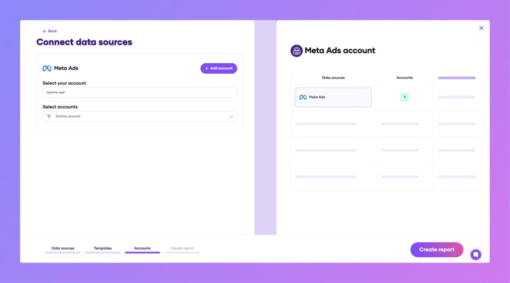
Step 1: Authorize your HubSpot account
Sign in to your HubSpot account when prompted. Grant Porter Metrics access to the HubSpot data you want to report on. Make sure you use the correct HubSpot account associated with your business data.
Step 2: Create and load your Data Studio report
After authorizing, click Create report. You’ll be redirected to Data Studio. Wait for the prebuilt HubSpot dashboard template to load. If you see no data, expand the date range in the report.
Click Save and Share in the top right, then Acknowledge and Save to publish your report.
Step 3: Explore your HubSpot dashboards
The prebuilt dashboard includes:
- Deals: Overview, funnel, acquisition, sources, summary; metrics like total deals, closed won/lost, deal amounts, ACV, ARR, MRR, pipeline stage and owner performance; tree maps and time series by pipeline, stage, source, and owner.
- Acquisition: Reports using original source fields and UTM parameters.
- KPI summaries: By month or week. Sessions, CTA views, actions, submissions, form data.
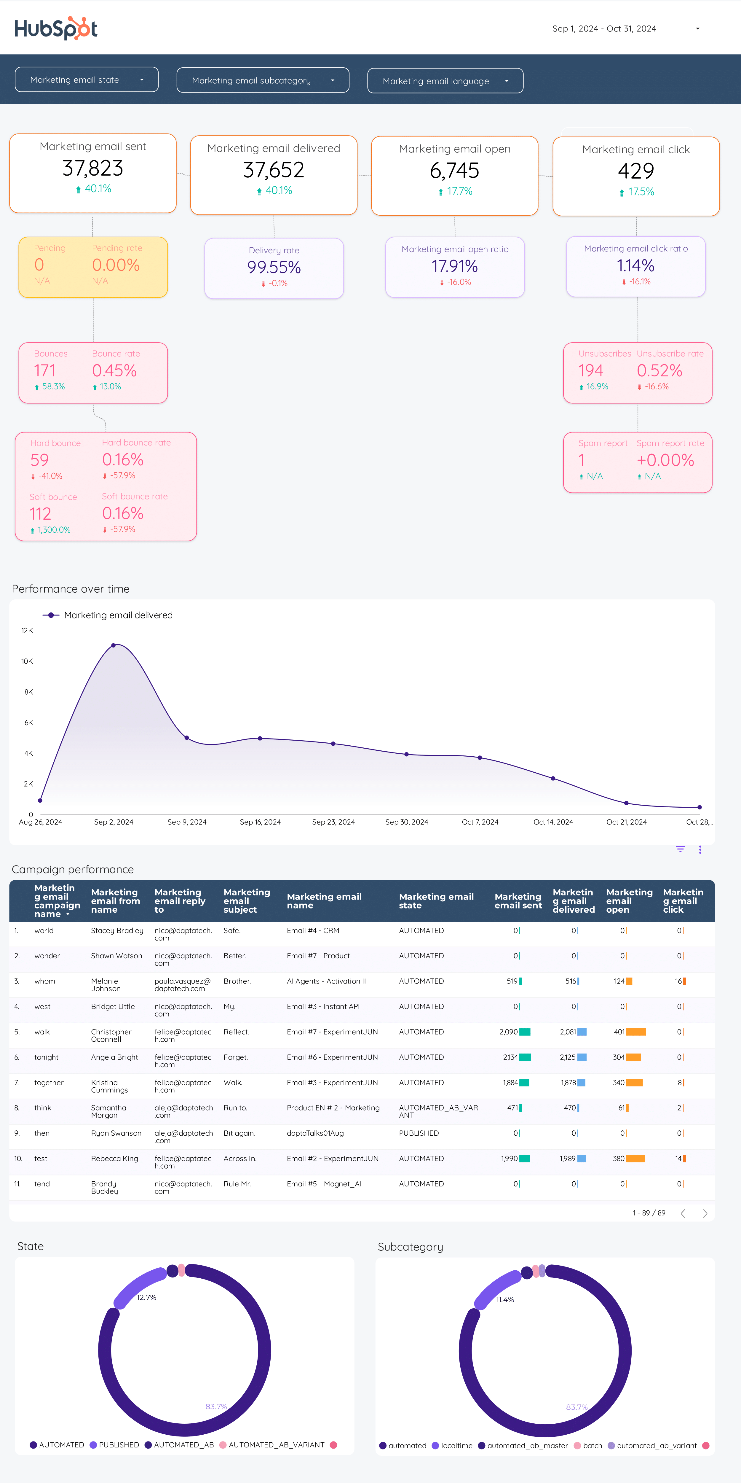
- Email performance: Sends, delivered, opens, clicks, by campaign/automation.
- Form submissions: Over time.
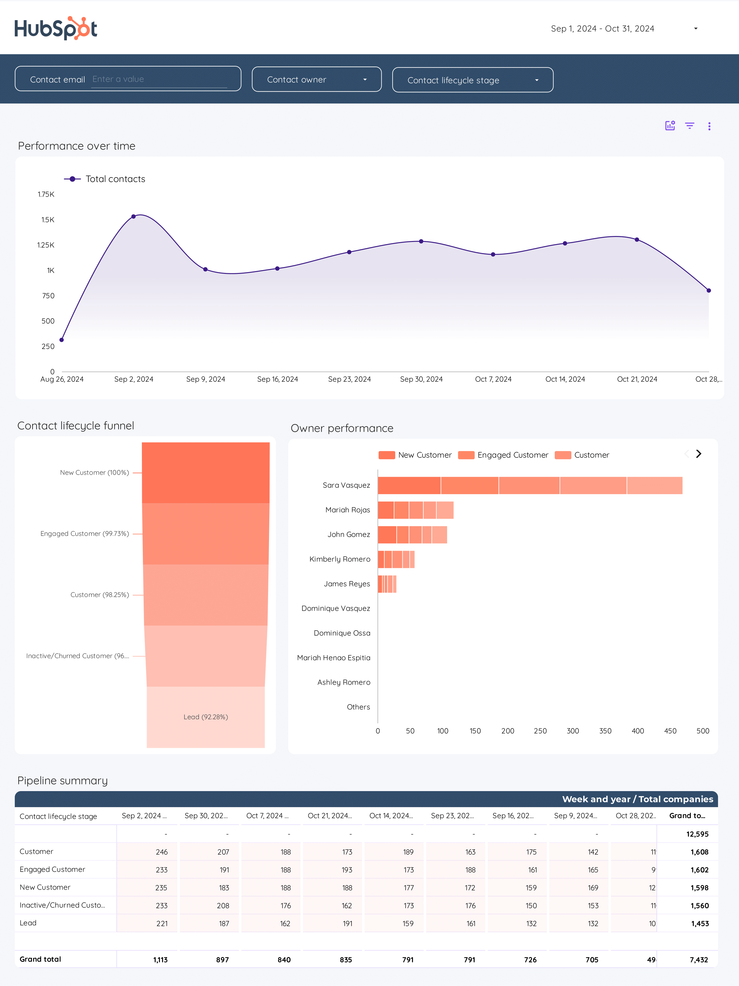
- Contacts: Lifetime contacts, acquisition source, lifecycle stage, activity by email/web/CRM, SQL/MQL funnels.
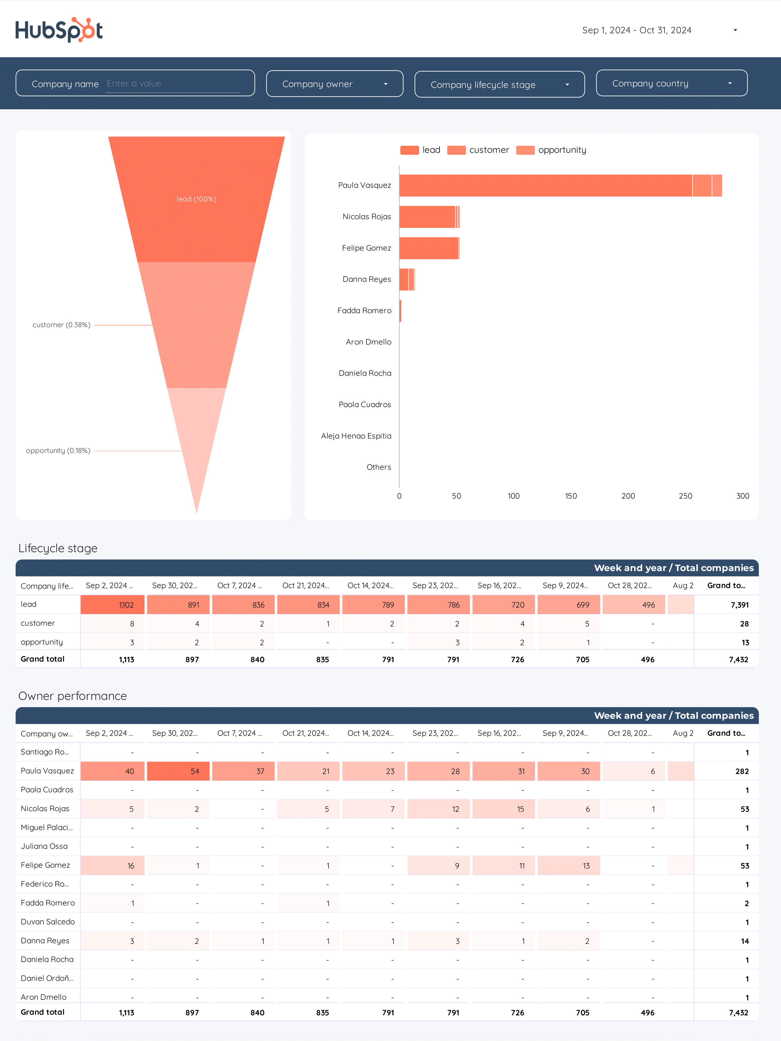
- Companies: Traffic by company, sessions, submissions, associated contacts, acquisition sources, stages, owners, enrichment fields (website, LinkedIn, revenue).
You can customize reports with filters, tables, charts, scorecards, pipelines, or blend HubSpot data with other sources (e.g., LinkedIn Ads). This connector makes HubSpot data fully explorable and more flexible for reporting than HubSpot’s native dashboards.
HubSpot dashboard templates
Once you connect your HubSpot dashboard template, you’ll access these use cases:
Email marketing dashboard
Track your HubSpot email campaigns with metrics like open rates, click rates, bounces, unsubscribes, and spam reports. Analyze performance by subject line, sender, and audience segment. Visualize delivery, engagement, and lost contacts to optimize your email marketing strategy.
CRM dashboard
Monitor your HubSpot CRM with insights on accounts, contacts, companies, and deals. View total numbers, pipeline stages, deal values, and owner performance. Drill down into company and contact details, engagement activities, and lifecycle stages to manage your sales process efficiently.
B2B funnel dashboard
Visualize your B2B sales funnel from lead generation to closed deals. Analyze conversion rates, deal progression, and pipeline health. Segment by source, industry, or deal owner to identify bottlenecks and optimize your sales and marketing alignment.
Visit our template gallery to explore additional HubSpot templates for Data Studio.
How to build a HubSpot dashboard in Data Studio
To connect HubSpot to Data Studio, go to portermetrics.com, start a free trial or use the free plan, and sign in with your Google account (the same one you use for Data Studio). Choose Single data source, select HubSpot, authorize your HubSpot account, and click Create report. Once redirected to Data Studio, wait for the template to load, then click Save and Share > Acknowledge and Save. If no data appears, expand the date range.
Step 1: Add charts to visualise HubSpot KPIs
Add scorecards, time series, tables, pie charts, and more to visualise your HubSpot data in Data Studio.
- Bar charts: Compare deal amounts by pipeline stage or owner to see which teams or stages drive the most revenue.
- Scorecards: Show KPIs like total deals, closed won, or new contacts this month.
- Tables: Combine dimensions like deal name, owner, stage, and amount to analyze pipeline health.
- Time series: Track new deals, contacts, or form submissions over time to spot trends.
- Treemaps: Visualize deal volume or value by pipeline or source for a quick overview of distribution.
- Pie charts: Show proportions of contacts by lifecycle stage or acquisition source.
- Scatter plots: Analyze relationships, such as deal size vs. time to close, to identify outliers or bottlenecks.
Step 2: Add context with comparisons
Add goals, reference lines, and conditional formatting to compare HubSpot data and add context.
- Comparison date range: Compare KPIs like new deals, contacts, or MRR against previous periods to spot growth or declines.
- Reference lines: Add target or average lines to time series charts for metrics like deal value or email open rates.
- Conditional formatting: Highlight high-performing owners or stages in tables, e.g., flag deals with high value in green.
- Goal tracking: Track progress toward sales or marketing targets, such as monthly new contacts or closed deals.
Step 3: Make dashboards interactive
Interactive elements make HubSpot dashboards easier to explore:
- Buttons: Add navigation buttons to move between Deals, Contacts, and Companies pages, or reset filters.
- Date range controls: Switch between this month, last quarter, or custom periods for deal and contact activity.
Sliders: Filter deals by amount or contacts by engagement score. - Dropdowns: Filter by deal owner, pipeline, or lifecycle stage.
Input boxes: Search for specific companies, contacts, or deals by name. - Cross‑filtering: Click a pipeline stage or source to filter all charts to that segment.
Step 4: Design and white-label
Learn to design your Data Studio reports and follow best practices for dashboard design for HubSpot data.
- Theme and layout: Use your company’s branding, colors, and logo for a consistent look.
Page navigation: Organize dashboards by Deals, Contacts, Companies, and Marketing. - Navigation and headers: Set up tabs or menus for easy access to each HubSpot data section.
- Images and text: Add company branding, section headers, and chart labels.
- Shapes and lines: Use for visual separation or emphasis on key metrics.
- Copy-paste styling: Apply consistent styles across all HubSpot charts.
Aligning charts: Keep charts and tables neatly organized. - Conditional formatting: Color-code metrics like deal status or contact engagement.
- Modern charts: Use advanced styling for a polished dashboard.
- Report-level elements: Keep your logo, report title, and date controls visible on every page.
Step 5: Share your HubSpot dashboard
Learn to share your Data Studio reports with your team or clients:
- Invite people via email: Add team members or clients as editors or viewers, just like Google Docs.
- Draft mode: Edit dashboards without showing changes until you’re ready.
- Schedule email delivery: Send automated HubSpot reports to stakeholders on a set schedule.
- Share via link: Generate a shareable link for your HubSpot dashboard and control access.
- Download as PDF: Export your dashboard for offline sharing or presentations.
- Embed report: Add your HubSpot dashboard to your website or internal portal using an embed code.
HubSpot KPIs
The HubSpot connector brings in a comprehensive set of metrics and dimensions from your CRM, marketing, sales, and service data, including:
Conversions & Engagement
- Form Submissions: Track the number of form submissions, conversion rates, and submission sources.
- CTA Performance: Monitor CTA clicks, views, and click-through rates to measure engagement with your calls-to-action.
- Contact Lifecycle: Analyze contacts by lifecycle stage, lead status, and customer conversion dates.
- Email Engagement: Review marketing emails delivered, opened, clicked, and unsubscribed, along with open and click ratios.
- Deal Progression: Evaluate deals by stage, amount, probability, and win/loss outcomes.
- Sessions & Page Views: Analyze sessions, entrances, exits, page views, and average time on page.
- Bounce & Exit Rates: Monitor bounce rate, exit rate, and new session percentage to assess visitor engagement.
CRM & Sales Metrics
- Account & Company Data: Profile accounts and companies by industry, revenue, employee count, and public/private status.
- Deal Financials: Track deal amount, ACV, ARR, MRR, TCV, and associated contacts.
- Call Engagements: Review call engagement details, including type, direction, status, duration, and recordings.
Dimensions
Segment data by:
- Time: Date, Week, Month, Quarter, Year, Day of week, Hour of day
- Account & Company: Account name, Company name, Industry, Location
- Contact: Lifecycle stage, Lead status, Owner, City, State, Country
- Deal: Pipeline, Stage, Owner, Forecast category
Custom fields
- Custom Metrics: Build new KPIs such as lead-to-customer conversion rate, average deal size, or custom engagement scores using calculated fields.
- Custom Dimensions: Use REGEX and naming conventions to group by sales region, product line, or account segment. Filters: Apply filters at the chart, page, or report level (e.g., Company industry contains “SaaS”).
- Data blending: Blend HubSpot CRM data with other sources (e.g., Google Ads, LinkedIn Ads, or Shopify) for unified reporting, sales attribution, and ROI analysis.