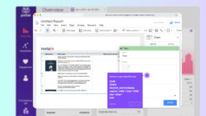
To create a good report you have to understand how to create and edit charts on Looker Studio.
If you want better reports, you have to understand:
The technical part: what are metrics, dimensions, and how to customize them
How to choose the right chart to communicate the right message to your audience
Combining these two ideas will help you create engaging, useful reports. I will cover the step-by-step process of creating charts, the different types, customization options, and interactive filters-
Before we start, if you want to automate your reports without starting from scratch, we have more than 100 Looker Studio marketing report templates that pull data automatically from over 19 data sources.
We made a step-by-step video so you can see how we do it in Porter Metrics:
How to add a chart to a Looker Studio report?
To create a chart follow these steps:
The first step in creating a chart on Looker Studio is to connect your data source to Looker Studio
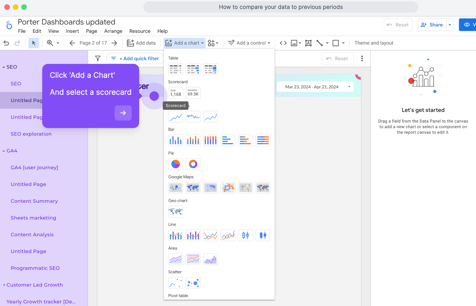
After connecting your data source, click “Add a chart on your dashboard.”
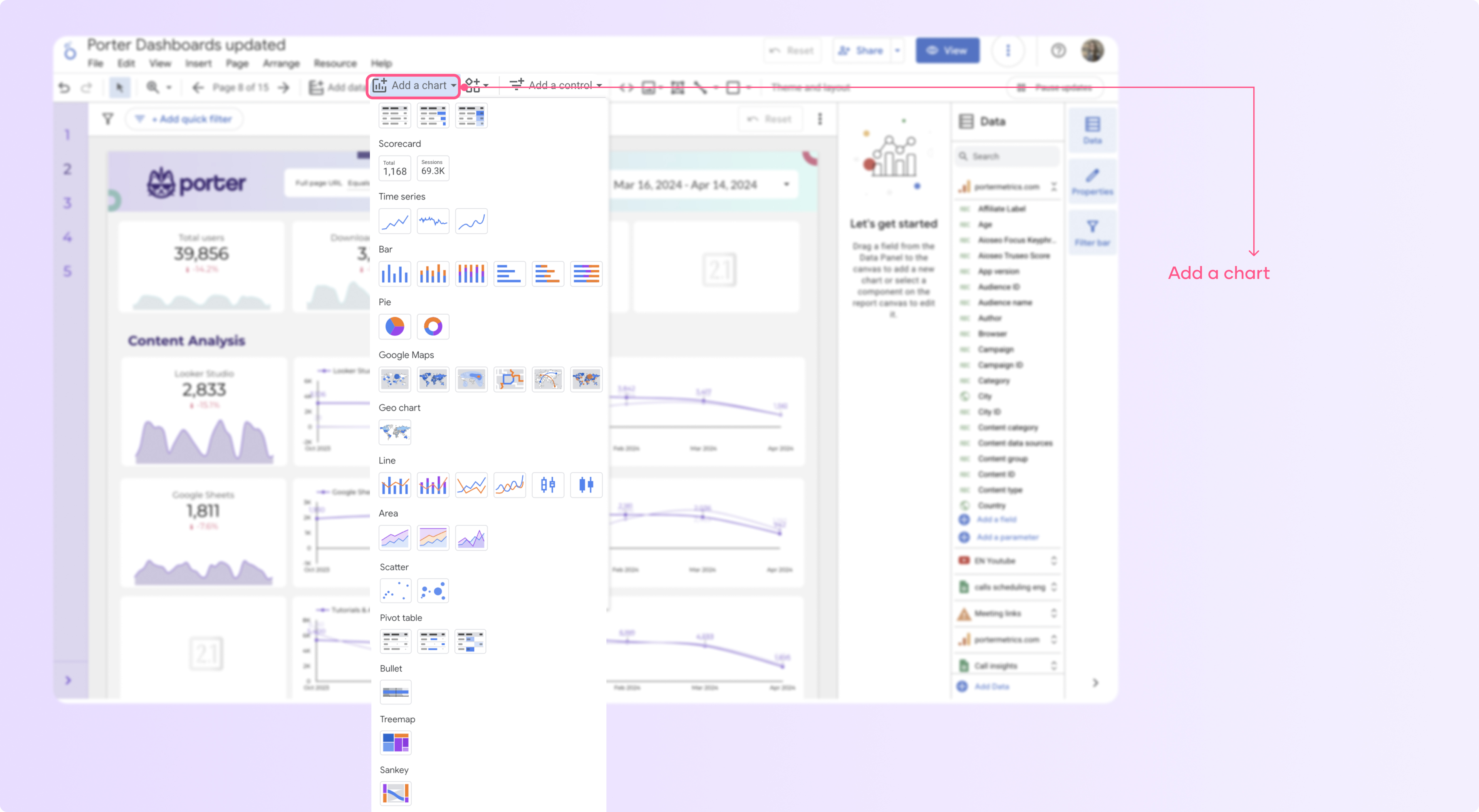
Select the chart you want to add to your page, such as time series, tables, and scorecards.
Click anywhere on the canvas area to add the chart to your page.
Edit the metrics and dimensions you want to include in your chart.
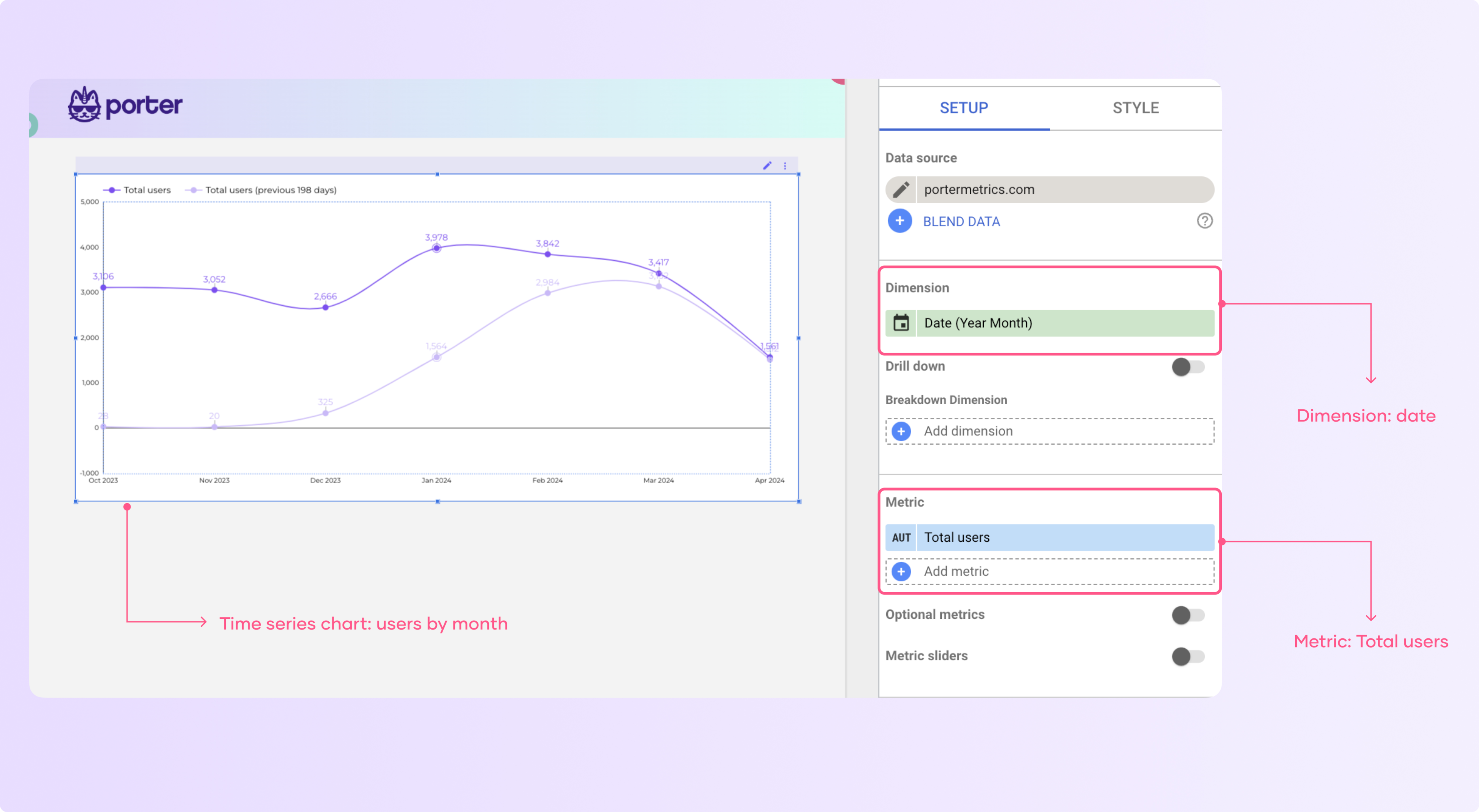
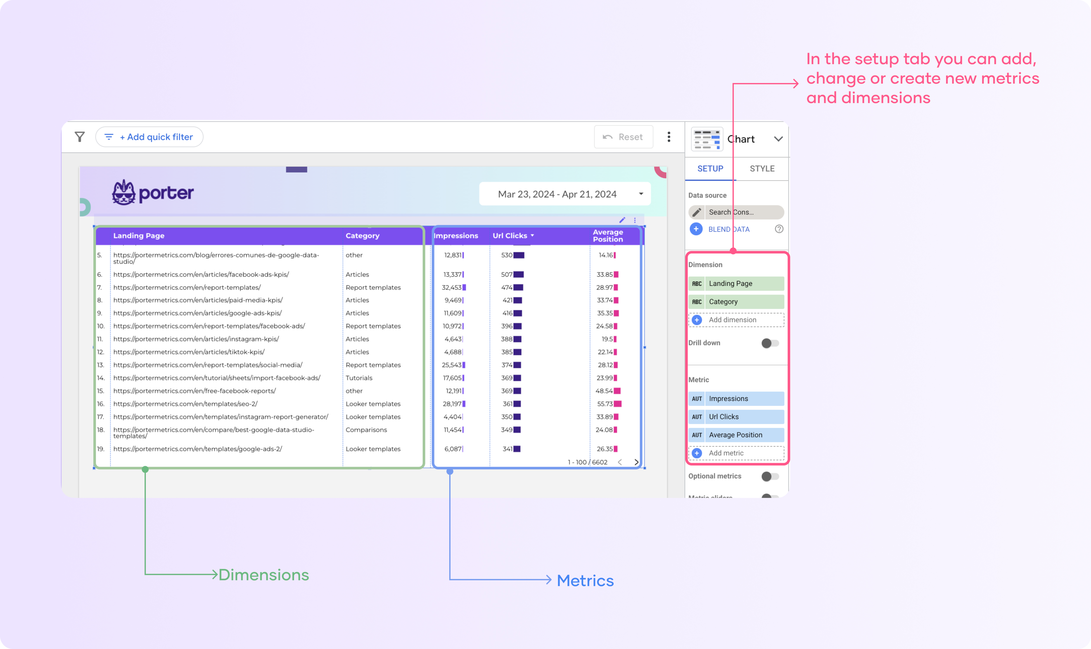
Understanding metrics and dimensions
Charts are made of fields, and they are composed of metrics and dimensions.
Metrics are the quantitative values, such as ‘users,’ and the dimensions that categorize your data, such as date.
You can differentiate them on Looker by their color and symbols: metrics are usually blue, and they have a number symbol next to them; dimensions are green, and they usually have symbols such as text ‘ABC’, date, or geography.
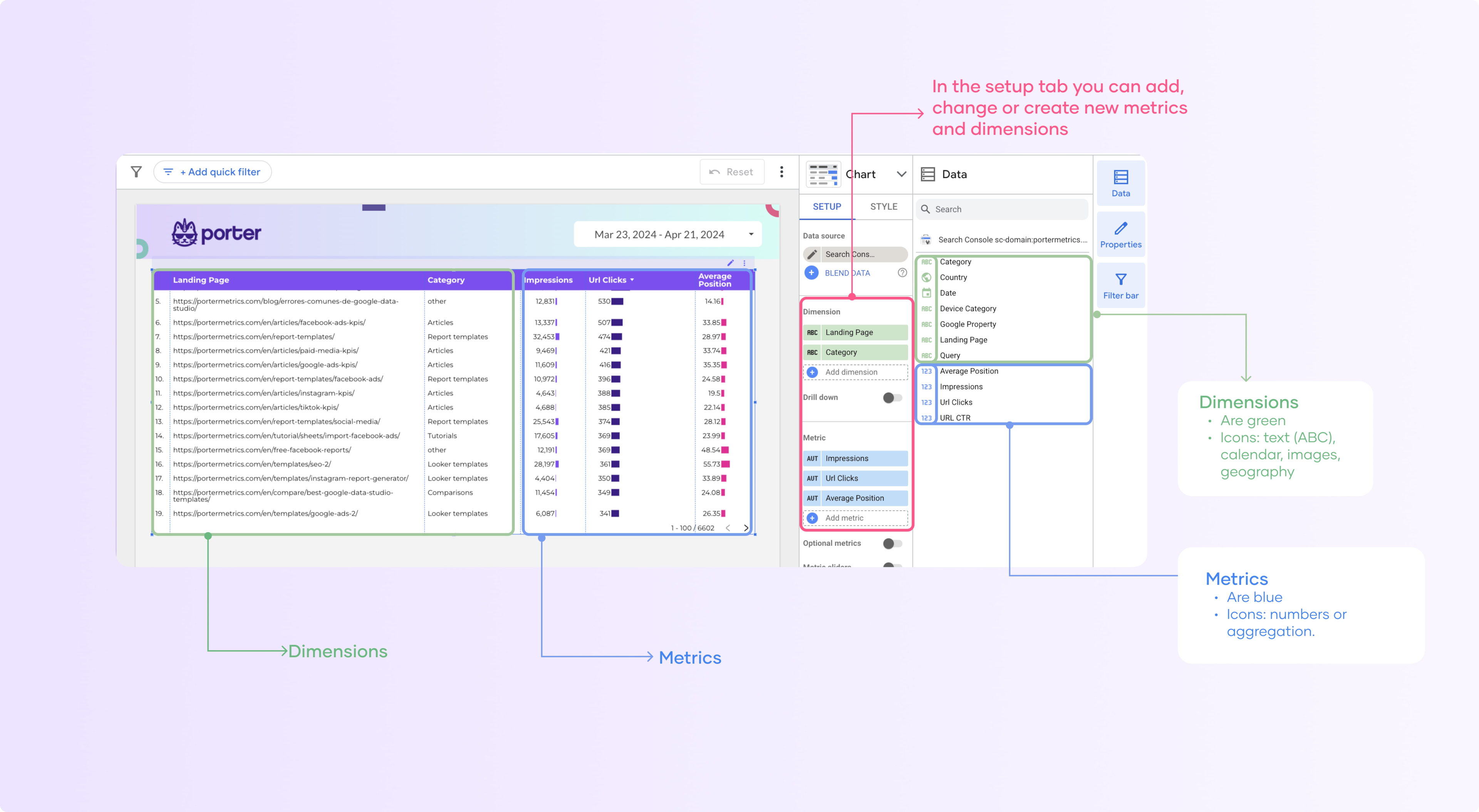
Depending on the type of graph you will have a limit of metrics and dimensions you can add. For instance, in scorecards, you can only add one metric and customize the comparison options.
This is the foundation of any chart, so it’s important to have the concepts clear.
As you can see, any data source you add to Looker Studio has its own metrics and dimensions, but you can create your own.
We wrote a full article on how to create custom fields on Looker Studio if you want to go deeper.
Customize your Looker Studio charts
Customization options are what make a report go from good to great, my recommendation is that you understand the basics and then explore each chart with its own customization options.
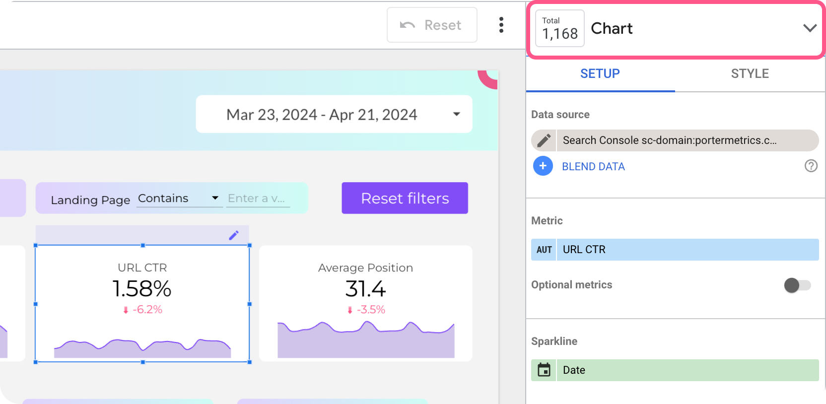
To customize any chart you have two options:
The setup tab is where you can edit everything related to your data: the metrics and dimensions, date range, filter, and parameters.
On the Style tab, you’ll find options to change design elements such as trendlines, change colors, size, and much more.
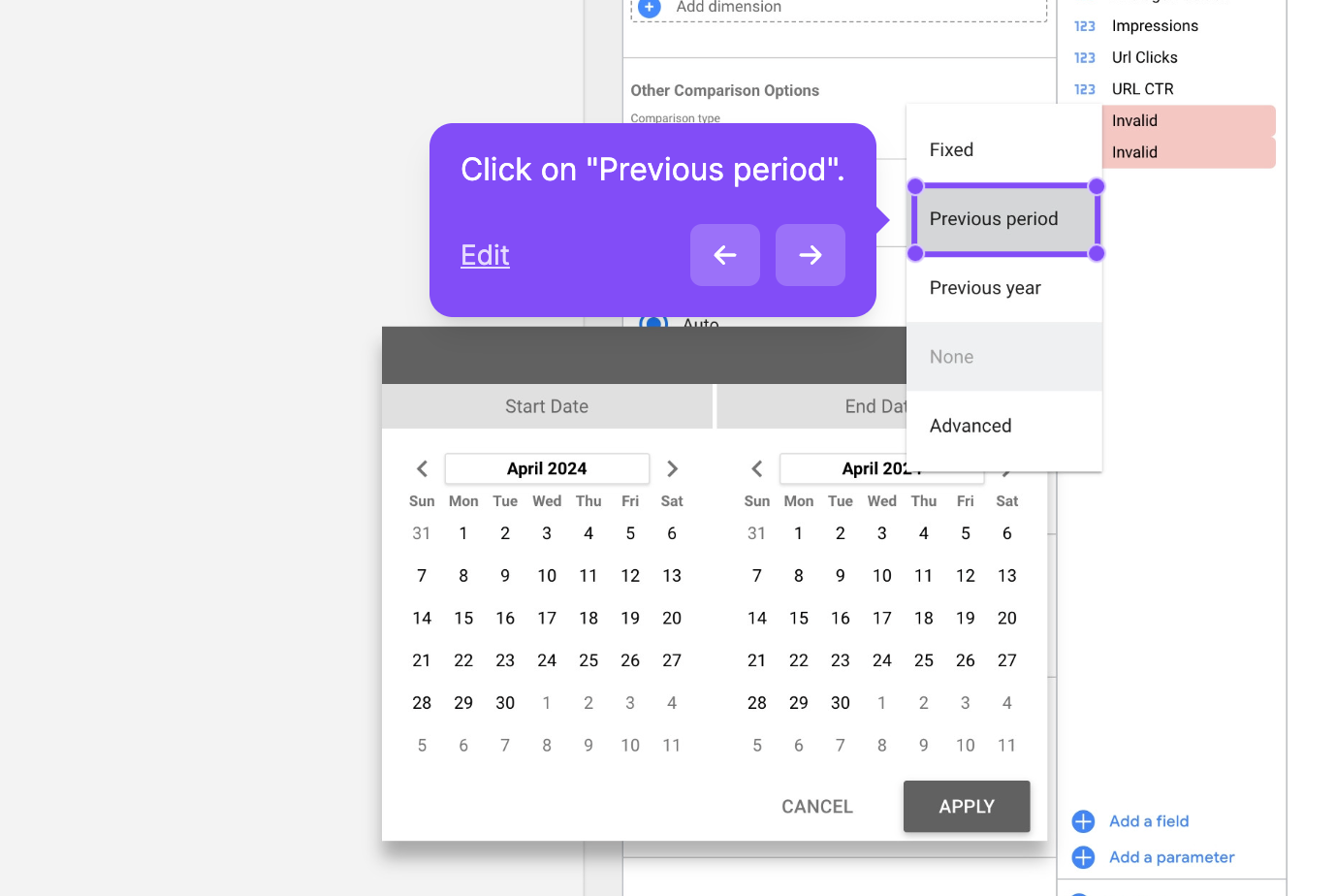
Compare your data to previous periods
You can compare your charts with previous periods. I almost always add them to my reports. It’s a good practice because it offers context to the report reader.
To add comparison date ranges to your report:
Select the chart you want to edit
Click on the dropdown on the comparison date range function
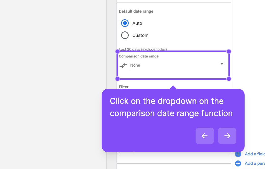
Select the date range you want to compare the chart with.I recommend choosing ‘previous period’ because it will always compare the result with the previous period you selected on your dashboard.
Click on ‘None’ in the right corner and select ‘Previous Period’
Customize and edit your chart style
Select a chart and go to the “Style” tab in the side panel.
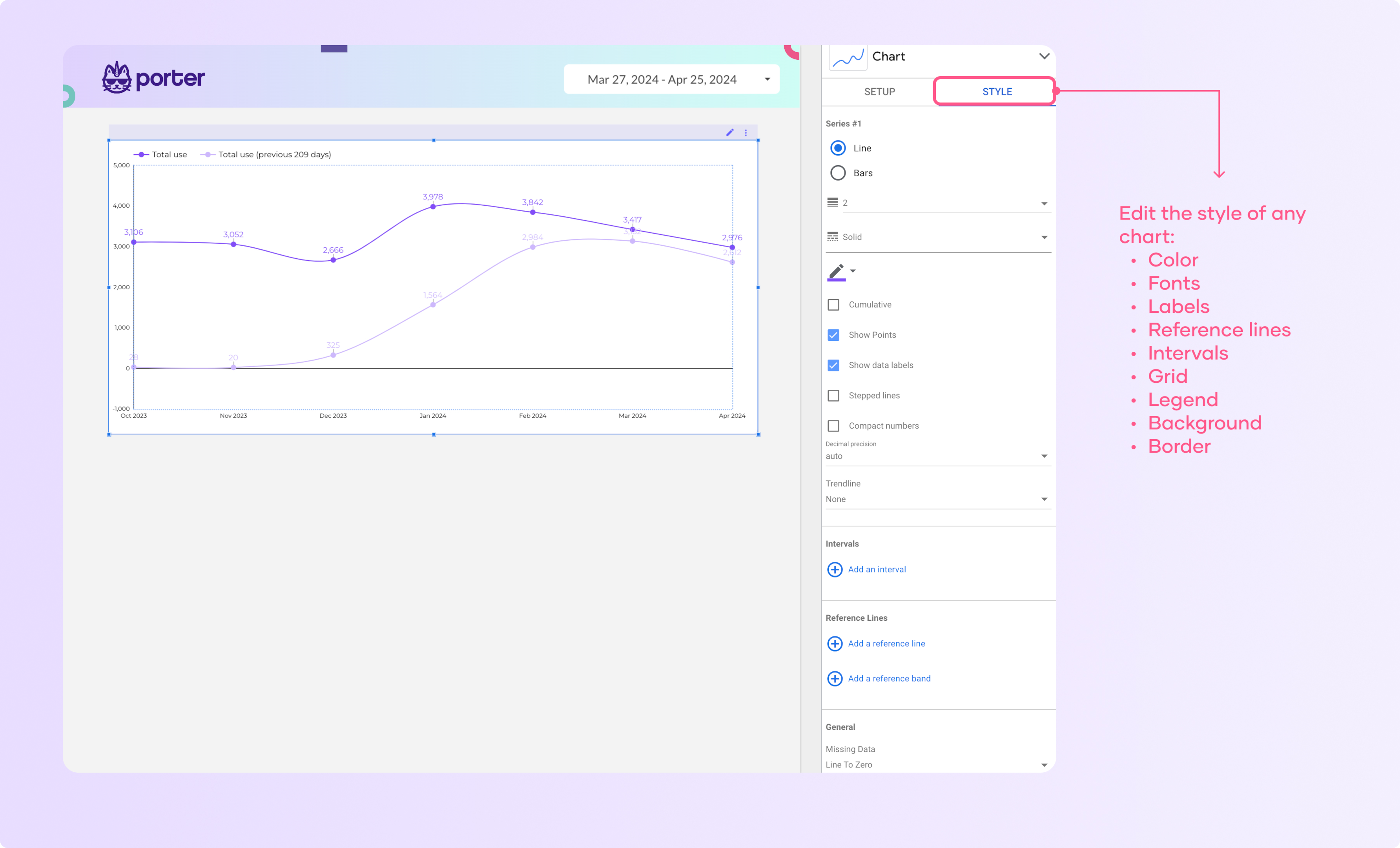
Here you can change the colors, fonts, labels, and other visual aspects of the chart.
Now you can play with the different settings and see how your visualization changes.
I recommend that you think of what you want to do and then search for the settings that allow you to modify that.
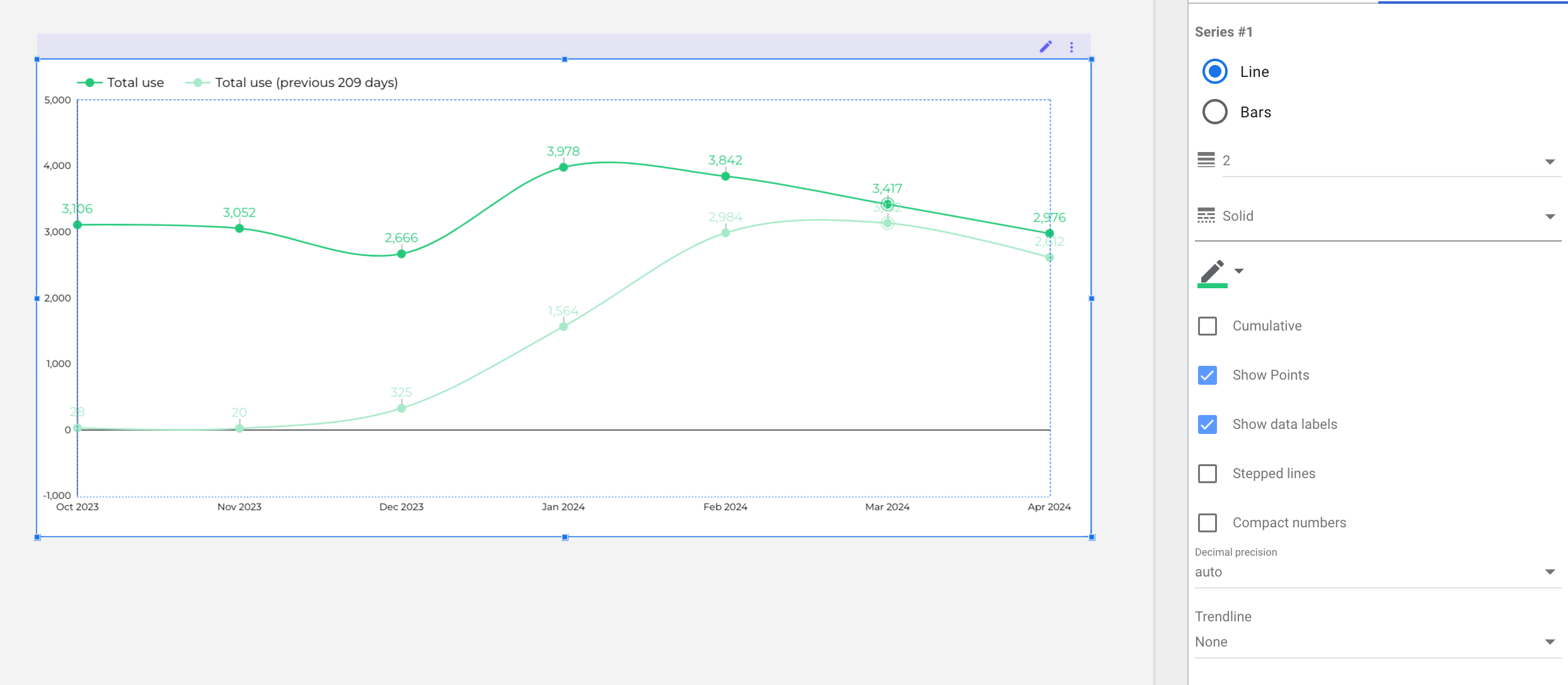
If I wanted to modify the color of the line series, go to the series line you want to modify, click the pencil with color, and select a new color from the palette or create a custom color.
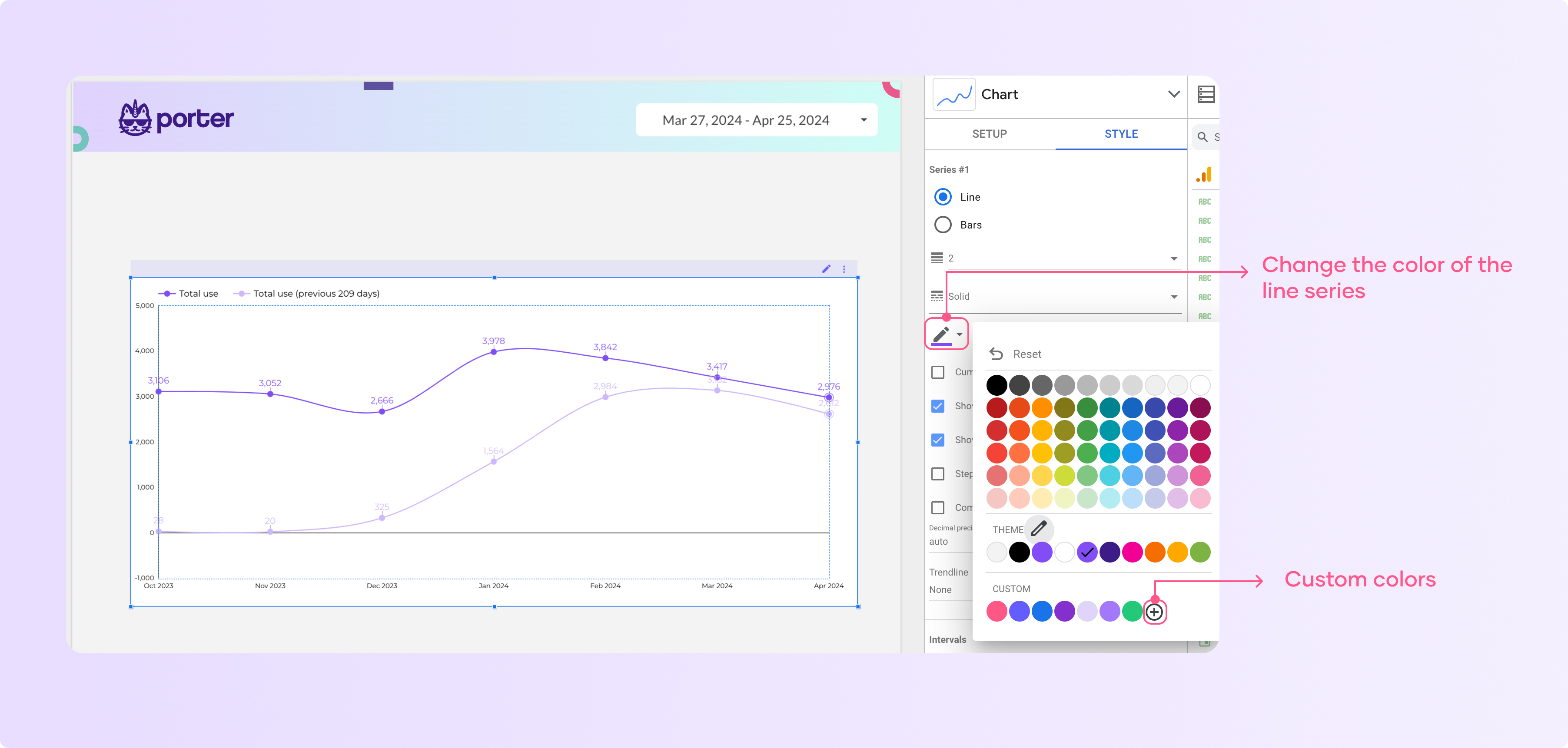
Here you can see how to line changed from purple to green
How do I set goals in charts?
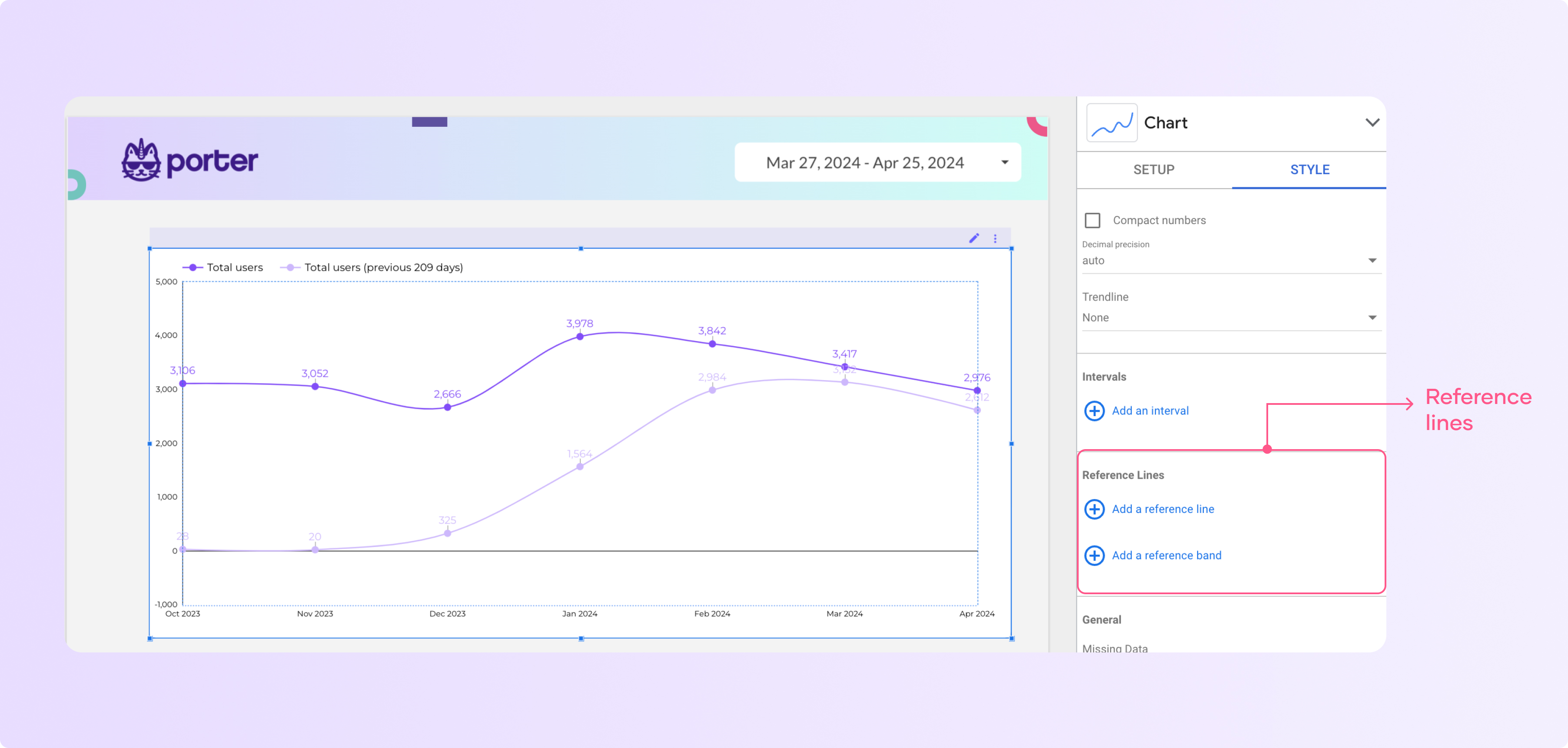
Reference lines
Reference lines provide you with a reference point, e.g., a goal or a threshold between two values. You can apply reference lines to bar charts and time series charts.
Here is the step-by-step on how to add reference lines to a visualization:
Click the chart and go to ‘Style’
Scroll down, go to ‘Reference lines’, and click ‘Add a reference line’ or ‘Add a reference band’.
The main difference between the two is that the first is one line and the second is a range between two values.
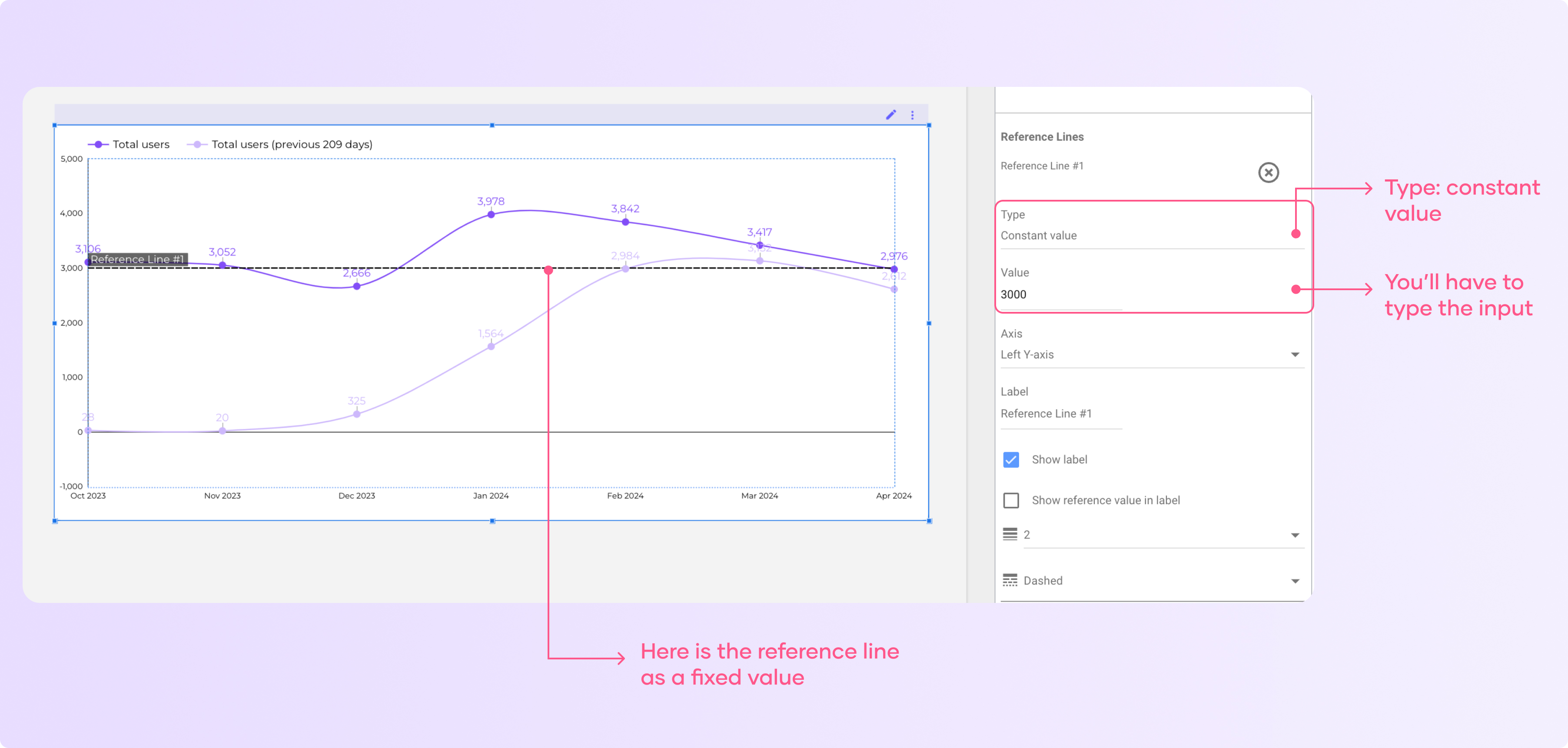
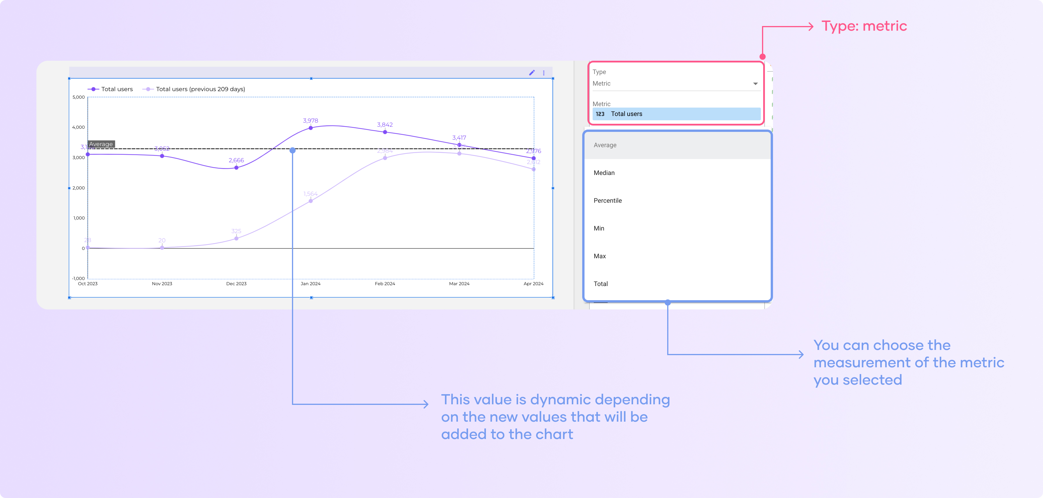
Select the dropdown on ‘Type’ and select if you want to use a constant value, metrics, and parameter.
If you select a constant value, you have to type an input.
If you select a metric, you will work for any metric you have in the data source you are using.
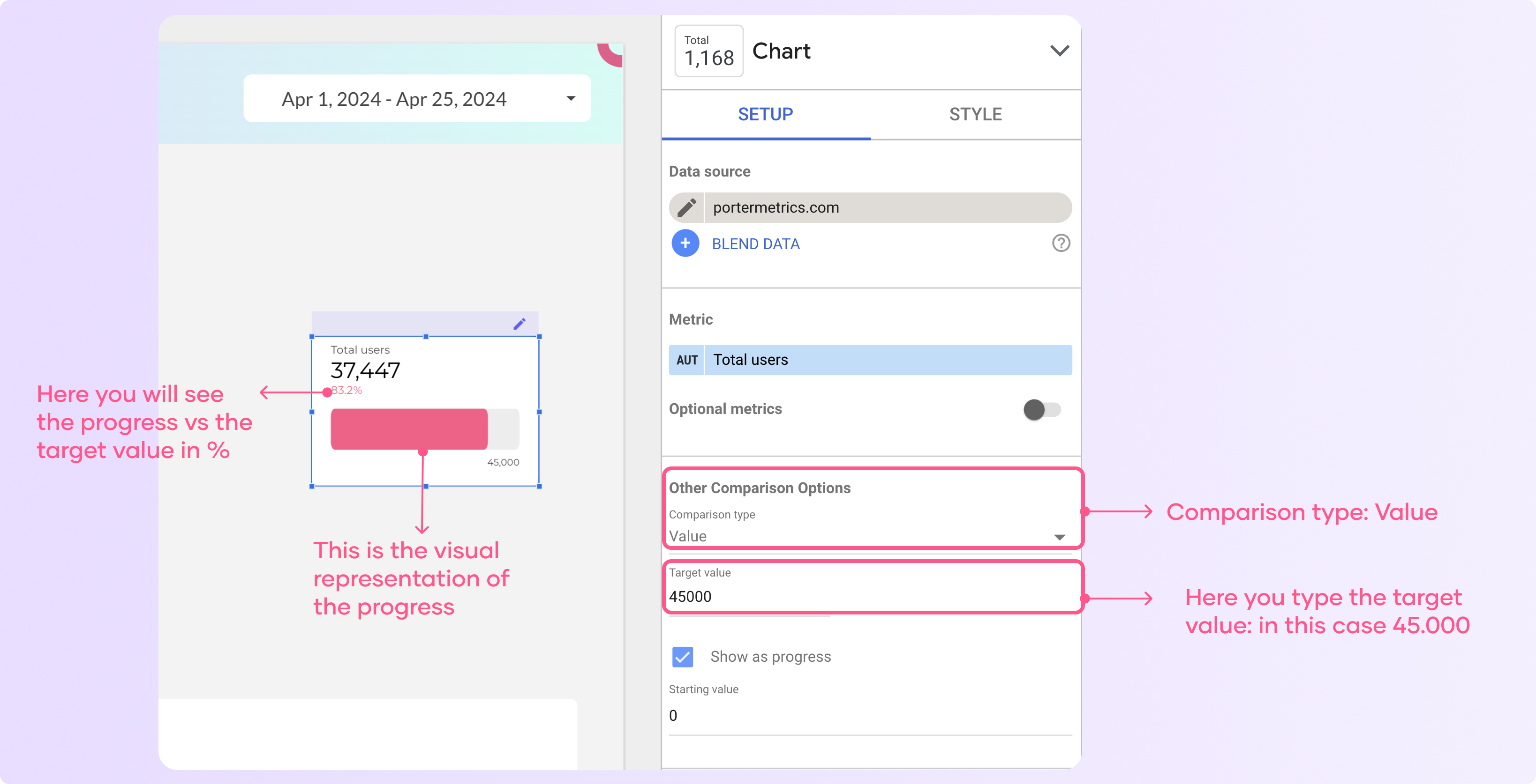
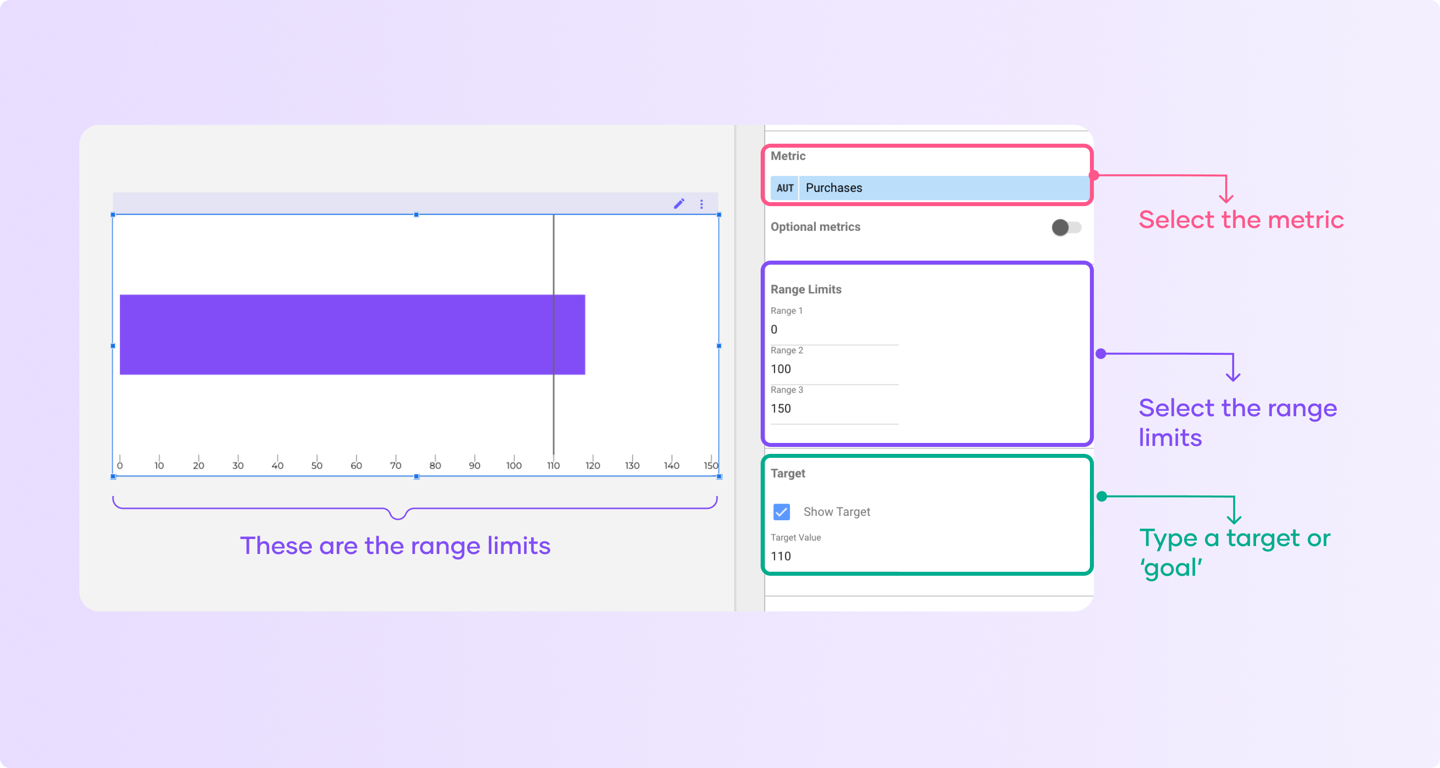
Show targets
Targets allow you to compare your goals vs. actual progress. You can use them in bullet charts, tables, and gauge charts.
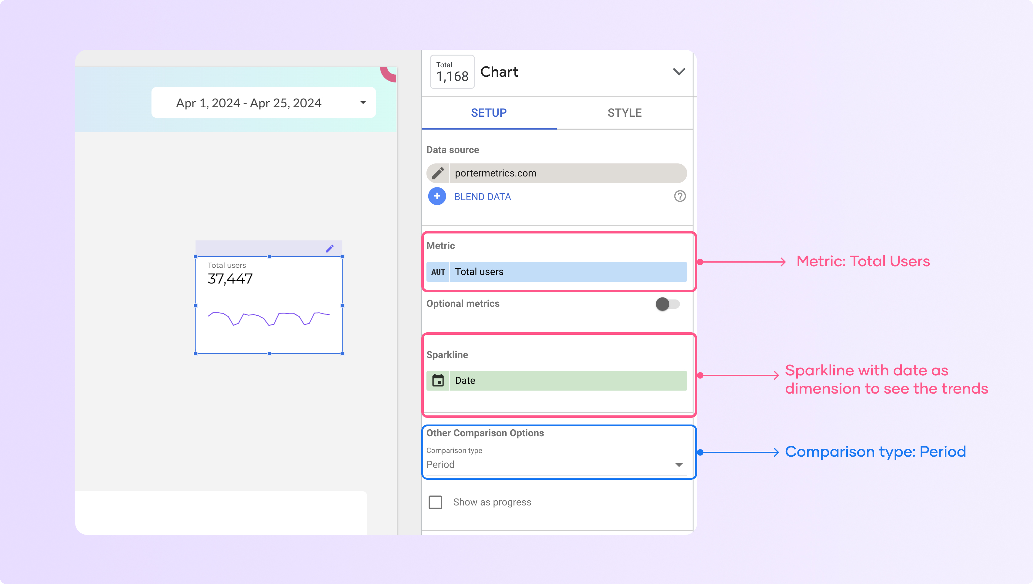
To add a target to a chart, follow these steps:
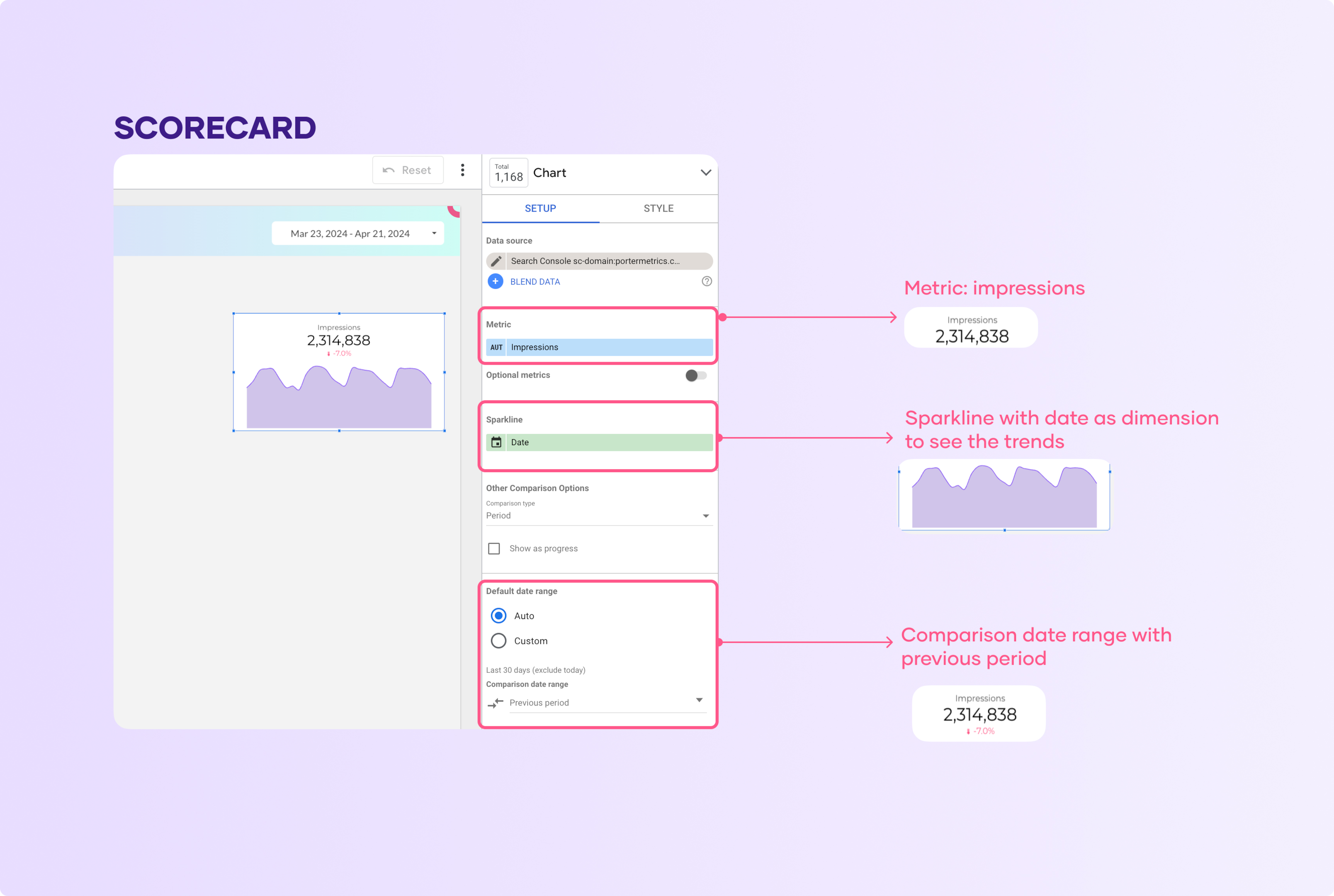
Select the scorecard
In the “Data” tab, choose a date dimension (e.g. date) to show the metric over time
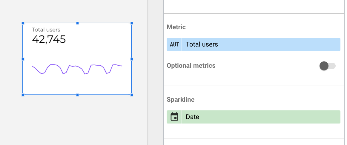
This will add a sparkline trend line below the main metric value
Now, change the comparison type to add a target and select ‘Value’ as the comparison type.
Then type a target value to show the result vs. the progress.
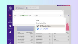
Adding custom date ranges
Date ranges are essential in data visualization. If you want to visualize your data over a period of time via charts, a date range helps you achieve that.
By default, all your charts will have an ‘automatic’ setup, meaning that they will change as the date filters on your report change. By setting a custom default date range, the report filters won’t modify these charts – they will only be affected by the conditions you have added
To add a custom date range to your chart, follow these steps:
Select the chart you want to edit
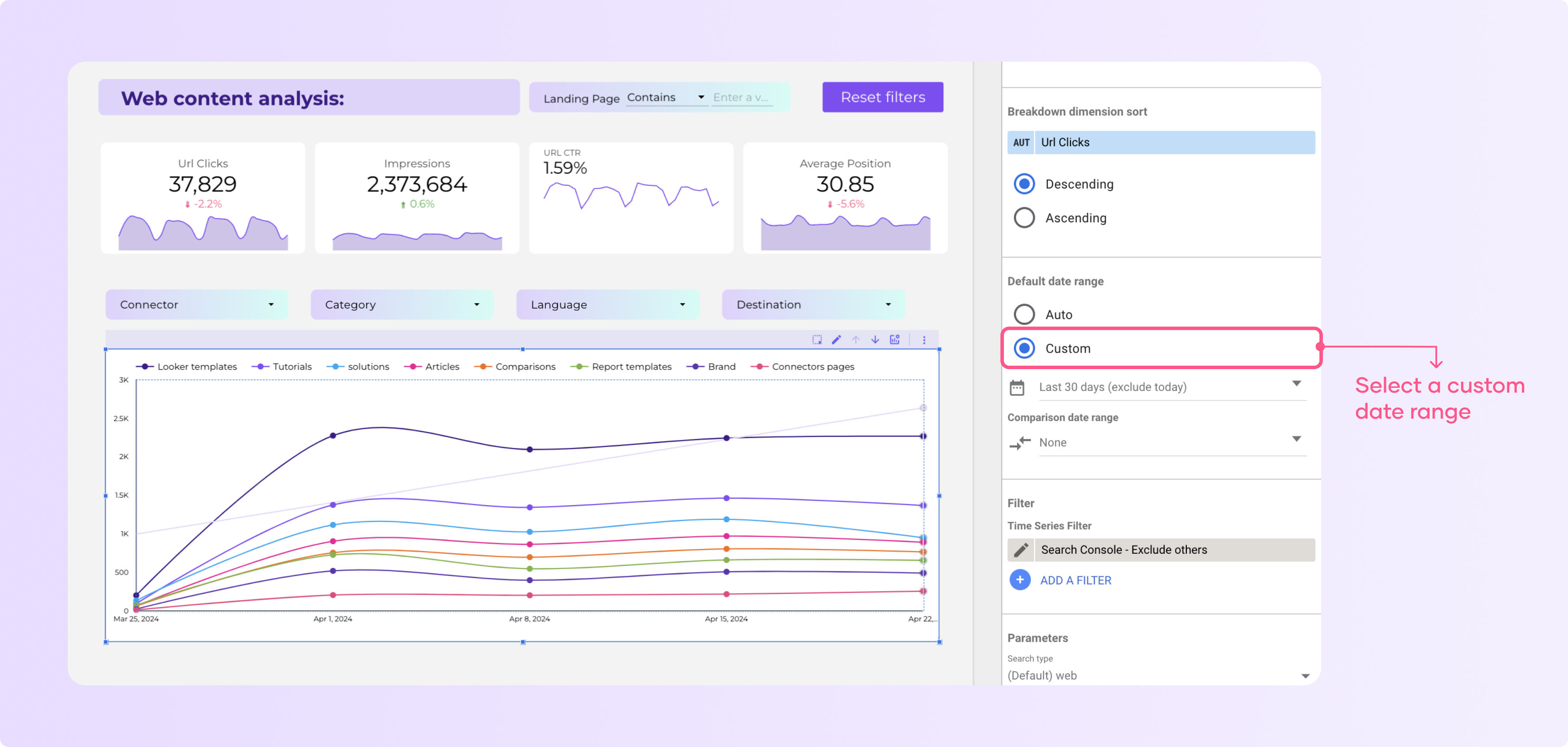
In the setup tab go to the ‘Default date range section’ and click custom
Now click on the calendar with the date below the ‘custom’ button
Select a fixed date range or a dynamic date range.
Adding Segments
Segments are vital when visualizing Google Analytics data. We can use segments to visualize different aspects of your audience. For data sources, you can segment your chart by users, returning users, paid traffic, and organic traffic.
What are the different types of charts in Looker Studio?
Looker Studio has more than 17 chart types, including time series, bar charts, pie charts, pivot tables, and area charts, that allow you to create different visualizations.
Now, I will show you how to add different chart types on Looker Studio with real examples so you can decide which is better for your use case.
1. Adding a scorecard
A scorecard represents your data project’s key results, KPIs, and other metrics. It can visualize progress over time and provide a quick snapshot of key indicators.
To create a scorecard on Looker Studio, click “add a chart on your dashboard.” On the dropdown menu, click Scorecard.
You can easily change the dimensions or metrics you want to visualize
You can add a sparkline or other comparison options to add context, such as trends, or compare with a specific metric.
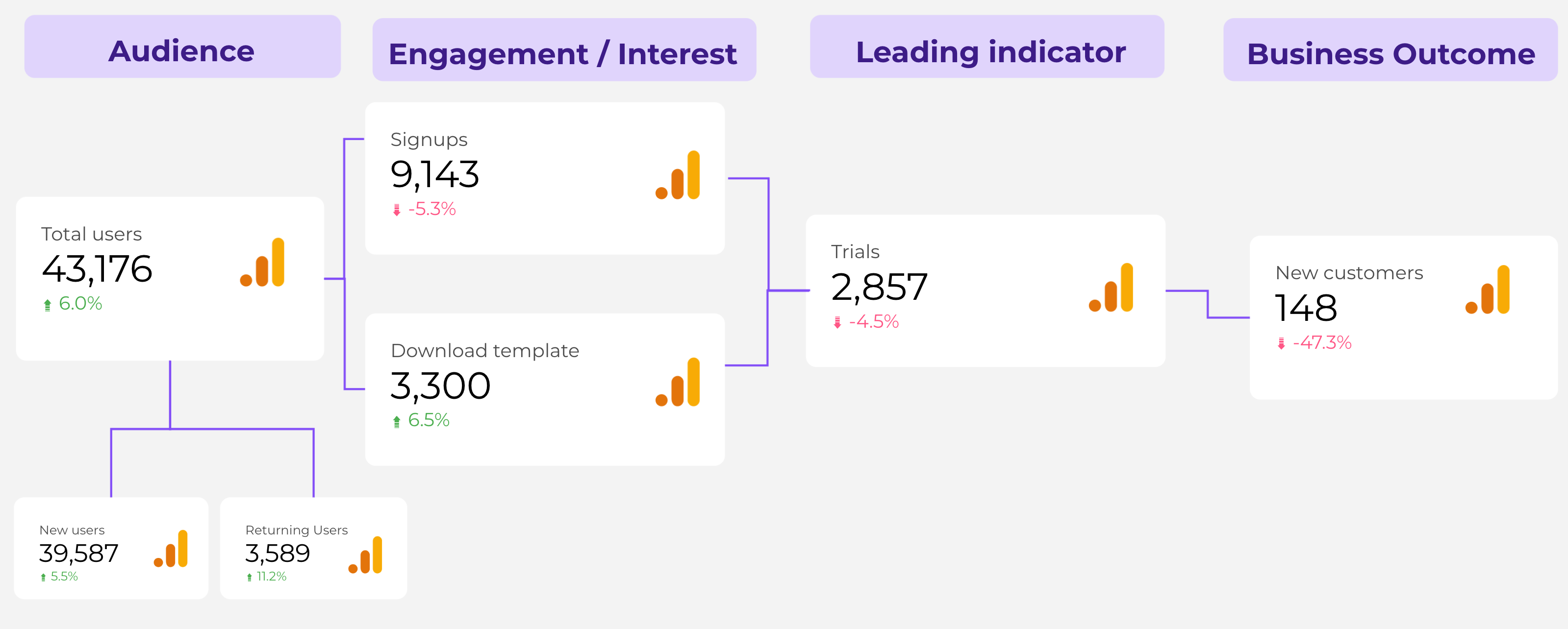
This is an example of a marketing and sales metrics map made using scorecards and custom images.
A variation of the scorecard is the gauge chart. The main difference is that Gauge charts are better at tracking the performance of the metric vs. a goal or benchmark.
2. Adding a bar chart
Bar charts display data similar to graphs. They are used to compare the relationship between two or more variables using rectangular bars, as shown below.
Adding a bar chart follows a similar process.
Click on “add a chart,” then choose a bar chart.
Depending on how you want to visualize your data, you can choose a stacked bar chart, 100% stacked bar chart, or stacked column chart.
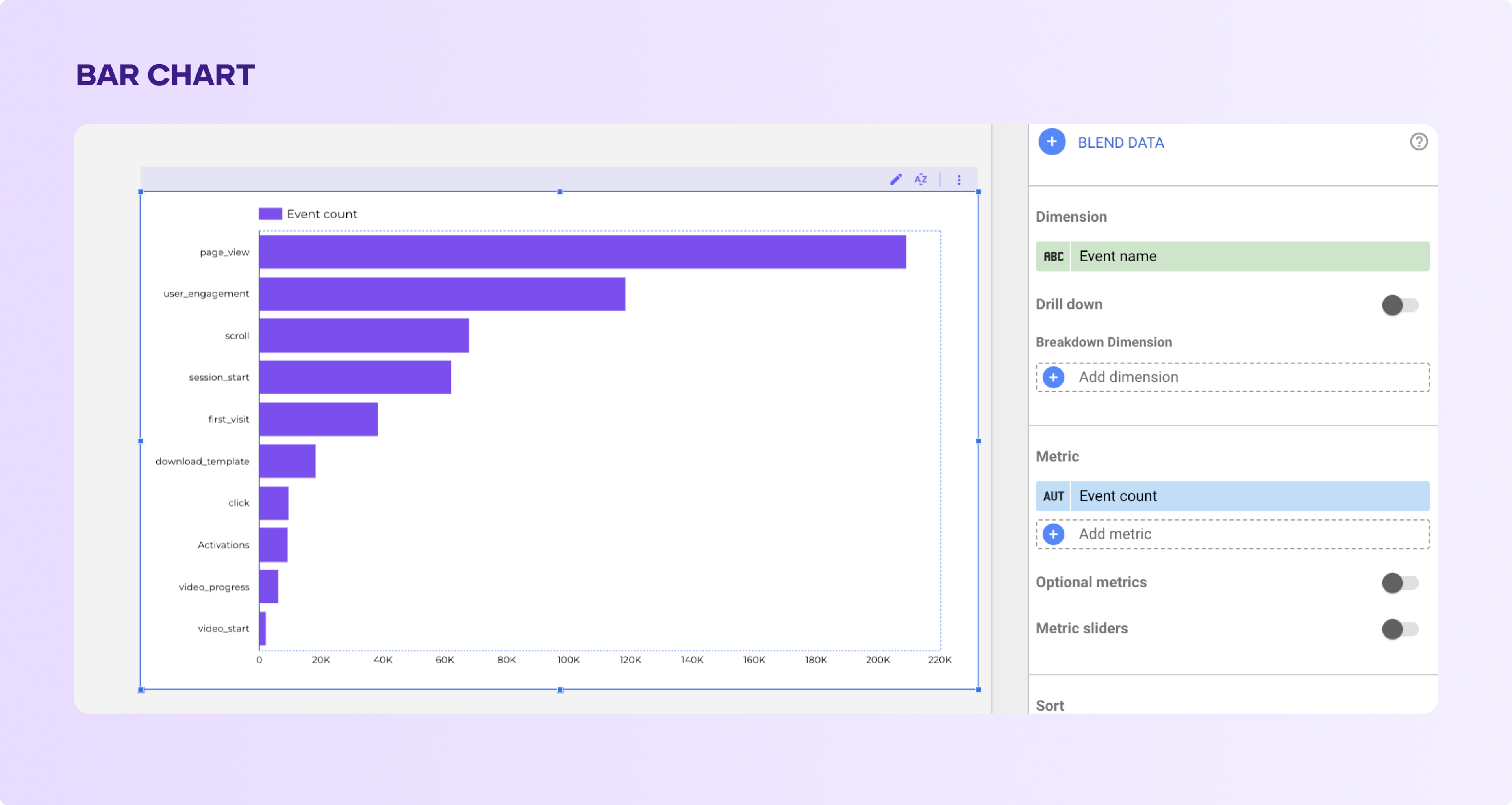
Add it to your report and select the metrics at least one dimension and metrics.
Let’s examine each of them.
1. Column chart
This is exactly like the chart you saw above. They are the simplest type of bar charts. They compare the relationship between two variables.
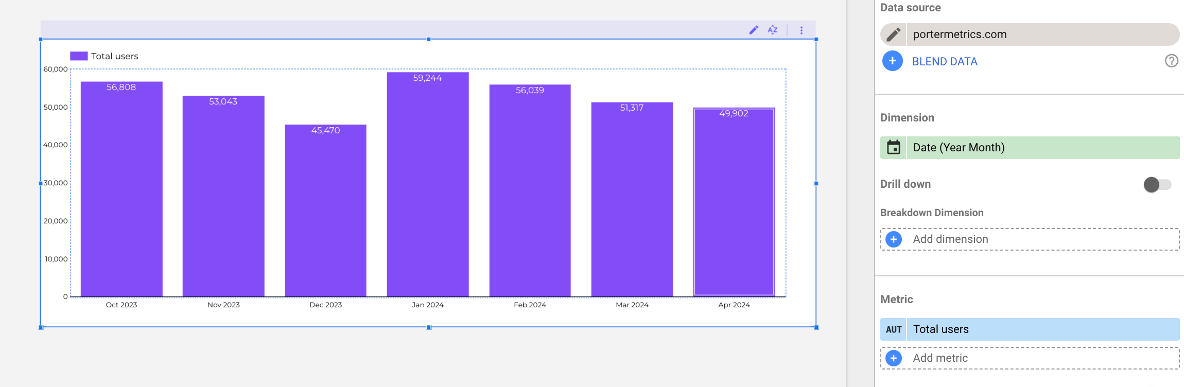
In this case I’m measuring the number of users month by month. You can add additional metrics or breakdown the data by adding a ‘Breakdown dimension’
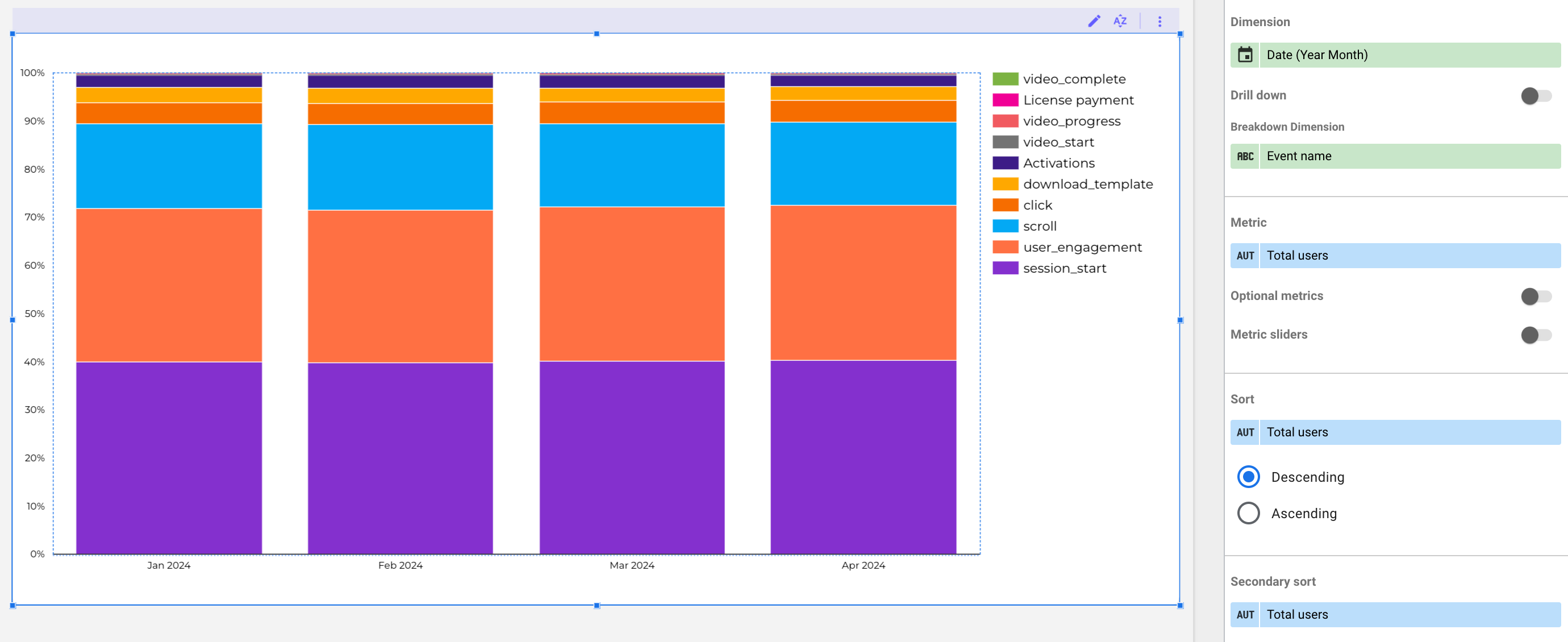
2. Stacked column chart
The stacked column chart works similarly to the column chart. The difference is that you compare data points or variables for a stacked column chart. In this case, a series of bars are stacked on each other, as shown below.
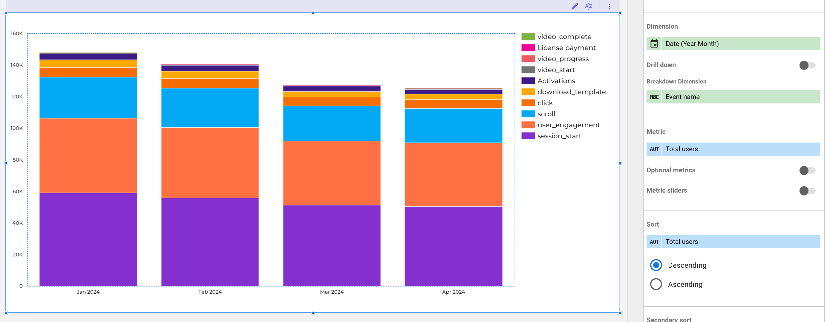
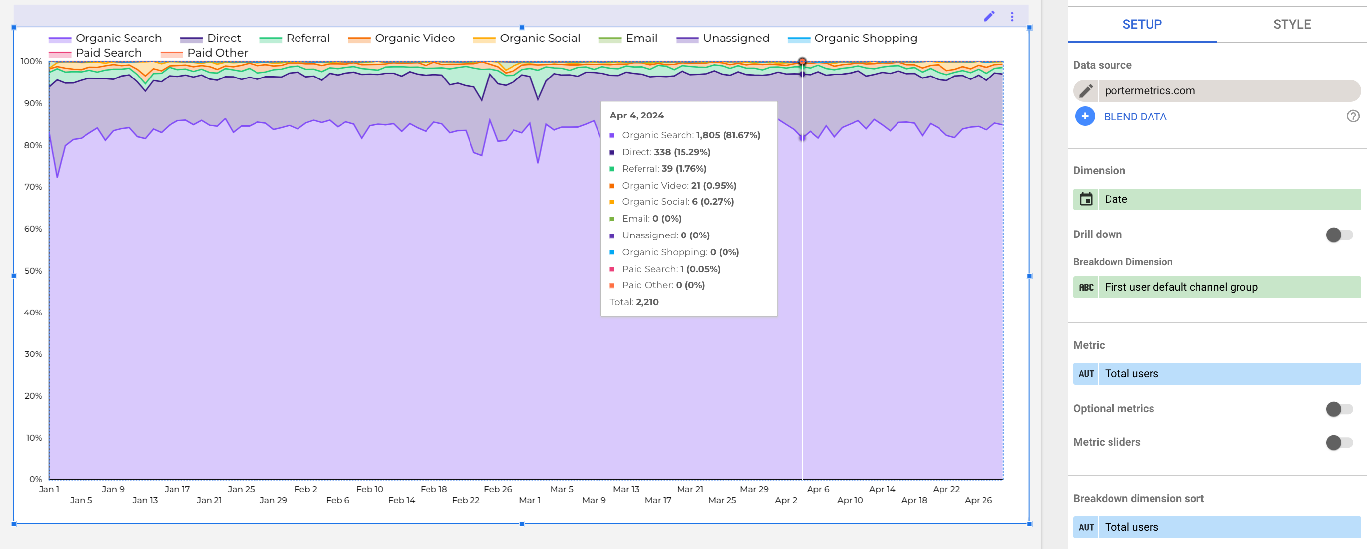
3. 100% stacked column chart
Similar to the stacked column chart, all categories on each column equal 100%. That’s the key difference between a stacked column chart and a 100% stacked column chart. Check out the chart below.
This chart shows the relationship between date and events from traffic. Each column for each event equals 100%. The 100% stacked column chart helps identify top-performing metrics on the spot on bar charts.
3. Adding a pie chart
The next type of chart on Looker Studio is the pie chart. They are a popular means of visualizing data. Pie charts are circular charts that show the percentages of data represented in the chart.
To add a pie chart:
Click on the pie chart in the drop-down menu after clicking “Add a chart.”
On Looker Studio, pie charts are visualized in two ways; regular pie charts and donut pie charts.
Add them to your page, Looker Studio will suggest automatically the metric and dimension
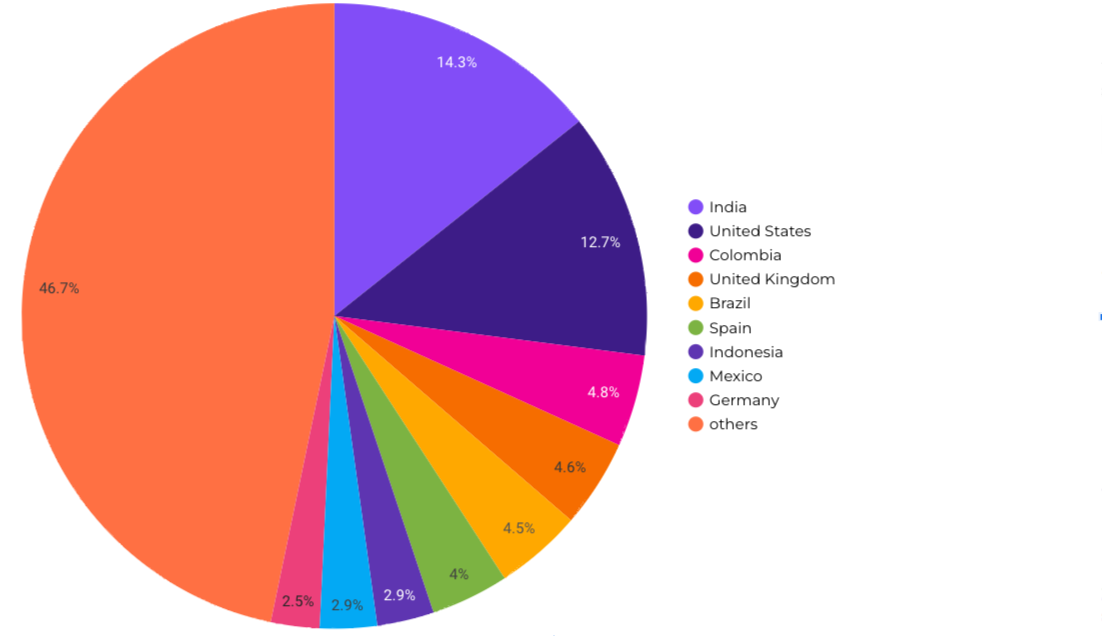
This is a regular full pie chart.
Remember you can change the metric and dimension. For this example, I selected country as dimension and sessions as the main metrics.
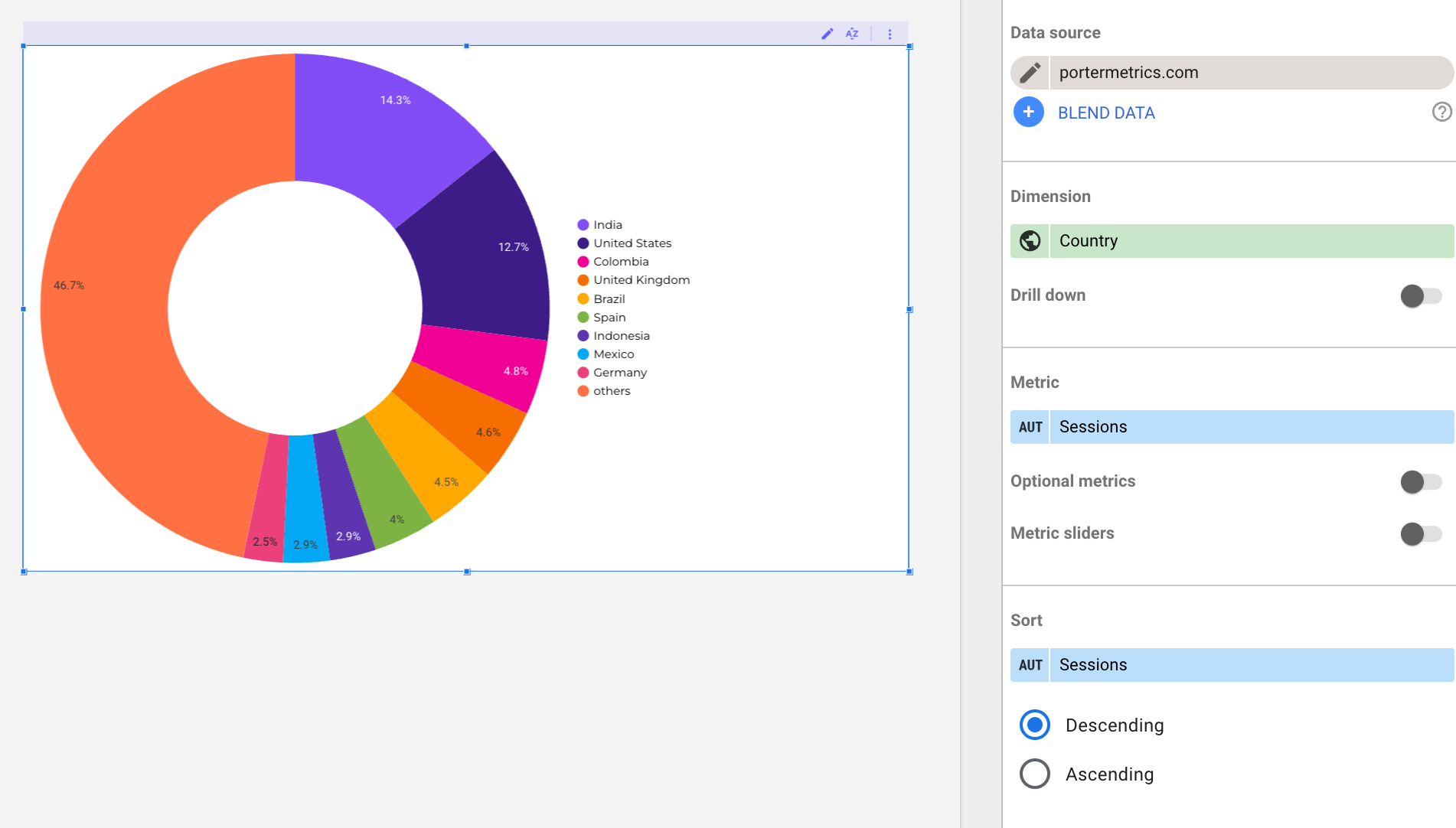
This is the donut pie chart, it’s very similar to the regular pie chart but I think the donut is better.
Tip: If your pie charts have more than 5 variables, consider using a column chart instead; it’s easier to read.
4. How do I create a table on Looker Studio?
This list wouldn’t be complete without tables. They are the most popular and straightforward method of data visualization.
Looker Studio allows you to create simple tables like the above and other complex types. For example, you can create a table with a heat map or bar chart.
This type of table takes tabular data visualization to the next level. The table below shows a table with bar charts.
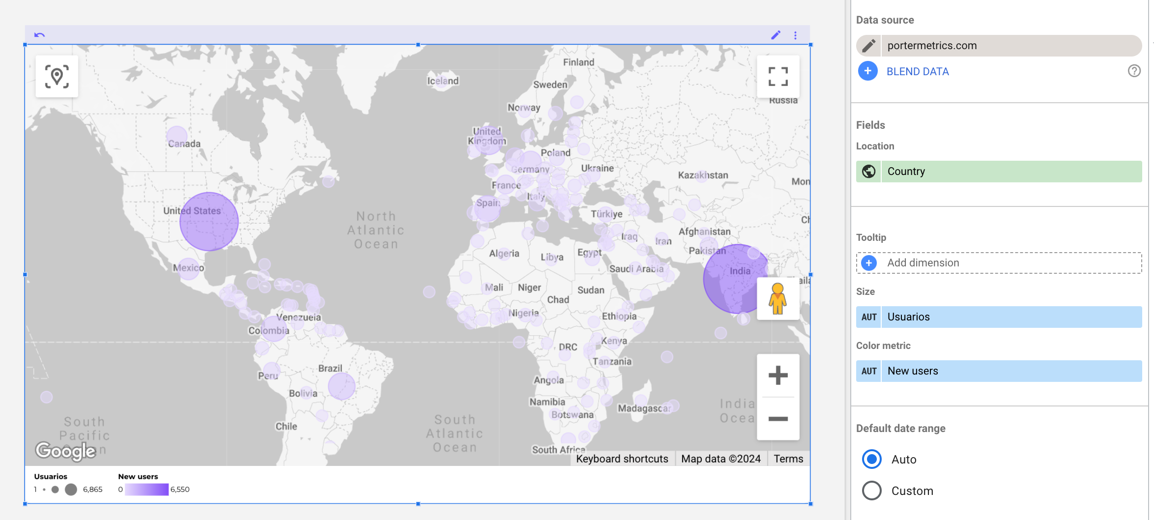
5. Adding a Map chart or Geo chart
Google Maps are one of the types of visualizations that can be used on Looker Studio. There are four types of Google maps on Looker Studio: the bubble map, filled map, heat map, and line map.
Adding these maps is easy and follows the same process explained above. Click “add a chart” on your dashboard and scroll to “Google maps.” Choose any of the map types to add to your dashboard.
6. Area Chart
Area charts are used to see how your data trends over time. These charts allow you to visualize a single dimension and metric plotted over time.
On Looker Studio, there are three ways you can visualize data using area charts.
1. Area chart:
This is the simplest type of area chart. It is a variation of a line chart or time series chart. As shown below, it uses a shaded area to represent the volume of data.
The area charts help identify trends in your data and are commonly used for comparative analysis.
2. Stacked area charts:
This type of area chart has their dimensions values stacked one over the other, as shown below:
3. 100% stacked area charts:
Like the stacked area chart, they have their dimension values stacked over the other, but each category contributes to each dimension in terms of percentages.
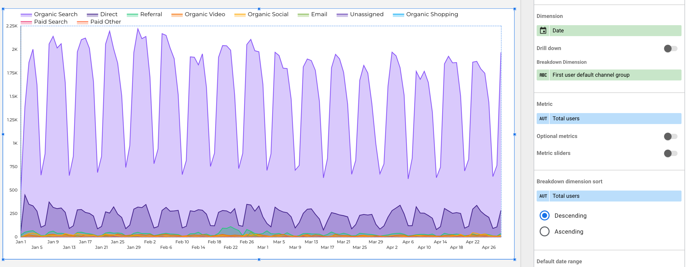
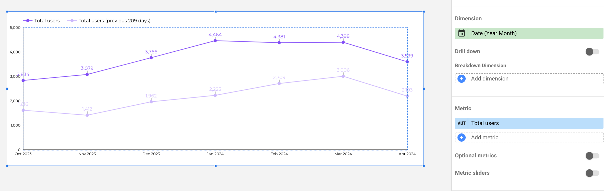
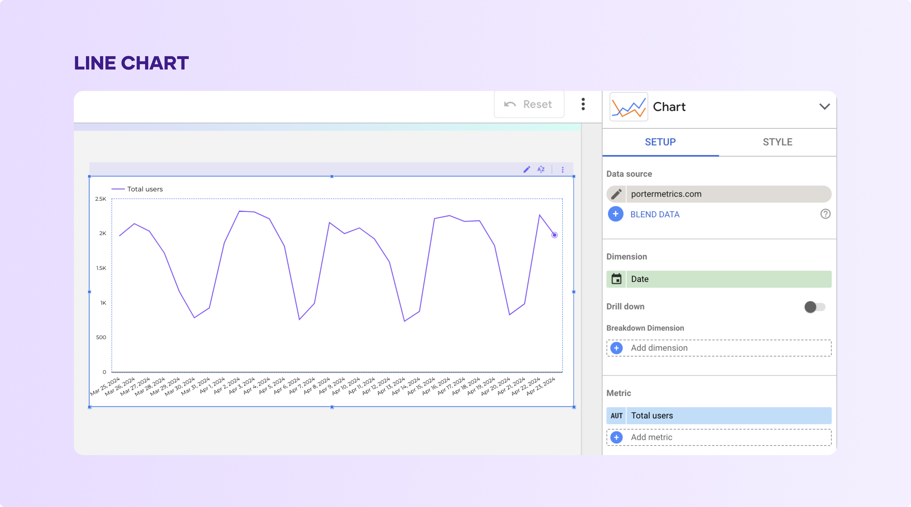
7. Time Series
Time series are used to visualize trends over a period of time. Looker Studio gives you options in using time series. The first option is the regular of the way as shown below;
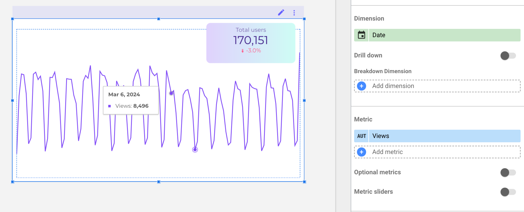
Here, we can see how user traffic varies from September to November. Looker Studio also allows the use of time series by creating a Sparkline time series, as shown below.
Here, we kept the data consistent. The Sparkline time series is perfectly combined with a scorecard cause you will see the value of a metric paired with the trend.
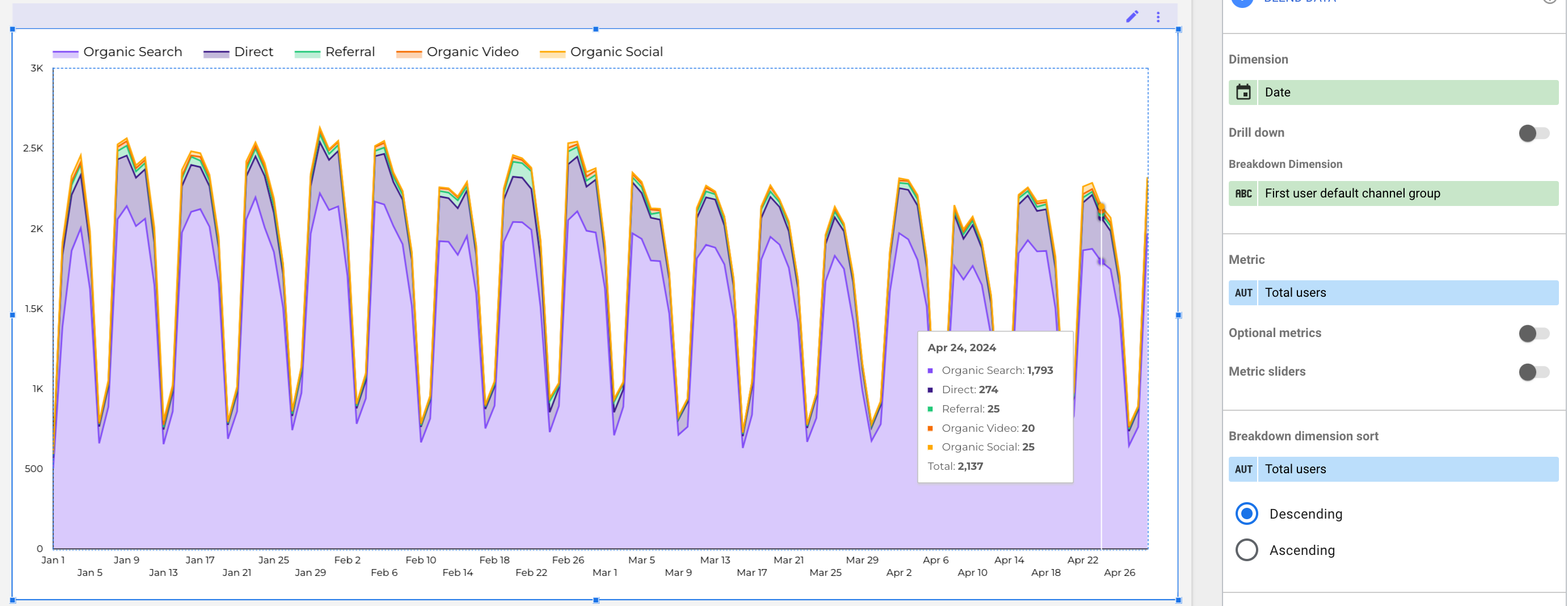
The next type of time series chart is the smoothed time series, the dynamic is very similar, but in this case I’m adding a comparison period on the ‘Setup tab’
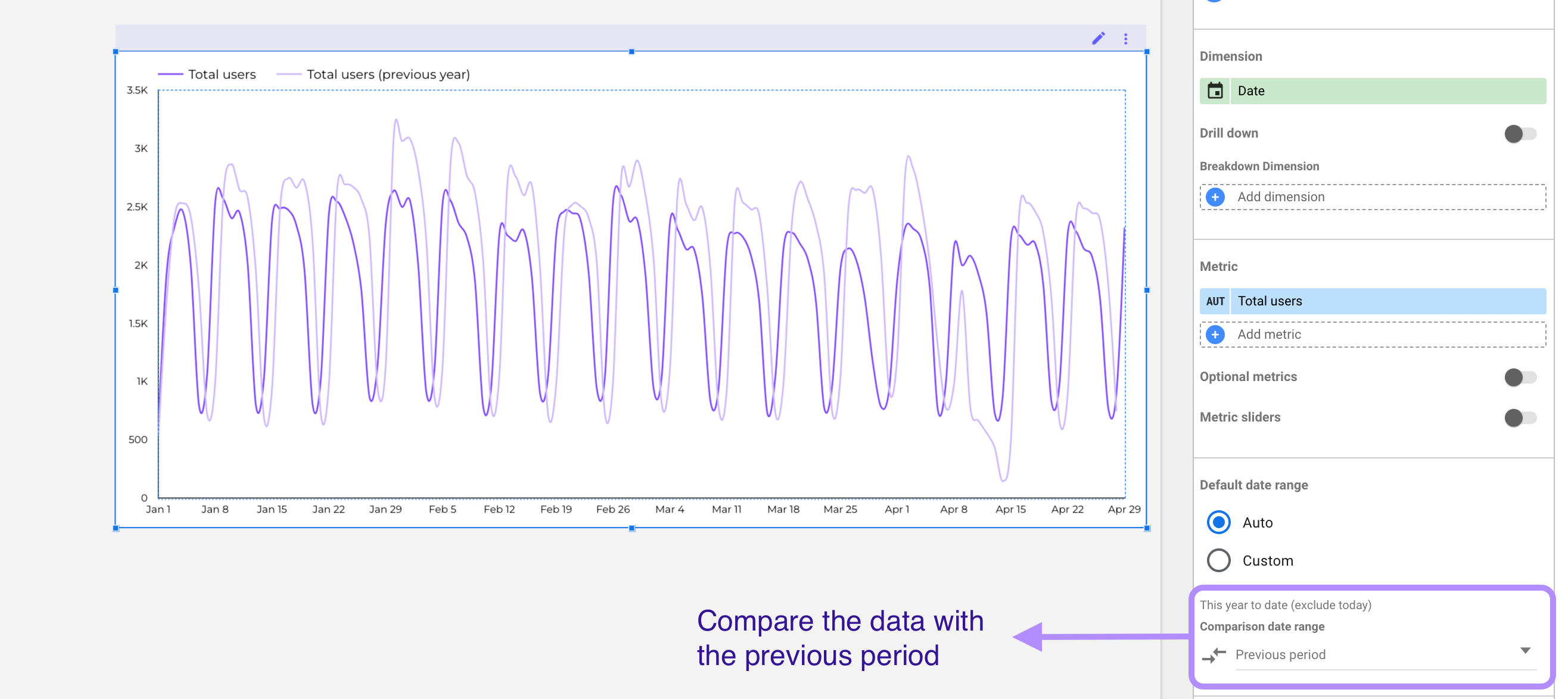
In this case, the trend isn’t represented by a sparkline; the lines are smoothed. There’s no rule as to which to use when creating your marketing reports.
Now on the ‘Style tab’ check the ‘Cumulative box’ to compare the compound data with the previous period.
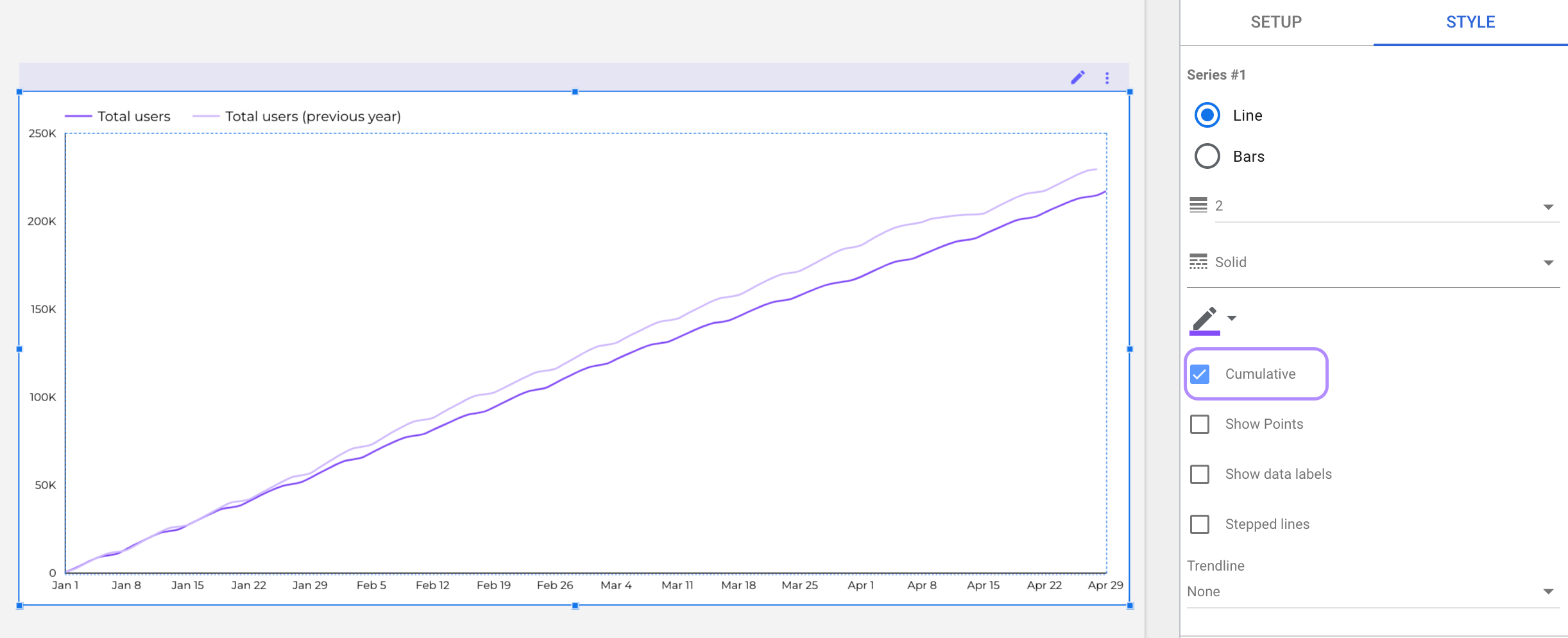
In this case my intention is to compare the same time-period with the previous one a have a clear answer about if we are growing in new users or not.
8. Line Chart
This is another type of simple chart found in Looker Studio. They are used to compare three or more variables.
You can create a line chart in four different ways. The first way is to create a simple line chart, as shown below:
Another way is the smoothed line chart, which is the same it only changes the visual appearance, as we saw with time-series charts.
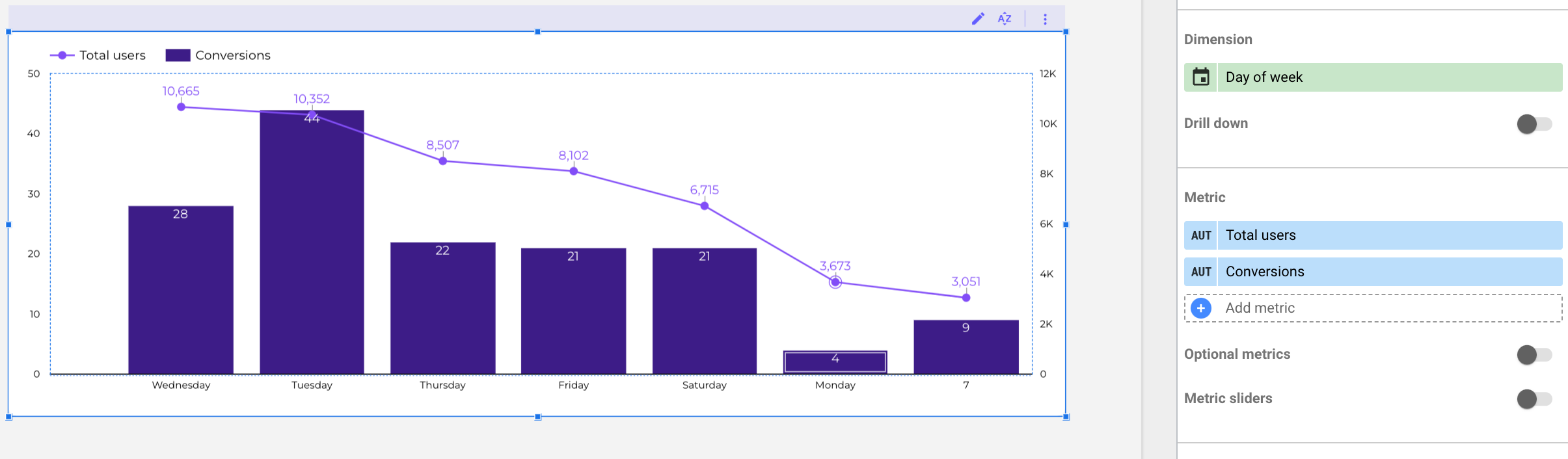
You can also use a combo chart that is a mix between lines and bars
The line chart you choose to use depends on the type of data you want to visualize and to what degree.
9. Scatter chart or bubble chart
A bubble chart is a type of scatter chart. They are primarily used to determine if three variables share a pattern or are related.
These data points are usually seen as bubbles scattered around the chart, hence, the name.
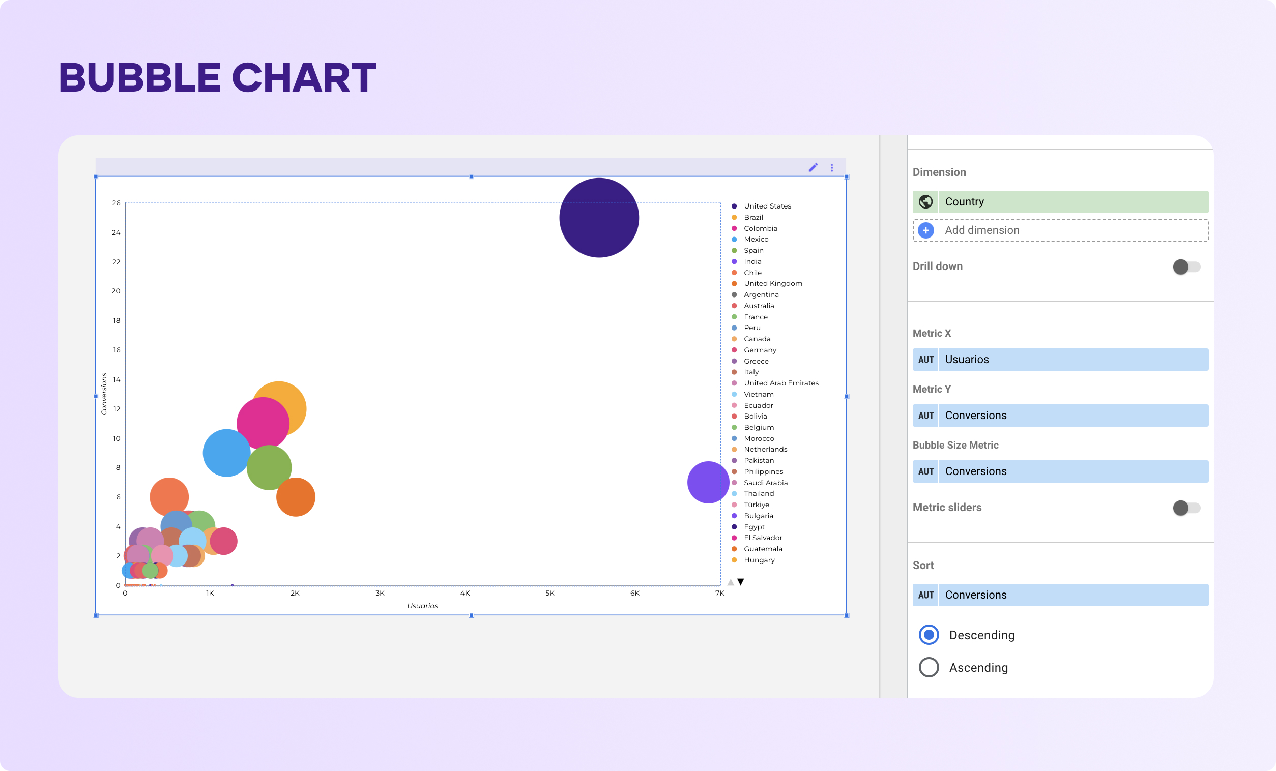
With this bubble visualization, I want to see the relationship between users and conversions, by country.
Here you can see that The United States stands out with the largest bubble size and a high position on the y-axis, indicating it has both the most users and the highest number of conversions by far.
You can edit the size and colors of the bubbles to make it clear for the readed.
10. Tree Map Chart
Treemaps are used to show hierarchical data on dashboards using nested rectangles.
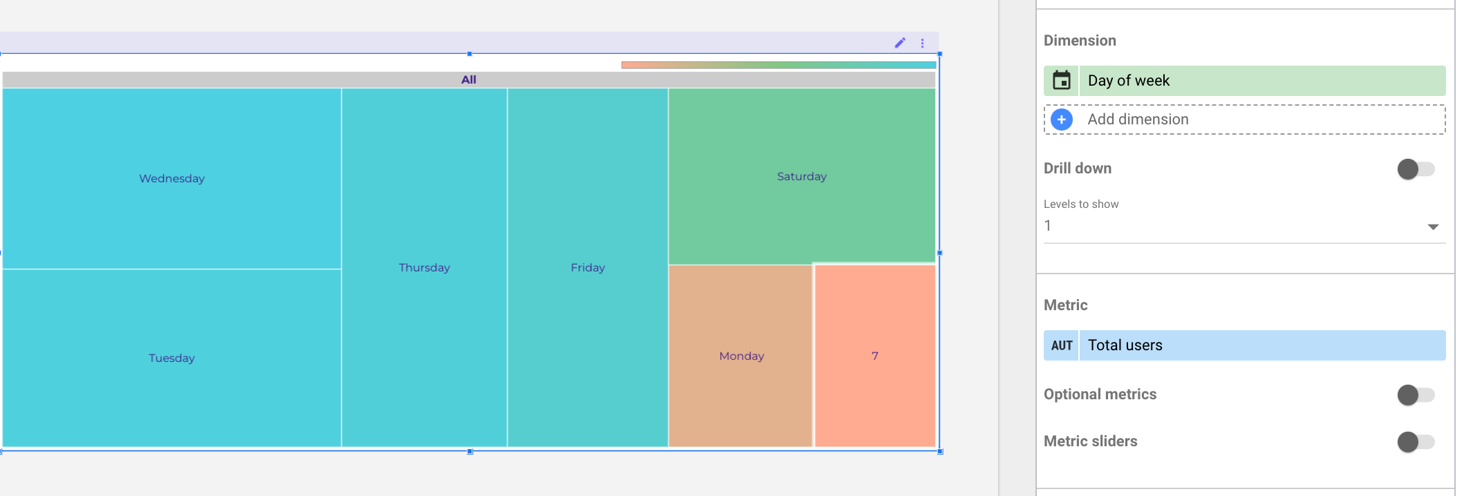
Here, you can see that the days in blue have the most people visiting, while the green and orange days have the least. Also, the bigger squares show that more people came on those days compared to the smaller squares.
11. Pivot Table
Pivot tables help summarize your data in a condensed manner. They help you group your data so you can quickly draw reasonable inferences from them.
On Looker Studio, you can create the regular pivot table with bars and heat maps as shown below
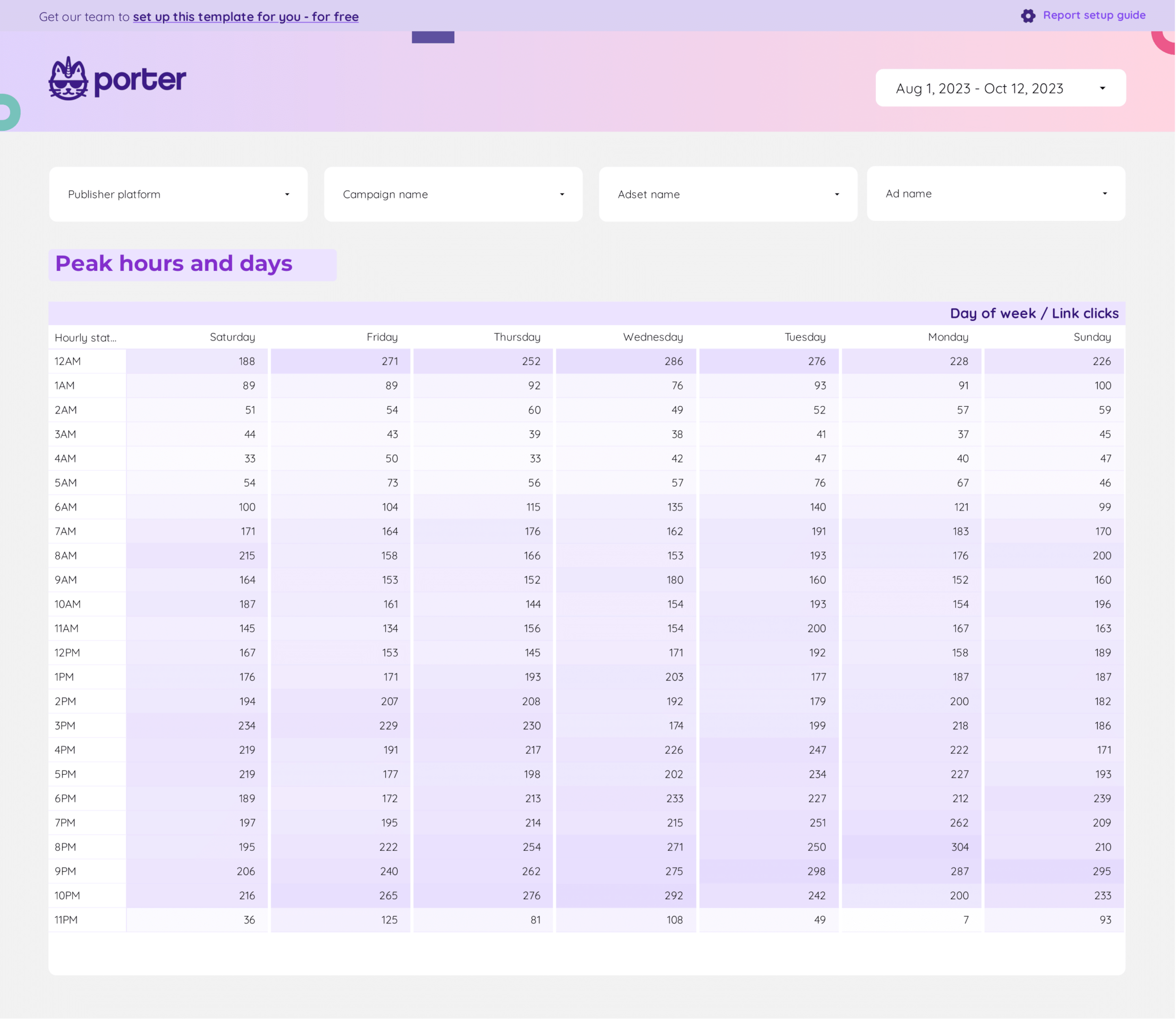
This simple pivot table shows the link clicks by hour of the day—the heat map visualizes hours with the highest link clicks to the lowest link clicks.
12. Bullet Chart
A bullet chart helps display a metric against a target. This thermometer-like chart displays several color-coded columns. Here is an example on how to setup a bullet chart.
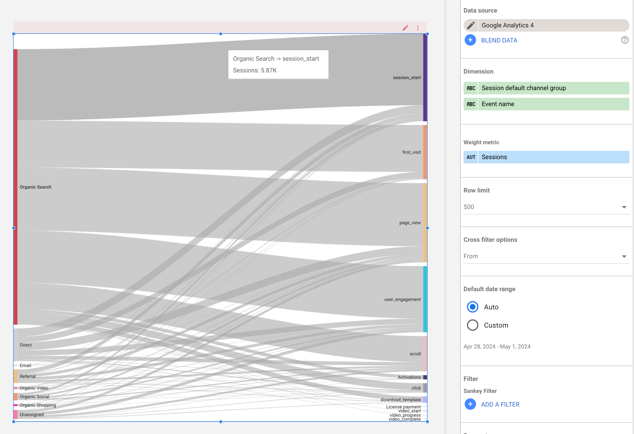
13. Sankey chart
Sankey charts are flow diagrams that help you understand the movement of different variables from one point to another, commonly used to visualize flows in a system.
In this example you can see the default channel group and the events performed by people coming from those channels.
13. Community visualizations gallery
Looker Studio allows you to use a visualization made by the community, you can even create one if you are a developer.
I’ll guide onhow to use these community visualizations:
Go to the menu and click on the dropdown with the icons, then select the ‘+Explore more’ alternative
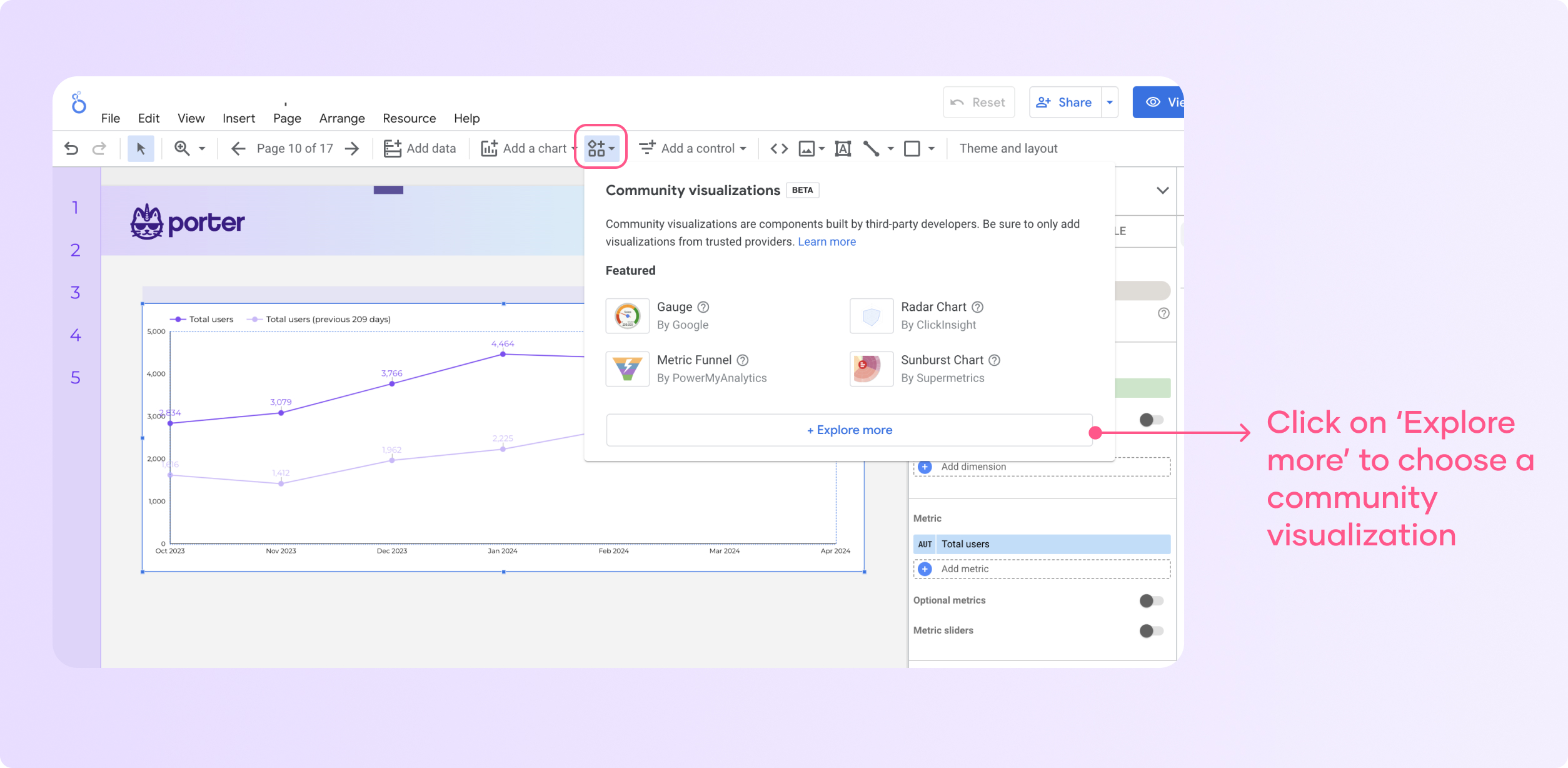
When you do dad, you will see that you have dozen of charts, you can select one and authorize them to work with your data.
Actually the process is very similar to what we have done in the previous examples.
Adding Controls To Your Charts On Looker Studio
Controls let you change the data displayed on your dashboard. They act as filters on your dashboard. In this section, we’ll learn how to add controls to our charts.
1. Add a control to the report.
The next step is to add a control, which is relatively easy. Click “Add a control” on your dashboard menu. The drop-down menu shows a range of options available to you.
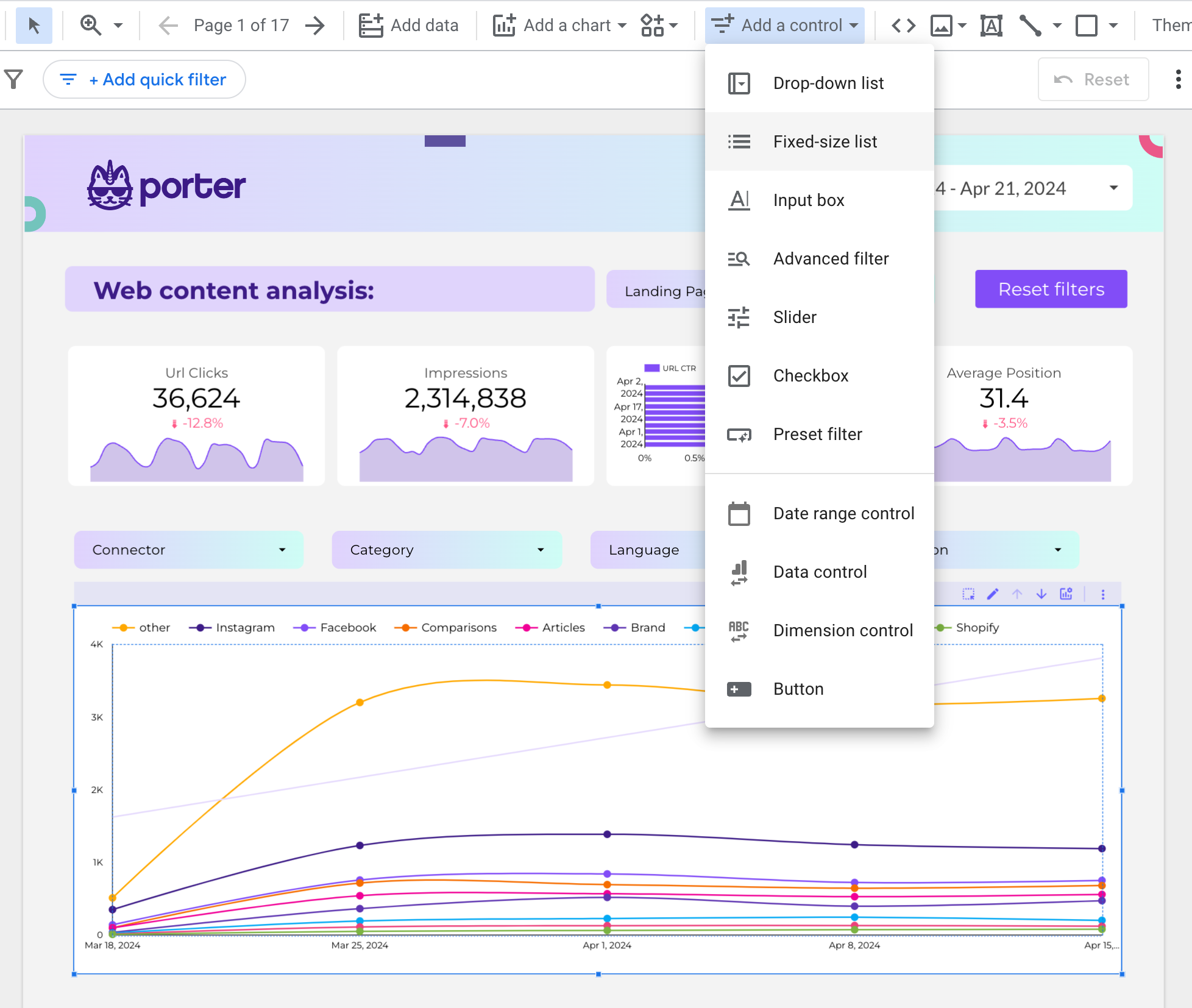
Looker Studio offers eight (11) controls that can be added to your report. They are:
- Drop-down list
- Fixed-size list
- Input box
- Advanced filter
- Slider
- Checkbox
- Date range control
- Preset filter.
- Data control.
- Dimension control
- Buttons.
To get further insights on how to set up controls, check out our article to learn how to set up filters and controls on your dashboard
2. Switch the chart type
After adding a control to your report, you can visualize how your charts look by switching to another chart type without starting from scratch.
To do this, on the right-hand side of your dashboard, click “chart.”
The drop-down immediately displays all the chart types available on Looker Studio, as shown below;
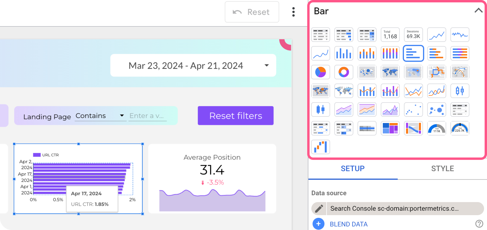
Looker Studio adjusts the default dimensions and metrics depending on the chart type selected. All customizations made on the previous chart are preserved in the new chart.
Similarly, you can also switch between control types.
3. Add other components to the report.
Aside from visualizations and controls, you can add other components to your reports, like text, images, lines, rectangles, etc. These are simple ways to customize your reports and give them some branding.
4. Arrangement and layout options
After adding other components to your report, to further customize, you can change the layout, how different components are arranged on the report canvas, or even customize the theme and layout of your reports.
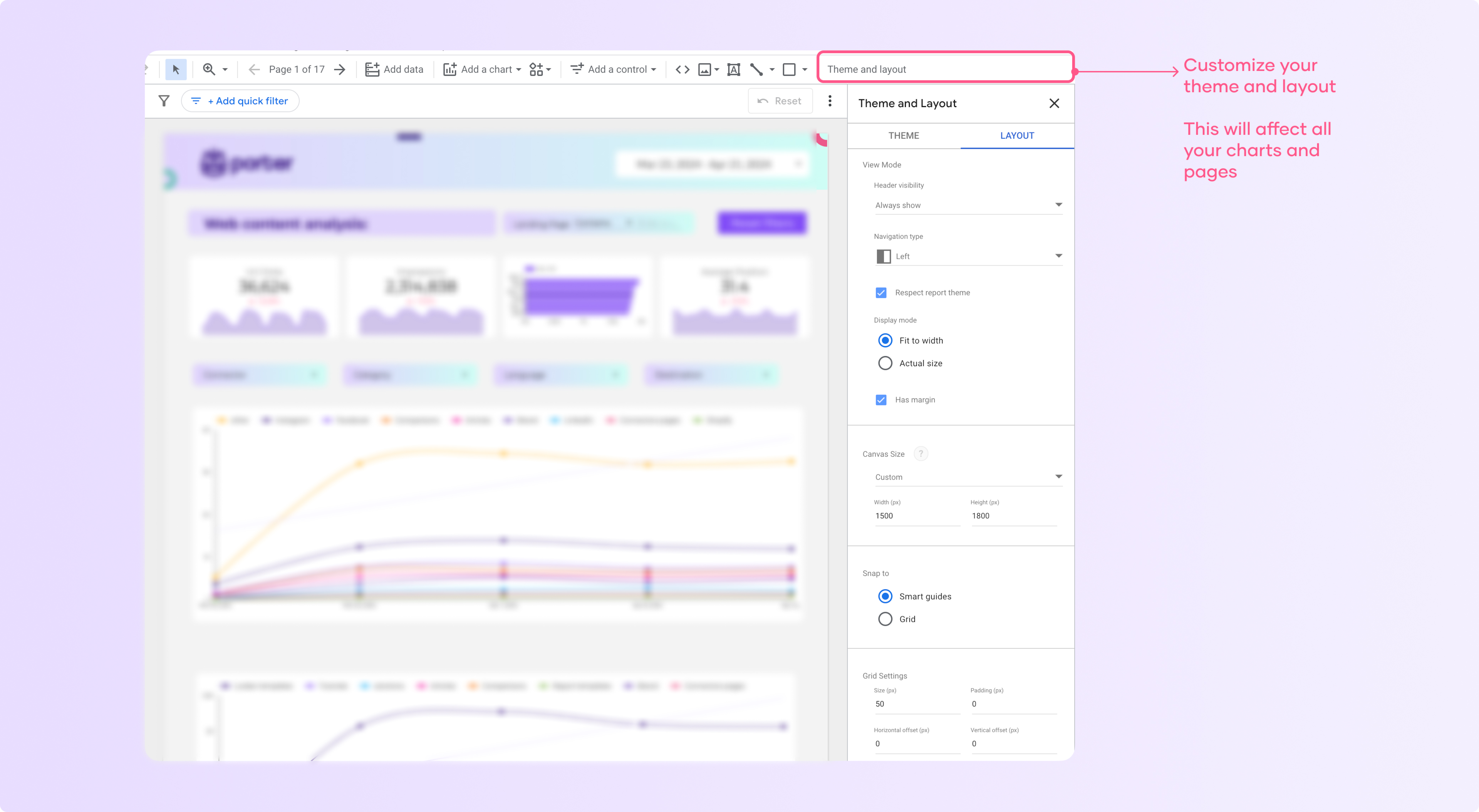
Clicking “themes and layout” on your dashboard gives you options to help further customize your report. We have a detailed guide on how to customize your Looker Studio reports. You should check it out.
Using Charts as Interactive Filters
It’s easy to create an interactive filter from any table, geo map, bar chart, or scatterplot with just a few clicks. Here’s how:
1. Create a new chart
The first step in creating an interactive filter is to create a new chart. As explained throughout this article, this is easy to do.
2. Turn on the cross-filtering option
After adding your data source, under Chart setup, turn on “cross-filtering” under chart interactions.
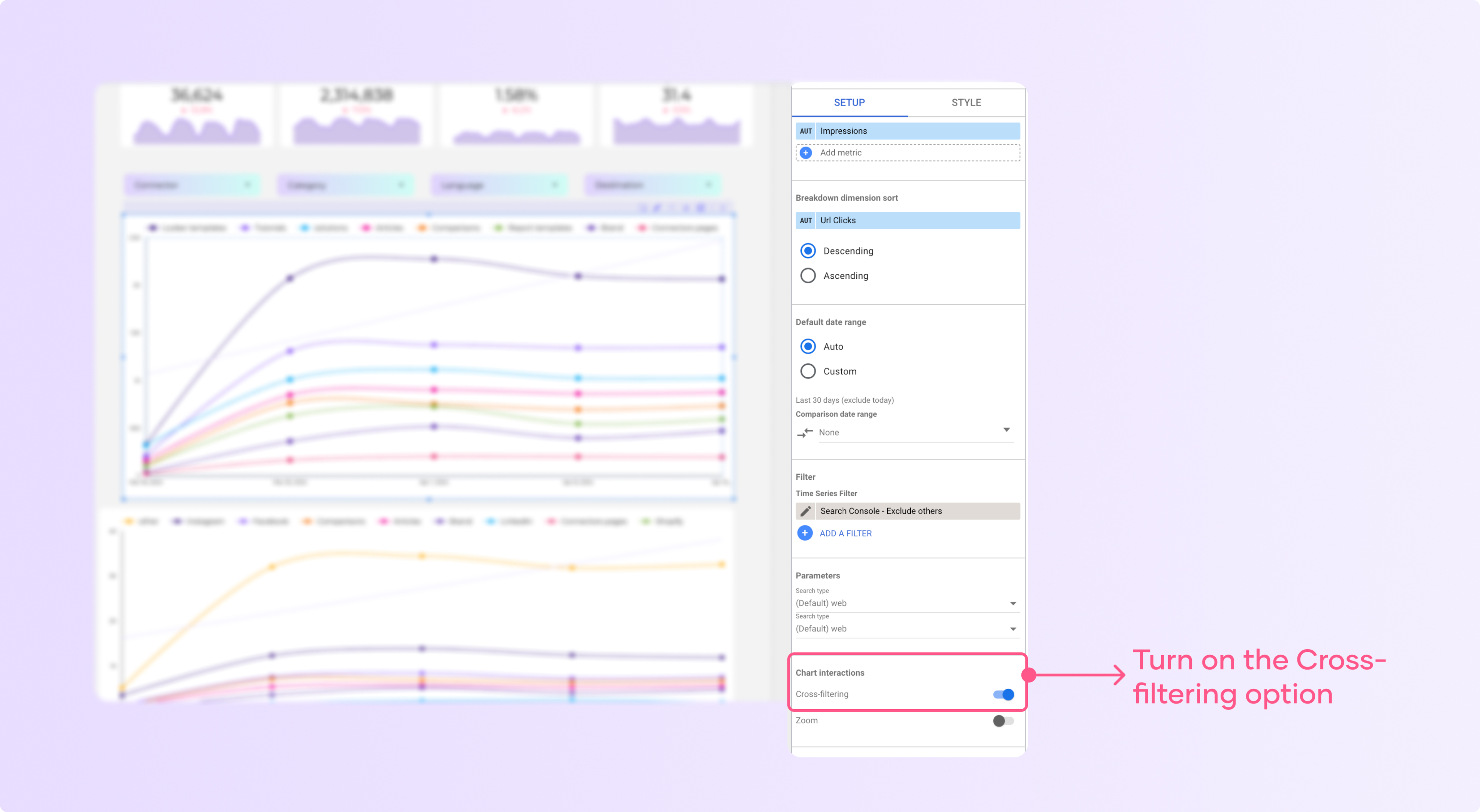
3. Use the chart as a filter.
Turning on cross-filtering on your charts makes it possible for other properties on your dashboard to display information about metrics you click on the chart.
Consider the dashboard below; it shows a bar chart and a table displaying the results of a Google ads campaign.
After applying the cross-filtering function on the table clicking on any page on the chart immediately shows me the results of that page on the table on the right as shown below:
As you can see, the time series chart was filtered by the specific page I selected on the table. That’s how you make your charts and dashboards interactive.
I have a tip for you: if your audience is not used to interactive dashboards, you have to teach them how to use or it is better to disable the cross-filtering function because it can be confusing.
Create reports faster using Looker Studio Templates
Like every other marketer, you already understand the need to create a detailed, interactive visual report for your clients or boss.
We’ve made it much easier to implement this advice by creating free report templates for you.
Yes, you can grab any of our templates and ready your marketing reports in 5 minutes. We have templates for virtually every use case. You can use them to create Facebook ads reports, Instagram insights, LinkedIn insights, TikTok, and many more.
Conclusion
Visualizing your data can help you communicate your insights clearly with your audience. Consider your goals and how each chart relates to the audience when creating visualizations.
If you’re creating a report, ensure that the visualizations support the story and make sense. If you’re creating a chart, consider how it relates to the audience and supports the story.