


In the last session, we explored the Google Data Studio connectors. In this session, we will create a report on Google Data Studio with Google Sheets.

Why Google Sheets is Great for Data Studio
There’s a misunderstanding of people comparing Google Sheets VS Google Data Studio, when they’re complementary, not alternatives.
As we have mentioned before, Google Data Studio doesn’t store any data—it visualizes it.
You can store data on a Google Sheet. In fact, you can manipulate to clean it or do some changes that are impossible on Google Data Studio.
The first thing you will do is signing up on Google Data Studio. You must use a Gmail or G Suite account like any Google Product.
Once you create your account, you should see Data Studio main page:
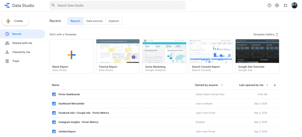
Once there, we’ll create a report from scratch.
How to connect Google Data Studio to Google Sheets
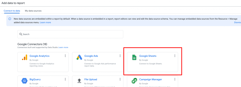
You have two options: clicking on Blank report or on the Create button in the top-left corner – Report.
Now, choose the Google Sheets connector for Google Data Studio.
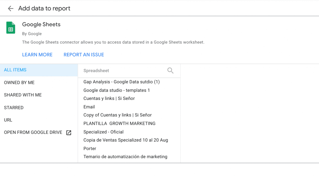
You should grant access Data Studio to your Sheets account, so it can retrieve all the Google Sheets documents associated with your Gmail account:
Choosing a Google Sheet
I know you’re eager to create a report with your data, but I suggest you use our Google Sheets template so you can see the correct structure and setup you should use from now to create your reports.
Open the CRM Google Sheet template.
Once you create a copy of this template—by clicking on File and Make a copy—go back to Google Data Studio to see your Sheets, you will find it as first, just like I show you here:
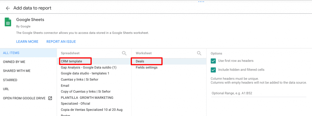
If your Google worksheet has multiple tabs (or sheets), remember also to specify it to pick the right one.
If you’re wondering what is a sheet on Google Sheets, I’m showing an example below:
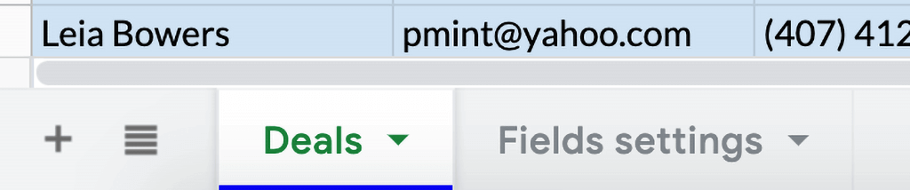
In our case, the sheet that contains the data is Deals.
Now click on Add to connect your sheet to Google Data Studio.
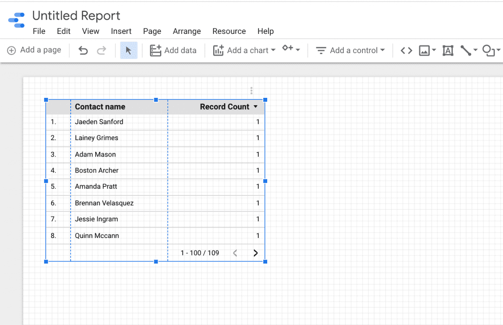
Google Data Studio will automatically generate a table, showing that it successfully connected your Google Sheet!
Create your first charts
From now, everything is about creating visualizations. We will make a couple so you can get familiar with Google Data Studio.
As we’re visualizing CRM data, we may be interested in our sales performance.
So, let’s go back to the Google Sheets and identify the column that contains sales data:
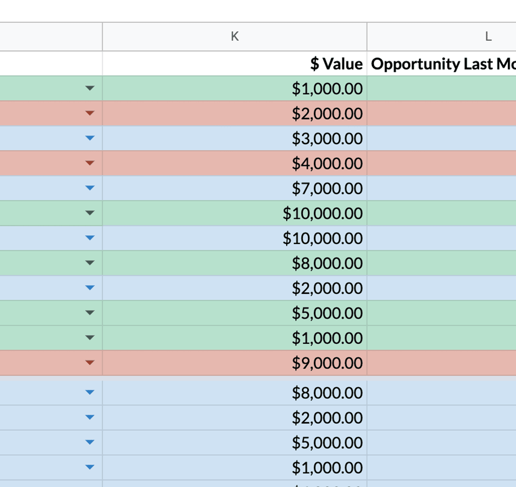
The field that contains sales data is called $ Value.
Let’s visualize it on Google Data Studio.
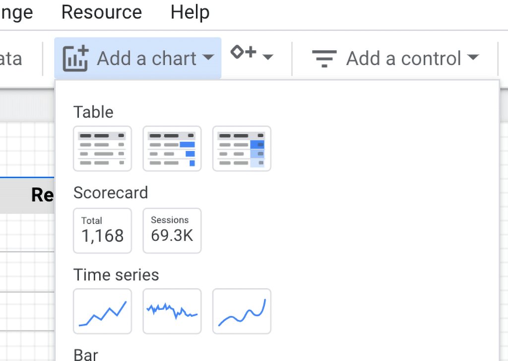
Go to Insert or Add a chart (whichever you prefer) and create a scorecard:
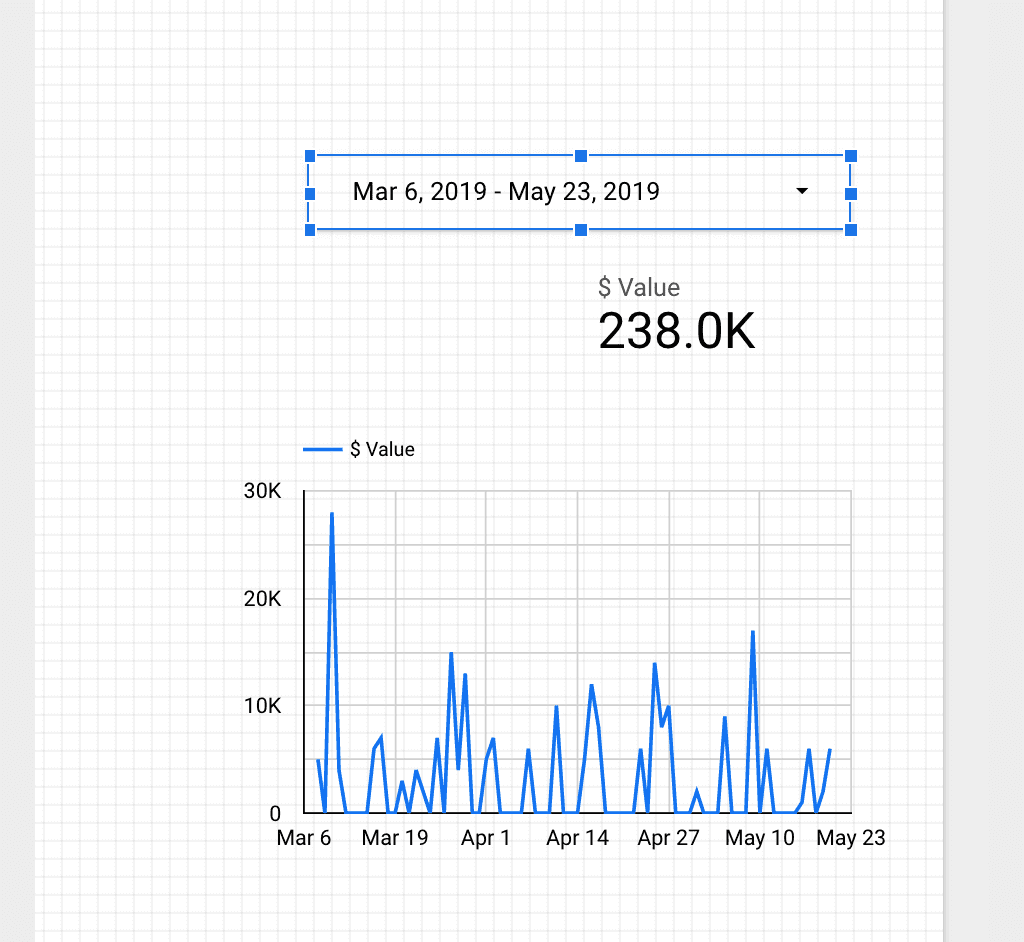
Place it wherever you want and choose as metric the field $ Value, just as I’m showing you in the image.
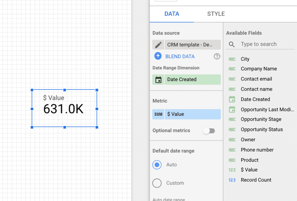
And it will automatically display the total sales volume.
What Google Data Studio does—and how every data visualization tool works— is that it takes all the values in the $ Value column and sums them to give you a total.
You may also request Google Data Studio to choose the minimum value, the maximum, or the average, and this transformation is called “aggregation.”
We haven’t yet specified the date range we want to visualize. We’ll do, but let’s first visualize our sales data in a time series.
Go again to Add a chart and choose Time series, and use the field $ Value again.
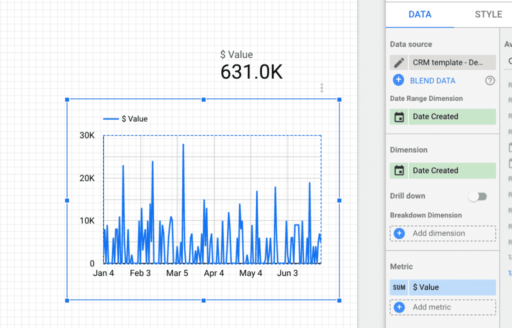
Aren’t you excited? You’ve created your first visualizations on Google Data Studio!
Select a date range
To finish this introductory tutorial I will show you how to set a dynamic date range so you can specify to visualize data from, for instance, this year, last month, August, or whatever you need.
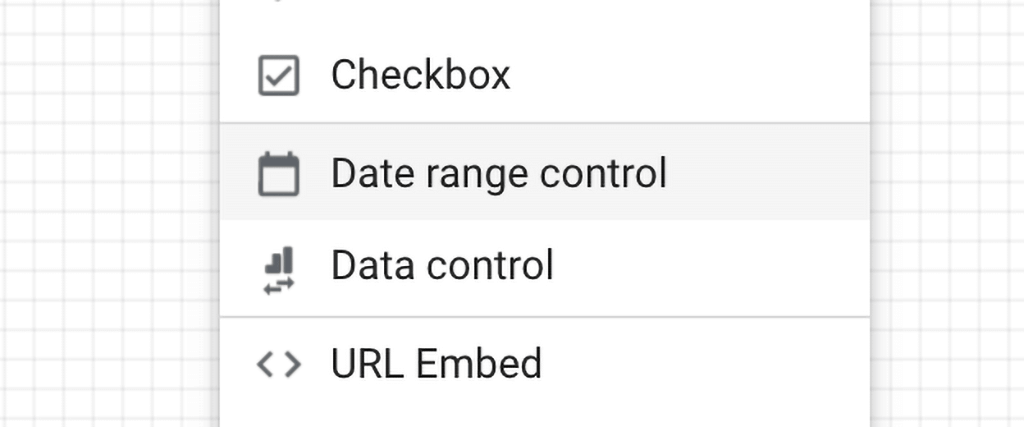
Go to Insert and choose Date range control. Now you can choose any range and all your visualizations will change accordingly.
Next lesson
In the next lesson, you will understand how to ask questions with your data by understanding the types of data, metrics, and dimensions.