


Databox is one of the most used marketing reporting automation software. It is designed to make the reporting process easier for individuals and companies working with data all the time.
However, this article is created for those who want to find the list of Databox alternatives. If you are into marketing data reporting, Databox is a familiar name for you probably.
Or, you can be new to the industry, and all this may sound new to you. We have created a complete review of Databox for people without prior knowledge of the tool.
There you can look at the detailed information on specific features of the tool. This article will analyze the main Databox features shortly and give you the best Databox alternatives.
Databox Overview
Databox, which was founded in 2011, is one of the most popular marketing reporting solutions on the market. Databox is trusted by more than 2K clients and more than 20K enterprises. The company has grown fast over the last decade, and in 2022, it is estimated to have a revenue of 4.8 million dollars and 90 employees.
Databox is an online platform that allows you to centralize all of your data and generate key performance indicators (KPIs) for your company. In a nutshell, Databox is a KPI tool for business analytics.
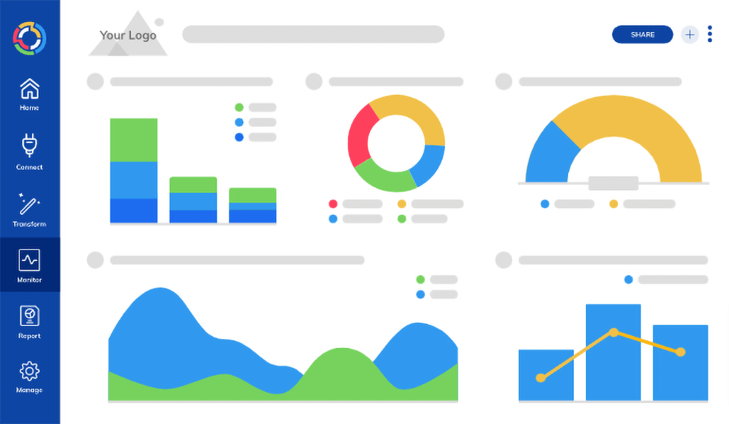
As we see from the dashboard, the data is visible through all kinds of graphs. It makes the dashboard colorful and more appealing.
Databox Pricing
Databox has three pricing plans, while most marketing reporting solutions have at least four to five. They also have a lifetime free plan available on the Databox app, and to get started, you’ll need to provide your company email.
You will have the following options with the free plan:
- Standard features
- 3 connectors
- 60 integrations
Here are the main paid Databox pricing plans:
Databox Connections and Integrations
The list of Databox integrations is long, as more than 100 of them exist. The main ones include:
- Starter: This plan costs 72 dollars per month, more than the industry’s average. However, some benefits come at a cost, making the service worthwhile. You’ll receive access to four data sources, daily data syncs, and up to 11 months of historical data. Up to 5 people can access it, and white-labeling is not possible with this package.
- Professional: This package, which costs $135, provides consumers with more options. It supports three data source connections and hourly data synchronization, with historical data spanning up to 24 months. With the professional plan, you can additionally have 7+ SQL integrations and Google Sheet integration. Aside from that, the dashboard can be accessed by up to 25 individuals, and white labeling is possible.
- Performer: The Performer plan, which costs $231 per month and expands your options, is the most expensive. This pricing plan is available with hourly updates, unlimited historical data, 20 GB Warehouse Storage, up to 1000+ metrics to study, unlimited users, and single sign-on possibilities. This plan is for larger firms and corporations.
- Facebook Ads
- GitHub
- Google Big Query
- Google Search Console
- SEMrush
- Google Analytics
- Microsoft Advertising
- Google Ads
- Linkedin Ads
This allows the users to extract data from more platforms, which also means that the tool gives more flexibility to people from various industries.
Databox Features
Databox allows you to create custom metrics by using filters and dimensions. With Query Builder, you may generate unique metrics without having any technical or engineering skills.
Databox can also be white-labeled by customers, which is an easy purchase process. Simply go to add-ons and purchase white-label from the “Branding & White-Label” section.
It allows you to customize mobile branding and change or remove specific information from your reports, among other things. You can also analyze the data for the past 2-3 years, depending on the channel’s API you are connecting to.
The freshness of data can also vary depending on the data source and how often it is synchronized. YouTube, for example, updates every 8 hours. However, it could be for many data sources once a day, every 12 hours, or even every 24 hours.
Who Is Databox Recommended For?
The ease of use makes us conclude that Databox can be suitable for everyone; you need to understand marketing data. No technical background or skills are demanded.
We may claim that Databox is for all types of businesses, including small businesses and large corporations, based on the sizes and revenues of its customers.
In addition, digital marketing professionals who wish to employ an effective marketing reporting tool can do so by selecting a pricing plan that fits their budget.
Databox Customer Service
The customer support is simple with Databox. To contact the Databox team about your concerns, you can fill out a form on their website or send them an email detailing your concerns as thoroughly as possible so that they can assist you.
The lack of flexibility in the types of contact methods (telephone, live-chat, training) can be considered a negative for the service. But we do not see customer complaints about it on tech platforms, and that is the only thing that matters.
Databox Pros and Cons
Databox Advantages
When you read different comments, you’ll see that people highlight a variety of benefits. Customizable controls, an excellent and simple-to-use mobile app, flexible data administration, a beautiful user interface, and a variety of data visualization possibilities are all available.
Databox Disadvantages
When you look at the disadvantages, you’ll notice that users complain about the time it takes to set up the tool, the lack of adjustable dates, the constraints for historical data for different channels, and having wrong or out-of-date data on occasion.
Databox Ratings and Reviews
Databox has received a variety of scores on review sites, including the following:
Databox received an 8.6/10 on Trustradius, which is a good score, but the limited number of reviewers might also explain it.
The tool received 4.7/5 ratings on Getapp.com, which is excellent given there are over 150 reviewers.
It has the same 4.7/5 ratings on Capterra, which is outstanding.
The ratings are 4.2/5 on G2.com, which is significantly lower than the others but still reliable.
Despite its flaws and missing functionality, these reviews show that Databox is a reliable tool in the industry.
Databox Highlights
After what we have analyzed and noted above, Databox is a high-quality, all-in-one solution for marketing reporting. It is secure, protected, and encrypted. Customizable templates and white-labeled dashboards are also available using Databox.
The pricing makes the tool affordable too, so before looking at the main Databox alternatives, we should mention that the tool could be enough for you with the right budget and plan.
So, it is time to analyze the alternatives.
Databox Alternatives
Porter Metrics
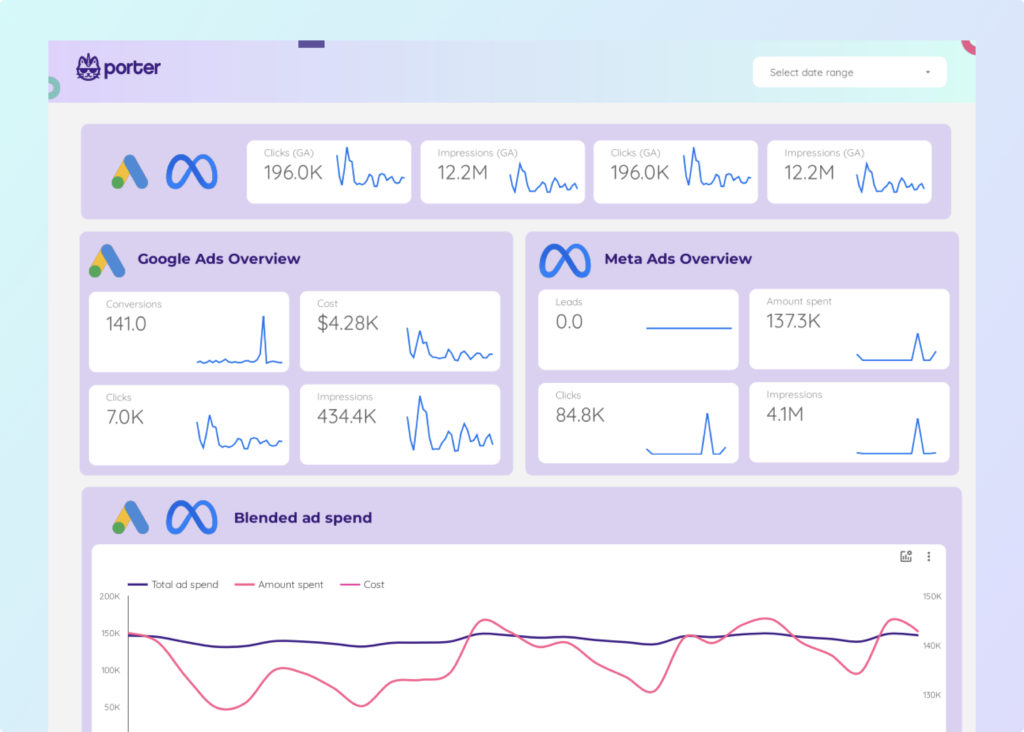
The first tool we choose for you as an alternative to Databox is Porter Metrics. When it comes to usability and ease of use, it is hard to compete with Porter Metrics, as you can create the report you want in less than a minute.
The dashboard will include all the significant metrics and provide the insights you need in appealing visuals you will adore.
Porter Metrics Overview
Porter Metrics is a digital tool that helps you improve and automate your reporting. This can be achieved using social media, website analytics, PPC, SEO, e-commerce, and CRM channels.
You will have to choose your channels and campaigns and determine what your goals are before you start generating these reports. After extracting data from various channels and combining it with dashboard layouts, you’ll be able to generate reports.
The entire procedure will take just a few seconds. As a result, we can definitely declare that Porter Metrics prioritizes its users throughout their experience.
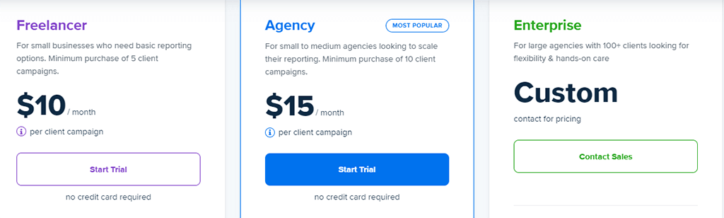
Porter Metrics Pricing
Like the other marketing data automation tools, Porter Metrics has a few pricing options. However, as you will see after comparing the products listed in this post, Porter Metrics is less expensive than the other Databox competitors. The following pricing plans are available from Porter Metrics:
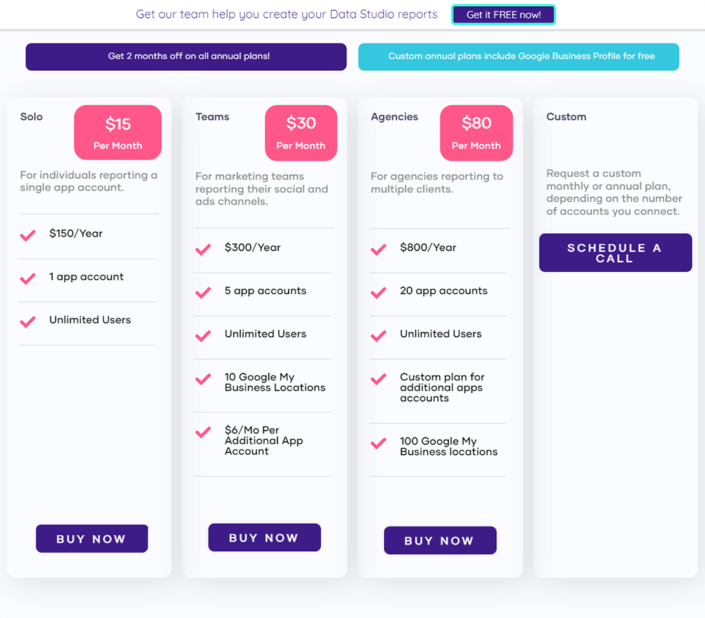
As you see, there is also a custom price which is designed for bigger companies and agencies with more financial privileges.
Porter Metrics Integrations
Besides the tool’s number of integrations, the quality is also significant as you want to see more popular and important data integrations. The following is a list of main Porter Metrics integrations:
- Instagram Insights
- LinkedIn Ads
- Twitter Analytics
- WooCommerce
- Shopify
- Facebook Insights
- Google My Business
- LinkedIn Pages
- Facebook Ads
You can use these data connectors with a free and easy-to-use platform for marketing reporting, Google Data Studio.
Porter Metrics Features
One of the most intriguing features of Porter, as previously mentioned, is the ability to create reports with a single click. When it comes to creating reports from scratch, freelancers and small enterprises on a budget will love this quick and simple solution as an alternative to Databox.
Improve your KPIs, add your metrics to the report, white-label them, and make the reports look like your agency or business developed them. Right now, you can start the onboarding process.
Porter Metrics Customer Support
The website articles (knowledge-based support) in the Porter Metrics help center can give you the information you need to solve your problem.
On the other hand, customer service is not solely dependent on knowledge. You can engage in a live chat at any moment and contact the staff with any questions or concerns you may have.
Porter Metrics vs Databox
As some Databox users mentioned technical issues with data load, accuracy, and historical data, you can be sure that there are no such issues if you choose Porter.
The tool is specifically designed for your needs and will do what you want from a marketing automation tool: make the process short and easy for you.
Although Databox itself is a great marketing data reporting automation software, Porter is a worthy first alternative for it on our list.
Reporting Ninja
The second alternative to Databox on our list is Reporting Ninja.
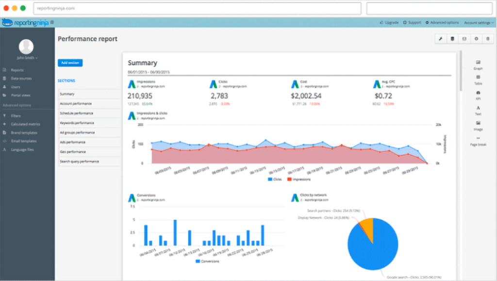
The ultimate goal is to make the reporting process shorter and simpler. And Reporting Ninja does quite a great job in it.
Reporting Ninja Overview
Reporting Ninja is a PPC-focused marketing reporting solution. In other words, it’s a premium campaign reporting tool that’s also one of the best in the business.
Reporting Ninja helps you gather data from many sources and put it into a dashboard with a simple interface. By email, you may get performance-changing statistics for your paid campaigns using Reporting Ninja.
It is a well-known marketing reporting tool that was founded in 2010. The company’s headquarters are in Madrid, and its clientele comes from worldwide. Despite having less than 20 employees, it is highly regarded by digital marketing experts and critics.
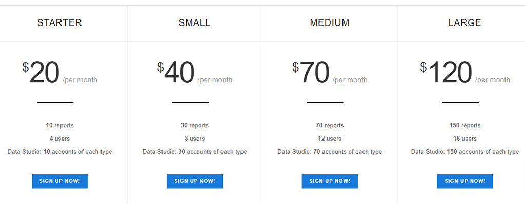
Reporting Ninja Pricing
In the first 15 days, you can sign up for free and take advantage of some of the services. This timeframe may be sufficient to evaluate the tool and determine whether it meets your requirements.
If you want to keep working with Reporting Ninja after this period, you can choose from one of four pricing plans:
Reporting Ninja Integrations
Reporting Ninja’s Integrations include the most popular social media and website analytics channels. Some of them are:
- Google Ads
- Facebook Ads
- Google Analytics
- Youtube
- Hubspot
- Google Sheets
We can not claim that Reporting Ninja has got the highest number of integrations, but it will probably meet your needs.
Reporting Ninja Features
If you want to provide high-quality service, you can white-label your data with Reporting Ninja. It enables you to construct a custom report portal that adapts to various devices.
You can customize the items you desire, such as color, font styles, and sizes. In addition, if you work with clients, you can personalize your reports and send them to them. You can also create customer portals.
It helps you add your clients to your reports using these portals, allowing them to monitor and follow their progress without having to download any data to their devices.
You may use Reporting Ninja to combine data from several sources, such as Google Ads, Google Analytics, Facebook Ads, and others, into a single dashboard.
You can export these reports to a PDF file and deliver them to your clients as a document after filtering out the data you don’t need and working on them until they are ready.
Reporting Ninja Customer Support
Reporting Ninja’s customer service is one-way, as stated on their website, which is email. You should send an email to the address they provide you with, describing your problems.
Given that most marketing reporting solutions provide customers with two or three means to contact them (phone, email, and web form), this might be viewed as a disadvantage for the brand.
Reporting Ninja vs Databox
As already noted, the focus of these two tools is different. Reporting Ninja focuses more on the paid campaigns and channels, while Databox does not limit itself to it.
So when choosing between two, you have to consider all your marketing activities and decide if you want to focus more on paid channels or organic ones. The third tool that earned its place on our Databox alternatives list is AgencyAnalytics.
AgencyAnalytics
This software might be the one you need if you are looking for a change of scenery in your reporting activities.
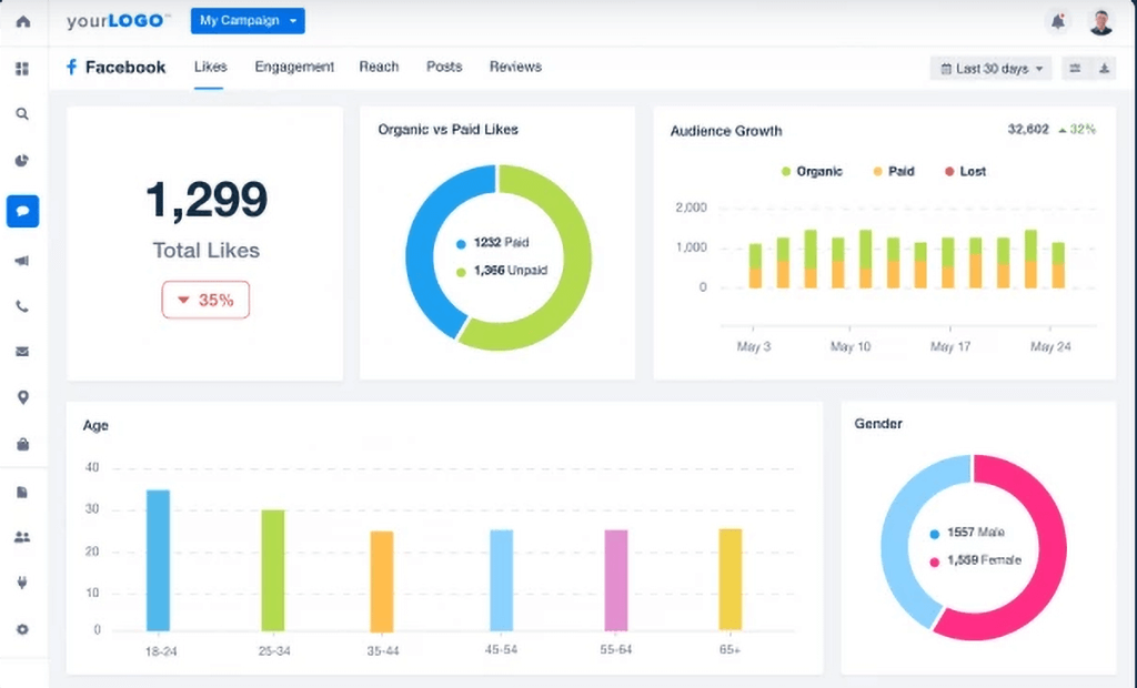
This dynamic, colorful dashboard, alongside the other templates they provide, will make the reporting process more smooth and enjoyable.
AgencyAnalytics Overview
AgencyAnalytics is a marketing reporting tool that assists agencies and professionals with automating their reporting procedures. It provides its clients with a wide range of digital marketing solutions, including SEO, SEM, and social media campaigns.
In 2009, AgencyAnalytics was established in Canada. It is now one of the most well-known marketing automation platforms available. The company’s annual sales are around $2 million and employs between 20 and 30 people.
AgencyAnalytics Pricing
When it comes to pricing plans, AgencyAnalytics could be the most affordable tool in the market. Here are its main pricing plans:
The enterprise plan can go up to a few hundred dollars, depending on your marketing goals and the budget you want to spend on the tool.
AgencyAnalytics Integrations
The list of AgencyAnalytics Integrations is very long, so this time, we would like to mention the ones you probably have not heard of:
- GatherUp
- Google Lighthouse
- Klaviyo
- Marchex
- PhoneWagon
This variety allows users from all kinds of industries and positions to try AgencyAnalytics comfortably for their reporting. After all, the number of connections is crucial in deciding for them.
AgencyAnalytics Features
The dashboard templates in AgencyAnalytics are completely customizable, which means you can add your own data, change the dashboard’s appearance, and produce reports exactly how you want them.
It effectively contributes to the user experience and makes it easier for clients to comprehend the info they see on your screen. You will also be able to generate white-labeled reports by making the dashboards look like you have created them and adding your brand elements to them.
Aside from that, AgencyAnalytics has connections to over 60 platforms, so you’ll get your data from a variety of sources. It enables data blending because all of your data is contained on a single dashboard.
AgencyAnalytics Customer Support
There is a search bar on the company’s help center page where you can hunt for solutions to your problem on the website if it is in their database.
You can also participate in a conversation where a customer support team member will contact you and clarify your problem.
Customer service is super-fast, the team is really lovely to talk to, and their sole focus is on addressing the problem for the customer, according to user reviews.
AgencyAnalytics vs Databox
AgencyAnalytics is more flexible as a tool and will give you more custom features. This might or might not be a crucial advantage for you as a marketer, but if you are after a high number of connections and sources, then, AgencyAnalytics could be your best choice.
However, it is not easy to tell which tool is the best overall. For its features and the reputation it has made in the industry, AgencyAnalytics finds its place on our Databox alternatives list. However, the final decision will be yours.
TapClicks
The next tool we are going to analyze and compare with Databox is TapClicks. Below, you see the sample layout you will get from the tool for various data connections:
This tool also focuses on having bright, positive colors, which keeps the visuals cool and easy to distinguish.
TapClicks Overview
TapClicks is created to help you have a better reporting experience, and it’s perfect for combining your analytics data from several sources into a single dashboard. The dashboard was created with a non-technical audience in mind.
You can use TapClicks to track your marketing KPIs and visualize your results over time. It’s ideal for tracking SEO, PPC, and social media statistics. TapClicks was established in 2009 in San Jose, California.
The company is mid-sized, with about 50 workers, and Crunchbase estimates that it has raised around $30 million in total capital. In addition, TapClicks controls about 0.1 percent of the marketing analytics market.
TapClicks Pricing
There are 3 main TapClicks pricing plans, which have different features and benefits:
Basic: For $499 per month, you get a restricted number of data connectors, basic features, and email support from TapClicks. It is intended for small businesses. This plan is not highly recommended in light of current market prices, as you can get a lot more for the same money with alternative tools.
Pro: This plan is 999$ a month and includes a pro feature set and excellent customer service. You’ll get access to over 250 connectors as well. Pro plan is best for medium-sized businesses and agencies.
Elite: This plan is suggested for the largest businesses, and the pricing is determined on a case-by-case basis. With this pricing plan, you may obtain an exceptional feature set and specialized support.
TapClicks Integrations
There are more than TapClicks integrations you will have access to, and some of them are quite unusual:
- Waze
- Yelp
- Verve Velocity
- Vimeo Videos
- Wufoo
- WhatConverts
In terms of the variety of integrations, TapClicks can beat almost any other tool in the industry.
TapClicks Features
In terms of technical characteristics, TapClicks enables customers to create unique dashboards based on their own data. You can customize your dashboards by adding custom data and dates, as well as the appearance of the reports.
You may also white-label your reports to give them a more personalized appearance. You can improve the appearance of your custom report by including your logo and the colors you want.
It offers a lot of marketing reporting tools, and it’s a must-have for them to provide high-quality service to their clients.
TapClicks Customer Support
Customer service is important to users and significantly impacts the company’s success. More important than the variety of ways you can contact the customer care team, getting responses to your requests as quickly as feasible is critical.
On the TapClicks contact page, we find that the website has a forum where you may enter your basic information and the problem you’re having. We can tell from the user reviews that customers are satisfied with the service they receive.
TapClicks vs Databox
In a head-to-head comparison, TapClicks has been around in the industry for quite a long time and longer than Databox. It is also as popular as Databox is.
However, the quality is top-notch for both of these tools; that is why it will only depend on the trial period you set for yourself to decide which one is the best.
One thing is for sure: TapClicks fully deserves to be up among the best Databox Alternatives.
10 Best Databox Alternatives
Not enough alternatives, you still think? Then, you should check out these tools as Databox alternatives as well:
- Porter Metrics
- DashThis
- Supermetrics
- Geckoboard
- Ortto
- Megalytic
- NinjaCat
- Klipfolio
- Cyfe
- Swydo