In this step-by-step guide, you will be able to find the easiest way to set up your Twitter Ads reports on Google Data Studio in minutes.
A Twitter Ads connector for Google Data Studio, your Twitter Ads account(s), and a Google account are all the items you need to start pulling your information to a unified dashboard. Let’s start with the generalities of Twitter Ads.
Twitter is different from other social media data sources. For example, sometimes you can have complete access from your personal Twitter account to many ads accounts, or sometimes you have to log in with the password of each account.
Before pulling data from Twitter Ads or Twitter Analytics itself, if you manage multiple accounts, it’s important to group them all to integrate them in one connection. No matter if you are going to integrate your data with Google Data Studio or use another connector to visualize data in a dashboard.
Whether you have full access from your personal Twitter account or you have to pull data from each Twitter Ads account, this guide is for you.
If you already have your accounts integrated, you can skip this chapter and jump right to the topic you like. Look for it up on the menu on the left-hand side of this page.
How to get access to Twitter Ads
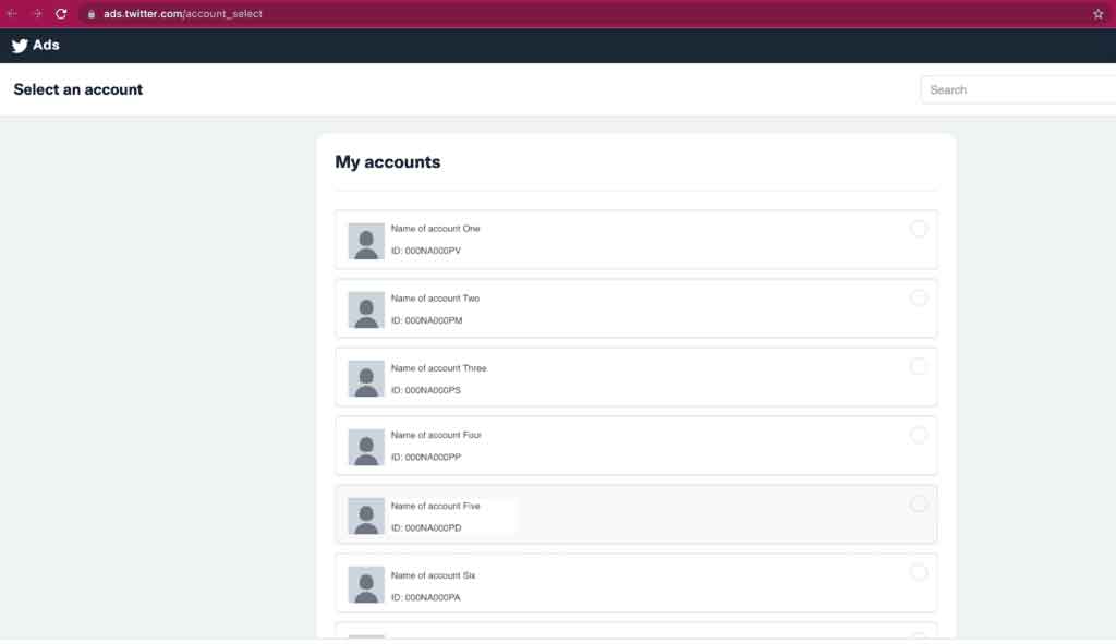
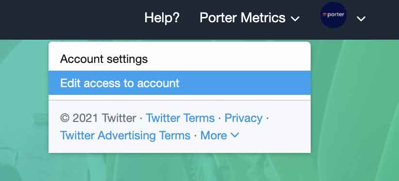
Log in to ads.twitter.com. If you manage the accounts, you probably have access to it using the handle and a password to log in. Select the name of your Ads account and select “Edit access to account” from the drop-down menu.
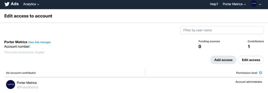
You will see in the top right corner the icons of the accounts you manage. Once on the multi-user login section of your ads account, you can select “Add access” or “Edit access”.
Follow these steps to manage and integrate all your accounts into only one account, your personal one, or a designated account for this purpose.
This is my account, and this is how it looks like:
I have all my Ads accounts linked to my personal account, and that makes the connection to any data visualization tool much more effortless.
But if you don’t see something similar, here is the step-by-step guide to connecting your accounts.
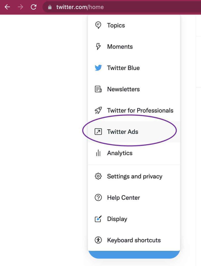
Log in with Twitter. Have at hand the username (or email) and password
Go to the menu and look for Twitter Ads
- Click on the “edit access to account” option.
- Then you will see you can manage access for different contributors such as media agency partners or someone in your team. Click on the “Add access” button.
- Type the handle @ of the profile you want to include in your ads platform and select the type of access you want to give to the contributor.
- Add as many collaborators as you wish and manage their access according to their roles.
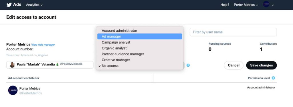
These are the most common types of roles you can give:
- Account administrator: Can upload content, manage ads campaigns, and can also visualize the analytics of your account.
- Ad Manager: Can manage the campaigns and visualize only data related to the advertising campaigns on your account.
- Campaign Analyst: can visualize, download and pull the information from your Twitter Analytics and Ads analytics.
- Partner audience manager: With this permission, the user can view, create, modify, and delete Custom Audiences through the Twitter API.
- Creative Manager: can modify creatives and previews but cannot create or modify campaigns.
Go to the Twitter Ads official documentation if you want to explore more about the accesses and roles.
After following the steps, now I’m able to manage the Porter Metrics account from my account.
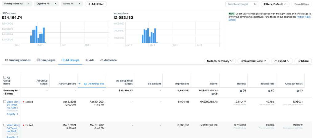
To visualize the information, Twitter provides a native dashboard, and you can track the performance of your ads by campaign, ads groups, content, and even the audience.
I recommend you look at the metrics you have available, the different data dimensions, and how they classify the data to understand the Twitter Ads Campaigns better.
Twitter Analytics has one of the most complete documentation interfaces you can find across the Internet and you can have almost an answer for every question you could have.
Twitter Analytics has its visualization dashboards and it’s great when you have to track recurrently the performance of your strategy.
Once you are familiar with the Twitter Ads data, you can effortlessly create, pull, and visualize your data.
Since 2014 Twitter Analytics has been available for all accounts whether you are a business or a personal profile, which is amazing because you can explore the tool no matter if you manage a huge account, or you are just starting your business and you want to see what you can get when you open a Twitter profile for a business or a brand.
Even though Twitter Ads/Twitter Analytics is one of the most comprehensive interfaces for Social Media native analytics platforms, there are still some limitations with this dashboard. That is why many advertisers use Google Data Studio connectors to track the performance of the ads campaigns.
The main limitation is that it is not possible to customize the visualization. So advertisers cannot cross data in charts or tables according to their needs.
And it takes us to a considerable struggle, the manual process of extracting data.
To download it in a CSV, organize it, harmonize it, etcetera, it’s something we don’t like you to spend time on.
At Porter Metrics we hack your tedious reporting tasks. So that’s why we create data connectors for you to pull the information and create your own visualization on Google Data Studio.
Free Twitter Ads connectors for Google Data Studio
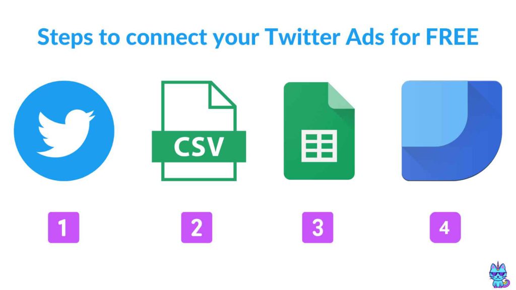
The current only free way to connect Twitter Ads to Data Studio is to first download a CSV and convert it to Google Sheets and then connect it to Google Data Studio.
If you look for Twitter connectors for Google Data Studio, you will find that there was a free access connector for Google Data Studio powered by Twitter. But unfortunately, it stopped working in 2019. So if you are reading this article, I’m sorry to confirm your suspicions. It is not free anymore!
Nevertheless, it was not as complete as those you can find right now on the Google Data Studio Gallery.
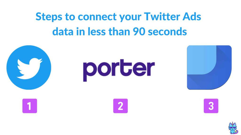
If you love hacks as we do, connect and automate this tedious reporting task in less than 90 seconds with the Twitter Ads Porter Metrics connector for Google Data Studio.
Porter Metrics is a provider of these connectors; we have an idea of why nobody currently offers a freemium model (aka an always free, limited product) instead of just a free trial.
It turns out that sustaining any connector is super challenging for everyone. It is an ongoing and not a one-time task. If someone decided to build a free connector, chances are they will be outdated or be affected within a few months.
As providers, we need to constantly update and fix these connections; we’re dependent on Twitter API updates.
If you’re still not willing to pay for a connector, you can still send your Twitter data for free to Google Sheets and connect your spreadsheet to Google Data Studio; but it’s manual or pretty limited.
Just as with Data Studio, automatically pulling data from Twitter to Google Sheets requires ongoing developer effort. So, Google Sheets connections—while there could be freemium options—will be limited anyway, and the direct connection is more powerful and flexible than having Sheets in between.
Twitter Ads connectors for Google Data Studio
First, we’ll learn how to import Twitter Ads data to Google Data Studio. Then, do it automatically using a connector.
For this tutorial, of course, we will use our Porter Metrics Twitter Ads connector. It is self-promotion, but we will also mention to our readers why we made it the best solution available.
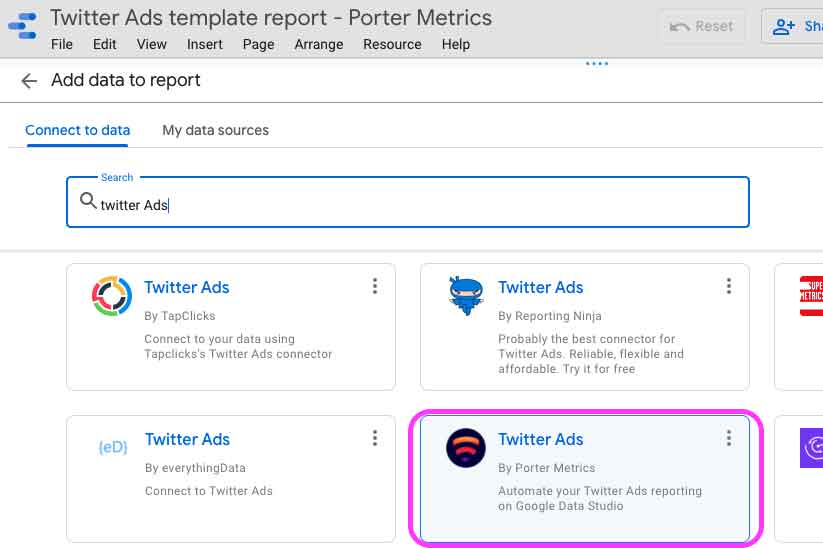
You can access your data using the Twitter Ads connector in four ways:
- By using this link
- By using our Make a Free Report button on our website
- Or using a Free template from the Porter Metrics Gallery
- Or by searching for it on the Google Data Studio connectors gallery by typing “Porter” or “Twitter Ads” and then selecting the Porter Metrics’s connector
As I’m showing you here:
Signing up with Google and Twitter Ads
Once on the connector, signup with your Gmail account to create your Porter account. You only need your email. Porter does not require or take any other personal information.
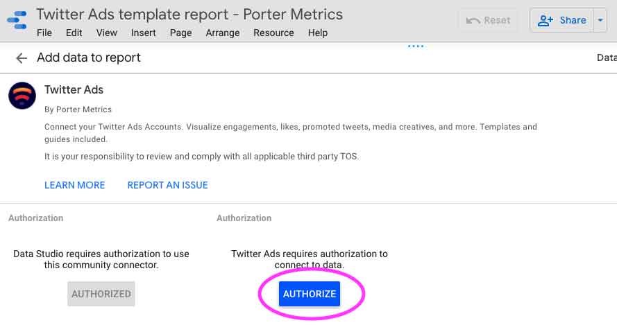
Then, you should sign in with your personal Twitter account.
Keep in mind you will get access to the accounts you manage, but if you don’t want to have the full management responsibility under your personal Twitter account, you will need the @ or username and the password of the Twitter account.
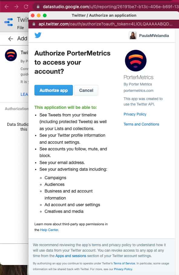
Authorize Porter Metrics’ connector to pull the data from the account API to start reporting on Google Data Studio.
About privacy: we only get your emails to create users. We don’t bring any other information or share it (on purpose) with third parties. Read more about our Porter Metrics Privacy Policy.
Despite the warning, Twitter says we can manage and access your accounts, but Porter does only connect to the API to bring data to Google Data Studio.
Finishing the setup
Select the data sources you want to start reporting and pulling data from.
Check and mark the options to start pulling your data.
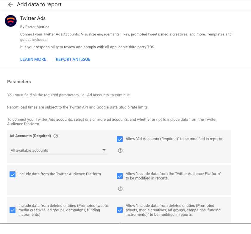
And click on the “Add” button.
Now you can start creating charts and scorecards to report your Twitter Ads campaigns on Google Data Studio.
While Google Data Studio is great for building reports, getting started is not always easy.
That’s why today I’m going to show you how to build a Twitter Ads report in Data Studio using the Porter Metrics Twitter Ads connector.
Let’s get into it now!
Create your Twitter Ads Dashboard on Google Data Studio
Once on the connector, signup with your Gmail account to create your Data Studio Dashboard. From now, you will see everything is about creating visualizations. We will create one together, so you can get familiar with Google Data Studio.
First, it is time to connect your data. Select a Twitter Ads connector. If you choose Porter Metrics, you have a 14-day trial, so you have the time to explore the possibilities you have and also compare with other report connectors or platforms.
We know how hard it is to start. So you will see once you start your trial, this connector includes an initial template. You can use it, adapt it and rebrand it. We also recommend you read this tutorial first to explore all that you can do with the Porter Metrics Twitter Ads connector.
Follow these steps to create your first charts:
- Open the Google Data Studio report on the edit mode.
- Go to the menu and select Insert or Add a Chart.
- Choose a chart type (scorecard, time series, tables, pie charts, and bar charts are the most common).
- Make sure the chart is linked to the Twitter Ads connector.
Depending on the chart, you should choose a combination of metrics and dimensions.
Not sure what to visualize, we got you! Keep reading this guide.
Settle what you want to report on your dashboards
Once you have your Twitter Ads up and running, you’ll have a lot of metrics and information available. But the importance of this very first step is to identify what will give you an idea of the performance of your paid and content campaigns.
Here is when you will decide what to include in your report, and of course what you shouldn’t.
Like all your marketing initiatives, your dashboards and reports should serve your audience. In this case, think about who you’re reporting to and what kinds of information may be relevant to them.
When thinking about the content strategy you have to improve the way you are engaging with your consumers. Twitter is a social media where you can place multi-purpose content.
When defining your marketing objectives, it’s more simple to create engaging creatives and smart use of hashtags that drives people into a conversation. You can also use viral references And try creating original content such as polls that allows your users to build a relationship with your brand.
Regarding your content strategy, you must keep in mind that tracking the presence in Twitter is an important part of a business social media strategy and that is because Twitter is where the conversations are.
On the other hand, you have your budget, how is it distributed to make possible the achievement of your goals.
Understanding Twitter Ads metrics
Twitter analytics provide the principal insights or metrics around how your audience is engaged with your content.
By exploring the metrics and dimensions you can ask for some answers related to what content is performing best and what’s the best approach for you to engage with your consumers.
You can set up your Twitter Ads report on Google Data Studio by navigating all its fields, metrics, and dimensions available.
For this example, I’m creating a report as if I were part of their media team.
My first approach with this dashboard was before pulling the data. I reached the Marketing and Communication team and asked them what they wanted to answer when receiving this report.
They asked the following. As clients we want to see the following on the campaign report:
- How are our Twitter Ads campaigns performing in general?
- What the top campaigns/pieces of content are?
With that in mind, I started to think about the data I needed to report.
The metrics you add to this part should reflect your Twitter Ads performance and campaign ROAS.
Metrics included in the Twitter Ads Porter Metrics Connector
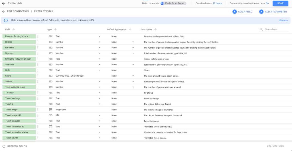
The Twitter Ads Porter Metrics connector includes more than 300 metrics and dimensions fields.
When connecting, refreshing, or editing your Porter Metrics connectors on Google Data Studio, you will see if there is any update or a new field.
We recommend doing this often (once or twice a month) to make sure you are pulling updated fields.
Take your time to read the list of fields before starting your dashboard. It will give you an idea of what metrics you should pull to deliver an insightful report.
Most common metrics and their definition: Twitter Ads
The most common Twitter Ads metrics are those related to the performance of your campaigns and their budget. Therefore, impressions, interactions, and calculations based on the costs and ads spent are those that must be highlighted at the top of your reports.
Now, we are going to make sure you can read and understand them correctly.
- Impressions: The number of times users have seen your ads. (Either on their feed or search results)
- Clicks: The number of times users have clicked on your ads. It could click on pictures to open it, details, hashtags, or links.
- Link Clicks: The number of times users have clicked on the links on your ads. Yes, only LINK clicks!
- Click-through-rate: The ratio of total clicks/total impressions. This will reflect the quality of your ads. If your ads are relevant and attractive to your audience, you should see a high CTR.
- Conversions Metrics: Actions users take on your website after seeing your ads. Conversions tell you if your landing page is working. This metric sometimes is different from the one you can get on Google Analytics. Comparing this data with Google Analytics data to see the path users take from your ads to your website and from your website to conversion is how you can get a comprehensive analysis of your campaigns.
- Conversion rate: The ratio of total conversions/total clicks.
- Cost-per-acquisition (CPA): How much you’re paying for each conversion on your website. CPA helps you optimize your budget. For example, if you spot a campaign that drives most conversions at the lowest price, you can allocate more budget to that campaign or create similar campaigns.
- Cost: How much you’ve spent so far.
- Cost-per-click (CPC): How much you’re paying for each click on your ad. It’s total spend/total clicks.
- Cost-per-impressions (Cost per 1k Impressions – Aka CPM): How much you’re paying for every thousand impressions. It’s a good metric to track if you’re running a brand awareness campaign.
Next, let’s see how we can visualize these metrics and build a dashboard.
Twitter Ads report Google Data Studio – Template guide
Google Data Studio is a free visualization tool you can use to create integrated dashboarding with a Google account. Twitter Ads connectors are necessary to automate this task and get your reporting done effortlessly.
Before pulling data or creating data widgets on a blank page on Google Data Studio. To elaborate a report, it’s necessary to keep your Twitter Ads campaign goals in mind. If you don’t have them clear, try to answer the following question:
What is the real performance of your campaigns? For this specific analysis, I will create a dashboard for Google data Studio. At the end of this guide, I’ll give you some resources you can use to improve how you are achieving your goals and optimize your budget to maximize the relevance and engagements of your content.
One of the most common goals that advertisers use to drive more traffic to a website is “Link Clicks”. We have prepared a template for Google Data Studio. You can download it and start reporting your Twitter Ads campaigns with the less effort possible.
With this Twitter Ads report template, I wanted to provide some ideas about reporting according to your different business objectives. For instance, we will go through the analytics of Twitter Ads and the dimensions you can pull and visualize on Google Data Studio.
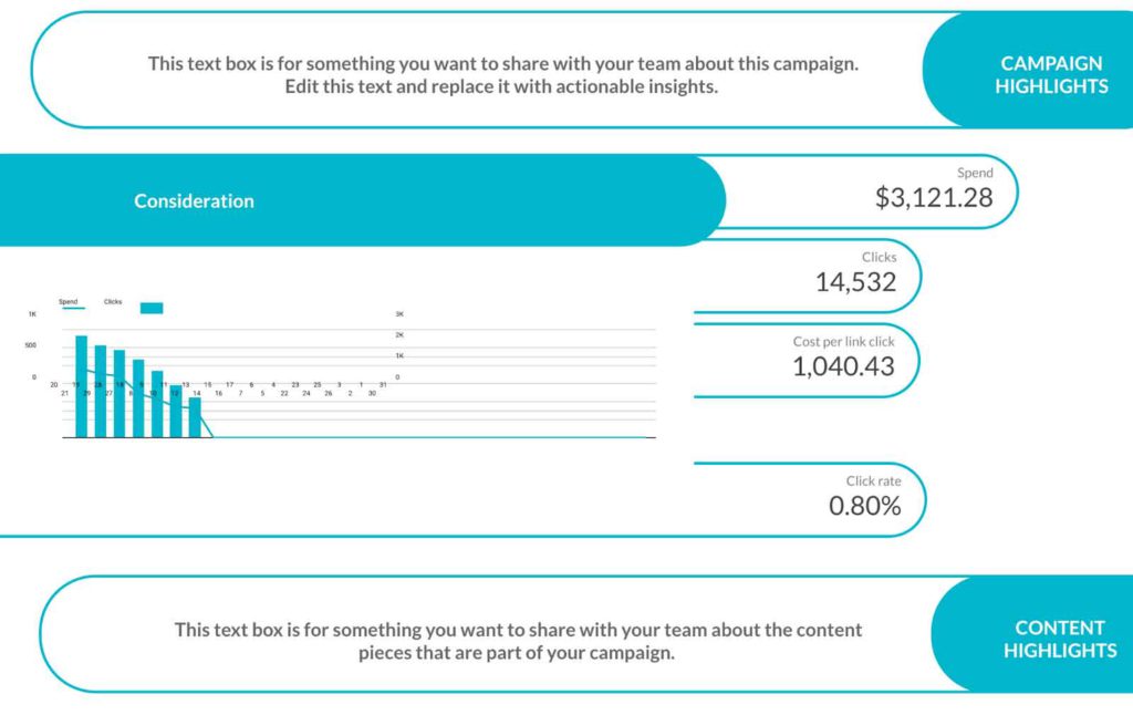
Twitter Ads Campaign Analysis
To create a Twitter Ads campaign analysis, you need to consider the main objective of your single or multiple campaigns.
When multiple campaigns are part of the same strategy, focus on the main goal and then try to build a story with data. The easiest way to visualize it is with a timeline and highlighting the hits and how those helped to achieve specific goals.
On the first page of your report try to visualize them organized, structured, and of course don’t forget about the labels and titles.
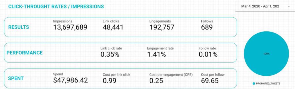
Group the metrics by level. As you can see in the example above, I placed the most popular metrics on the “Results” section.
Impressions, Link Clicks, Engagements, and Follows
Then I jumped to the next level by analyzing the “performance” with ratios.
Link Click Rate, Engagement Rate, and Follow Rate
Finally, I presented the money spent during a specific time.
Now you are ready to start creating your own charts and tables. Again, remember to keep in mind the dimensions regarding what information you want to show.
The dimensions are just levels of data that group the main characteristics.
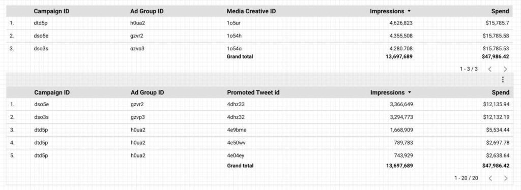
With the Porter Metrics Twitter Ads connector, you can break down the information by Ad Group, Campaign, Funds Source…
Twitter Ads Groups
The Twitter Ads Groups on Google Data Studio will help you visualize your campaigns according to your planned objectives.
The Porter Metrics Twitter Ads connector is structured as the following:
- Campaign
- Ad Group
- Spend
- Funding Source
- Media Creative
- Segmentation
The ads objectives you can find on the Porter Metrics Twitter Ads connectors are:
- App Installs
- Promoted Tweet
- Promoted Video
- Reach and Average Frequency
- Tweet engagement
- Website Clicks
Twitter Ads Metrics and Dimensions
I’d like to share a hack to differentiate the Dimensions from the Metrics. Dimensions are qualitatives and help group the information by date, location, or Ad groups and Ad types. In comparison, the metrics are qualitative and contain results and percentages.
As de dimensions are qualitatives, identify them by checking if the left-hand icon or short description contains the following:
- ABC
- Calendar icon
- Map icon
- Thumbnail or image preview icon
- Link icon
Dimensions
Dimensions will determine the granularity of the information you want to analyze. The Twitter Ads Porter Metrics connector includes more than 100 dimension fields.
The Twitter Ads dimensions that are used the most to organize campaigns data are:
- Account name
- Tweet Image preview
- Account id
- Ad group id, creative source, currency, advertiser domain, categories, status, objective, placement, currency, name…
- Campaign id, status, objective, date
- Placement
- Media types
- Formats
- Audiences
- Cities
- Gender
- Age
- Interests
- Events
- Languages
- Bid amount, optimization, type
- Campaign total and daily budget
- Funding source data
- Date (Year, Month, week, day)
Metrics
The metrics will give you the results depending on the Dimension you choose. The Twitter Ads metrics available with the Porter Metrics connector are more than 200. The way you can find them is when you can see in the lint a “123” before the field.
The following are the most common metrics you can use to report your Twitter Ads results:
- Cost Metrics
- Impressions
- Followers
- Clicks
- Conversions and Rates calculated
- Video Metrics:
- video_15s_view_rate
- video_6s_view_rate
- video_3s100pct_view_rate
- video_view_rate
- video_completion_rate
- video_views
- video_views_25
- video_views_50
- video_views_75
- video_completions
- video_cta_clicks
- video_content_starts
- video_3s100pct_views
- video_6s_views
- Video_15s_views
- cost_per_video_views
- cost_per_video_6s_view
- cost_per_video_15s_view
- cost_per_video_completion
- Cost_per_video_3s100pct_view
- Engagement Metrics
- engagement_rate
- engagements
- retweets
- replies
- likes
- leads
- clicks
- media_engagements
- unfollows
- votes
- swipes
- tweets_posted
- click_rate
- lead_rate
- media_views
- cost_per_link_clicks
- link_click_rate
- Link_clicks
- Conversion Metrics
- Purchases on web and mobile
- Custom conversions
- Downloads
- Sign-ups
- Logins
- Tutorials completed
- Sales
- Invites
- Pageviews
And many more! Start pulling your data to discover more.
Now that you know how to group and break down data to analyze. Let’s see if you are ready to master Data Studio dashboards. Check the following tables:
Can you see the difference?
I bet you can! It is time to put the cherry on the pie. You will learn how to create your own analyses at the next level.
Twitter Ads individual Tweets Analysis
I highly recommend creating tables before anything else. A table allows you to analyze and understand better the results of your pieces of content.
I’m using six columns to deliver results (metrics) and two to determine the main characteristics of the tweets, the ID, and a reference image(see the example below.)
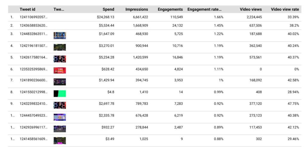
I have it all at a glance!
My favorite metrics when creating an engagement report are:
Impressions and engagements and, of course, the Engagement rate, so I can easily read the performance of my pieces of content and when posting Video ads, of course, the Video View Rate.
The Twitter Ads Porter Metrics connector contains these calculations, so you don’t need to worry about creating fields.
Twitter Ads report insights
This is the final part, and now it is time to share our Twitter Ads campaigns with the world. At least with our clients.
Now, I’ll show you the best way to communicate your results to your clients or the business managers you are working with.
- Never deliver data without context. Explain a little bit of the campaign, its purpose, and objectives.
- Share the results with your internal team before delivering them to your clients and other stakeholders. Make your reporting process collaborative.
- Bring actionable insights and next steps. Use Data Studio text boxes to say something about the strategy.
- Deliver your reports in time. People are waiting for data to make attainable decisions.
I recommend you to insert your own analysis, be creative and propositive. Clients love this attitude when working with data teams.
If you need extra help, download a copy for free of our Link-Clicks campaign – Twitter Ads report template for Google Data Studio.
Twitter Ads report additional hacks.
Think about the objectives before delivering insights. Ask yourself. Is my campaign delivering results according to the expectations?
If not, think about the creatives, segmentation, or even bidding type.
Is any creative delivering better results in terms of cost/efficiency?
Talk to your creative team to make sure you are engaging with content.
Video metrics included in the Porter Metrics Twitter Ads connector can help you with quartile analysis. If you are running video ads, you probably care a lot about the length, completion rate, and of course, the Video View Rate, aka VTR (View-through rate), which is calculated by dividing the number of video views over the Video Ads Impressions.
Engagement is the key to winning on Twitter. If you are getting low engagement (Replies, Retweets, and Likes, reevaluate your call to action, use resources such as polls or threads to increase the interaction.
My social media analyst bonus hack is:
Think about the audience you are reporting to. For example, if your report’s target audience is the executive marketing team, deliver information regarding the spending and results.
If your report’s target audience is the Media or Advertising agency, or team, show them relevant information regarding segmentation, formats, lengths, and how they spend varies.
Try not to overwhelm your audience with irrelevant and confusing information.
I hope this tutorial has helped you with your Twitter Ads reporting on Google Data Studio. Remember that you can find inspiration and more templates available on our “Resources” tab at portermetrics.com.
See you next time!