


Long story short: we published a COVID-19 dashboard that went kind of viral and attracted the attention of a large company that would become a customer, leading to several projects and contracts with our startup.
I’d like to say that such a win was premeditated, and it was part of our marketing strategy, but it wasn’t. Yet, I will share some lessons and insights from it.
Like everything in 2020, it was due to COVID-19
I wanted to quickly teach “someone” (aka my ex) to use Google Data Studio to create dashboards and visualize data.
It doesn’t sound like the most romantic thing, I know, but I believed that if she combined her knowledge of public policies with data analysis she could do amazing things and stand out, as most people in her field are technophobic.
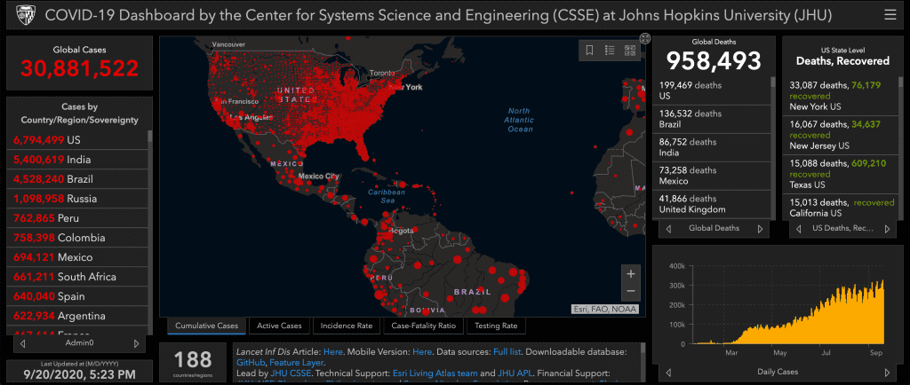
She loved the idea. To prove it, I wanted to replicate the John Hopkins University COVID-19 dashboard but only with Colombian stats.
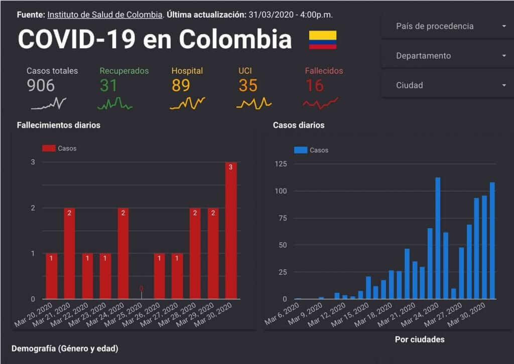
As it was in an early stage, I thought I could do something similar by only using Google Sheets and filters. Back then, there were a few hundred cases—not millions.
So I took the public raw dataset that the Colombian Government had on its Health Ministry website. It turned out that they already had a dashboard, but who cared?
I should give merit to the Colombian health institute that made this data accessible. Other countries would hinder their stats on purpose.
Just for the record, if you want to learn Google Data Studio, we have a free course. Then I created the dashboard and published it on my Facebook and several groups, without expecting what would happen next.
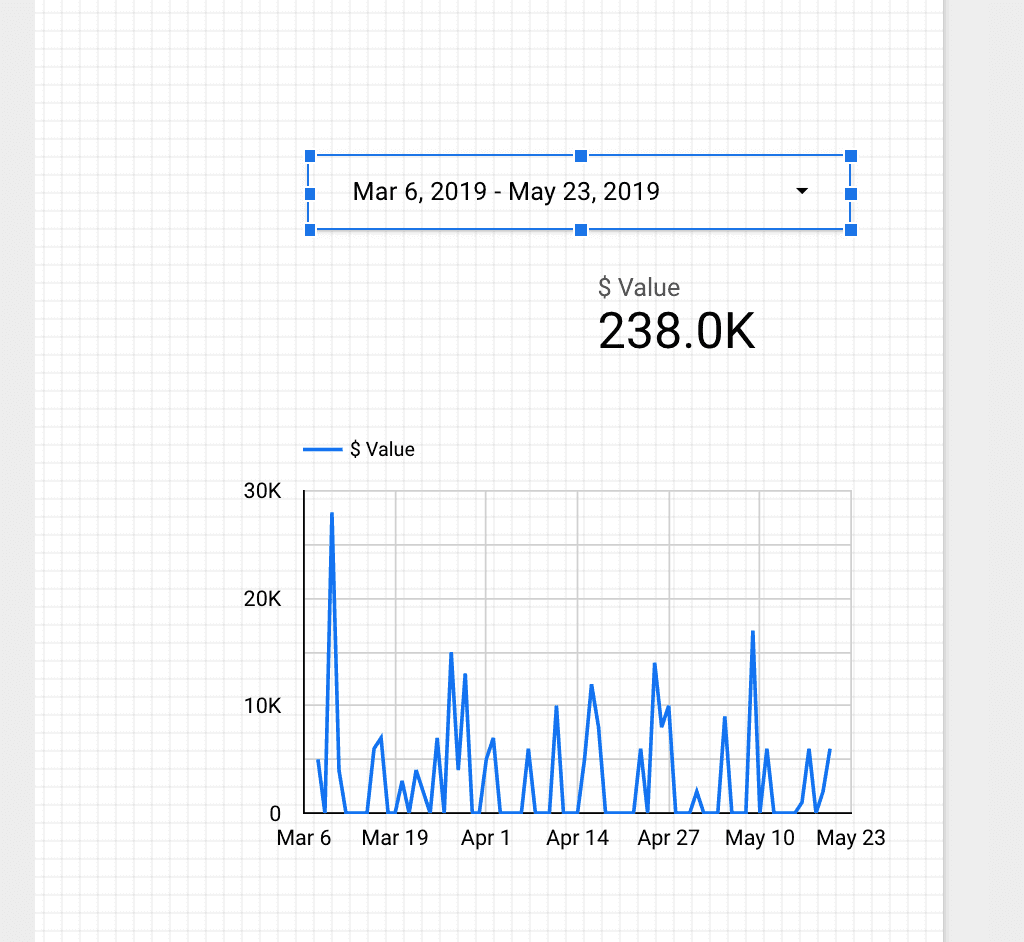
This is a snapshot of how part of the dashboard looked initially. You can access it here.
By accident, I built something people liked
I thought a few people I know would look at it until I found that more than 100 people were seeing it simultaneously, so I quickly installed a Google Analytics script to track traffic and pageviews.
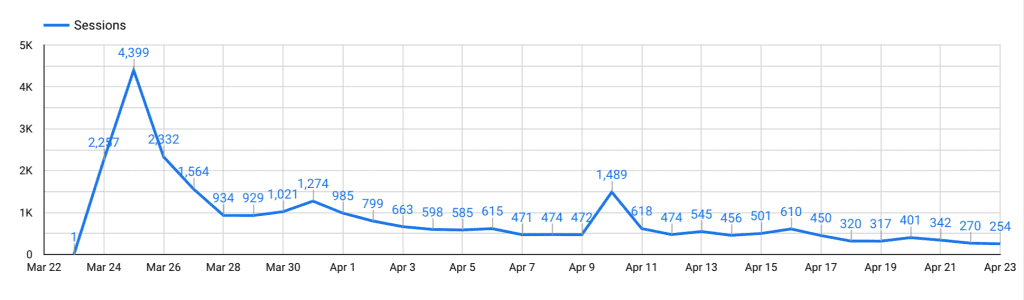
The COVID-19 in Colombia dashboard had 2257 sessions on the 1st day, and 4399 sessions the 2nd day. I accidentally built something that people liked. I didn’t have any plan to monetize it.
During those days I was reading Hooked—which I recommend to any product or marketing person—so I was constantly wondering what could be done to make people stick and visit the dashboard at least once a week.
Here are some of the things I did. Some of them worked.
- Showing the last update time. I thought it would encourage people to constantly check for novelties.
- A link to a Google Form, so people could subscribe to get the dashboard every Monday. I was shocked when I later found the list contained emails from universities, companies, and the public sector.
- A shortened link that people could remember and share with others. You can still access it: http://bit.ly/covid19colombia.
- A stat showing how many people the number of pageviews the dashboard had. That was a proxy for social proof.
- Adding and customizing charts constantly so people could find something new, a strong reason to come back.
I kept things simple
I can count at least ten engineers reaching out to me excited about scaling this personal project to a robust, automated infrastructure. I heard so many ideas that sounded cool but unlikely:
- A web scraping system that would automatically update data
- Migrating the database to SQL so it could be scalable
- Building a custom dashboard with React JS (aka coding)
- A predictive model that forecasted future COVID-19 cases
- And my favorite of all: connecting all Colombian cities weather data to find a correlation between weather and contagions
Of course, none of them happened. Some of those developers tried; all of them desisted a few days later.
I noticed a pattern that I had seen before in the developers’ community: discrediting something only because it was simple to do, an evident bias towards complexity and sophistication.
The dashboard was rudimentary; it was copying and pasting a CSV file on a Google Sheet that I’d connect to Google Data Studio, just like those Sheets-based MVPs you read about on HackerNews.
But it had something special: it existed. It was imperfect, but it was there, functional.
We built authority through content
I added a basic Call to Action at the bottom of the report. It said something like “if you’d like this kind of dashboards for your company, reach out to us.”
Expecting a consistent flow of low-quality leads every day, we only had one: the only one we needed. A large company scheduled a call with us. There was no commercial intent. They didn’t even know about our services (neither did we, to be honest).
When we met, they only said that they liked our infographic-like dashboards, and would like to know the kind of services we could offer or if we could help them solve their data-related problems.
The rest is history—one that only the sales and development team can tell as me, the marketer, wasn’t present in further meetings. But we did it. As for today, we have several projects running with them.
I’d like to give credit to my marketing skills, but I admit it was pure luck.
Yet, this unplanned success case reinforces the premise that content marketing—rather than just pitching your company or ranking on Google—is meant to provide so much value to others, that you can influence their decision making.
To me, content is the purest form of the principle of reciprocity applied in marketing. The COVID-19 dashboard that I built in minutes was helpful and insightful, but its timing was perfect. Here’s why.
Timing matters: sharp but short interest
The topic “Coronavirus” had its Google searches spike worldwide in March. In Colombia, the trend was similar.
Yet, in March, the number of contagions was irrelevant compared with what would come next in July and August:
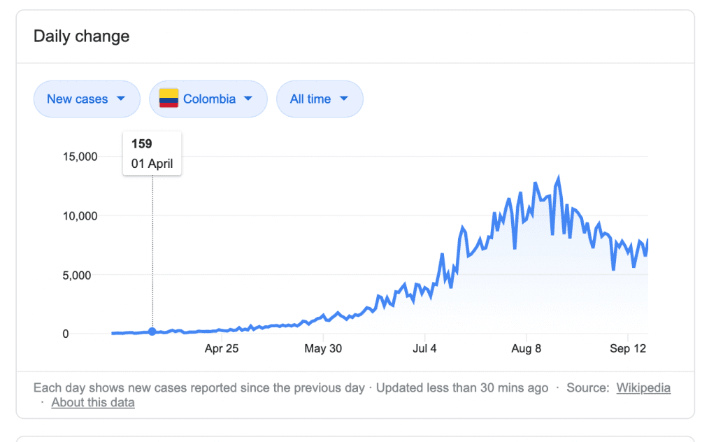
Paradoxically, people didn’t seem to search that much about COVID19 when it mattered the most during the peak in August, just like if we got used to the “new normal.”
I noticed similar behavior with the popularity of our dashboard. Regardless of the updates and “optimizations”, its popularity would diminish over time.
I still wonder if the dashboard would have reached so much interest if I published one or two weeks later.
Still, such a small, loyal audience contained the Fortune 500 company that we landed, executives from Rappi—one of the two unicorns in Colombia—, government collaborators, and tech companies.
During those days, our dashboard reached 30k pageviews.
Want to learn data visualization and marketing reporting?
We created a free Google Data Studio course for digital marketers. It will teach you the highest-demanded skill in digital marketing and level up your content marketing skills by telling stories through insightful dashboards.
I’d say dashboards and data visualization will gain more popularity over time as a form of content. I encourage you to be part of those marketers ahead.