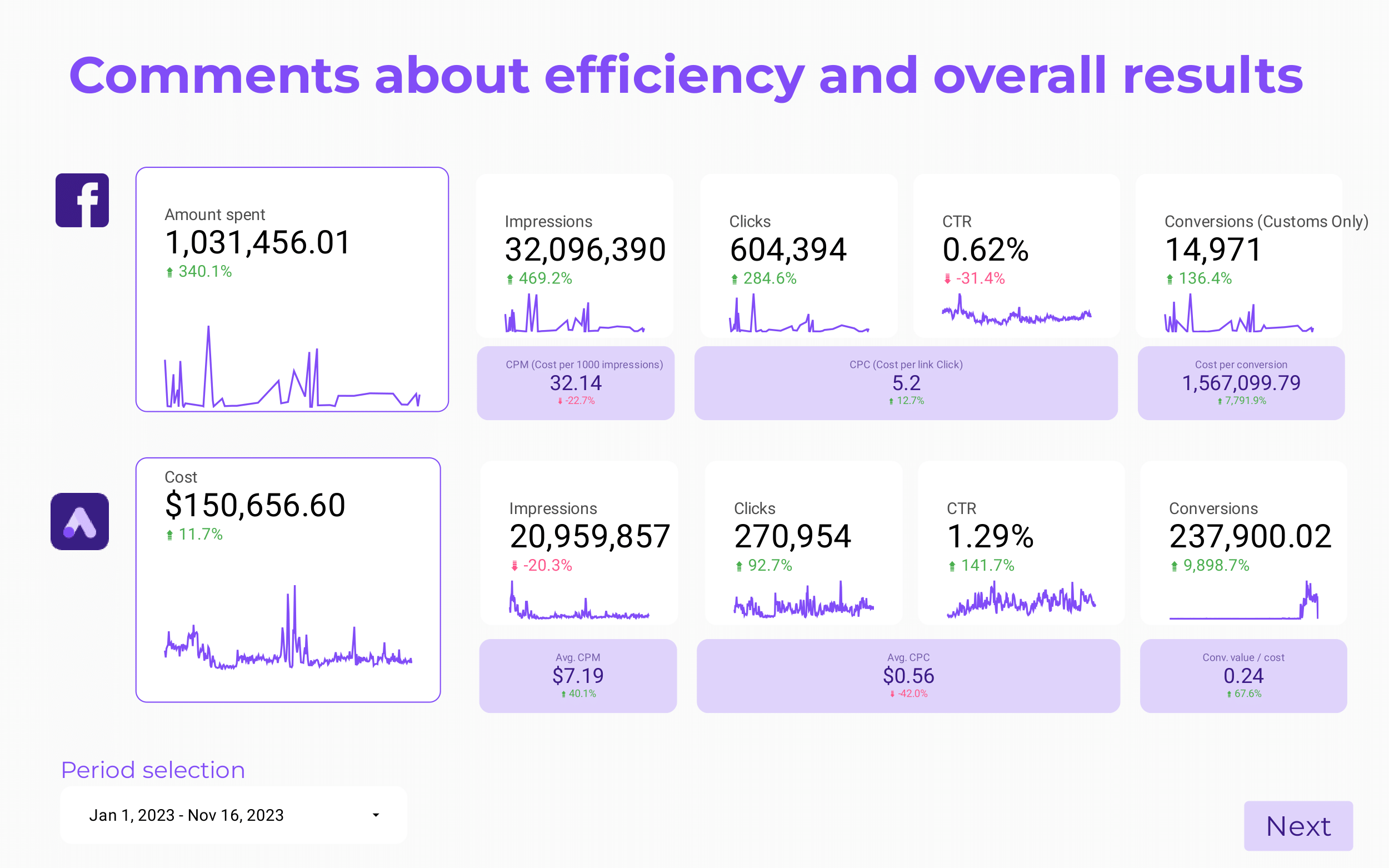
A client report should include breaking down metrics by visibility, engagement, and conversion metrics. This can be achieved by segmenting data by campaign, channel, audience, content, objective, and date. For example, visibility metrics may include impressions and reach, engagement metrics could include likes, comments, and shares, while conversion metrics may focus on click-through rates and conversions.
To analyze the data for a client report, follow these steps:
1) Choose metrics for visibility: track impressions, reach, and website traffic.
2) Engage metrics: consider click-through rates, social media engagements, and time spent on the website.
3) Conversion metrics: measure conversion rates, leads generated, and actual sales.
4) Add context by comparing against the cost: provide data on cost per impression, cost per click, and cost per acquisition.
5) Compare date range: evaluate the data over a specific time period to identify trends.
6) Align with goals: mention the client’s objectives and how the data aligns with those goals.
7) Compare to industry rates: include benchmarks for metrics such as click-through rates or conversion rates.
8) Segment data by campaign: break down data by individual campaigns to evaluate their performance.
9) Segment by channel: analyze data from different marketing channels, such as social media or email campaigns.
10) Segment by audience: consider the data for different target audiences, demographics, or user segments.
11) Segment by content: evaluate the performance of various content types (e.g., blog posts, videos).
12) Segment by objective: categorize data based on the specific marketing objectives.
13) Segment by date: compare data from different time periods to identify any changes or trends.
For example, the report could highlight metrics such as website traffic, social media engagements, and conversion rates for a specific campaign targeting young adults in the last quarter. Comparisons can be made with industry benchmarks, costs per impression, and by evaluating performance across different marketing channels and content types.
To build a Paid Media Client presentation dashboard, 1) connect your data and accounts from various platforms like Google Ads, Facebook Ads, etc. 2) Select the metrics to monitor performance such as click-through rates, conversion rates, cost per click, etc. 3) Segment or break down data by campaign, channel, audience, product, customer content, objective, date for a comprehensive analysis. 4) Add filters or buttons to make your report interactive, allowing clients to view specific data points. 5) Share the dashboard via PDF, scheduled emails, or links for easy access and review.
A Paid Media Client presentation dashboard is a visual tool that displays key performance indicators (KPIs) related to paid media campaigns, helping businesses to track their performance and make data-driven decisions. It is significant for businesses as it provides insights into the effectiveness of their paid media strategies, using tools like Looker Studio to create interactive and real-time dashboards. Key elements typically include metrics like click-through rates, cost per click, conversion rates, and return on ad spend. Real-time data monitoring is crucial as it allows businesses to react quickly to changes and optimize their strategies. For learning how to create a marketing dashboard using Looker Studio, visit our YouTube channel: https://www.youtube.com/@porter.metrics.
Can I download this template in PDF?
 Impressions
 Reach
Reach Quality Score
 Engagement Rate
 Video Views
 Engagements

