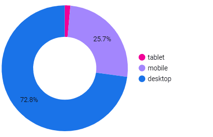
Pie charts on Google Data Studio Reports are good for cardinal values like breaking down your data by gender or device, as the order of how this data is displayed doesn’t affect its context.
Pie charts on Google Data Studio Reports are good for cardinal values like breaking down your data by gender or device, as the order of how this data is displayed doesn’t affect its context.


