A HubSpot report should include breaking down metrics by visibility, engagement, and conversion metrics. This can be achieved by segmenting data based on campaign, channel, audience, content, objective, and date. For example, visibility metrics could include impressions and reach, engagement metrics could include clicks and likes, and conversion metrics could include lead generation and sales. By organizing and analyzing data in this way, the report provides valuable insights into the performance of different marketing efforts.
To analyze HubSpot data, 1) choose visibility metrics such as website traffic, social media impressions, and email open rates. Engagement metrics could include social media likes, comments, and blog post shares. Conversion metrics might involve lead generation via landing page submissions and sales generated. 2) Add context by comparing against cost per lead, date range performance, goal achievement rates, and industry benchmarks. For example, compare email open rates against the average industry open rate to assess performance. 3) Segment data by campaign (e.g., comparing different marketing campaigns), channel (e.g., analyzing website vs. social media performance), audience (e.g., comparing performance for different target personas), content (e.g., analyzing blog post performance), objective (e.g., comparing lead generation performance for different objectives), and date (e.g., comparing performance over different time periods).
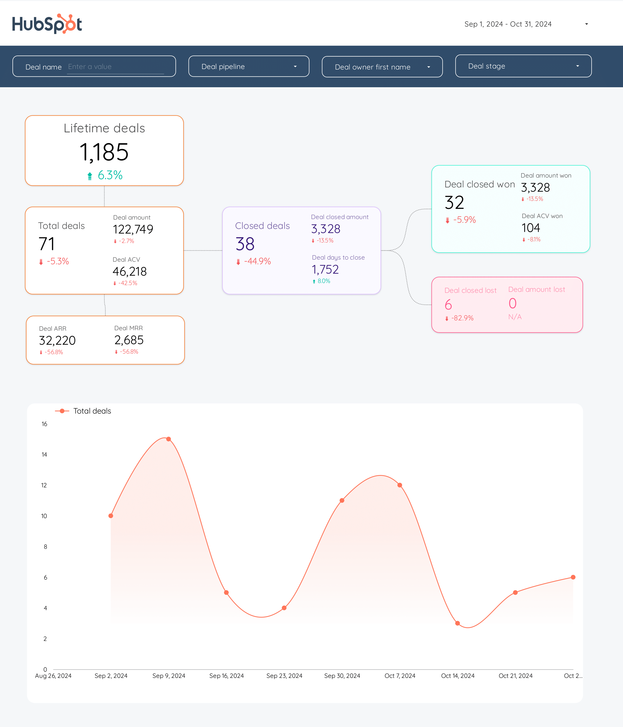
To build a HubSpot dashboard, 1) connect your HubSpot data and accounts. 2) Choose metrics such as website traffic, lead generation, or sales performance to monitor. 3) Segment your data by campaign, channel, audience, product, customer content, objective, or date for detailed analysis. For instance, you can break down data by a specific email campaign or a particular product. 4) Add filters or buttons like ‘date range’ or ‘region’ to make your report interactive. 5) Finally, share your dashboard via PDF, scheduled emails, or links to relevant stakeholders.
A HubSpot dashboard is a customizable tool that visually presents data related to marketing, sales, or service activities, helping businesses track performance and make informed decisions. It is significant as it provides real-time data monitoring, which is crucial for timely decision-making and strategy adjustments. Key elements typically included are metrics, charts, and reports, and tools like Looker Studio can be used to create such dashboards. For a detailed guide on creating a marketing dashboard using Looker Studio, visit our YouTube channel: https://www.youtube.com/@porter.metrics.
Can I download this template in PDF?


 Impressions
 Ad Spend