A Google Ads peak hours report should include metrics such as conversion metrics like Conversion Rate, Cost Per Conversion, and Conversion Value; engagement metrics like Click-Through Rate (CTR), Conversion Rate, and Cost Per Click (CPC); and visibility metrics. Such data should be segmented and filtered by campaign dimensions like Campaign Type, Device Type, and Day of Week; audience dimensions like Hour of Day, Day of Week, and Device Type; and time dimensions like by hour, day, week, month, quarter, or year. Once the data is ready, make sure to add buttons and filters to make your reports interactive, use custom colors and logos to make it white-label, and share via link, PDF, or email so your teams or clients can access it.
To analyze Google Ads peak hours data, start by measuring the cost and revenue metrics attributed to Google Ads peak hours in PPC. This involves examining the times when your ads receive the most clicks and conversions, and correlating these with the costs incurred and the revenue generated. By identifying these peak hours, you can optimize your ad spend to ensure that your budget is allocated to the times when your ads are most effective, thereby maximizing your return on investment.
Then, move backwards down the funnel by measuring the engagement metrics during these peak hours. This includes analyzing click-through rates (CTR), conversion rates, and other relevant engagement metrics to understand how users interact with your ads during these times. By doing so, you can identify patterns in user behavior and adjust your ad content or targeting strategies to better capture the attention of your audience during peak times.
Next, assess the quality of traffic during peak hours by examining metrics such as bounce rate, average session duration, and pages per session. This will help you determine whether the traffic generated during peak hours is of high quality and likely to lead to conversions. If you notice high bounce rates or low engagement, it may indicate that your ads are not reaching the right audience or that your landing pages need improvement.
Finally, consider external factors that might influence peak hours, such as seasonal trends, holidays, or industry-specific events. By understanding these factors, you can better predict and prepare for fluctuations in ad performance, allowing you to adjust your strategies accordingly. This comprehensive analysis will enable you to make data-driven decisions to optimize your Google Ads campaigns for peak performance.
To build a Google Ads peak hours report, start by connecting your PPC accounts, such as Google Ads, to platforms like Google Sheets or Google Looker Studio. These tools allow you to import and organize your advertising data efficiently, providing a solid foundation for your report.
Next, select the key metrics you want to monitor to assess performance. Important metrics to consider include Conversion Rate, Cost Per Conversion, Conversion Value, Click-Through Rate (CTR), and Cost Per Click (CPC). These metrics will help you understand how well your ads are performing and where improvements can be made.
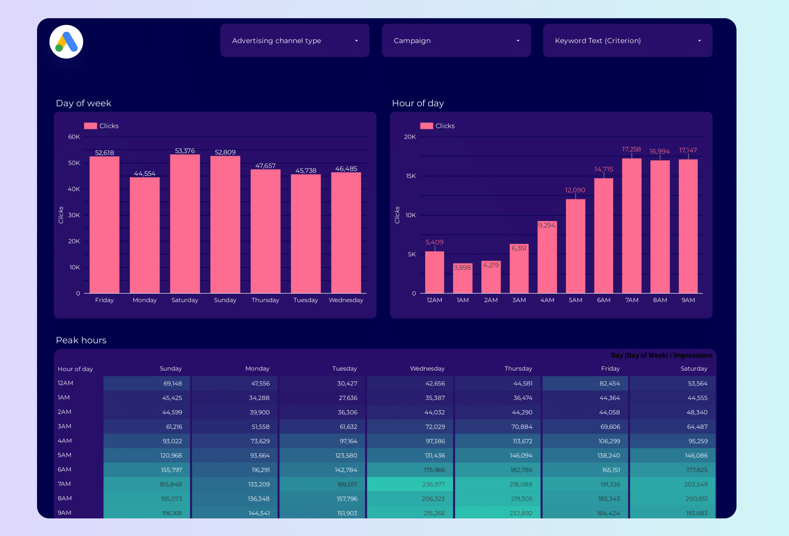
Once you have your metrics, segment or break down the data to gain deeper insights. You can segment the data by various dimensions such as campaign type, device type, day of the week, hour of the day, and more. This segmentation can be done by hour, day, week, month, quarter, or year, allowing you to identify trends and peak performance times.
To enhance the usability of your report, add filters or interactive buttons. These features enable users to filter the data by date range, user demographics, or other relevant criteria, making the report more dynamic and tailored to specific needs.
Finally, share your dashboard with relevant stakeholders. You can do this by exporting the report as a PDF, scheduling regular email updates, or providing direct links to the dashboard. This ensures that all stakeholders have access to the insights they need to make informed decisions.
A Google Ads Peak Hours Dashboard is a visual tool that tracks and analyzes the performance of Google Ads during specific times when ads receive the most engagement, such as clicks and conversions. It helps identify peak performance times by segmenting data by hour, day, and other dimensions. The dashboard includes key metrics like Conversion Rate, Cost Per Conversion, and Click-Through Rate (CTR), and can be customized with filters and interactive features for better insights and decision-making.
Can I download this template in PDF?
 Impressions
 Ad Spend

