A frequency report should include metrics categorized by visibility, engagement, and conversion. The data should be segmented by campaign, channel, audience, content, objective, and date. For visibility, examples can be impressions and reach, engagement may include likes, comments, and shares, while conversions can be measured by click-through rates and conversion rates.
To analyze the frequency data, we can include the following metrics: 1) Visibility – number of impressions, reach, and frequency distribution. 2) Engagement – click-through rate, likes, comments, and shares per impression. 3) Conversion – conversion rate, cost per acquisition, and return on ad spend. Adding context, we can compare these metrics against previous campaigns, specific date ranges, established goals, industry rates, and benchmarks. Segmenting the data by campaign, channel (e.g., social media platforms), audience demographics, content type, campaign objective, and date of each campaign. For instance, we can analyze the frequency distribution for a specific Facebook campaign targeting young adults in April, comparing it with the industry average for similar campaigns.
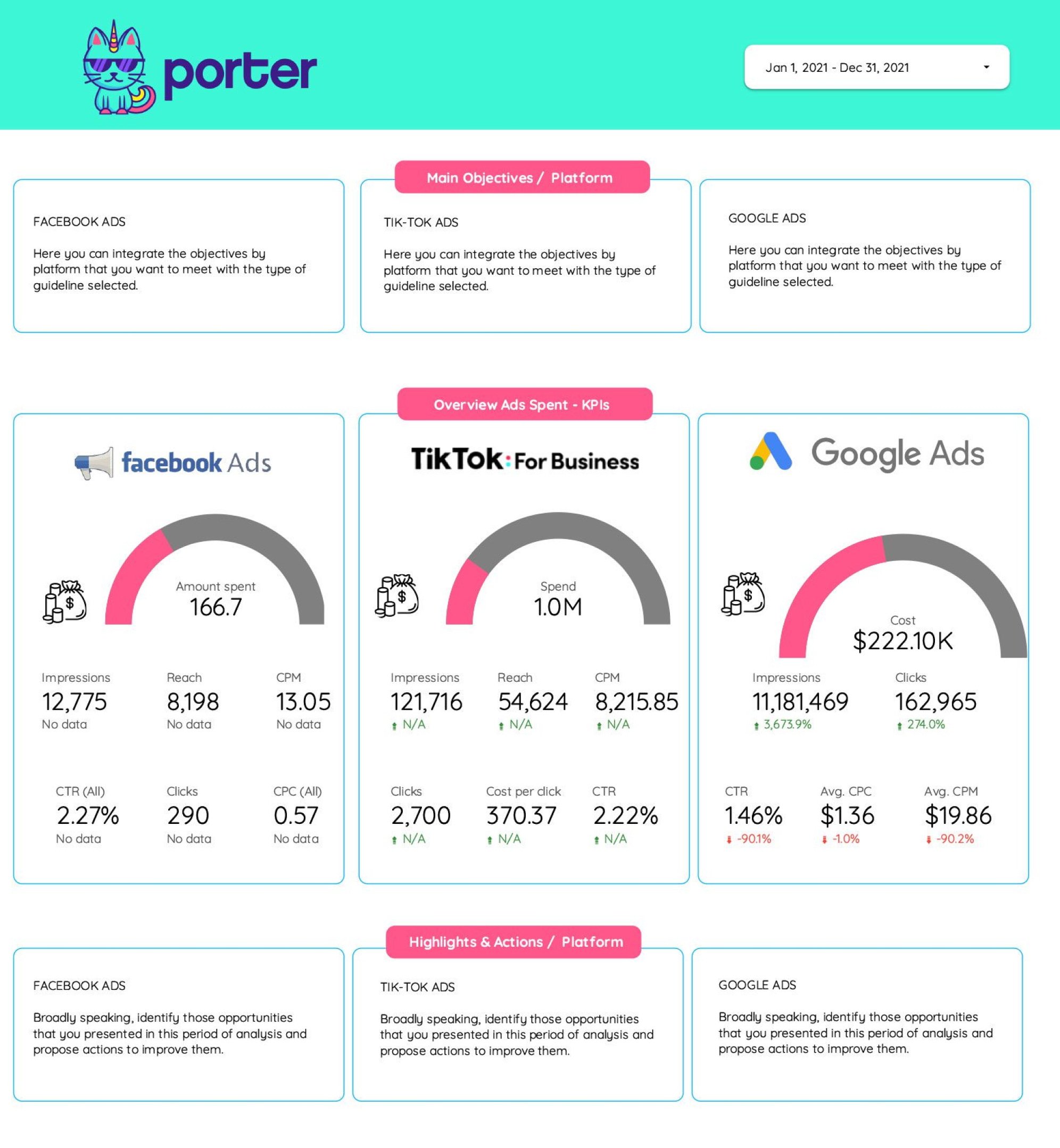
To build a frequency dashboard, 1) connect your data and accounts such as Google Analytics, Facebook Ads, or Mailchimp. 2) Select the metrics to monitor performance, for example, impressions, reach, and frequency. 3) Segment or break down data by campaign, channel, audience, product, customer content, objective, date to understand the frequency of user engagement. 4) Add filters or buttons to make your report interactive, like filtering by date range or specific campaigns. 5) Share your dashboard via PDF, scheduled emails, or links for easy access and review.
A Frequency Dashboard is a visual representation tool that tracks, analyzes, and displays key performance indicators, metrics, and key data points to monitor the health of a business, department, or specific process. It is significant for businesses as it provides a quick overview of business performance and aids in making informed decisions. Tools commonly used to create such a dashboard include Looker Studio, Tableau, and Power BI, and key elements typically included are data graphs, charts, and metrics. Real-time data monitoring is crucial as it allows businesses to respond quickly to any changes in metrics. For learning how to create a marketing dashboard using Looker Studio, visit our YouTube channel: https://www.youtube.com/@porter.metrics.
Can I download this template in PDF?


 Impressions
 Reach
Reach Video Views
 Engagements
 Bounce Rate