A CRM report should include visibility metrics such as impressions, reach, and website visits. Engagement metrics like click-through rates, time spent on page, and social media interactions are also important. Conversion metrics such as lead generation, sales, and customer retention should be included. The report should further segment the data by campaign (e.g., Black Friday sale), channel (e.g., email marketing), audience (e.g., current customers), content (e.g., blog posts), objective (e.g., brand awareness), and date (e.g., monthly). For example, a CRM report could showcase the impressions and click-through rates of an email campaign targeting inactive subscribers for the month of February 2021.
To analyze CRM data, begin by choosing metrics such as visibility (e.g., number of impressions, reach), engagement (e.g., click-through rate, time spent on page), and conversion (e.g., lead-to-customer conversion rate, revenue generated). Break down these metrics in terms of campaign (e.g., email campaign, social media campaign), channel (e.g., website, mobile app), audience (e.g., new customers, repeat customers), content (e.g., blog posts, videos), objective (e.g., brand awareness, lead generation), and date. Add context by comparing data against costs (e.g., cost per impression, cost per lead), date range (e.g., month-over-month performance), goals (e.g., target conversion rate, revenue target), rates (e.g., click-through rate benchmark, industry average conversion rate), and benchmarks (e.g., competitor performance, industry standards). For example, compare the click-through rate of an email campaign targeting new customers to the industry average rate for similar campaigns. Stay concise within the maximum character limit.
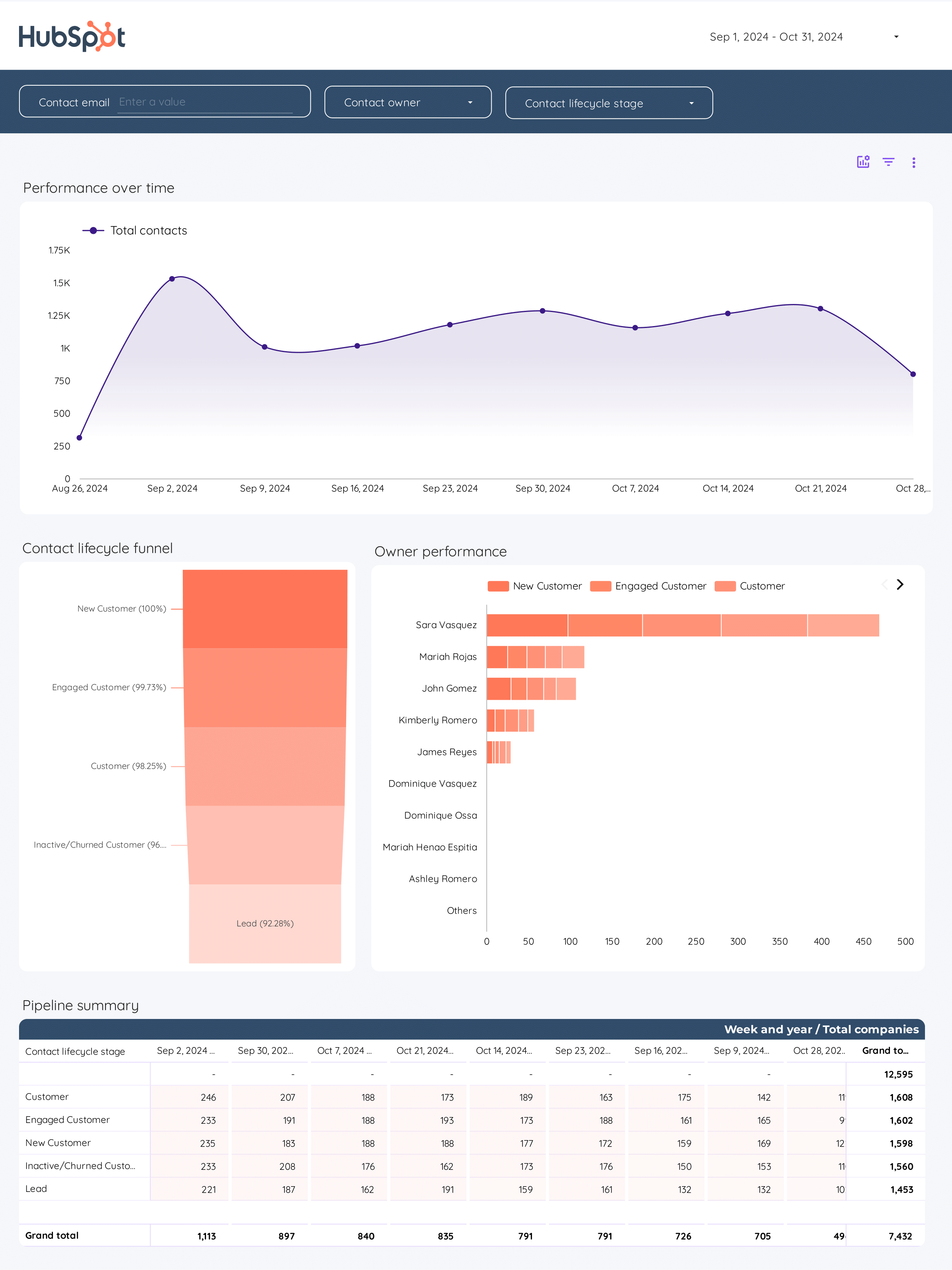
To build a CRM dashboard, 1) connect your CRM data and accounts. 2) Select metrics such as customer acquisition cost, customer lifetime value, and churn rate to monitor performance. 3) Segment or break down data by campaign, channel, audience, product, customer content, objective, and date. For example, you can segment data by the type of product purchased or the marketing campaign that led to the purchase. 4) Add filters or buttons to make your report interactive, such as a filter to view data from a specific time period. 5) Share your dashboard via PDF, scheduled emails, or links.
A CRM dashboard is a centralized platform that displays key metrics and data related to customer relationship management, helping businesses to track performance and make informed decisions. It often includes elements like customer interactions, sales metrics, customer satisfaction scores, and lead conversion rates. Tools like Salesforce, Zoho, and HubSpot are commonly used to create these dashboards. Real-time data monitoring is crucial as it allows businesses to respond promptly to changes and trends. For a detailed guide on creating a marketing dashboard using Looker Studio, visit our YouTube channel: https://www.youtube.com/@porter.metrics.
Can I download this template in PDF?
 Impressions
 Email Opens
 Email Sends
 Campaign Revenue

