


What is a data analytics dashboard?
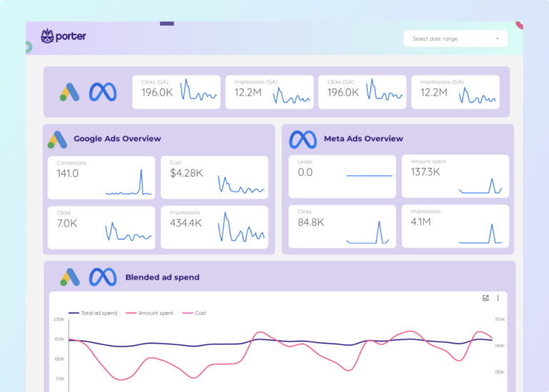
A data analytics dashboard is a visual interface that consolidates data from multiple sources—such as Google Analytics, CRM systems, ad platforms, and databases—to track and display key performance indicators (KPIs) in real time. It enables analysts, marketers, and executives to monitor campaign performance, data quality, and business metrics at a glance.
Data analytics dashboards are typically built using tools like Google Data Studio, Google Sheets, or Power BI. With Porter Metrics, you can connect 80+ data sources and build your analytics dashboard in minutes—no coding required.
According to Google’s Data Studio documentation, dashboards that combine multiple data sources into a single view help teams reduce reporting time by up to 80% compared to manual spreadsheet-based reporting.
Why use a data analytics dashboard?
Data analytics dashboards help teams make faster, better decisions by turning raw data into actionable insights. Here are the key benefits:
Save time on reporting
Instead of pulling data manually from multiple platforms, a dashboard automatically connects to your sources and updates in real time. Marketing teams using Porter Metrics templates typically reduce their reporting time from hours to minutes each week.
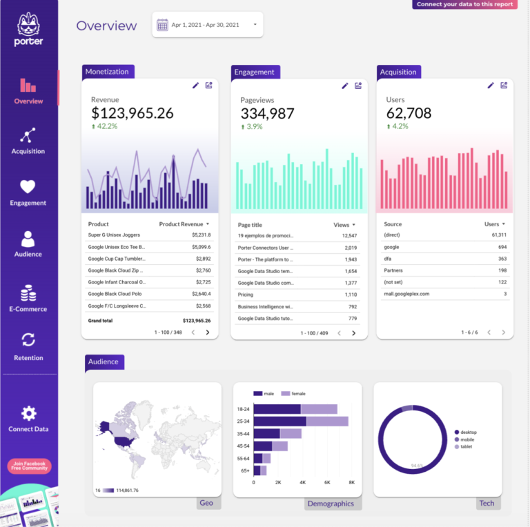
Get a single source of truth
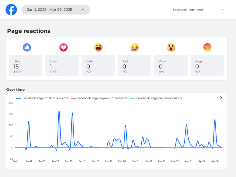
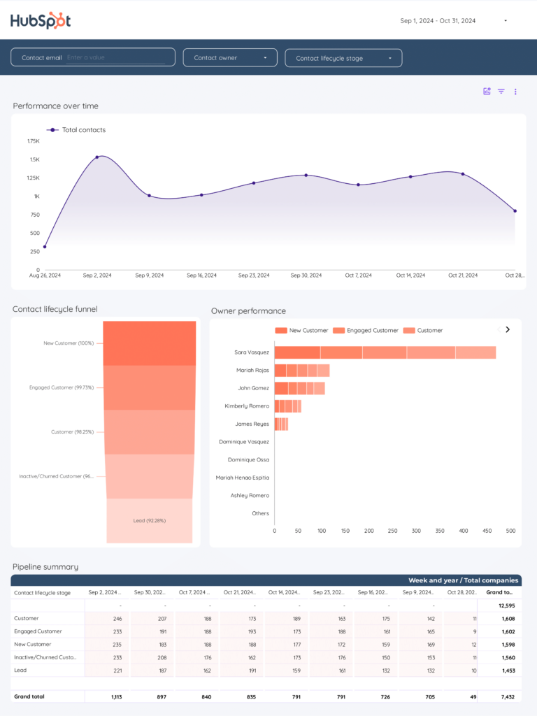
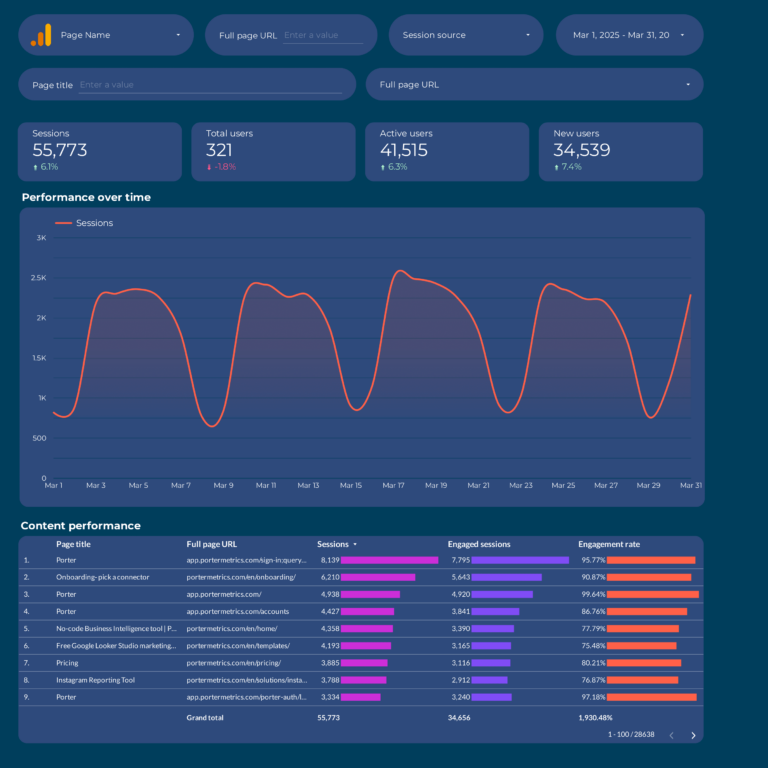
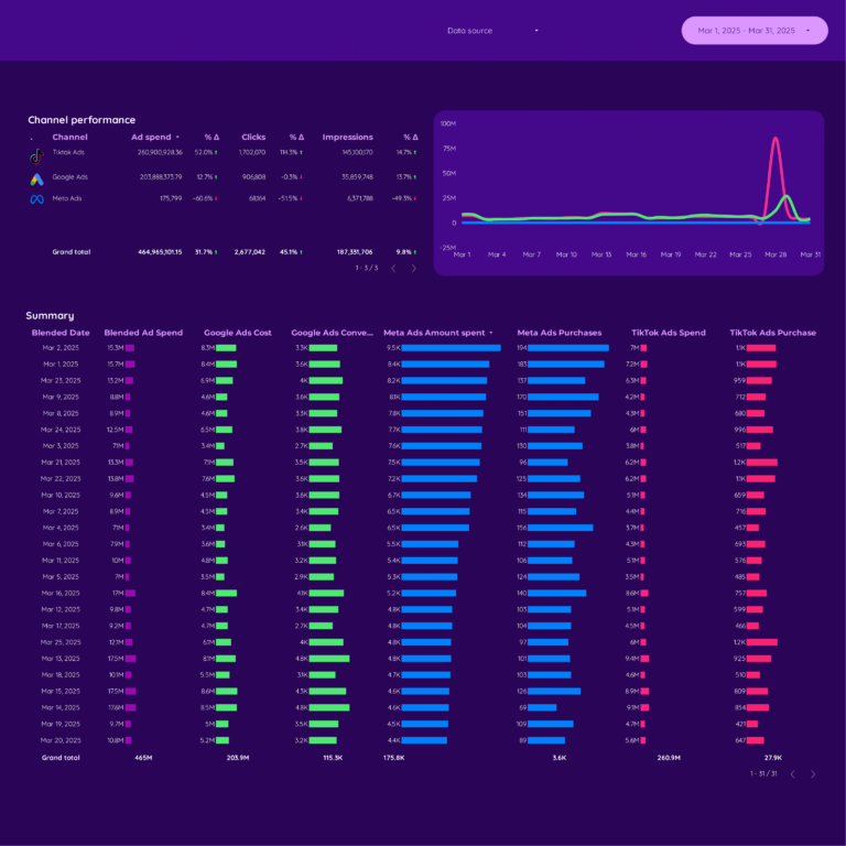
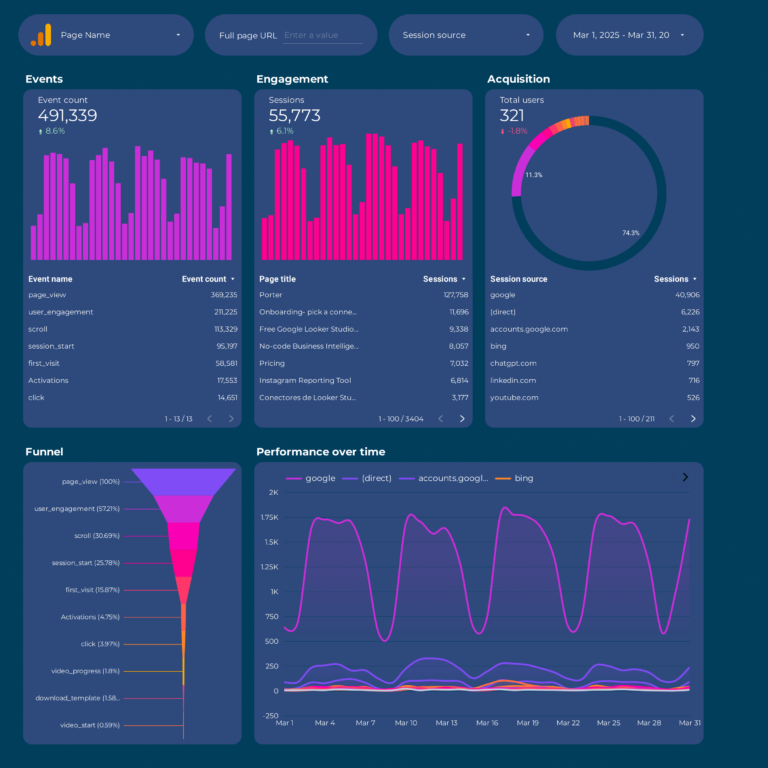
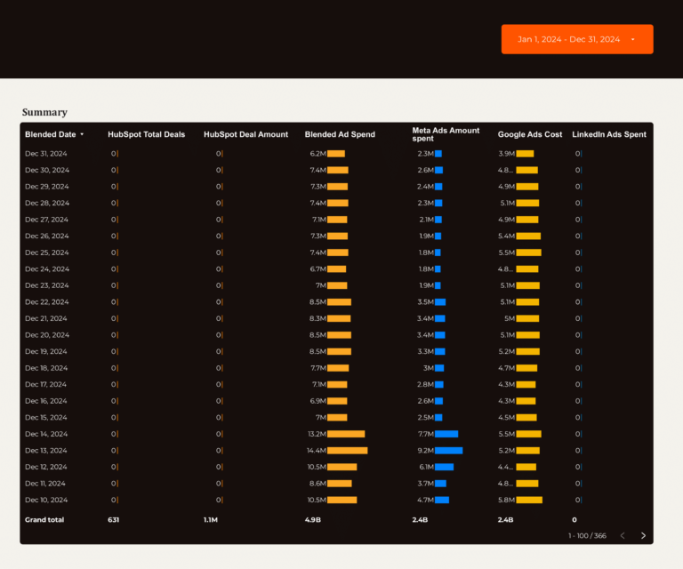
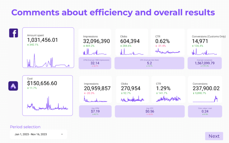
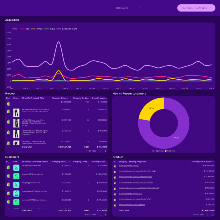
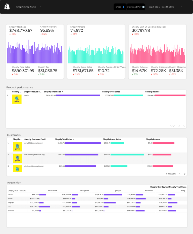
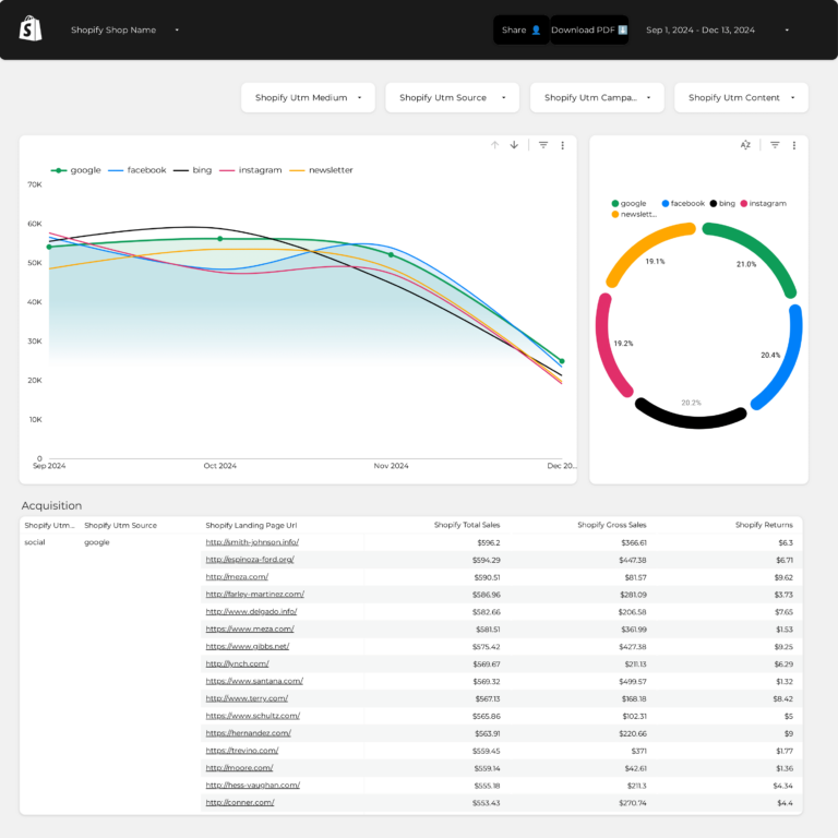
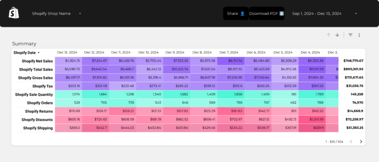
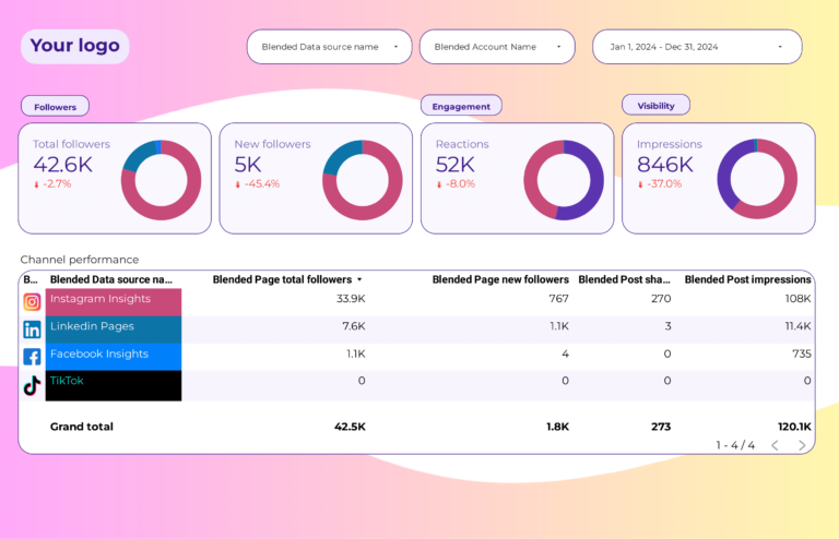
Dashboards consolidate data from Google Ads, Facebook Ads, GA4, CRM systems, and more into one view. This eliminates discrepancies between platforms and ensures everyone on your team is looking at the same numbers.
Make data-driven decisions
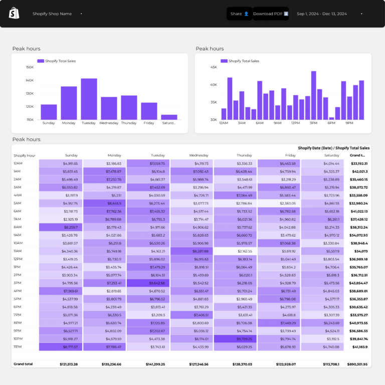
With real-time KPIs visible at a glance, your team can spot trends, identify underperforming campaigns, and reallocate budget faster. Dashboards help move from reactive to proactive decision-making.
Improve client communication
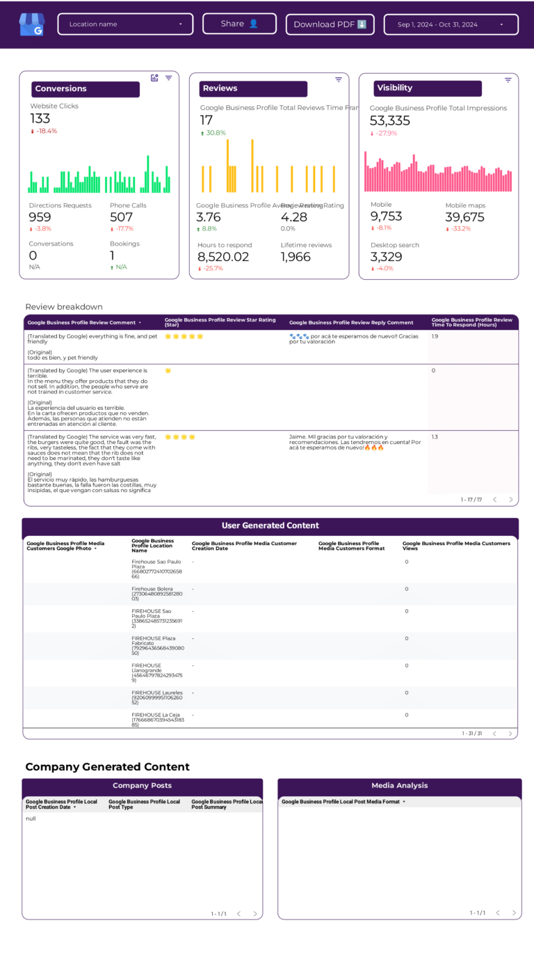
For agencies, white-label analytics dashboards make client reporting professional and consistent. You can schedule automated reports via email, share live dashboard links, or export to PDF—all with your agency’s branding.
Scale your reporting process
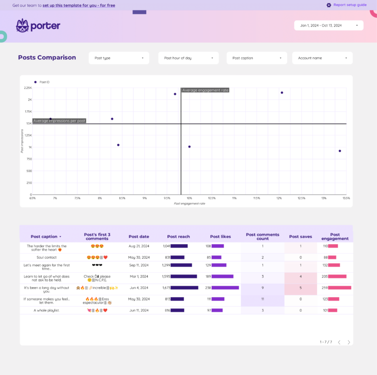
Once you build a dashboard template, you can replicate it for multiple clients or business units. This is especially valuable for agencies managing 10, 50, or 100+ client accounts. Browse our full template gallery to find the right starting point.
What to include in a data analytics dashboard
An effective data analytics dashboard balances context and specificity based on the audience—executives, managers, or analysts—and their use cases.
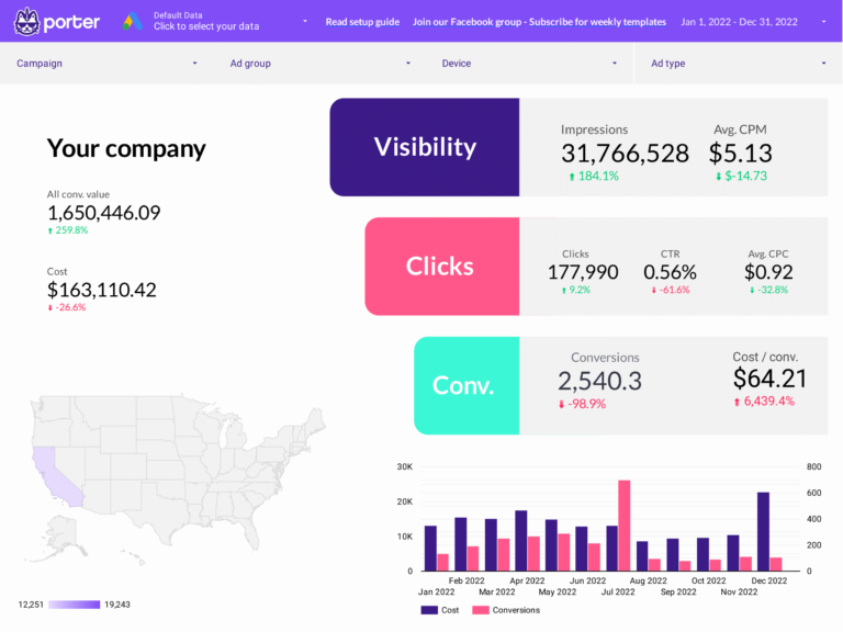
Executive analytics dashboards
Executive dashboards for CIOs, CTOs, and stakeholders show data’s impact on business decisions. Reviewed weekly, monthly, or quarterly, they include:
- Data quality analysis: accuracy by source, validation checks, and error tracking
- Data processing efficiency: processing time, resource utilization, and throughput
- Trend analysis: patterns and anomalies in data over time
- Additional context to translate metrics for non-technical audiences, presented in slide decks and Data Studio reports
Data manager dashboards
Manager dashboards have cross-department views with drill-downs by team, project, data source, and process stage. They help align teams and define strategies:
- Cross-department reporting: overall data quality and processing efficiency across departments
- Goal tracking: compare current performance vs objectives
- Audit views for prioritization and spotting issues
- Data source analysis for integration and optimization
Operational data analytics dashboards
Operational dashboards for analysts and data engineers have granular, customizable KPIs. Monitored hourly, daily, or weekly, they cover:
- Data ingestion: data flow, latency, and error rates
- Data transformation: processing time, accuracy, and efficiency
- Data storage: capacity, usage, and retrieval times
- Dashboard performance: user engagement and feedback
How to build a data analytics dashboard
To build a data analytics dashboard, connect your data sources, choose a template, select your metrics and dimensions, pick the right charts, customize the design, and share it with your team. Here is the step-by-step process:
1. Connect your data sources
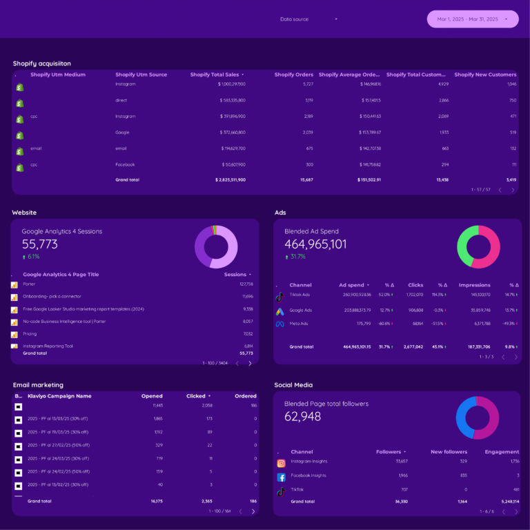
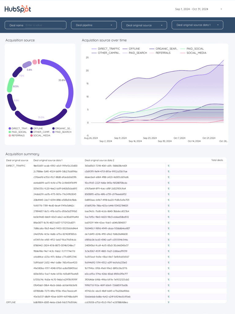
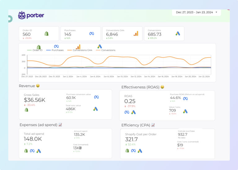
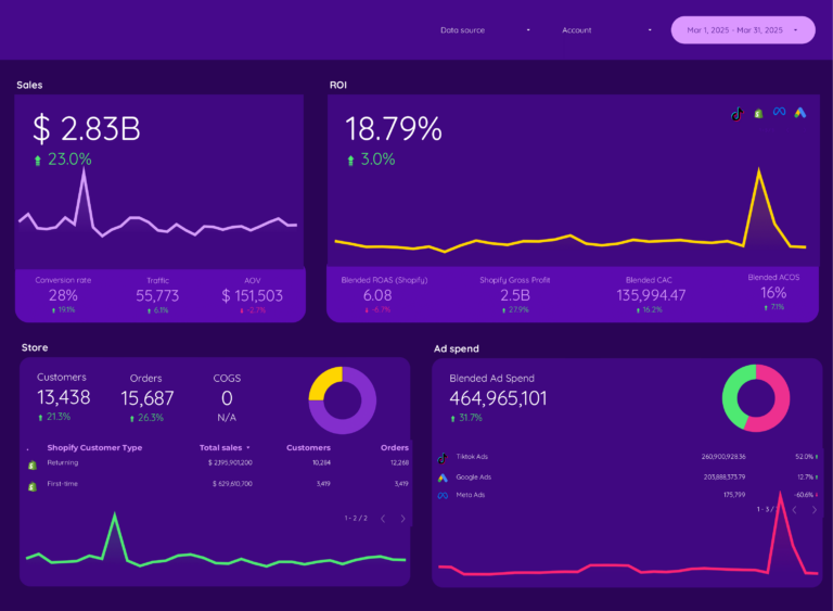
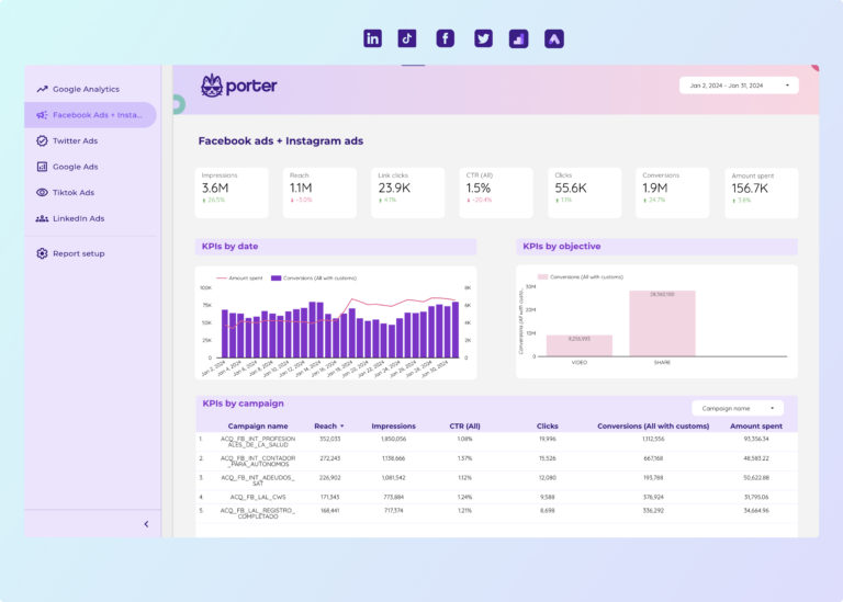
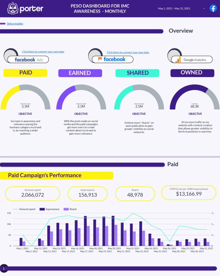
Define and connect the data sources for your dashboard. Common sources include Google Analytics 4, Facebook Ads, Google Ads, CRM systems, and databases. Go to portermetrics.com and choose the data sources to connect.
You can follow our step-by-step tutorials to get started:

Connect Meta Ads and Google Ads to Data Studio
Porter Metrics
Connect Google Analytics 4 to Data Studio (2026)
Porter Metrics2. Choose a dashboard template
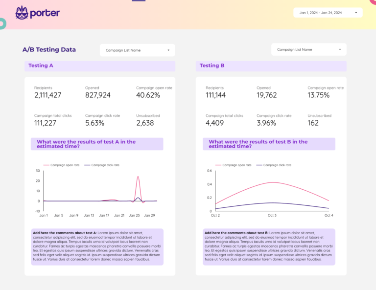
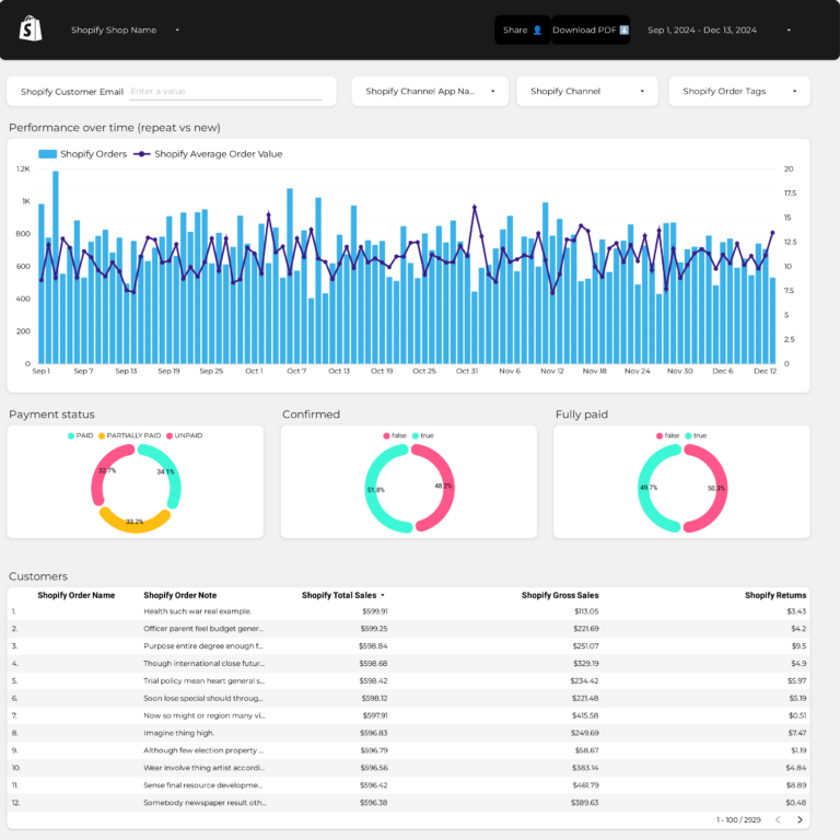
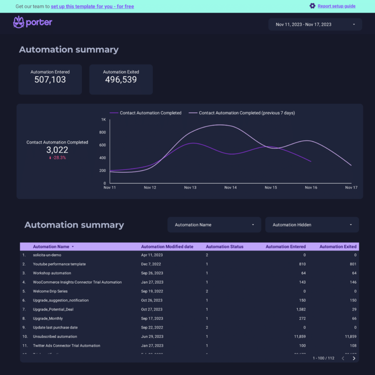
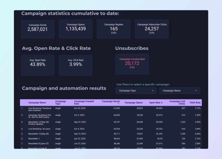
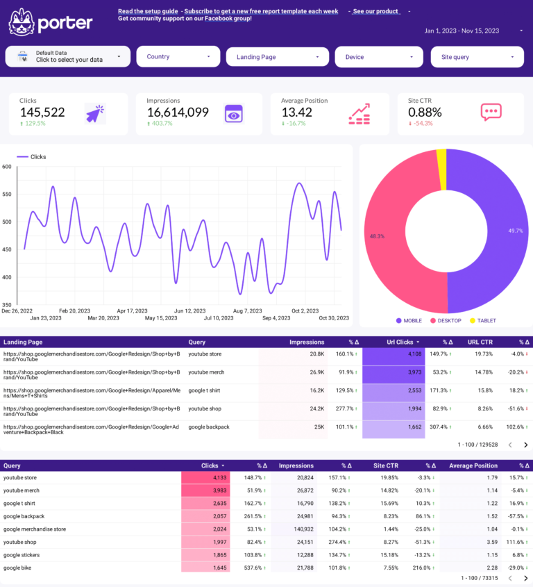
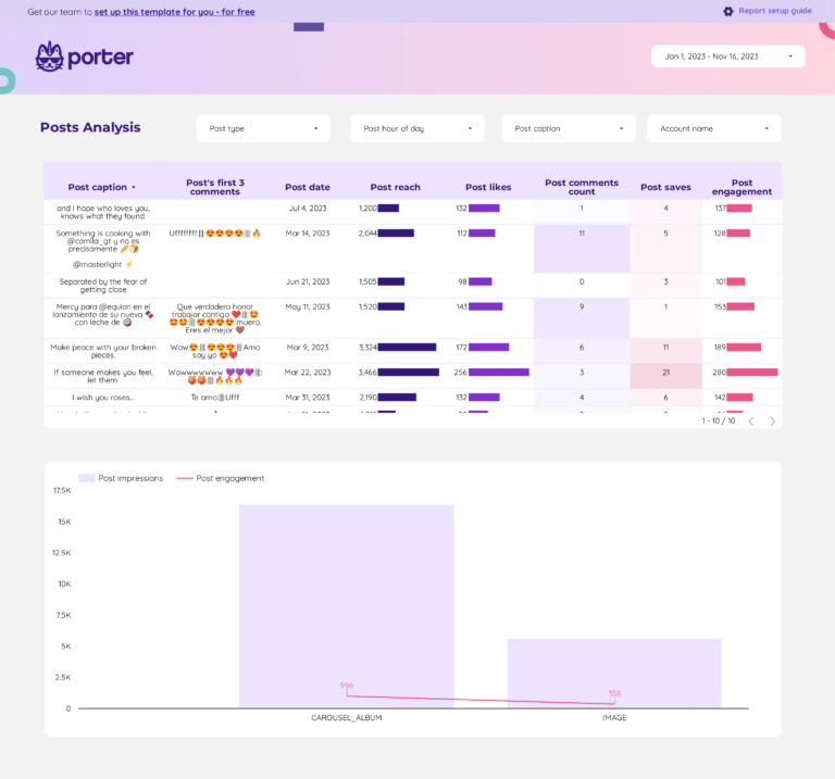
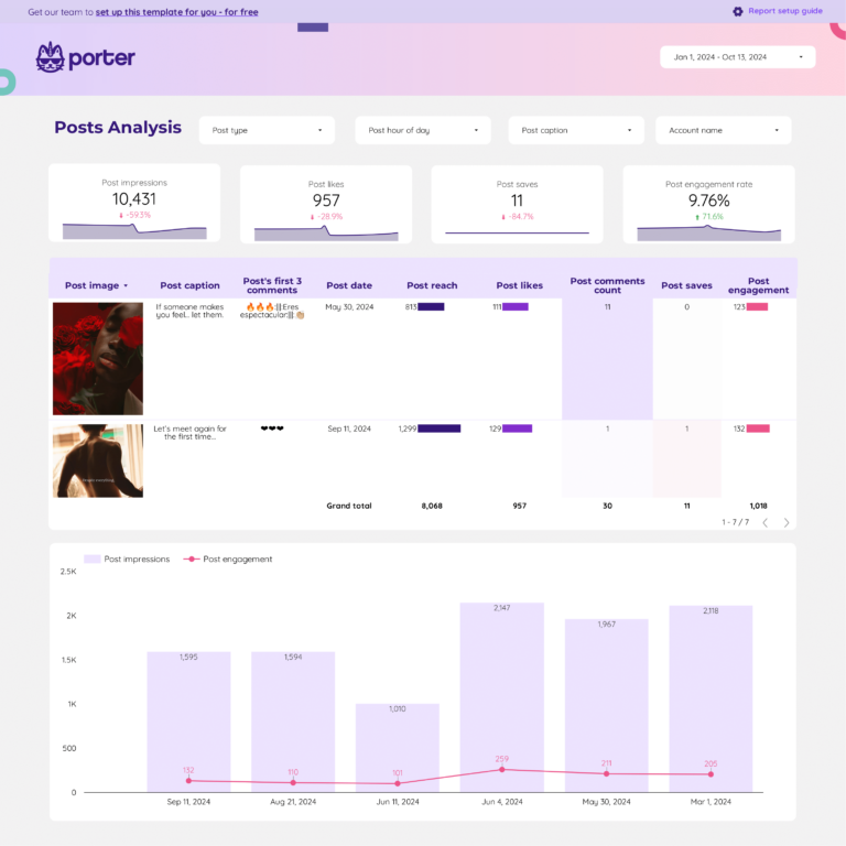
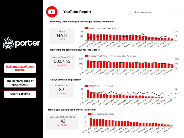
Choose from dozens of data analytics dashboard templates in Data Studio or Google Sheets, designed for use cases like PPC analysis, SEO tracking, and social media reporting.
Learn to copy Data Studio templates.
3. Select metrics, dimensions, and charts
Once your template is downloaded, modify it or create a blank page:
- Select the data source and connected account
- Choose metrics (e.g., clicks, impressions, conversions, ROAS, revenue)
- Choose breakdowns to segment your data (by date, campaign, channel, etc.)
Learn how to customize your data with these tutorials:
- Calculated fields — create custom metrics
- Charts — choose the right visualization
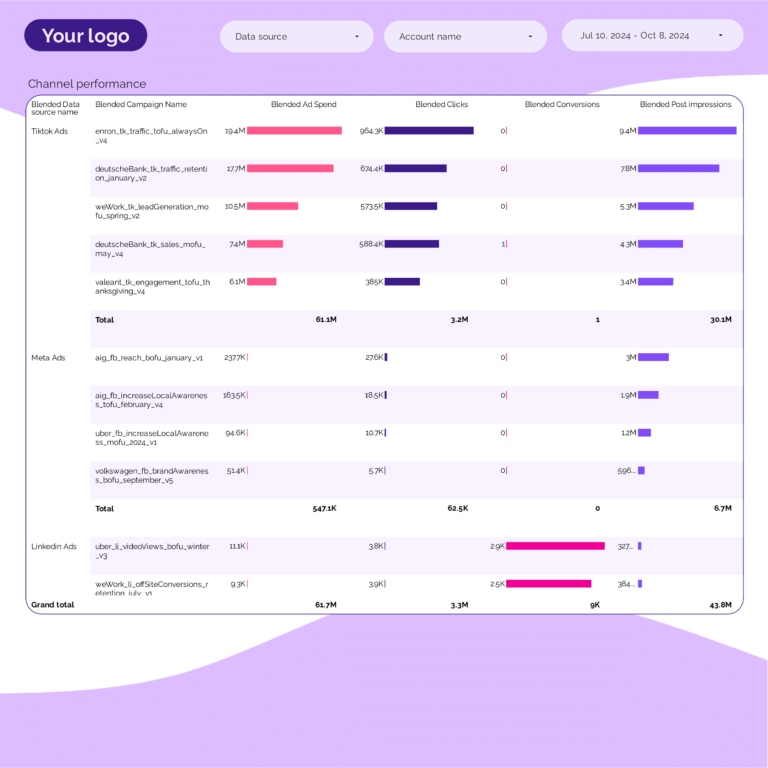
- Data blending — combine multiple data sources
- Grouping and tagging — organize campaigns with regex
4. Design your analytics dashboard
Make your data analytics dashboard white-label by adding logos, colors, fonts, and styling to match your brand. Follow our tutorial on how to design dashboards on Data Studio:

5. Share your dashboard
Share your data analytics dashboard via link, PDF, scheduled email, or embed it on your website. Control permissions for view-only or edit access. Learn how in our tutorial: How to share Data Studio reports.
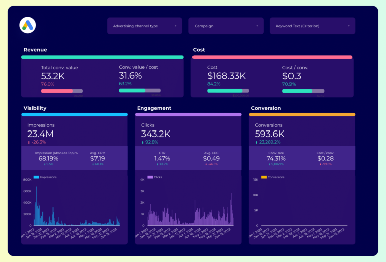
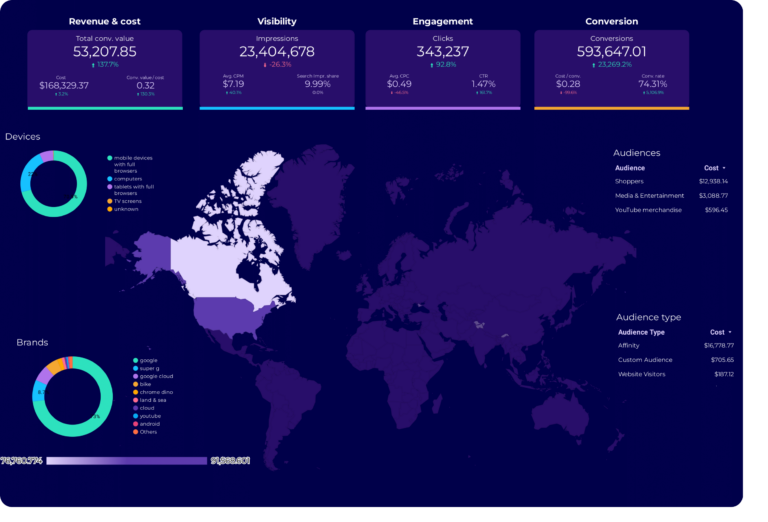
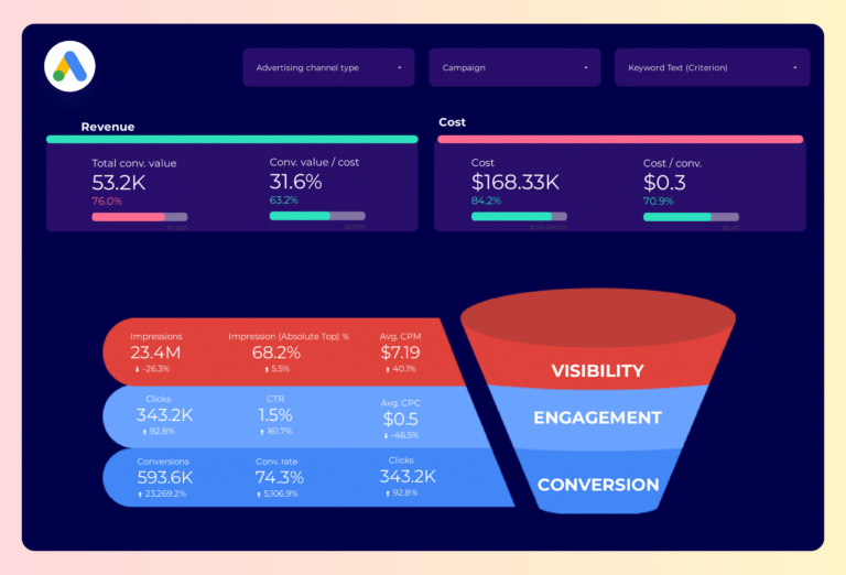
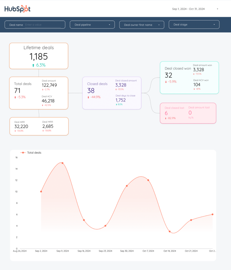
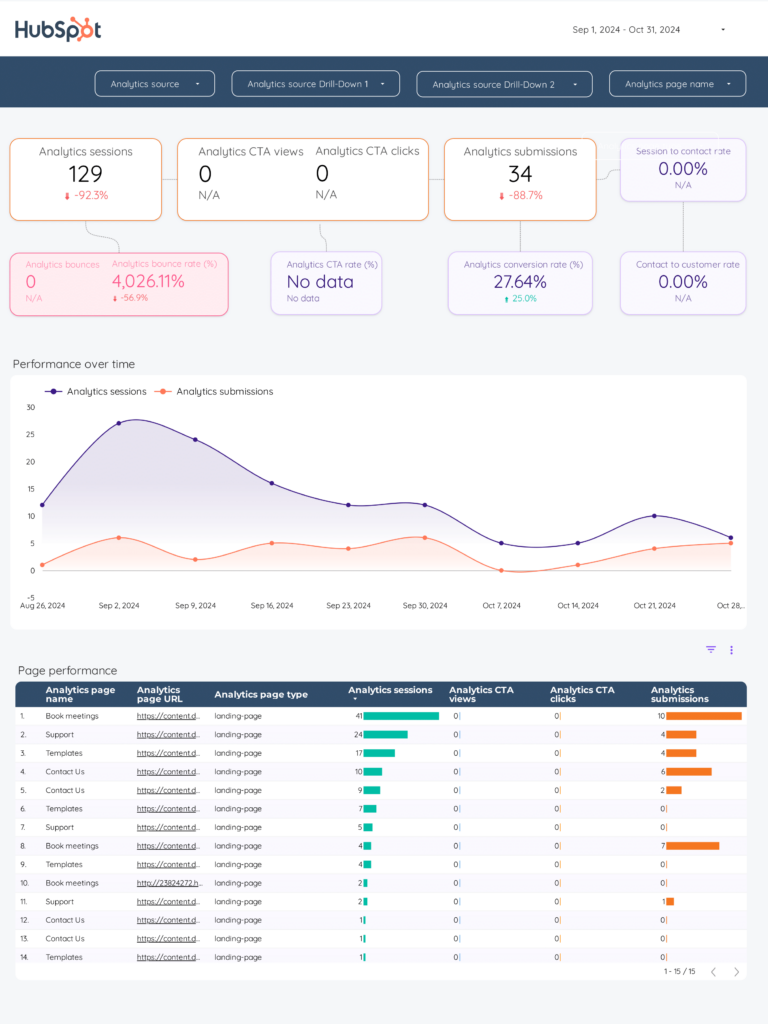
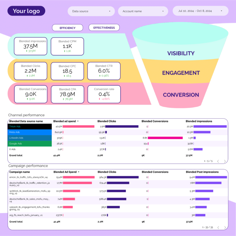
Key metrics and KPIs for a data analytics dashboard
Data analytics dashboards should include a balanced mix of quality, efficiency, and effectiveness metrics aligned with your business goals.
Data quality KPIs
- Accuracy metrics: error rates, validation checks, data consistency
- Completeness metrics: missing values, data coverage, data freshness
- Timeliness metrics: data latency, processing time, update frequency
Performance and efficiency KPIs
- Processing time: average processing time per dataset
- Resource utilization: CPU, memory, and storage usage
- Cost efficiency: operational expenses vs output
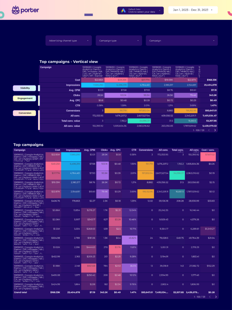
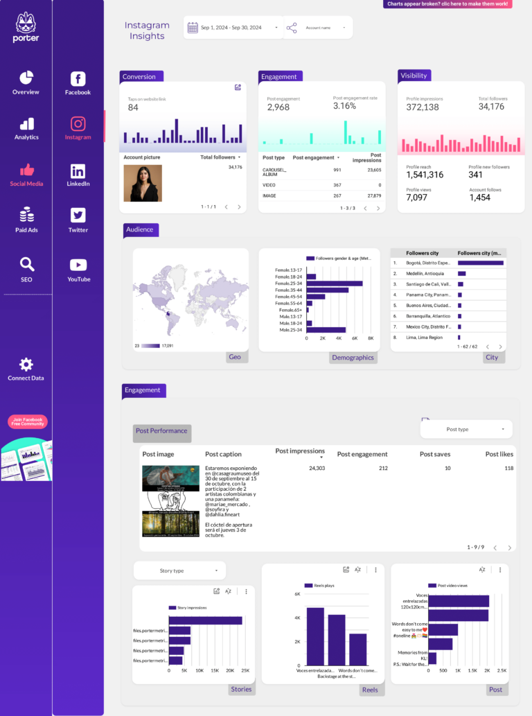
Marketing analytics KPIs
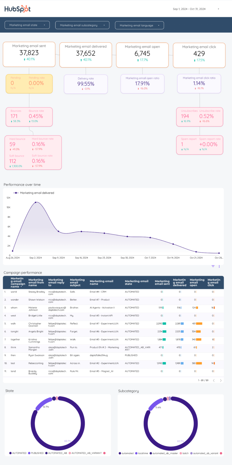
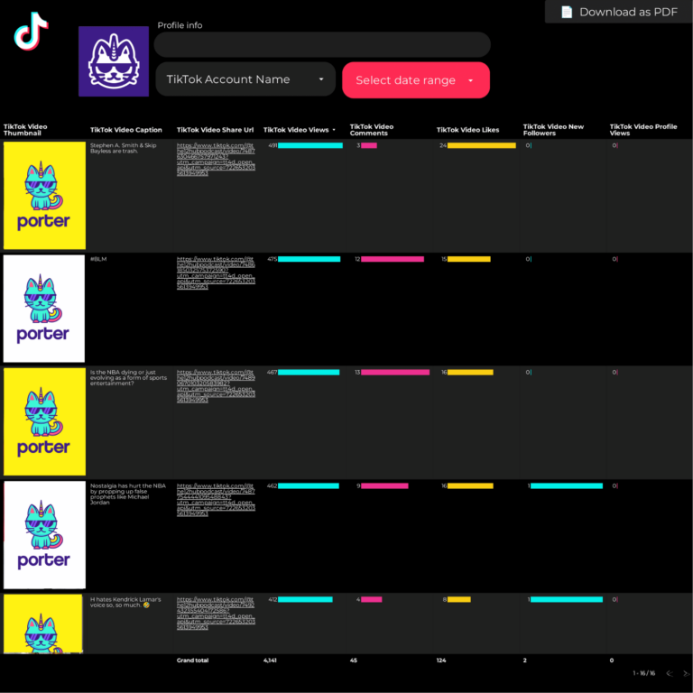
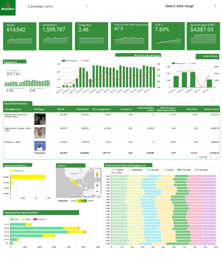
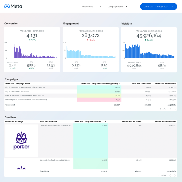
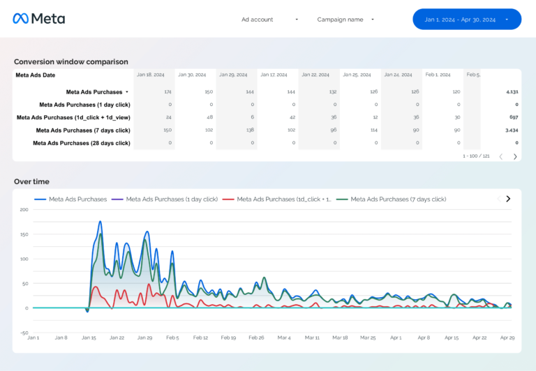
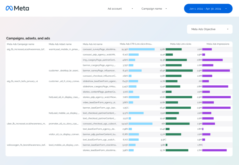
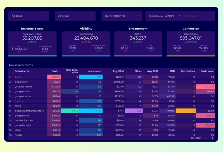
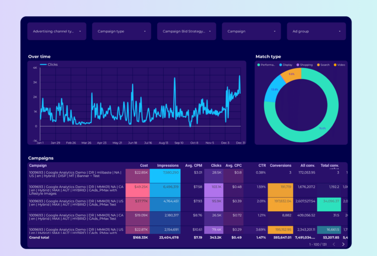
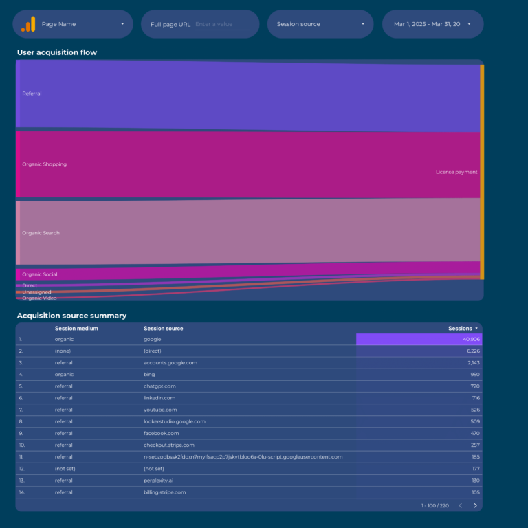
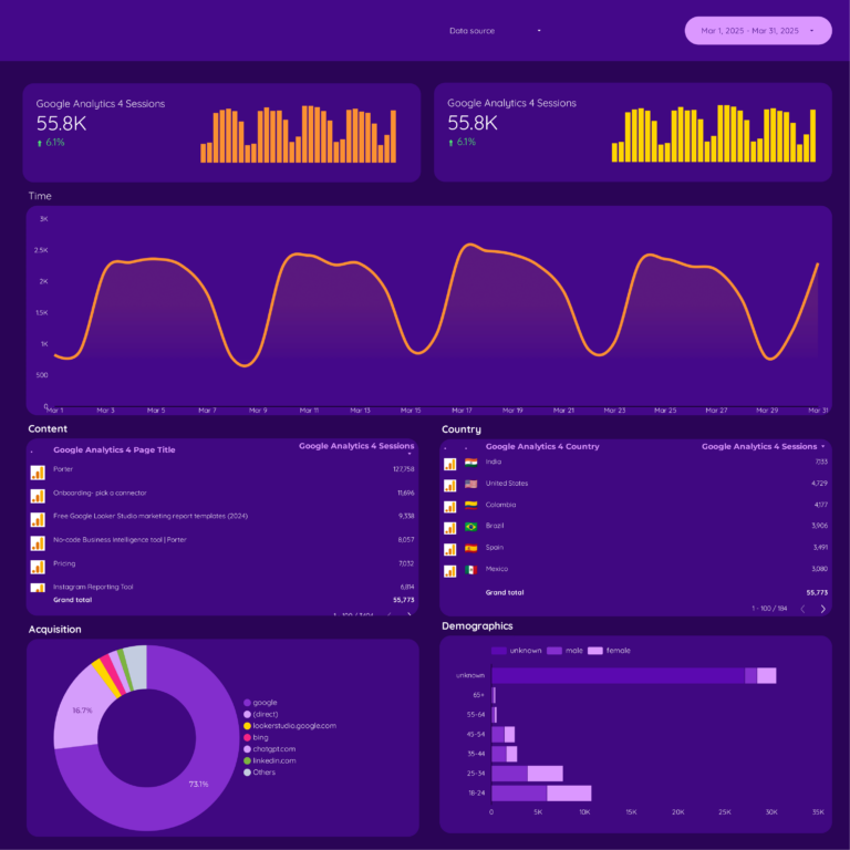
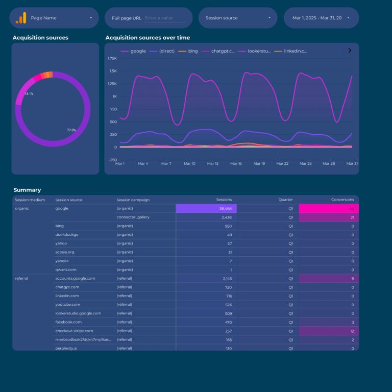
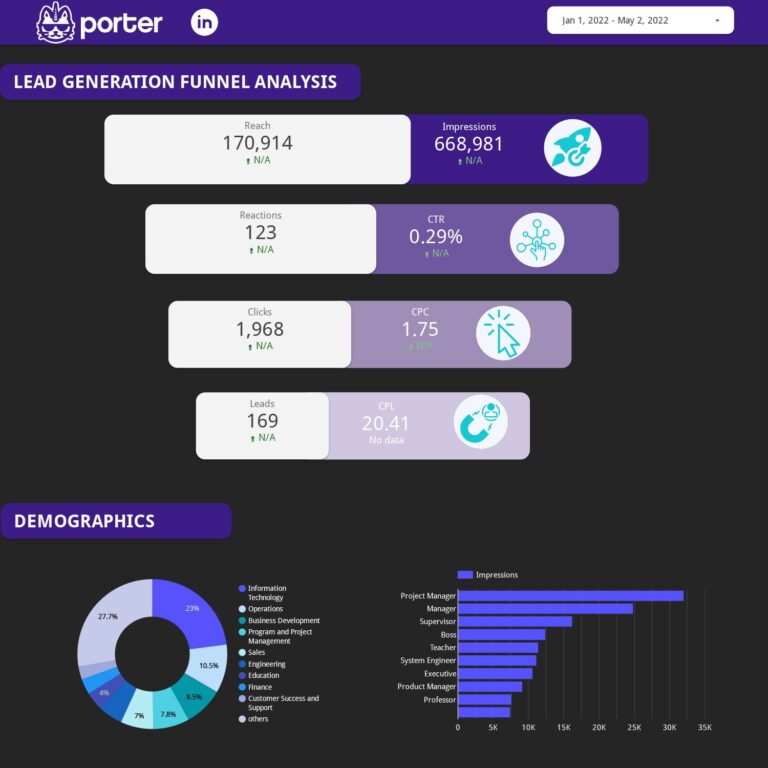
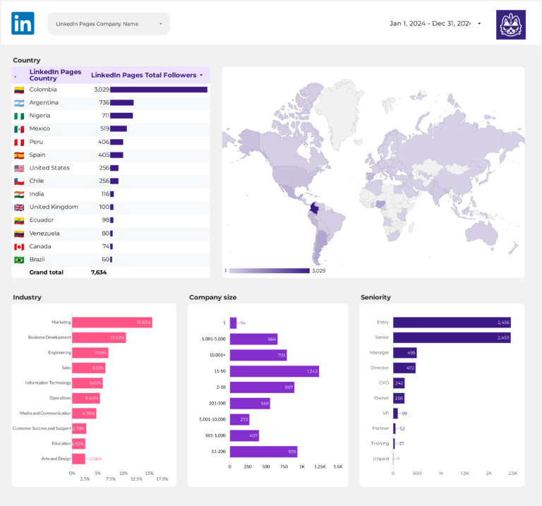
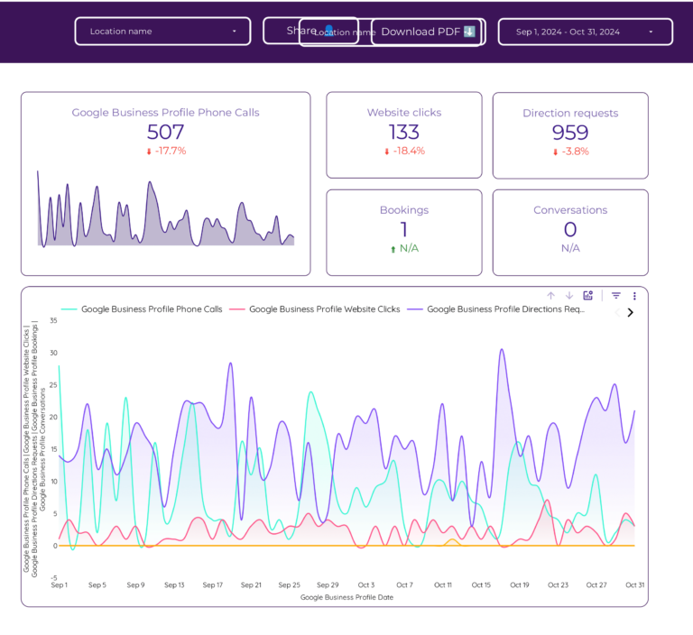
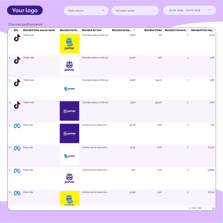
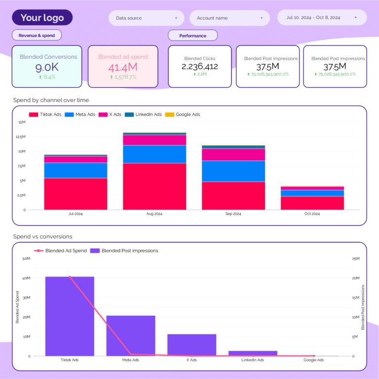
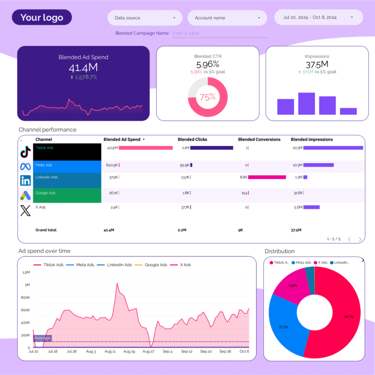
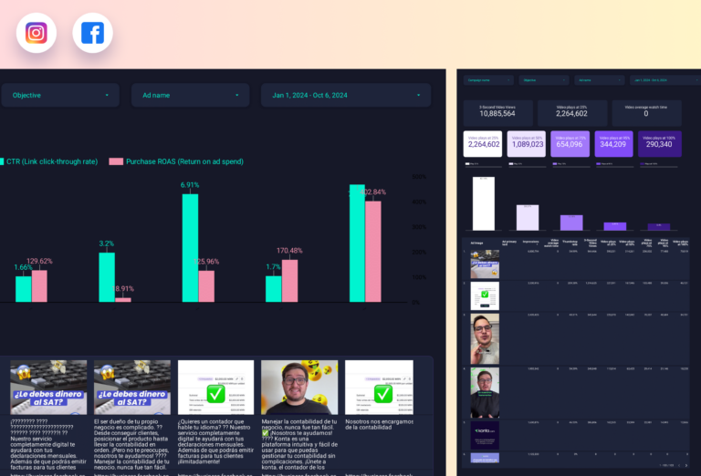
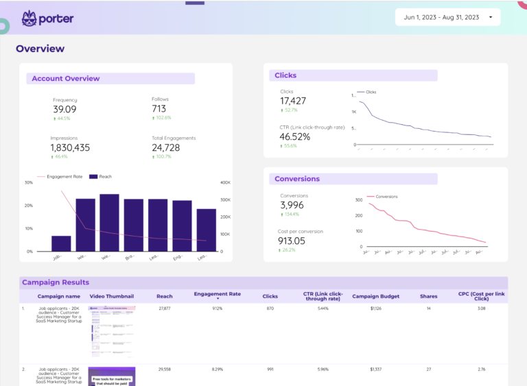
- Campaign performance: ROAS, CPA, CTR, conversion rate
- Channel attribution: performance by channel and touchpoint
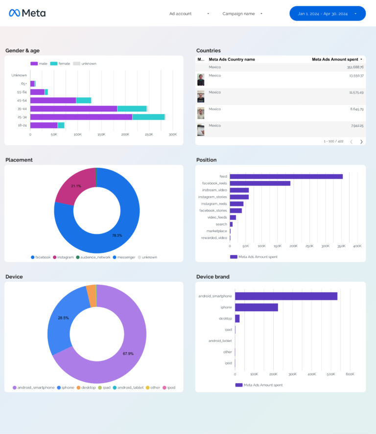
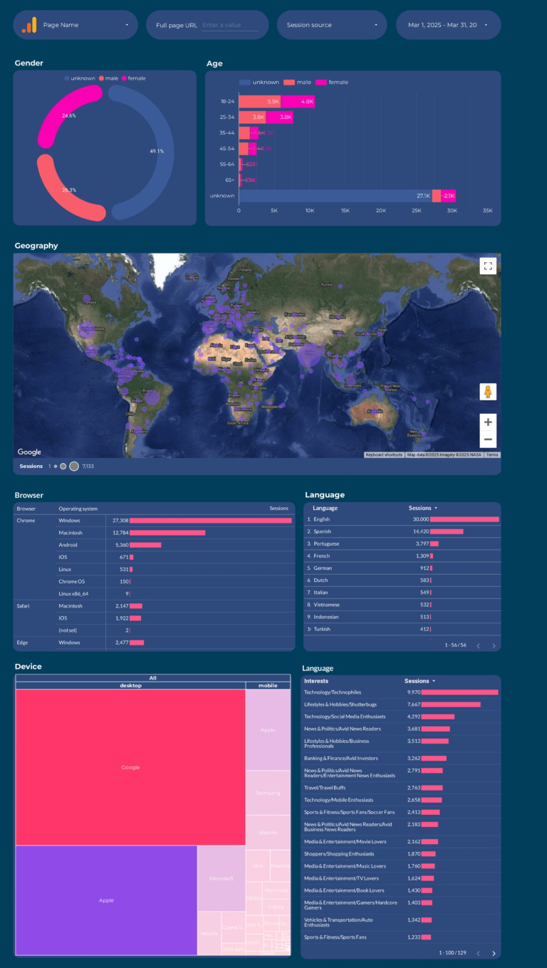
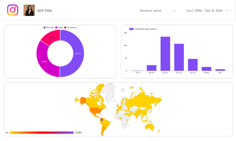
- Audience insights: demographics, behavior, engagement
Segment these KPIs by:
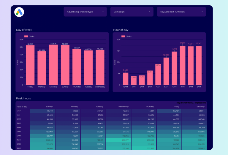
- Data source: Google Ads, Facebook Ads, GA4, CRM
- Time period: hourly, daily, weekly, monthly
- Business dimension: department, project, region, client