
The best free marketing funnel dashboard templates in 2026 visualize your customer journey from first touch to conversion — tracking drop-offs, conversion rates, and revenue attribution at every stage in Data Studio (formerly Looker Studio).
Built and tested by Porter Metrics, used by +10,000 marketing teams worldwide.
Quick answer — 8 Best Free Marketing Funnel Dashboard Templates in 2026
- Google Ads Funnel — Google Ads click-to-conversion funnel
- Facebook Ads Funnel — Meta Ads awareness-to-conversion funnel
- PPC Funnel — Multi-channel paid media funnel
- B2B Funnel — B2B lead-to-customer pipeline
- E-commerce — Shopping funnel: visit to purchase
- Acquisition — Traffic acquisition channel analysis
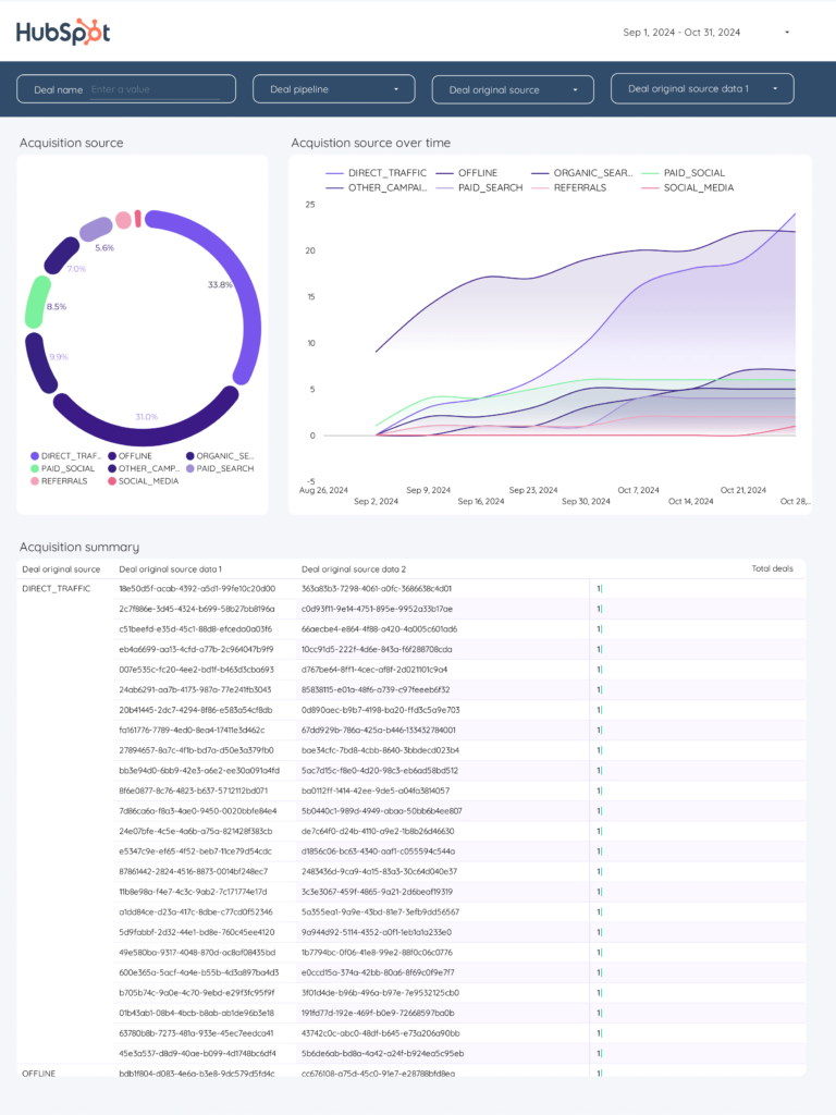
- HubSpot CRM — Deal pipeline and sales funnel
- Demand Generation — Demand gen pipeline tracking
Marketing Funnel Dashboard Template
General marketing funnel combining all channels: total reach (how many people entered the funnel), total engagement (how many interacted), total conversions (how many took action). Not channel-specific — use it as the executive overview that shows whether your overall marketing machine is healthy before drilling into channel-specific funnels.
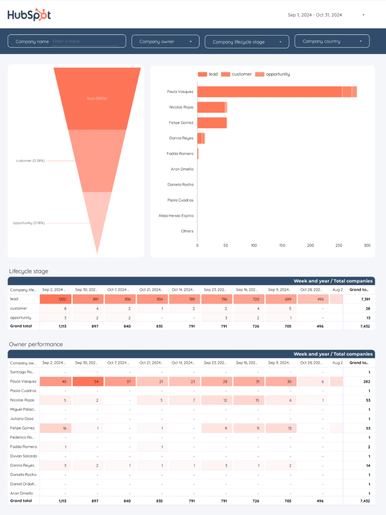
CRM Funnel Dashboard Template 
CRM pipeline visualization: new contacts → qualified → proposal → negotiation → closed. Shows conversion rate and average deal value at each stage. When pipeline value drops between stages, this template tells you exactly which stage leaks the most revenue — so you know whether to fix your pitch, your pricing, or your qualification criteria.
Quick Comparison
| Template | Best For | Setup |
|---|---|---|
| Google Ads click-to-conversion funnel | 2 min | |
 Facebook Ads Funnel Popular Facebook Ads Funnel Popular | Meta Ads awareness-to-conversion funnel | 2 min |
| Multi-channel paid media funnel | 2 min | |
| B2B Funnel | B2B lead-to-customer pipeline | 2 min |
 E-commerce E-commerce | Shopping funnel: visit to purchase | 2 min |
 Acquisition Acquisition | Traffic acquisition channel analysis | 2 min |
| HubSpot CRM | Deal pipeline and sales funnel | 2 min |
| Demand Generation | Demand gen pipeline tracking | 2 min |
The 10 Best Templates
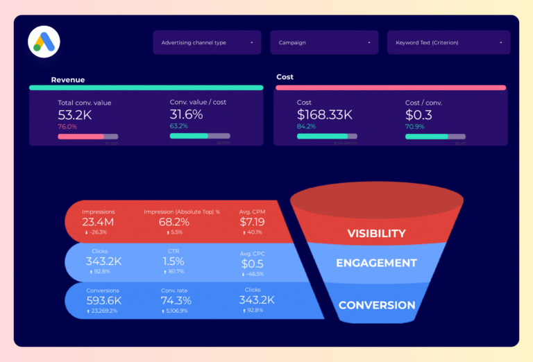
Google Ads Funnel Dashboard Template 
PopularMaps the full Google Ads journey: how many people saw your ad (impressions), how many clicked (CTR, CPC), how many converted (conversion rate, CPA), and how much revenue each step produced (ROAS). The drop-off between steps tells you where to optimize — landing page, offer, or targeting.
Key metrics visualized
- Visibility: top-of-funnel traffic, sessions, ad impressions
- Engagement: middle-of-funnel actions, sign-ups, content downloads
- Conversion: bottom-of-funnel conversions, revenue, conversion rate by stage
- Set up period-over-period comparisons to track trends, not just totals
- Segment by audience or campaign to find what drives the best results
- Focus on conversion metrics first — visibility and engagement only matter if they lead to outcomes
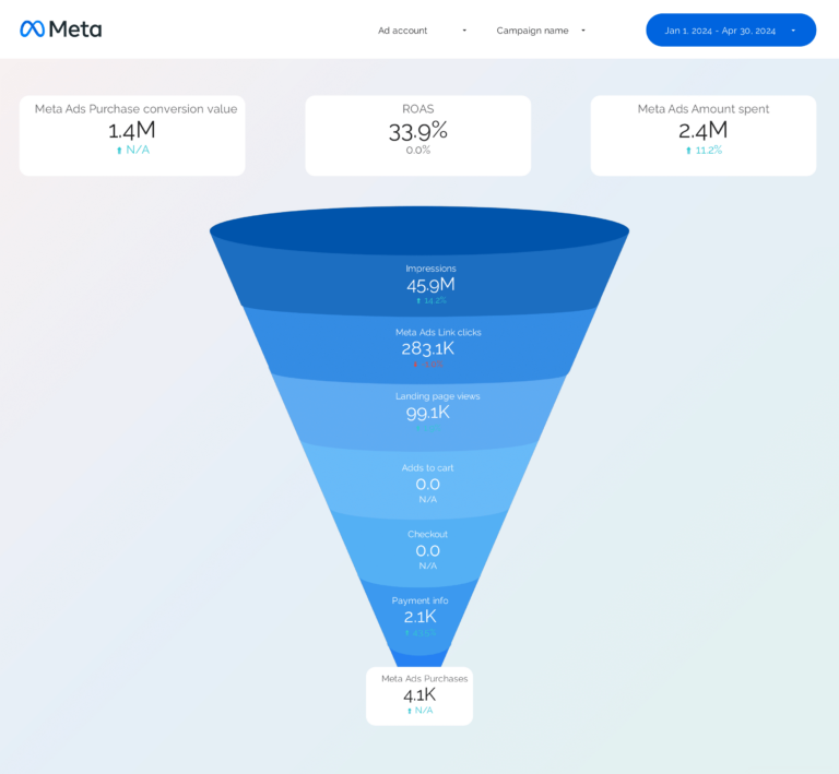
Facebook Ads Funnel Dashboard Template
PopularFollows Meta Ads from first impression to final purchase, split by placement (feed, stories, reels). At each funnel stage, shows both volume (how many) and efficiency (at what cost). A 2% CTR with $8 CPC means something different than 2% CTR with $1.50 CPC — this template surfaces that difference by ad set.
Key metrics visualized
- Visibility: top-of-funnel traffic, sessions, ad impressions
- Engagement: middle-of-funnel actions, sign-ups, content downloads
- Conversion: bottom-of-funnel conversions, revenue, conversion rate by stage
- Set up period-over-period comparisons to track trends, not just totals
- Segment by audience or campaign to find what drives the best results
- Focus on conversion metrics first — visibility and engagement only matter if they lead to outcomes
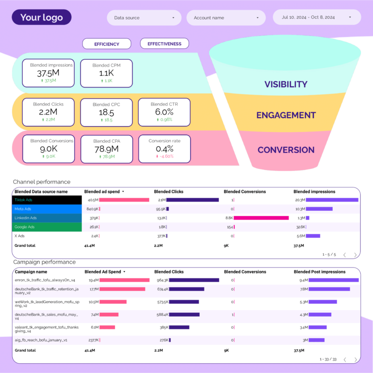
PPC Funnel Dashboard Template
Cross-platform paid funnel: Google Ads and Facebook Ads data in one view. Compares where each platform loses people — Google might convert clicks to leads better, but Meta might generate cheaper clicks. Shows cost-per-step at every stage so you can allocate budget to the platform that’s cheapest where it matters.
Key metrics visualized
- Visibility: top-of-funnel traffic, sessions, ad impressions
- Engagement: middle-of-funnel actions, sign-ups, content downloads
- Conversion: bottom-of-funnel conversions, revenue, conversion rate by stage
- Set up period-over-period comparisons to track trends, not just totals
- Segment by audience or campaign to find what drives the best results
- Focus on conversion metrics first — visibility and engagement only matter if they lead to outcomes
B2B Funnel Dashboard Template
B2B pipeline funnel from HubSpot: lead → MQL → SQL → opportunity → closed-won. Shows conversion rate between each stage (where the funnel leaks) and stage duration in days (funnel velocity). If 30% of MQLs become SQLs but only 5% of SQLs become opportunities, qualification is the bottleneck — not lead volume.
Key metrics visualized
- Visibility: top-of-funnel traffic, sessions, ad impressions
- Engagement: middle-of-funnel actions, sign-ups, content downloads
- Conversion: bottom-of-funnel conversions, revenue, conversion rate by stage
- Set up period-over-period comparisons to track trends, not just totals
- Segment by audience or campaign to find what drives the best results
- Focus on conversion metrics first — visibility and engagement only matter if they lead to outcomes
E-commerce Dashboard Template
Shopify purchase funnel: sessions → product views → add to cart → checkout → order. Each step shows both the number of people and the drop-off percentage. A 70% cart abandonment rate tells you the problem is between add-to-cart and checkout — not traffic, not product interest. Segments by traffic source to find which channel’s visitors actually buy.
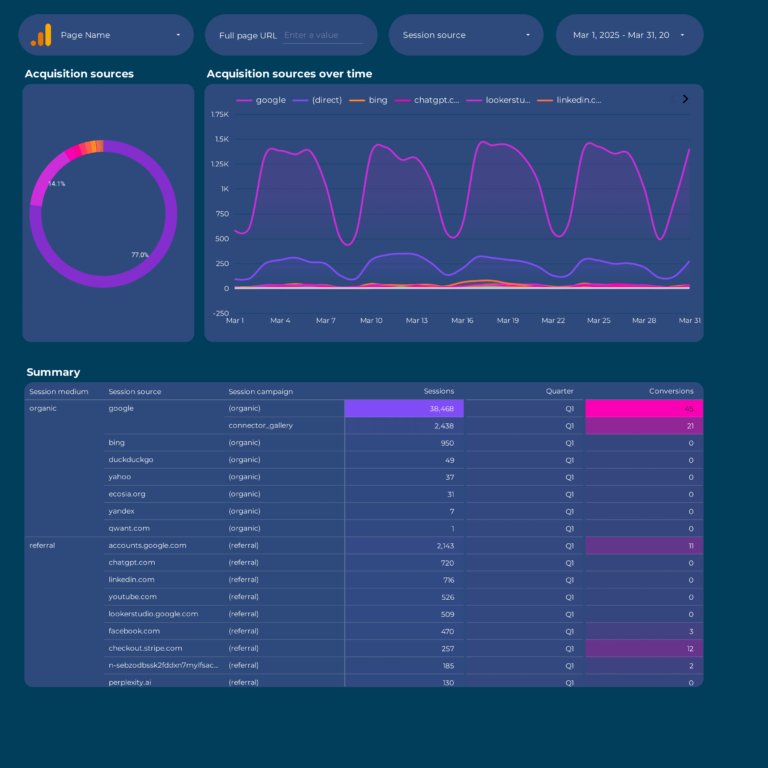
Acquisition Dashboard Template
GA4 acquisition funnel segmented by source. Compares organic, paid, social, email, and referral on engagement quality (session duration, pages per session) and conversion outcomes (goal completions, revenue). Social might drive the most sessions but organic might convert 3x better — this template surfaces that gap so you invest in the right channel.
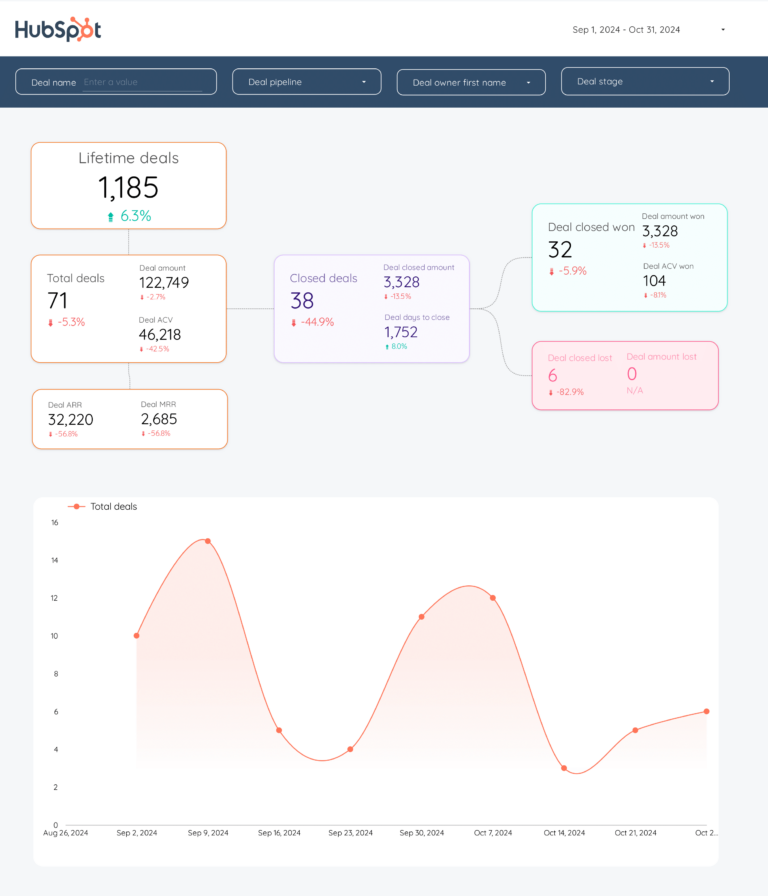
HubSpot CRM Dashboard Template
HubSpot CRM funnel in Data Studio: contacts (visibility), lifecycle stage progression (engagement), deals and revenue (conversion). Tracks how fast contacts move through stages (velocity context) and where they stall. Shows whether marketing feeds sales enough qualified pipeline to hit targets.
Demand Generation Dashboard Template
Measures demand gen across the full funnel: impressions and content views (awareness), downloads and demo requests (consideration), customers and revenue (conversion). Calculates marketing-sourced pipeline percentage — the metric that proves whether demand gen creates business or just content.
How to Use a Template
- Choose a template from the list above
- Click "Get this template"
- Copy to your Data Studio account
- Connect your data
- Customize with your branding
What Should a Funnel Dashboard Include?
A funnel dashboard exists to answer one question: where are you losing people? Every funnel has stages, and the gap between stages is where the money is. Here’s what to track:
1. Stage-by-stage conversion rates
The core of any funnel dashboard. For e-commerce: sessions → product views → add to cart → checkout → purchase. For B2B: lead → MQL → SQL → opportunity → closed-won. For PPC: impression → click → landing page → conversion. Show the absolute number AND the conversion rate between each stage. A 2% checkout-to-purchase rate means something different than a 2% click-to-lead rate.
2. Drop-off analysis
Conversion rates tell you where the problem is. Drop-off rates tell you how big it is. If 10,000 people visit a product page and 300 add to cart, your 97% drop-off rate is the metric that gets budget for CRO. Show this visually — bar charts or funnel diagrams that make the leak obvious.
3. Funnel by source
Aggregate funnels hide your best and worst channels. Segment by acquisition source (organic, paid, social, email, direct) to see which channel brings visitors that actually complete the journey. Google Ads might drive the most traffic but social might have 3x the conversion rate at checkout.
4. Revenue attribution by stage
Attach dollar values to each funnel stage. For B2B: pipeline value per stage, average deal size, and revenue per source. For e-commerce: revenue per session, AOV by traffic source, and customer lifetime value by acquisition channel. This turns a behavior report into a business report.
5. Time-based trends
A single snapshot of your funnel is a photo. Weekly or monthly trends are the movie. Track how conversion rates at each stage change over time — this is how you measure whether your optimizations actually worked or just moved the problem to a different stage.
Funnel Dashboard Best Practices
- Start from the bottom of the funnel, not the top. Fixing a 1% checkout completion rate has more revenue impact than doubling top-of-funnel traffic. Optimize the stage closest to money first.
- Compare funnels by segment, not just in aggregate. Mobile vs desktop funnels behave differently. New vs returning visitors convert at different stages. A single funnel view hides these patterns.
- Set benchmarks per stage. A 3% add-to-cart rate is bad for fashion e-commerce but normal for luxury goods. Use your own historical data as the baseline, not industry averages.
- Track funnel velocity, not just conversion. How long does it take to move from MQL to SQL? If deals take 90 days to close but your attribution window is 30 days, your paid ads look like they don’t work.
- Separate first-touch from last-touch funnels. First-touch shows which channels generate awareness. Last-touch shows which channels close deals. Using only one gives you half the picture.
- Add a “leak size” column to your funnel table. Show the absolute number of people lost at each stage, not just the percentage. Losing 500 people at add-to-cart is a bigger problem than losing 50 at checkout, even if the percentage is smaller.
FAQ
What is a marketing funnel dashboard?
A marketing funnel dashboard visualizes the customer journey from first interaction to conversion. It shows drop-off rates between stages (awareness, consideration, conversion) and helps identify where prospects get stuck. Our funnel templates do this for both paid ads and CRM pipelines.
How to create a conversion funnel in Data Studio?
Copy a funnel template (Google Ads Funnel, Facebook Ads Funnel, or PPC Funnel), connect your data source, and the funnel visualization populates automatically. Each template shows impressions → clicks → conversions with drop-off rates per stage.
What is the difference between a PPC funnel and a B2B funnel?
A PPC funnel tracks ad performance stages: impression → click → conversion. A B2B funnel tracks the sales pipeline: lead → MQL → SQL → opportunity → customer. We have templates for both — PPC Funnel for ad campaigns and B2B Funnel for HubSpot CRM data.
Can I track the full funnel from ad click to purchase?
Yes. Our E-commerce and PPC Funnel templates connect ad platform data (Meta Ads, Google Ads) with conversion data to show the complete journey from ad impression to purchase, with conversion rates at each stage.
How do I identify funnel drop-off points?
Funnel templates show conversion rates between each stage. A large drop-off between clicks and conversions may indicate landing page issues. A drop-off between impressions and clicks suggests ad creative or targeting problems. The dashboard highlights these automatically.
What metrics should I track in a funnels dashboard?
Organize metrics in three layers. Visibility: top-of-funnel traffic, sessions, ad impressions. Engagement: middle-of-funnel actions, sign-ups, content downloads. Conversion: bottom-of-funnel conversions, revenue, conversion rate by stage. Add context with period-over-period comparisons and segment by campaign, audience, or content type to find actionable insights.
How often should I check my funnels dashboard?
For operational monitoring, check daily or every few days. For performance management and client reporting, weekly or monthly. The right cadence depends on your role: media buyers need daily data, account managers need weekly summaries, executives need monthly overviews.
Can I white-label these templates for my clients?
Yes. Every Data Studio template is fully customizable. Add your logo, change colors, adjust date ranges, and remove Porter Metrics branding. Share via live link (always updated) or scheduled PDF export for professional, branded reporting.
Do I need a connector to use these templates?
It depends on the data source. Google-native sources (Google Ads, GA4, Search Console) connect directly to Data Studio for free. For non-Google sources (Facebook, Instagram, Shopify, HubSpot, LinkedIn, etc.), you need a connector like Porter Metrics to bridge the data.
What is a funnels dashboard template?
A funnels dashboard template visualizes conversion stages from awareness to purchase (or from lead to customer). It shows drop-off rates between stages, conversion rates per step, and identifies where your biggest leaks are. Unlike a single-metric report, a funnels report template tracks the entire customer journey — so you can optimize the stage with the biggest impact on revenue.
Start with a free template
Every template is free, white-label ready, and takes under 5 minutes to set up.
Browse all 110+ templates →Other Dashboard Templates
Explore more free Data Studio templates by category: