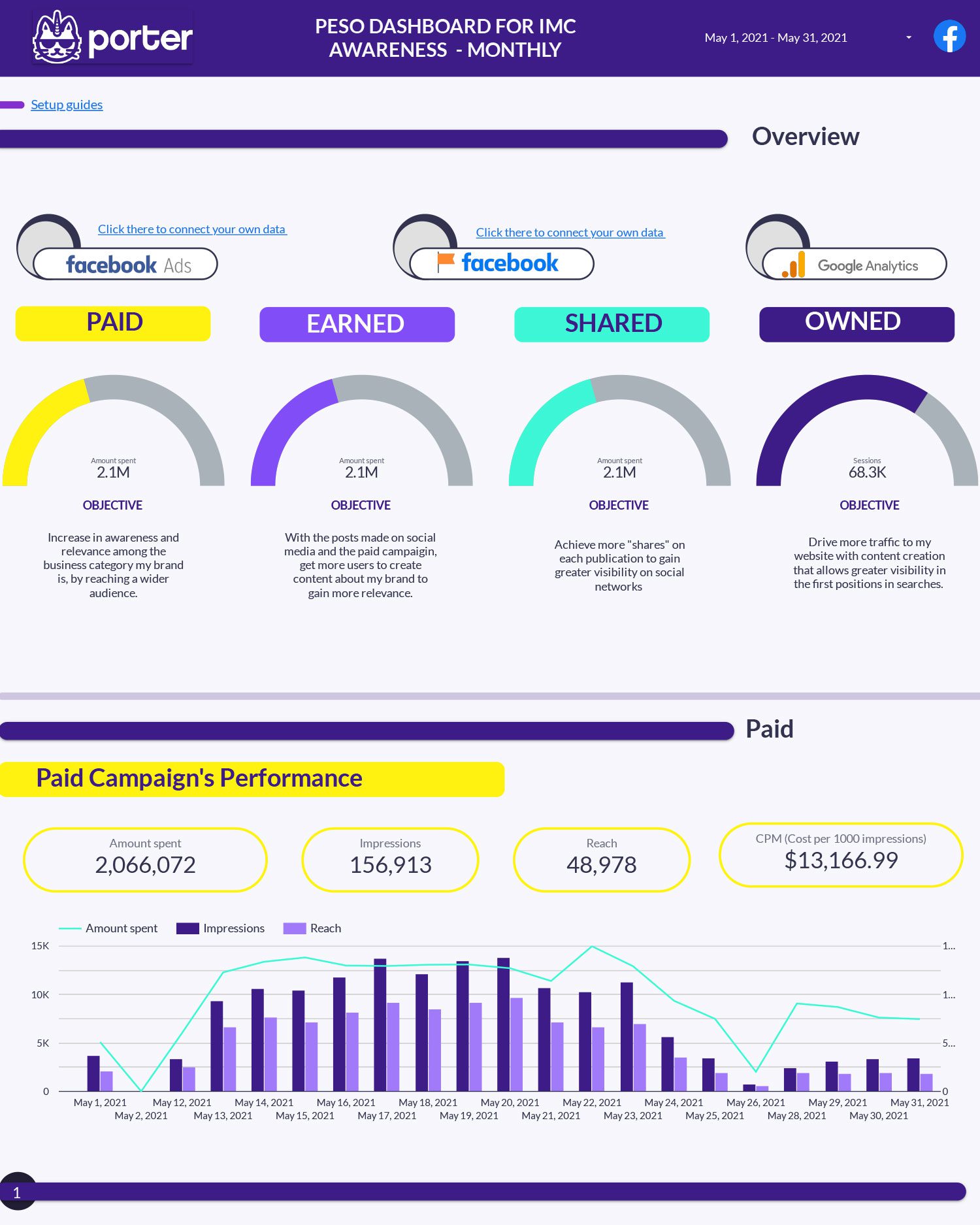
Website content performance report template
Measure your website content performance with Google Analytics behavior metrics.
Connect +19 marketing data sources to visualize your marketing data!
Export your marketing data to Google Sheets in seconds.
Get your free Looker Studio Report within 48 hours
Earn a 20% recurrent commission for every referral
Get exclusive templates worth +$800 [customers only]
See what we're building. Upvote integrations
Check all the templates and choose one based on your use case
Copy a template that combines multiple data sources
You can find related templates to “Google Business Profile” on our SEO reports’ gallery.
Needed apps to connect your report template:
PESO is a media model strategy that stands for Paid, Earned, Shared, and Owned media. This idea of converging media as part of the IMC (Integrated Marketing Communications) was brought to life by Gini Dietrich in 2014. The Spin Sucks’ book, established a solid framework for implementing and embracing the PESO model that has become widespread in the industry.
By using the PESO model, the agency and corporate teams and determine what is the best type of content according to the trends among a specific category.
Paid media has quickly become your best strategy for better targeting and control of who is being reached by the content you create.
The metric that will determine the success of your paid strategy is the one you can set and place just next to the objective.
E.g. Calculate how much you spent and how it is helping the increase in awareness and relevance among the business category my brand is, by reaching a wider audience.
Earned media is all about relationship building. Calculate your “Page Talking About” to measure the impact of your marketing and communications strategy.
Shared media could be considered a sector of owned media because you own the content that is published to your social media platforms. But there is something you have to keep in mind. The more people share your content, the most relevant you are.
The owned media it’s created specifically for your brand that is published to your website or other owned channels such as blogs.
Here you can pull the metrics from Google Analytics to understand how different efforts are helping to increase your website traffic and content consumption.
Measure your website content performance with Google Analytics behavior metrics.
Understand your Facebook Ads results based on your campaign objective: leads, traffics, app downloads, messages, and conversions. Track your budget and compare your monthly goal with your current results.
This Facebook Ads template will help marketers and media agencies to understand the performance of different metrics of the content created from Facebook Ads organized by all their performance data.
We recommend you visualize all your relevant KPIs directly on Google Data Studio Dashboards because it is one of the self-service platforms to automate data and it is also for free. If you are not familiar with Data Studio, you can learn how to use it through the following tutorial: Google Data Studio tutorial – 2022.
Marketers and agencies want eventually to customize their reports, adding their colors and using their brand guidelines. If you work with a customizable or a white-label, you will be able to customize your report as much as you can.
We have prepared this tutorial to show you how to customize your reports.
All the reports need to be shared because someone else will help you to analyze your metrics and charts to create criteria and work on new strategies. Also, if you are an agency, you need to share your reports with your clients.
Through Google Data Studio you can share your reports via link or PDF. These are different ways to share your Facebook Ads report:
You can also learn more about his topic in the following tutorial: How to share your Google Data Studio reports.
You can use Data Studio to add different charts according to your need and how you want to visualize your data. These are some examples that you can use on your reports.
You can also customize these charts and change their color and sizes. Follow this video tutorial to learn how to create graphics and charts on your Data Studio reports.
All our templates, including the Facebook Ads report template, have predefined metrics based on real cases and the most used business KPIs.
As we told you, Google Data Studio has the option to let you schedule email deliveries which means you can send a copy of your Data Studio report to your stakeholders regularly.
You can also review the following article to create a new email delivery schedule for Google Data Studio.
Filters and controls on Google Data Studio make your reports interactive and clean your data.
For example, you can use the filters on your report to filter your “campaign objectives” or “camping names” and analyze the performance metrics just for some of them, excluding the campaigns that were meant for engagement rather than lead generation.
We have already created the following tutorial to show you how to create filters and controls on Google Data Studio.
You can review all your data and also combine it from old or blocked accounts with the new ones you create so you keep all the data consistent in a report. On Porter Metrics we retrieve all the historical data that the Facebook Ads API allows, which is generally 2 years.
In the same report view, you can combine data from multiple sources like Twitter, Google, Shopify, and more, so you truly have everything in one place.
If you are an agency, you can integrate multiple accounts together to have a full overview of all your clients’ data. Also, if you are a marketing team in charge of data, you can overview multiple brands, regions, etc.
You can use Porter Metrics to access our report templates gallery, inspired by real use cases. Review the galley to access to:
It is ok if you want to set up your report, but if you need help with it, feel free to contact our specialist team in charge. We can set up your reports for free!
We already have a tutorial to show you how to set up your report template, including use cases, charts customization, blending examples, and more.
If you are working with our report template, you need to know all the metrics and dimensions that belong to. For this reason, we’ve created this list.
We have chosen some related templates that can be useful to your business.
Track all your clients’ performance at a glance with this Google Sheets template. Keep high-performing clients happy; optimize under-performers on time.
Understand how are you acquiring users, engaging, and monetizing your e-commerce with this Data Studio template. Compare your monthly results and understand your user demographics.
Understand your Facebook Ads results based on your campaign objective: leads, traffics, app downloads, messages, and conversions. Track your budget and compare your monthly goal with your current results.
You can also review all our social and advertising report templates.
We understand how powerfull can be a template, so we can connect any dashboard with other app, we can help you to take a preview of your digital platforms
You can check our connector list to review similar connectors such as Instagram Ads and Google Ads to create a cross-channel ads report. Visualize your total ad spend and conversions across your paid media channels.
Learn how to connect your reports on different cases like next blending data with Google Data Studio
This report template is really for free, and you can copy it and use it whenever you want. However, you need to pull your data from the Porter Metrics.
Once you have successfully created a copy for this template, you will start a 14-days free trial with us. Also, you will choose a paid plan to upgrade your porter metric account and keep the connector working.
Note: If you don't want to upgrade a plan with Porter, you may keep with the template, but the connectors will stop working, which means your data won't be available in this stunning and comprehensive template.
When you have a custom report template, you can visualize real-time charts and know your performance when you have a custom report template.
Once you have set up your advertising report template, you will follow these steps to analyze your data:
You can customize your report by creating new charts, adding filters and controls, custom formulas, colors, logos, and changing the size of your canvas.
We have created the following video tutorial to show you all these options to customize your SM report template: How to customize a Google Data Studio report.
As we have shown you, Porter Metrics has been created as a non-code platform for marketers and agencies to automate your Data Studio reports in some minutes.
The difference between Porter Metrics and competitors is the non-code and the resources that Porter Metrics offers. You can also review this reporting tools list to know all the solutions available, including Porter Metrics and competitors.
Please make a copy of this funnel report template and use it now to track your campaigns. As we show you, these are the steps:
Remember, if you need help to set up your report or star tour free trial, you can schedule a call, and we will be happy to help you.
Porter is the fastest way to get your marketing metrics and dashboards where you need them.